Somewhere A Citadel

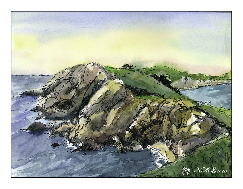
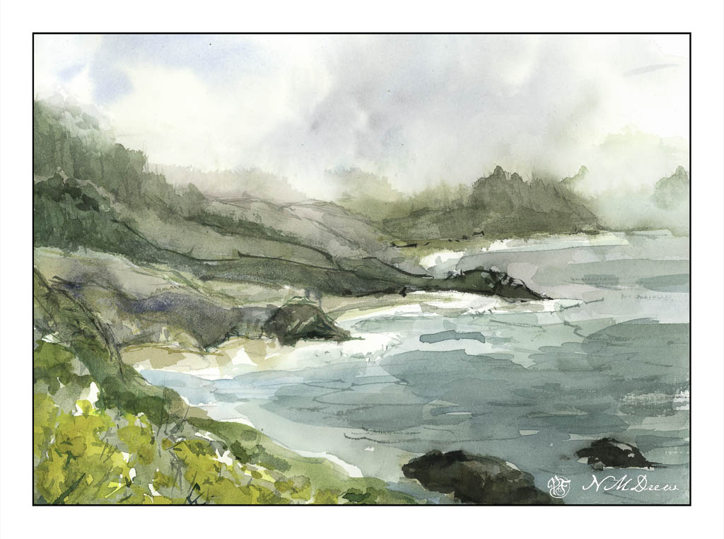
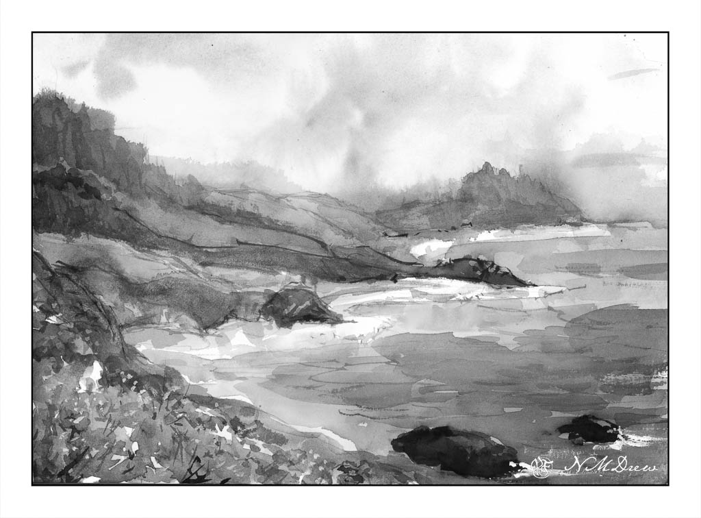
I travel the globe through watching videos, photo websites, and royalty-free images. This time I visited someplace in France, searching Pixabay for photos matching the term “citadel” and found some really interesting things. What I wanted in particular were photos with strong architectural details and perspective to use as practice for drawing / painting buildings. The one I used in the painting below was taken from a low vantage point and looking upward. The upper reaches of the tower were centered over the corner of the citadel, and the sides of the citadel sloped steeply downward.

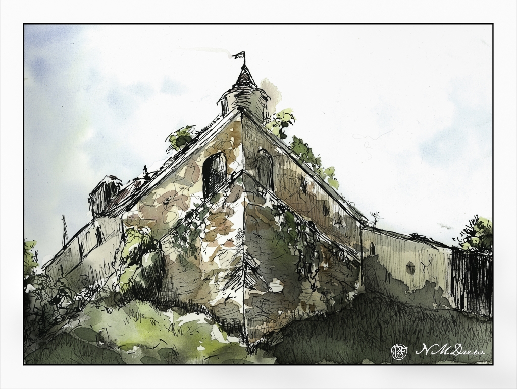
Working from a photo is often difficult, especially if it is small on screen and cannot be enlarged. The left and right sides of the building were confusing, so I just sorta made up what they were, but the center of the building was pretty clear in the photo. I drew first with ink, then added color, and then returned to add more ink and more color a few times. The ink proved helpful in making the right side of the painting darker, as it was in the photo. I didn’t want to add a lot of paint as the purpose of ink and wash is just that – delicate touches of color to the ink drawing.

I really like working with ink for drawing buildings. It will get there some day! Right now I still struggle with both depth and perspective, but practice like this is always fun, and usually to almost always, rewarding.

Impression of Wildcat Beach

India ink, watercolor, sketchbook. Wildcat Beach is one of the most beautiful beaches along the California coast, and what makes it interesting is not only do you see the ocean, you see the other side of peninsula, more water, and you want to wander along its top, and on the shore, or sail around. There is a lot of mystery here, beauty on a sunny day, strange and eerie in the fog and mist of the summer coast.

Misty Coast – 2 Versions

Seldom are my watercolors subtle in color. Instead, they tend to be bright and rather garish. Today, I focused on a softer color while painting, meaning more delicate colors, more muted tones. The reason for this is I was driving down to the Valley for an appointment, and I was noticing the soft, hazy qualities of the air. Greens were light and delicate, flowers alongside the roads, while strong, were not a brilliant yellow. In the distance hills and mountains were soft, blurring into the distance – still clear, but very, very soft.

This motivated me to see if I could accomplish something a bit more subtle. I looked at a picture of the northern California coastline, which can be rugged and foggy, with mists rolling in and out, obscuring and revealing at any given time.

Below, is the first painting. I used a lot of water to paint with as well as dilute my colors. This makes them more pale. It seems to have worked fairly well.

To test my theory of a softer, more grey image – longer grey scale – I turned the painting into a black and white image by both desaturating the same image above, as well as removing all vibrancy.

As you can see, there are a few areas which are very dark, but there are a lot of shades of grey, most of which fall into the arena of middle values.

Below is the “revised” version of the first. Here I added some white gouache to the rocks on the lower right, helping define them and to give a sense of breaking water. I cleaned up – removed – the turquoise streak sitting in the middle of the painting. Finally, I mixed some bright yellow and gouache to add dots of color to the lower left of the painting, creating a bit more defined foreground and to break up some of the edges.

I prefer the second version. However, you will note that the values remain the same for the most part below.

To tell the truth, delicate watercolor frighten me! They require a more delicate approach to the paint and water combinations. This was really a good exercise for me and I can see some more follow up paintings along this line. They do not even need to be misty, but just perhaps more pale but still with good contrast.

Where I live, it is quite dry, so those of you who live in more wet and damp climates have more water vapor in your atmosphere than we do. You can see this when you compare watercolorists’ work from other parts of the world, such as Britain or Holland.

Vaduz Castle

We let the butler and staff off for the 4th of July weekend and decided to cruise to Lichtenstein for lunch in the Stratos 714. We needed a break, so we stayed a few days. Beer drinking, fine weather and a bit of plein air sketching with ink and watercolor.

When I draw with ink, I almost never use a pencil. I like the challenge of inking directly onto the paper. I seem to be more successful, too, than drawing in a pencil line and then inking.

Today I used PH Martin’s waterproof India ink. It needs some drying time. Fountain pen ink is almost dry as soon as you write a letter, but because of its nature, India ink needs a bit of time is needed. A hair dryer can help. India ink seems to dry more quickly than iron gall.

The goal here? Play with the ink – an ink I haven’t used since who knows when – see how it performs, and work on perspective, too. That meant buildings. Buildings with right angles are fairly easy to sort out, but I thought a combination of curved walls and right angles might be a bit fun. They were. As well, a bit of distance using varying greens to depict the curve of the grassy hill.

I am pretty pleased with this. Ink first, then color and dry and color and dry and then more color. I had a lot of fun trying to get the slightly uneven rows of stone in the round tower depicted somwhat realistically.

Haystack Rock

More of the northern coast along the Pacific Ocean. Here, Cannon Beach in Oregon, possibly one of the most dramatic beaches I have ever seen. Sea stacks, tide pools, sand, mist and fog. When the fog lifts and the sky brightens, there is a glare that cannot be explained. It’s not a summer day brightness as we have in SoCal, but a brightness that is cold but not like on a snowy day. There is a lot of moisture in the air, from sea and fog, and perhaps that is what magnifies the light to such a degree.

If you look closely, you will see some of my ink bled into the paint. I used my iron gall in, not my waterproof micron pens, and a stub nib to draw. From there, I wet the sky, dropped in colors, and then let things dry to dampness. I wanted to create soft edges for the mist in the distance which blurs and softens edges. The rocks themselves were painted wet-in-wet initially, and then other colors applied to either dry or damp paper. The sand and the rivulets were painted in the same manner. In the end, I drew again with my iron gall ink to add texture or detail.

Keeping this sketchbook is so much fun! I have room to paint as the sheets are big, the paper is strong so I can use both sides, and I can paint with a lot of water should I wish. It is proving to be one of the best decisions I have made of late!