Rick & Me

About a year ago I found the YouTube channel of Rick Surowicz, and artist of considerable talent, and a formidably talented teacher.  In the space of just over a year, he has garnered 25K followers, and I am one of them.  Check him out if you don’t know who he is!

Anyway, I did two of his videos, both of which make use of frisket.  In general, I like to “travel light” – meaning, I like the idea of spontaneity for success, not thoughtful pre-planning.  The result for me is usually disaster and disappointment.  Rick’s videos are clear.  He explains what he does and why.  The results speak for themselves.  I decided to get off my don’t-panic-I’m-organic high horse and follow along.  These next two paintings are from his lessons, which I followed.  I can honestly say I enjoyed doing them, even in the moments of terror – that frisket!  those colors!  

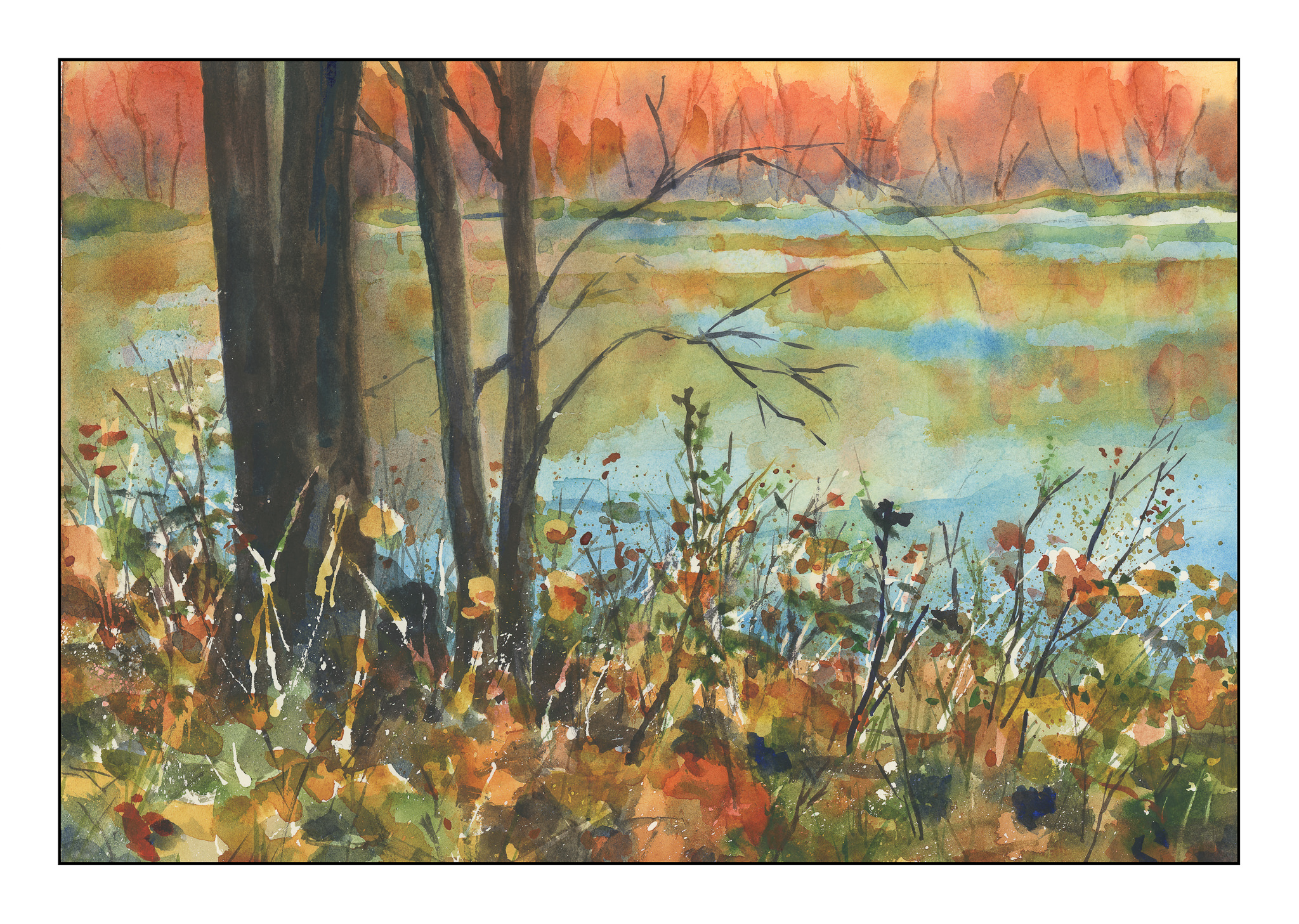
Each one of these paintings required the usage of liquid frisket. I applied it, let it dry, and got to work. The beauty of the liquid frisket is that it allows the application of broad washes across the paper without the loss of white paper, or having to do in painting or negative painting. This actually gives a bit more ability to be spontaneous and splashy than not using it! (Surprise lesson here.) I did each of these paintings over a two or three hour period, watching the steps in each video a number of times.

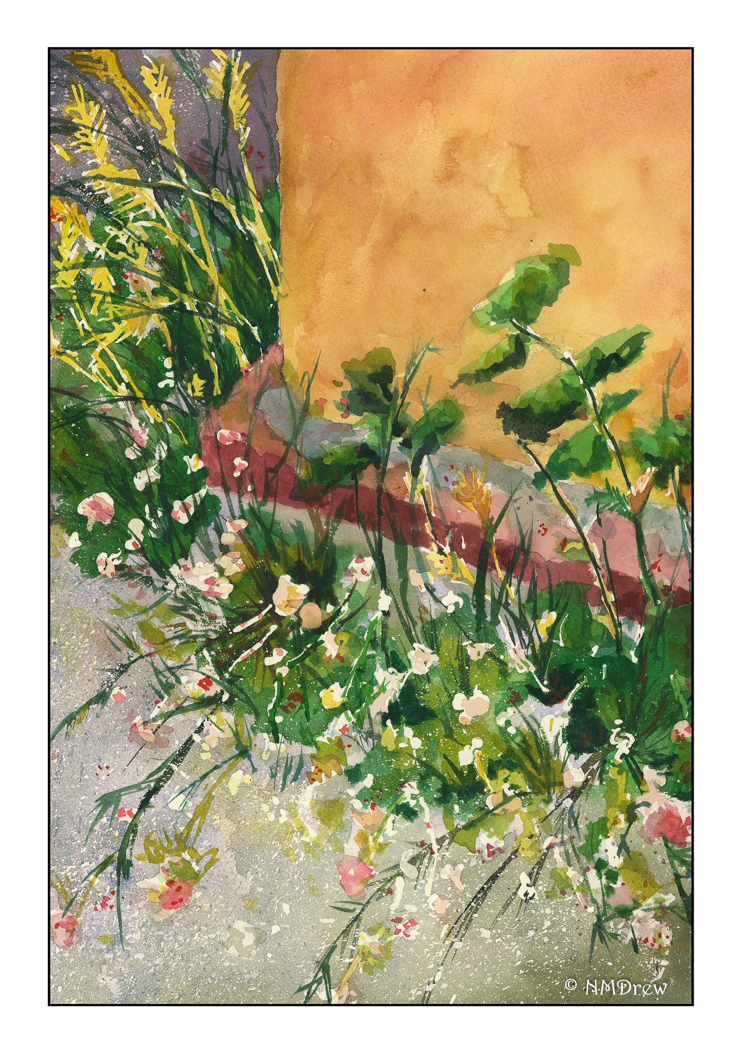
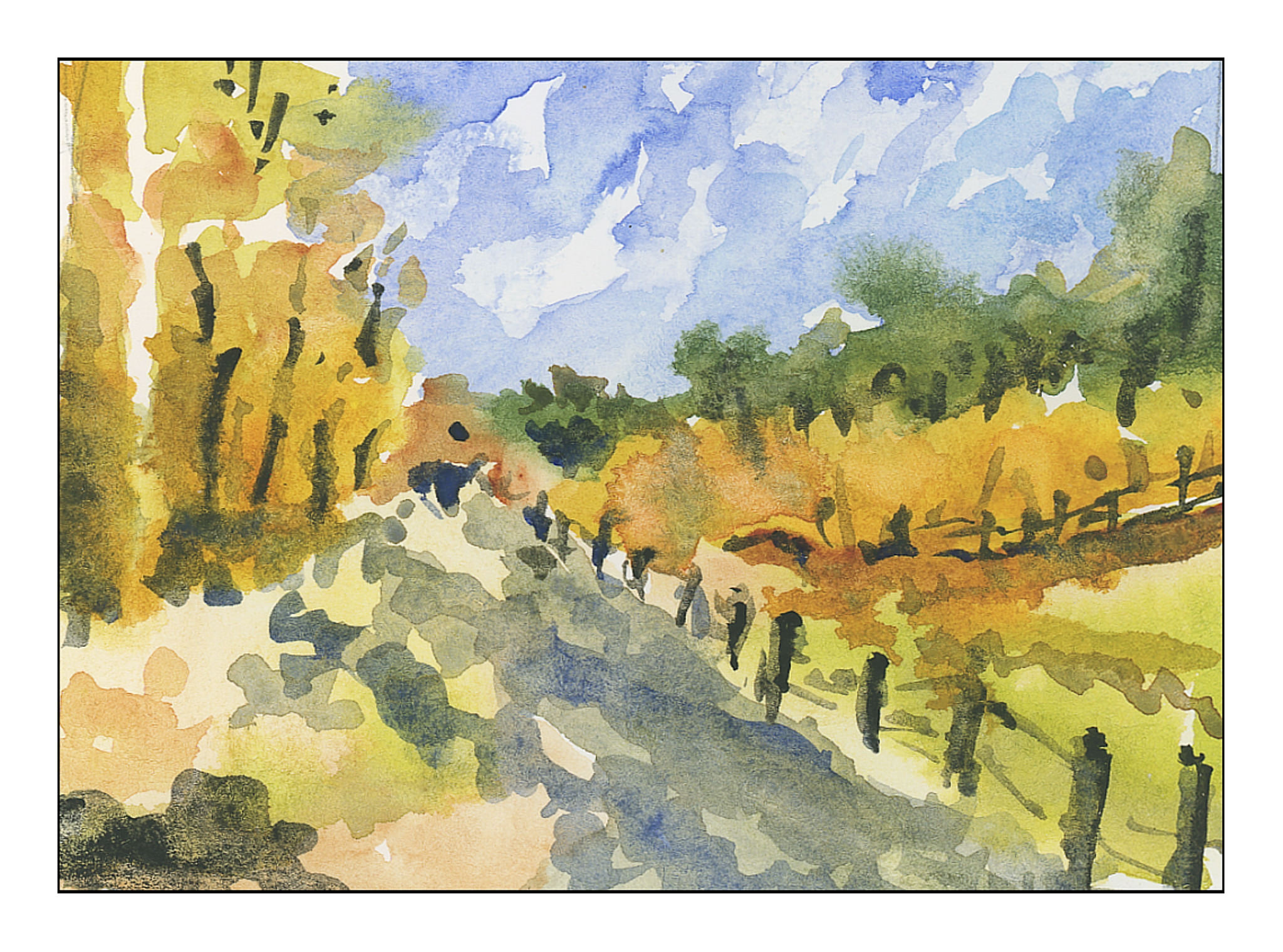
At some point, we all have to try our wings. I took a photo of a weed patch behind La Purisima Mission in Lompoc, California, last summer during a visit. There were white flowers – perfect for frisket – and yellowish grasses – also good for painted-over frisket after it was removed. This painting held a lot of terror, let me tell you! However, I am fairly pleased with the end result – simplification coupled with detail.

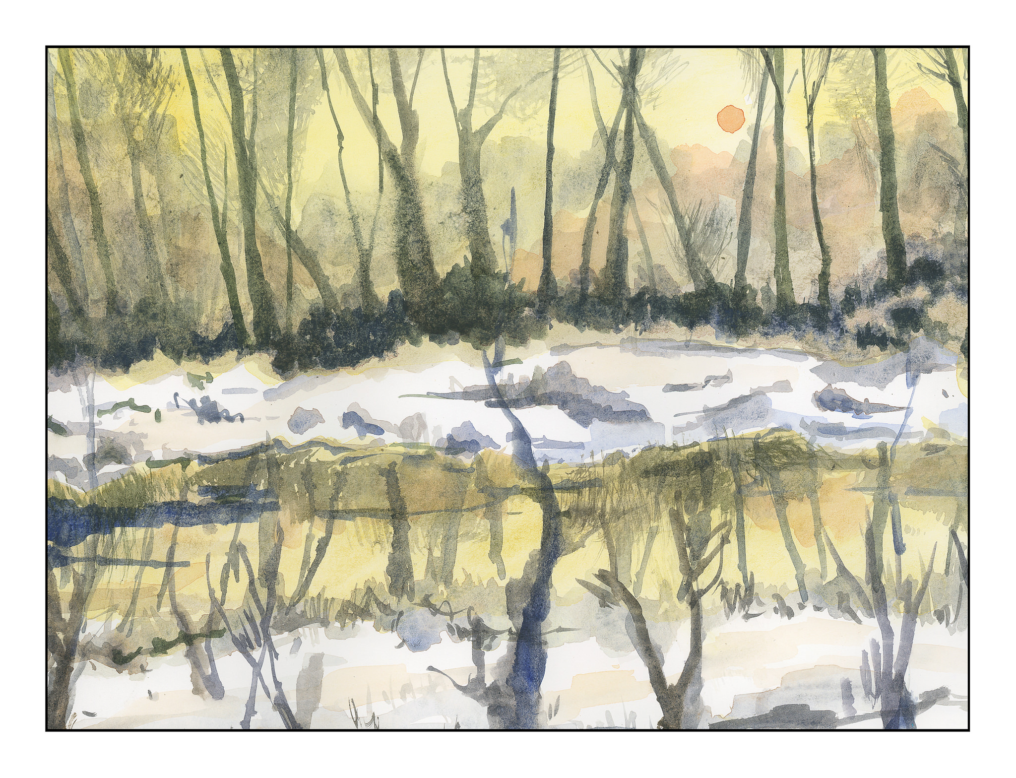
This morning, I did this painting, derived from a public-domain photo of an aspen grove. In the photo, light was shining from the right, and in looking at the picture carefully, the trunks of the aspens, which are a brilliant white, much as birch trunks are, were actually darker than the brilliant yellow-green foliage in the distance. I used frisket for the white areas on the right of the trees, and then, as I laid down layers of color, added more frisket here and there to protect areas of color. I did this for three or four layers until I finally removed it all, and then painted in areas needing more detail or contrast.

By following Rick Surowicz’s tutorials, I finally learned something. Frisket is not scary and can be an aid to a spontaneous or splashy wash as it helps preserve white paper. In the process of copying Rick’s process, I learned a bit about color, reworking areas, contrast, and whatever. I was also able to paint a representative of a bush or leaves rather than hankering to paint the details and losing the overall effect. I am thinking about redoing the last two paintings without frisket, just to work at white space without an aid. That will be more of a challenge I think than not using frisket!

Keep It Simple!

I have been so focused on buttonholes that I am getting a bit nutso.  Painting is a totally different experience, and was a welcome break yesterday and this morning from the analytics of buttonholes!  If I do anything with sewing today, it will be later on.  In a bit, we are headed out to collect our supplies for Thanksgiving dinner, and that will certainly be another pleasant break.  I don’t know about you, but too much of any one thing becomes almost an obsession with me – analyzing and studying whatever.  Painting does require a bit of analysis, but it also has an element of sheer doing that makes it very different.  It’s very relaxing, and because it just has a life of its own, watercolor is a challenge and a tease as well as a very creative experience.

Anyone who does watercolor or painting or drawing is well aware of the need to simplify details, especially in masses of color.  Every leaf does not need to be painted.  When we look, we see these details, and the effort to simplify them into areas of light and dark and midtones can be – and often is – very challenging.  Good artists make it look so easy!

The other day I was napping on the patio (I live in a warm part of the world).  When I woke up, I looked at the podocarpus trees along the back wall, and suddenly got the idea.  I saw the details of the leaves – each leaf – but I also saw the light and the dark areas.  That is when I realized I could do it – but it had never been in the front of my mind before.

I went to work.  No outlines by pencil, just some reference photos labeled “foliage” in a search.  Varied pictures showed up, and here are my studies of simplified details.

These first three are thumbnails, about 3×4 inches in the order I painted them.

I did the above paintings yesterday.  This morning, applying the same tactic of no lines drawn, I used a 9×12 inch sheet of paper and painted out to the edges.  Again, the focus is on simplification of details into masses of color.

Success?  I don’t think any of the paintings are particularly good, but I do think I am getting that element of simplification I find so elusive in my own painting.

Creating My Own Watercolor Palette

Books abound about colors to use and to choose and why and wherefore.  The fact is that to understand them you have to use them.  Years ago, my palette was filled with the traditional cadmiums and earth tones and blues and such, and I am very comfortable with them.  I still love those colors as they are old friends with history and familiarity.

Today I decided to choose 18 colors.  Some are new-to-me (like quinacridones) in the past year, and some are old buddies, like the earth tones.  Here they are, as arranged on the palette:

  1. Burnt Sienna (Holbein)
  2. Burnt Umber (Schmincke)
  3. Raw Umber (Winsor & Newton)
  4. Raw Sienna (Daniel Smith)
  5. Quinacridone Gold (Winsor & Newton – last bit, along with Daniel Smith)
  6. Hansa Yellow Deep (M. Graham)
  7. Perinone Orange (Daniel Smith)
  8. Quinacridone Rose (Daniel Smith)
  9. Alizarin Crimson (M. Graham)
  10. Carbazole Violet (Daniel Smith)
  11. French Ultramarine Blue Fine (Daniel Smith)
  12. Cobalt Blue (Daniel Smith)
  13. Manganese Blue Hue (Daniel Smith)
  14. Colbalt Teal (M. Graham)
  15. Green Gold (Daniel Smith)
  16. Hooker’s Green (M. Graham)
  17. Sap Green (Holbein)
  18. Lunar Black (Daniel Smith)

Some of these paints are old and little is left in the tubes.  I took a chance and mixed two different brands of Quin Gold together – it might be interesting to see their differences when I use them on paper.

All of these colors sit really nicely in the wells except the Cobalt Teal, which is very runny and puddles.  I want to use it up and try a different brand – I have a tube of DS sitting in the wings – but it produces an extraordinarily beautiful green when mixed with Quin Gold.  Having used neither color in the past, that was a fun surprise.

Other new colors include Green Gold, Perinone Orange, and Carbazole Violet.  I’ve never had a violet on my palette until this past year!

When you think about it, modern chemistry and color chemistry affect us everywhere we are, from the colors of our clothes, to neon signs (replaced now with LEDs), to food, to who knows what!  Thus, it makes sense to use modern colors in a more modern watercolor palette.  Additionally, many of the colors made today are much more lightfast, which means less if any fading, compared to the more traditional colors.  A watercolor of 100 years ago was probably far more vibrant then than it is today.

Old friends include Burnt Sienna, Burnt Umber, Raw Umber, Raw Sienna, Alizarin Crimson, French Ultramarine Blue, Cobalt Blue, Manganese Blue (now a hue)), Hooker’s Green, Sap Green, and Lunar Black.

It was really difficult to choose these colors – like a lot of painters, I read about or see a color and go off to buy a tube.  There are some that are incredibly beautiful – but for a travel palette, even 18 colors may be a bit much.  For myself, I prefer to have a stable of greens rather than mixing them a lot.  I haven’t really taken the time to do it as the Sap and Hooker’s have been in the color stable for a long time.  Green Gold is totally new to me this year, so I thought I would include it.  This forced me to narrow down my blues and reds to a degree, as well as the addition of the Perinone Orange and Carbazole Violet.

Over the next several days I plan to use these colors, perhaps make some swatches and grids to see how they react to each other.  A “good” artist is inclined to do that . . . me, I get antsy unless I make it a goal!

The Days of Inktober 2018

October is “Inktober” to many artists – a time when, around the world, artists focus on ink drawing, from a suggested list of words, or just because you can.  Drawing in ink can be done spontaneously, over a preliminary drawing, with pen or brush, with black or colored inks.  Ink is ink.  And the experience is great.

I’ve been focusing on the list, which you can see below.

When you think about it, it can be really hard to be inspired by the topics.  How do you depict “precious”?  “Chicken” can be pretty obvious – until you pursue the more obscure meanings of “chicken” – as in cowardly or yellow.

Below are my Inktober drawings through the 11th day.   For the last one, the mushrooms just have to have that glorious red – so watercolors were added.  And, to be honest, I needed something beyond the black and grey and whites of ink.

I hope you enjoy them!

Spring Bulbs on Paper

Winter is leaving and the bulbs are emerging.  In my own yard, freesias are in bloom, their sweet scent greeting me as I come and go from the house.  Other bulbs are found in the stores, as cut flowers or in pots.  Daffodils and tulips are the most common.  Hyacinths are rare.  Where I live, there is never snow on the ground, and if we are lucky, we get rain and a cold wind.  Having grown up in the middle of blizzard country, I miss the bulbs – but I don’t miss the weather!  So, here are some paintings of daffo-down-dillies and one of some tulips.  None are great, but all were fun to do!