On to “Brushwork”!

A few months ago I joined Ian Roberts’ online class “Mastering Composition.” First several weeks were simply drawing exercises, learning about values and shapes to create a 3D effect on the flat surface of paper. Two weeks ago we began the “Brushwork” component. I decided to use oils for this section simply because I have not painted with oils since high school – back in the last century.

What I like about Roberts’ class is he makes sense. He discusses things on very pragmatic terms as well as on a bit of a more esoteric plane. Both are satisfying. Exercises are clear and with stated purpose. The key components thus far are values and edges. He says, “If you can’t see it, you can’t paint it.” And that is true. If you don’t look and observe and get picky, well, it’s just not there.

Week One

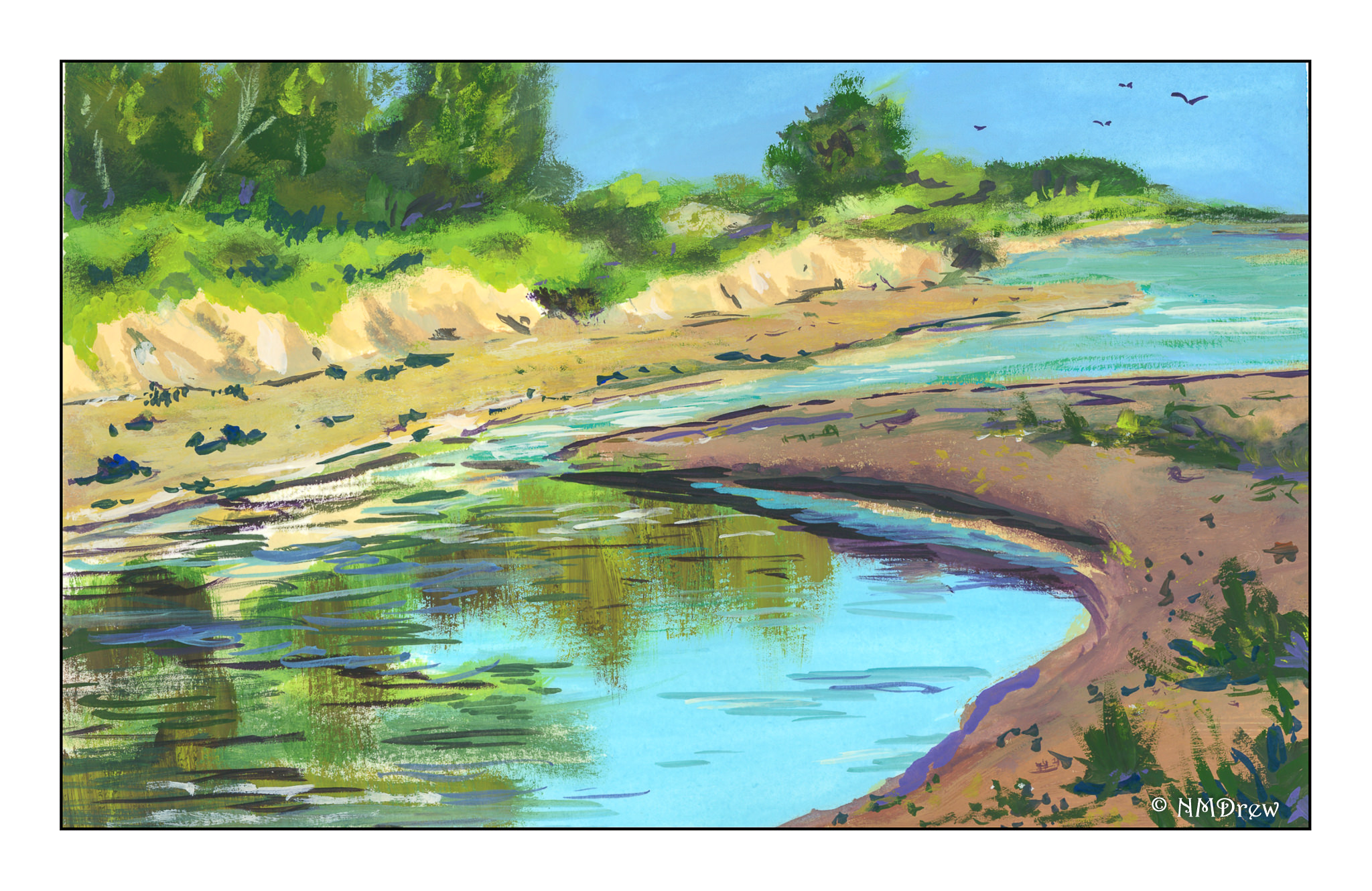
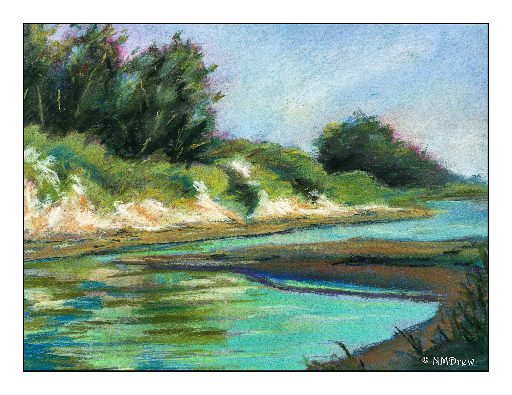
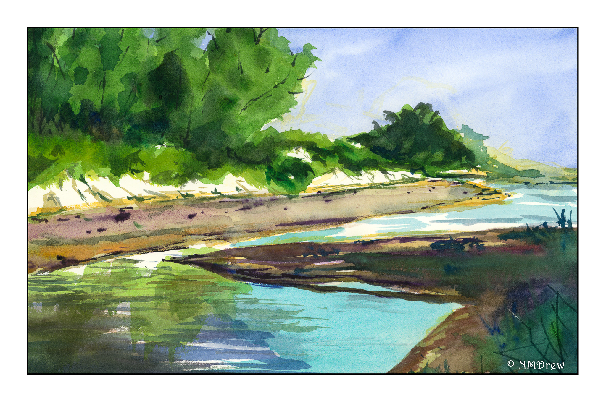
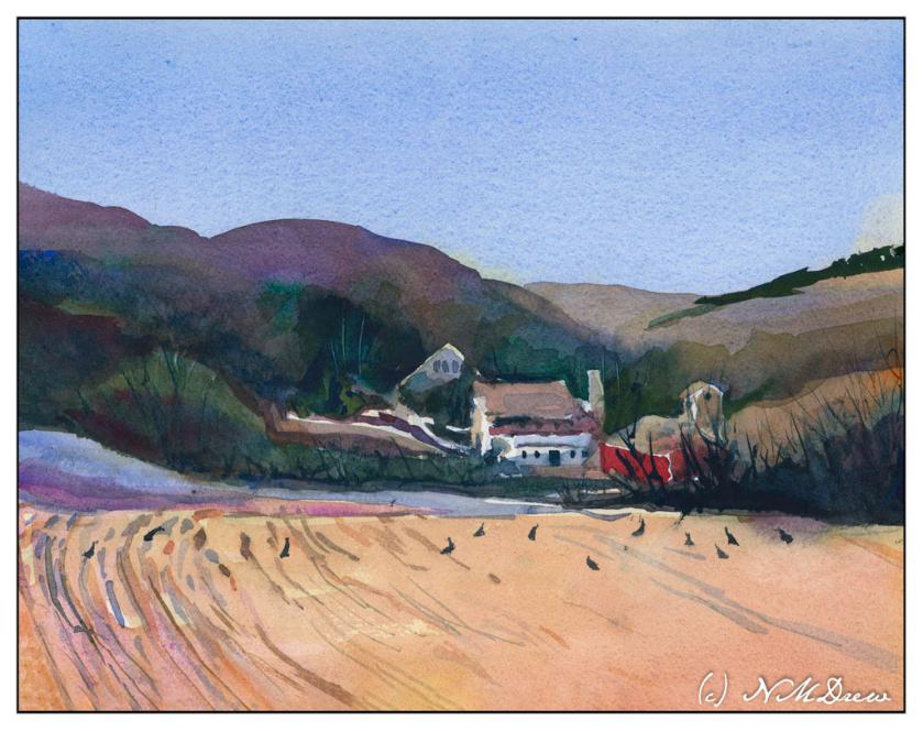
Simple value studies of a landscape. I did 4, in 4 different mediums in order to decide which I wanted to default to – I chose oils (see above).

Watercolor
Gouache
Acrylic
Oils

I won’t say any of them are great, but by posting them, fellow students give feedback. It’s useful as others see what you do not. As well, it is also useful to give feedback as it sharpens your eyes.

Week Two

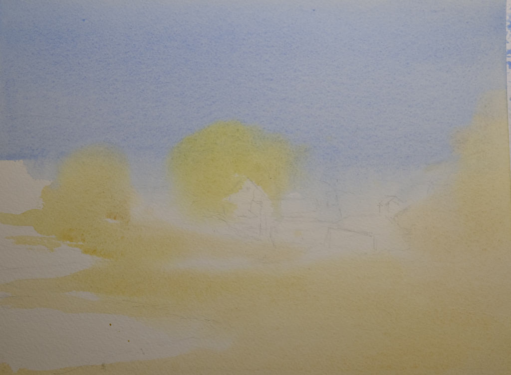
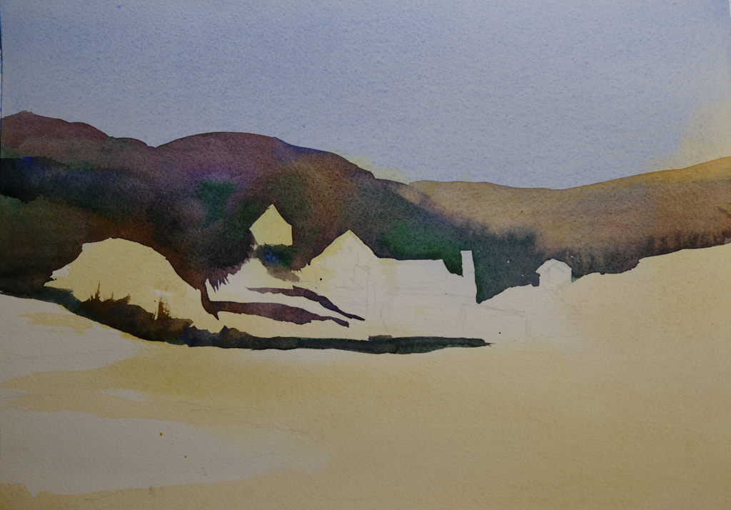
Now, onto still life, demonstrated by Roberts and then practiced by students. This was followed by a landscape. The still life focused on edges and values – and so does the landscape. The landscape is ours alone to do – no demo! I tried to make my landscape simple masses. Parts work, parts are illogical, and taking a photograph of both was a pain as they are both still wet. Oh, well.

Still Life in Oils

This was a fun study, and it was a challenge to really take the time to look, and to see, edges, shadows, shapes, etc. Overall, I am pleased with it. My sphere is a bit on the floating side, but I can fix that later. As well, it is fairly bright but monitors make it look darker or lighter, depending on which one I am using.

Landscape in Oils

This one is a challenge. It is wet and hell to photograph! One thing I have learned is that I will need to come back with a fine brush after it has dried to clean up some of the whites on the guardrails and perhaps elsewhere.

Thoughts

By far, this is the best online course I have ever taken! If you want to paint and learn a few things, you might check out Ian Roberts. He is on YouTube, so how he is there is how he is in the Zoom class meetings.

Stay tuned for Week Three and Week Four!

Turkeys in the Field

Turkeys in the Field

I feel like a school kid – classes are taking up so much of my life! It is keeping me off the streets, so I am sure a few people are glad to know that! The classes are a series with Ian Roberts (online), Andy Evansen (online), handsewing 18th stays with Burnley & Trowbridge (far behind!), and a local class in oils / acrylics with a good teacher. Housework is falling by the wayside!

The above is a watercolor exercise from Evansen’s class. It’s a year-long course in watercolor, and the content needs me, the student, to work hard at the lessons. We began with skies – I am pretty comfortable with those. This module works with values, and I think I did a pretty good job with it.

What I found especially interesting was the beginning of the value study. Unlike Roberts who puts in all values in a pencil sketch, Evansen puts the middle value only as the first step. The white areas are bright spots and the sky, but the middle values are all created as one big shape. That was quite interesting, and not the usual route one takes with value studies.

Pencil drawing with middle value only added as a shape.

I messed up a bit, but it did lay out a map that was more clear to me than also including the darks. Once I got the idea in my head, the next step was to lay in soft colors on paper that was wetted on both front and back with a natural sponge. I used 9×12 140# CP Kilimanjaro paper here.

After doing the middle value shape, both as a prelim and then on the final painting, you are supposed to go back and add the dark areas to the prelim. I didn’t get there – I was too involved in the final product!

Light areas filled in on dampened paper. Includes the sky, white areas for buildings, and field and trees.

Doing the light areas on dampened paper allows the colors to bleed a bit, and create soft edges.

Thicker paint added once the light areas have been worked.

The next step was to work left to right so that the shape created for middle values in the preliminary study could be made on the painting. The idea is to work in one movement – left to right since I am right handed, but right to left if you are left handed. The idea is to create a bead of color that varies as you paint in a continuous design.

To me, this was really a dark based on the reference photo, but that is life! As I did this, I worked around the buildings and structures, as well as roads. The thicker paint and dryer paper allowed this to happen to create hard edges. I was happy with how easy it was to do!

Almost done!

This was perhaps the 3rd stage in my painting. I added furrows to the field and details to the structures. I scraped in tree branches and such with my finger nail only to realize I keep them trimmed too short to be of any use there!

After all the layers were dried, I did the heavier dry brush as well as glazes over the field and hills to create areas of warmth or coolness. I also did it on some of the structures to keep them from dominating .

Some thoughts . . .

It is really a lot of work to do these classes. My whole purpose is to stop my old ways of approaching painting and create some kind of shift so that I can become a better painter in my opinion. Also, I need to stay busy. I have felt like I have been floundering a bit, so an area of focus was important, especially in an arena I wanted to learn. I am still adjusting to all this, but in the big picture, I am happy I made the commitments.

Painting in July

I have done a fair amount of painting this last month, some of which has pleased me, and, of course, some which is not what I intended. In between has been some sewing and photography.

The paintings in this gallery were done mostly in July and are in both watercolor and gouache. I have been doing water studies for the most part – some still, inland water – some oceans and shore. For years the subject intimidated me, but now it is getting a lot easier. From water on the ground I have also moved to water in the air – fog, rain.

Now I plan to pull out the pastels and try these same subjects in a very different and unwet medium.

Another Tale of 3 Paintings: Tanglewood

Yesterday was Painting Disaster Day. I suppose it had to happen after a couple of good rounds. It was also nearly 100F, and even with the air conditioning on, I was hot and cranky, and that doesn’t make for good focus. Anyway!
I took this photo last month, and rather like its moodiness. The dead leaves and bright new leaves create interesting colors while the trunks create interesting lines. The first attempt to reproduce this painting in some form or another began with pastels, then gouache, and finally watercolor.
This pastel painting is rather clumsy, but I have found in doing these kinds of series that usually the first one, in whatever medium I am using, is always the starting point. I learn more about the picture as I paint it. 9×12 on Mi Teintes paper.This is the second in the series – a small 6×8. What I did differently here than my usual gouache is I used Arches hot pressed paper and worked to keep my gouache paints thin (cream consistency) and moist while I painted. The smooth paper and smoother paints made painting a lot easier. It turned out pretty good!
Finally the watercolor. This is on the reverse side of another painting, on 16×20 Arches cold press watercolor paper. As both pastels and gouache allow for opaque overpainting of other colors, by this time I had a pretty good idea where light and dark were and could plan ahead. I used frisket on the tree trunks and in areas where the leaves are hit by the sun. Keeping these areas masked off let me apply broad washes across the paper without losing the shites.

Altogether, I am pleased with this series. I think I may redo the pastel painting as I have some new pastels to try out! Meanwhile, I am looking for some buildings for my next triad (or “try-at”) of paintings.

A Tale of Three Paintings

Over the last week I have been painting the same image three times, each time in a different media.   I began with gouache, moved to pastels, and did the final painting in watercolor. Doing such an exercise was really educational as well as pleasurable.

As you can see in the gouache, the perspective is totally off! I didn’t do much of an underdrawing, just a few quick lines, but I didn’t really check this point against that, as well as compare it to the photo. The result was an uphill beach, and a total lack of realistic perspective. I suppose it would look like htat if my head were on its side, lying in the sand or something! Anyway, it was a good lesson as I realized most of my perspective issues are simply the result of poor drawing techniques.

This next one is my favorite. Maybe it’s because I am just learning pastels and totally in love with them. Here, the perspective problem is solved. The cliffs look quite sandy in the picture, and in reality, they are. Along the coast where I live in California, cliffs tend to be friable, made of highly compacted but still fragile sand. They easily collapse, and it is really foolish to sit under them on the beach or to walk along there edges. After rains it can be especially dangerous, and one year a major landslide occurred and several people died. It was not good. So, I think these cliffs are pretty accurate representations of what our cliffs look like here.

Finally, watercolor. Perspective issues remain resolved, but a sense of distance prevails along the strand of beach on the opposite shore. Rather than overwork it, I left it as it was, still pondering how I could make a sense of distance as the beach veered off to the left and background. More blue? Less detail? I’m still befuddled on that one.

Altogether, using three different mediums to paint the same image was rewarding. Problems occurred in all paintings, many of which could be applied to others. Perspective is always an issue for me, so I really need to focus on it probably more than anything in landscapes. I know the rules, but need to find methods to implement them. Gouache and pastels are more forgiving as you can paint over what is underneath to a reasonable degree; watercolors are pretty much a one-shot deal. I think I will continue the 3 painting studies in the future as I learned far more than if I had only done one study in a single medium.