Having worked in the medical field, roaming through the emergency room and surgery, on and off varied floors, I am always interested in learning something I don’t know about things medical. Today I came across this video on YouTube, from the channel “Townsends” – purveyors of re-enactment clothing and utensils, and just a wonderful channel for learning all sorts of things.
Today, I watched and learned all about the St. Augustine, Florida, Spanish Military Hospital of 1784. View the video to find out just what amazing things were going on in 18th century medicine . . . if you were Spanish, you were lucky. Doctors had to be educated, licensed, and show they were still competent every 5 years to maintain their right to practice. Elsewhere, your life was at risk if a “doctor” touched you. Learn about bullet removal, amputation, trepanning, patient care, sterile and antiseptic bandages, post-op care, and more!
We all have prejudices for or against something. For me, my prejudice is what is labeled “mixed media” in artwork. It brings to mind things I don’t like, much less understand, to be “art” – and that is pretty narrow-minded, I admit. I think of “art” as being pictures of things I can relate to, things I love, and bring a visual beauty with them, even if a bit disturbing. For instance, I find Picasso’s “Guernica” to be quite disturbing – it’s not a pretty painting. The subject matter and colors are not “nice.” But, what is said and expressed in paint is the point.
Truthfully, I would rather look at a landscape versus a bloodscape any day. Google “landscape” and all sorts come up – sadly, in my opinion, many of them are really gaudy and unattractive. I prefer ones with more natural colors, ones which play with light, ones that catch a mood, such as fog or bright sun and a whipping breeze.
Fine Arts Museums of San Francisco, Public domain, via Wikimedia Commons
Above is a painting by Lucy Bacon, an American artist. I’ll put her paintings up on my wall any day.
So, back to the “purist” in me. Merriam-Webster defines a purist as “a person who adheres strictly and often excessively to a tradition” – and that is me in the world of art. (It also applies to usage of language, but I am all for its development and change – but that is another story!) For me, this means if you use watercolor, you only use watercolor. Oil paints? Only oil paints. A painting is a painting, and not a mish-mash of collage, ink, paint, etc. Pretty limiting view, eh?
So, enter a book I bought back when it first came out, back when I had no time, no studio, little experience, and the aforementioned attitude. The book is Creative Colored Pencil Workshop by Carlynne Hershberger and Kelli Money Huff. Back in 2007, it didn’t teach me what I wanted simply because I was not ready for it. Today is another story, and to be truthful, I am so glad I kept this book. It is opening my eyes to other ways of creating a drawing or a painting by demonstrating, though clear exercises, what can be done beyond a “pure” medium.
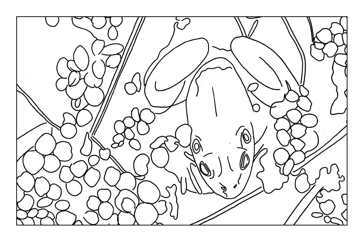
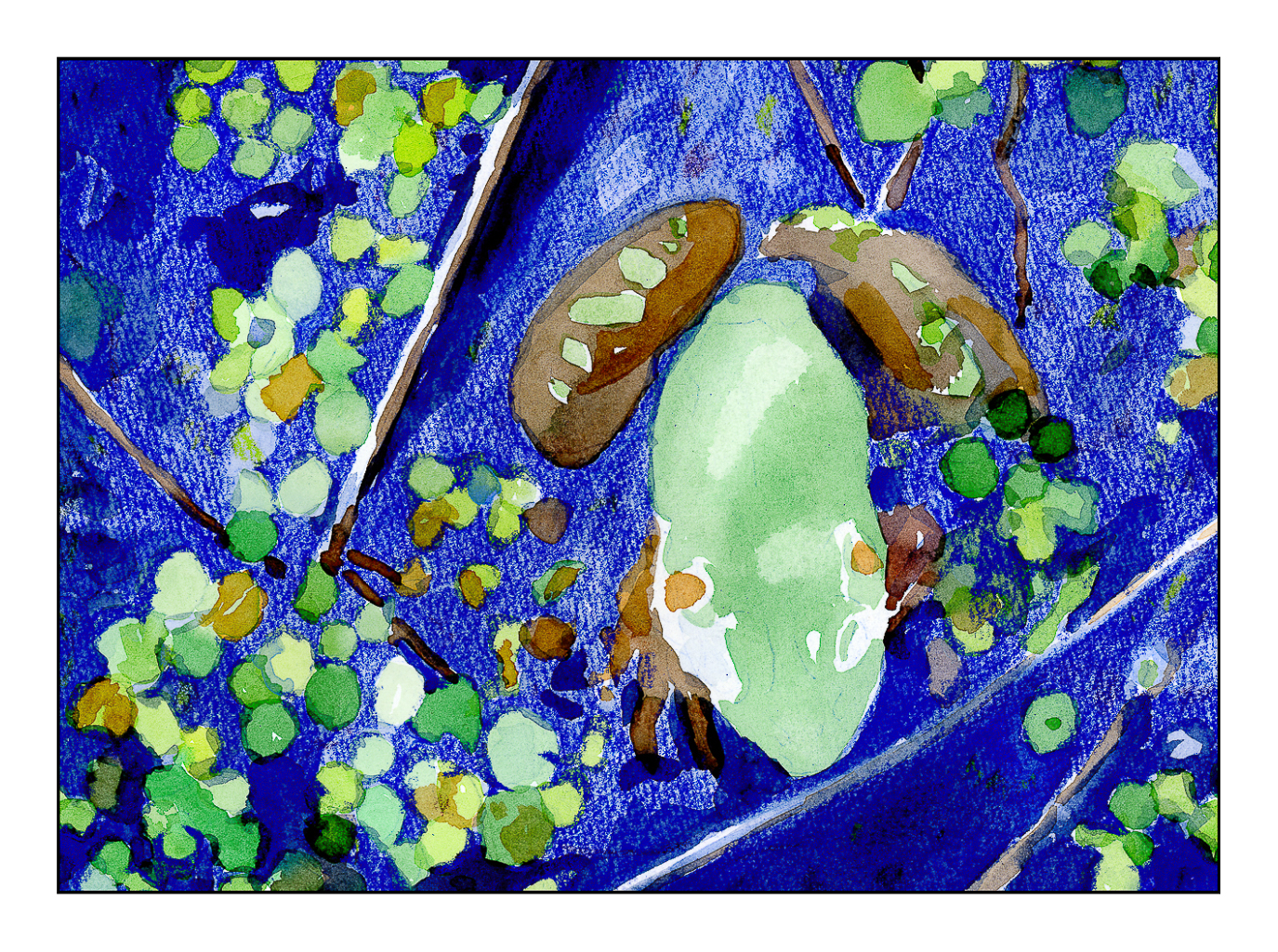
I started their exercise using watercolor and colored pencil. The study is a frog in a bit of shallow water. Step-by-step instructions. I did this exercise years ago, liked the result, but the purist in me was not happy with mixing the two together. Now, having started using colored pencil on a “serious” level, I appreciate the underpainting of the watercolor before the surface addition of detail in colored pencil.
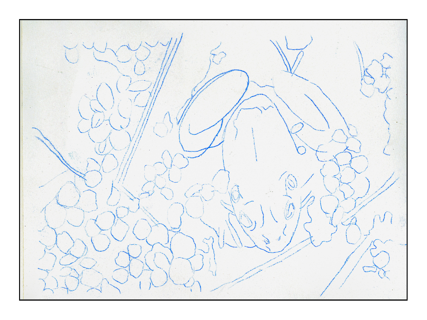
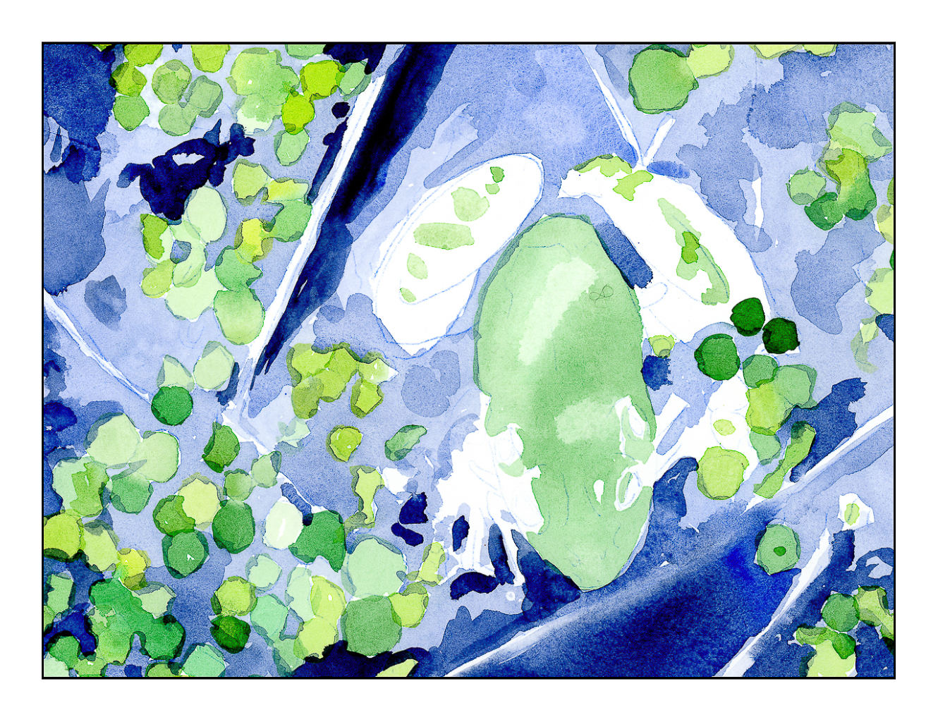
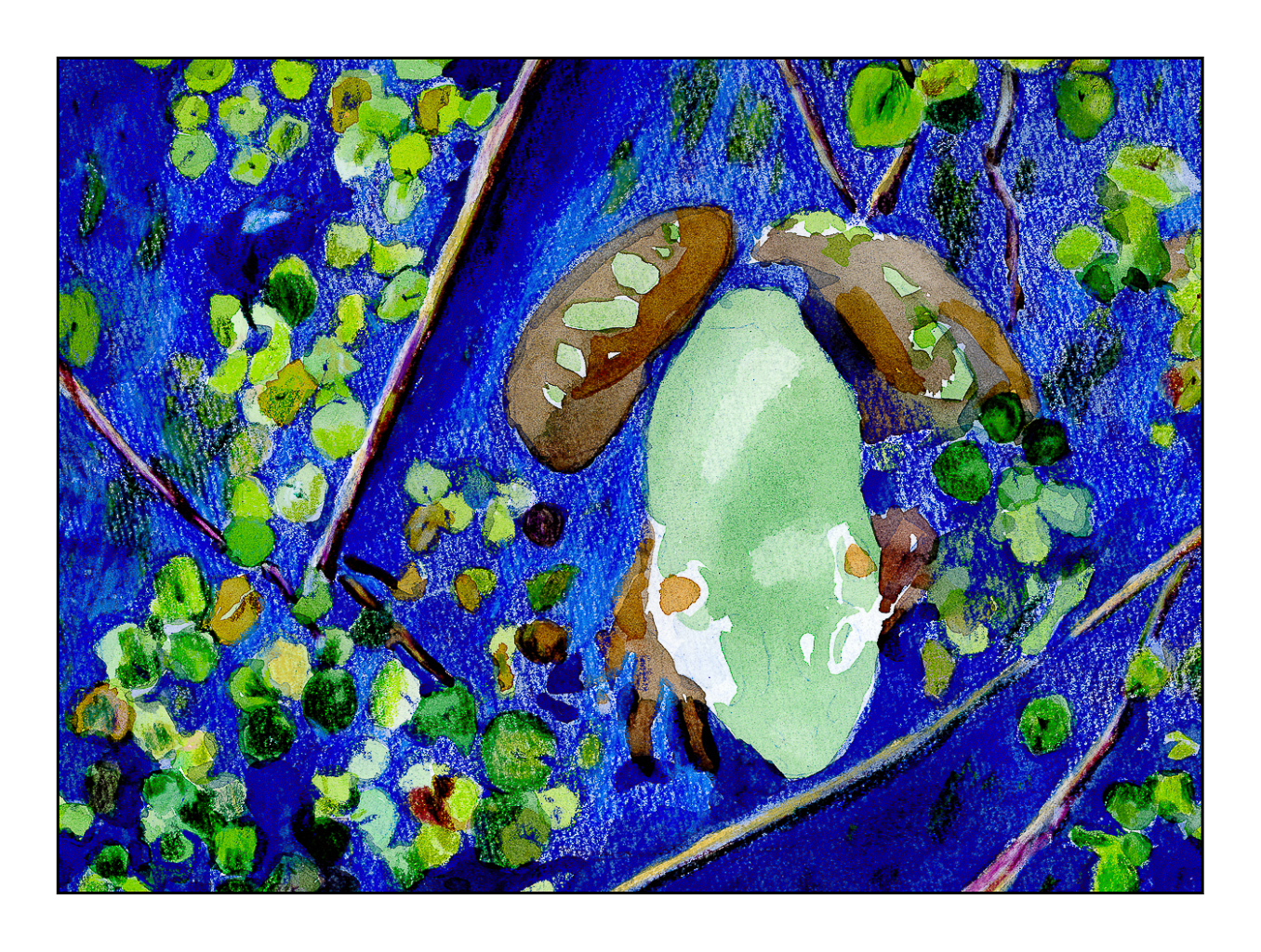
I scanned the original line drawing from the book, enlarged it, and then used Saral transfer paper to draw it onto a piece of Arches CP 140# paper. Initially I thought of using HP 140#, but changed my mind. The third picture shows the green watercolor laid in on frog and water plants, as well as varying blue watercolors for the pond. From there, browns and reds were added to the frogs body. These were all the watercolors used, essentially providing an underpainting for the colored pencils.
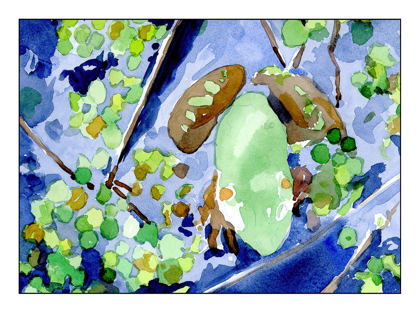
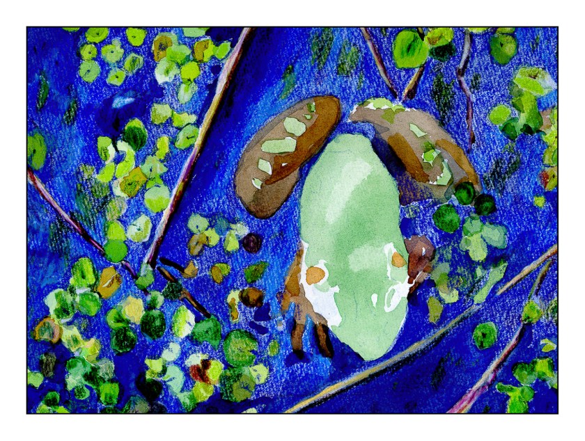
After the watercolor was done, the blues of the watercolor were covered with blue pencils. The same for the water plants, but greens instead. The frog itself remains untouched by colored pencils – that is for later! The pencils I have used so far are Prismacolor Premiers that I chose to meet my own taste. The book suggests colors for pencil and for watercolor, but after having given up the desire to create an exact duplicate of a study, I felt free to choose my own!
Current status of frog painting in watercolor and colored pencil. More to come!
The final picture in today’s post is the last one. Obviously, more work needs to be done. I hope to finish this fine fellow soon, but over the next couple of days other activities call.
Meanwhile, the purist is leaving town. The perfectionist has already left.
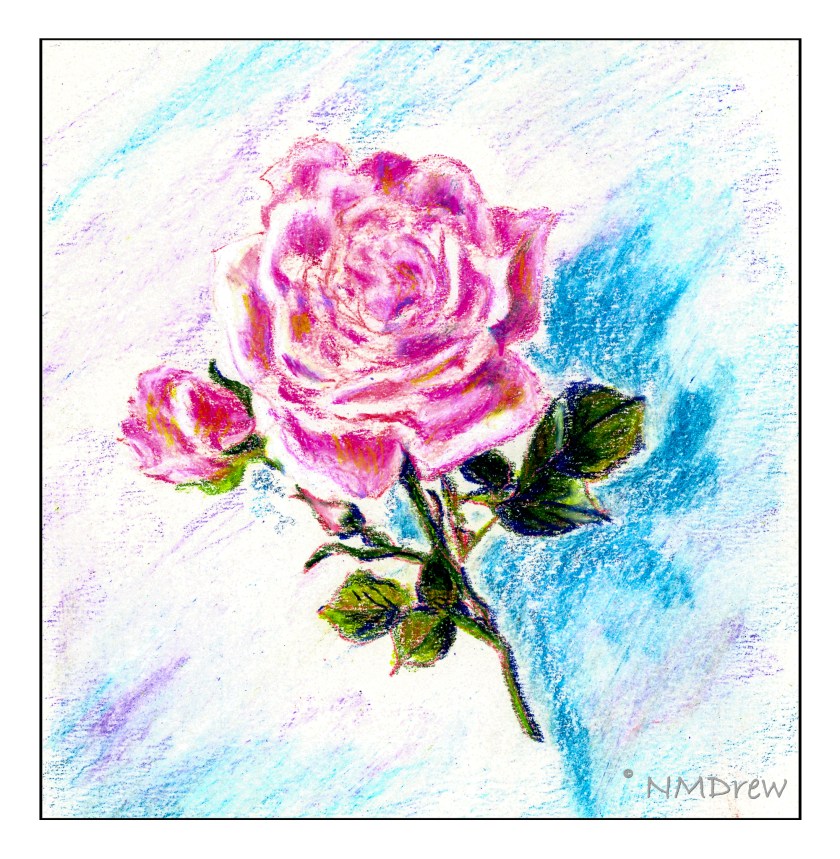
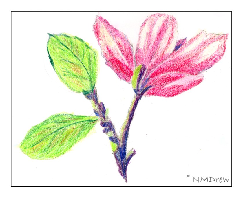
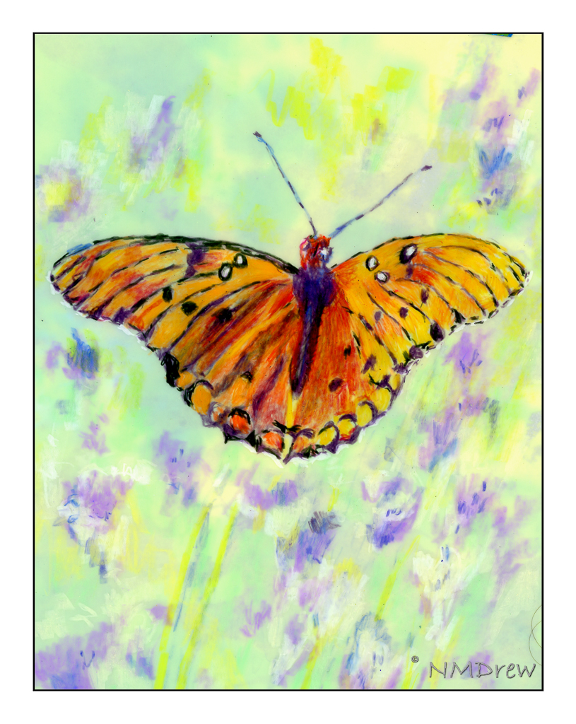
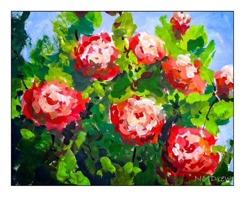
I keep finding new adventures in the art world. For the past 6 or 7 weeks I have been taking a beginning colored pencil class. What fun! Here you can see what I have done from earliest to most recent. I’ll say more at a later date because I am doing 2-fingered typing while my splinted finger heals.
Double Delight is one of the loveliest roses, both in fragrance and looks. I think it is a hybrid tea rose. It is a generous bloomer and pleases anyone who likes roses.