Another from the archives . . . 12/28/2010.
Photography is not so much a part of my life these days, but going through my archives reminds me of how much fun I have had with both digital and film.

Another from the archives . . . 12/28/2010.
Photography is not so much a part of my life these days, but going through my archives reminds me of how much fun I have had with both digital and film.

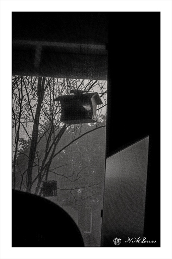
Sometimes you just rummage through things. This morning I was rummaging from my LightRoom archives, going as far back as 1999! This is from 12/23/2011 using the Nikon D70, on loan from a friend, and a Tamron 28-75 lens, the first I ever bought. This was snapped in the early morning, after a bit of rain, a few days before Christmas. The edit is from this morning.
How time just flies!
Edge of the old year, edge of the new year. A point where something morphs into something else. A precipice.

Let 2025 begin!
Scanning – sometimes I love it, sometimes I hate it. It is usually better than trying to take a photo of a painting though . . . .
I used Epson V600 Epson Scan on one of these; VueScan on the other.
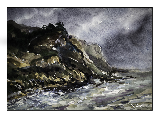
Above was done using VueScan. It captures the colors better but is a bit dark. Below, the greens of the trees and bushes are better captured.
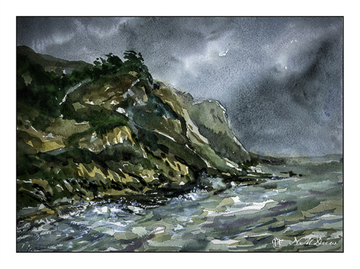
More of the colors show up using Epson Scan, but they are a little too intense.
Sigh.
The fact is that scanning and post-production can really influence how a painting looks. This goes whether the painting is scanned and interpreted using software, or photographed, and then interpreted and adjusted using software. If you look up a painting on the internet and then look at all the images of it, you know what I mean – colors can vary dramatically.
All this techno speak aside, I like them both for different reasons. Both do capture the moodiness of the original watercolor, which I like. Perhaps that is the most important thing – the mood is caught?
Watercolor, Arches 140# CP, 10×14.