Bouquet

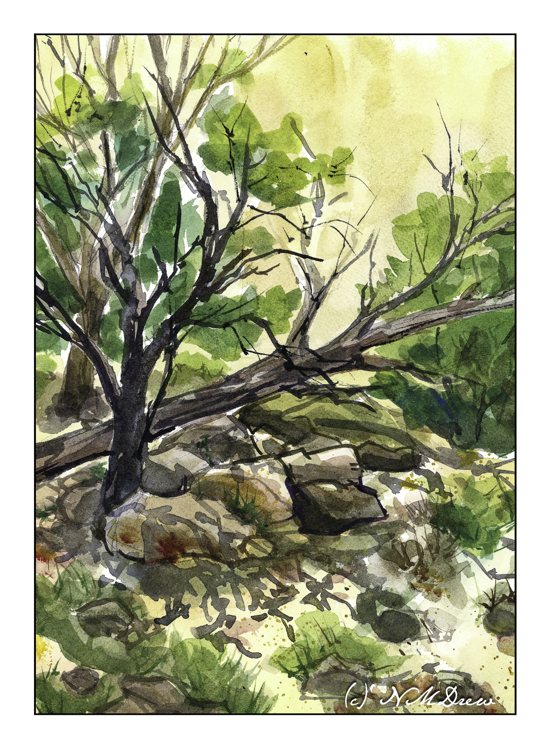
I am not a fan of what are called “heavy body” acrylic paints. They are thick when they come out of the tube and need to be thinned with water or medium. Even with a Masterson palette to help keep them moist, acrylic paints dry too fast for my liking. It always feels like a race against time when I use them.

Enter fluid acrylics. They are not “heavy body” but come in pourable containers. The paint is the consistency of thick cream. A drop or two may be all I need or want, and while they do dry quickly, they are very easy to mix together into the colors I want. Smooth blending a brushwork is far more easily accomplished with fluid acrylics.

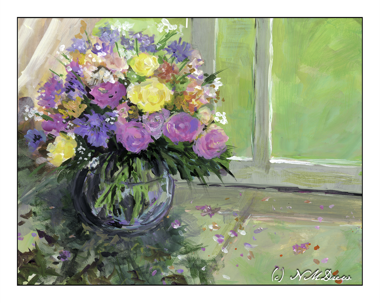
I spent about 3 days painting this because I had to correct mistakes and change this and that. All this is done with the fluid acrylics (Golden makes them, and Liquitex has their own equivalent, as do other manufacturers), a bit of color at a time. While the time element before they dry is still there, I don’t feel the waste of using too much paint – I am pretty good at figuring out how much I need before they dry on the palette. An advantage of acrylic paint over oils is that they do dry quickly, and a painting can be worked on in multiple dry layers throughout the course of the day. Hair dryers help to speed up the drying, too!

Acrylic paints can dry within 5-10 minutes, or even sooner, which is what I find so frustrating about them when using the heavy body ones, and drove me to give up on them altogether. I switched to oils, which I really enjoy, but using these fluid acrylics is a lot of fun, and I can work more quickly.

So, a bouquet. I am not totally sure if this painting is a “success” or not. Parts of it seem a bit peculiar once I see the painting as a scan. I like the window and green that is beyond the glass, as well as the window frame itself. The flowers are decent, but perhaps need more contrast and drama. The glass bowl is also okay. However, the “shadow” area in the lower left seems to not quite belong.

Whatever! I will leave it as is, generally pleased with this attempt.

Fluid acrylic paint (Golden and Liquitex), 11×14 Fredrix canvas pad, unmounted.

The Happiness of Trees

Trees always make me happy, and it makes me sad if I have to remove them for any reason. In particular, I like oak trees, and where I live, it is against the law to cut any oak tree down without permission. California is dotted with beautiful oak trees across the hills; from a distance, I always think that this is what a herd of buffaloes must have looked like in the 1800s as they grazed across the prairies. (Technically, the American buffalo is a bison.)

Mid-morning I headed out to a local park next to the botanical garden. The park is on a gentle slope upon which are several grand oaks. Many are supported by metal tubing as their branches can sprawl far from the trunk, often breaking and falling from the stress.

My goal this morning was to simply get out and sketch plein air. Rummaging through my stash of sketchbooks and paper, I found a 6×12 spiral-bound Pentalic watercolor journal, unused. Perfect for landscapes! And for the broad sprawl of the oak tree.

I think I did a decent job here!

Pen, waterproof ink, 6×12.

Life on Wonky River

Scanning my watercolors shows me the flaws so readily – ones I don’t see when painting!

When I looked at this scan, the creek in the foreground looks definitely off! I went in and repainted it, and the second scan showed more wonkiness. Finally, just a heavy application of blue on the river / creek (whatever!) and some zinc white gouache in straight lines, and the geographical problems were somewhat solved.

Overall, not really thrilled with this painting. I like my sky and the spindly trees in the distance. The barn and house were one of my rare attempts at buildings. The barn seems really out of place for the environment – too big or something. The little house is okay. I tried to show the banks of the creek and the terrain leading down to it using color swaths in directional lines, horizontally and vertically. Meh.

Fabriano 140# CP paper; watercolors; 9×12.

Estuary

Estuaries are important connections between rivers and fresh water to the sea. The land may be marshy, the water brackish, and adapt to the influx of waves and sea water and the outward movement of fresh water. Consequently, the estuary provides high levels of nutrients in both the water and the sediment, creating highly productive habitats. Plants, animals, birds, fish, and all sorts of life thrive in the estuaries.

Additionally, the estuaries form a protective barrier between land and sea, but with the loss of estuaries, the damage from the sea increases. A good example of this is in areas where hurricanes and other fierce storms sweep inland, causing great damage – estuaries can survive such storms and recover, but further inland where the land and water are not adapted for saltwater, valuable land may be lost.

Estuaries are found worldwide. In northern California, the Pescadero Marsh Natural Preserve is found near San Francisco, and offers a wonderful environment for hiking and observing birds and plants. Currently, many trails are closed, but the visit to Pescadero State Beach is beautiful, as are many of the beaches found the length of the coast of California.

And, if you didn’t know, all beaches are public in California, so even if someone’s house fronts the shoreline, the beach is there for all. There may be a couple of exceptions to this law, but by and large, no one can tell you that you cannot walk along the shore.

Watercolor, Arches Rough 140#, 12×16.

Deep in a Canyon

In the corners of southwestern canyons, near seeps, there is always something growing. These places are subject to harsh conditions, but somehow nature has evolved and beautiful trees and plants provide food and shade and protection for wildlife. And me.

I was really drawn to the contrast of the dark trees and shades of green against an ochre canyon wall. The shadows and the trees and brush create complex patterns in what is often a very barren landscape.

Watercolors, Arches 9×12 140# CP paper.