In the Park

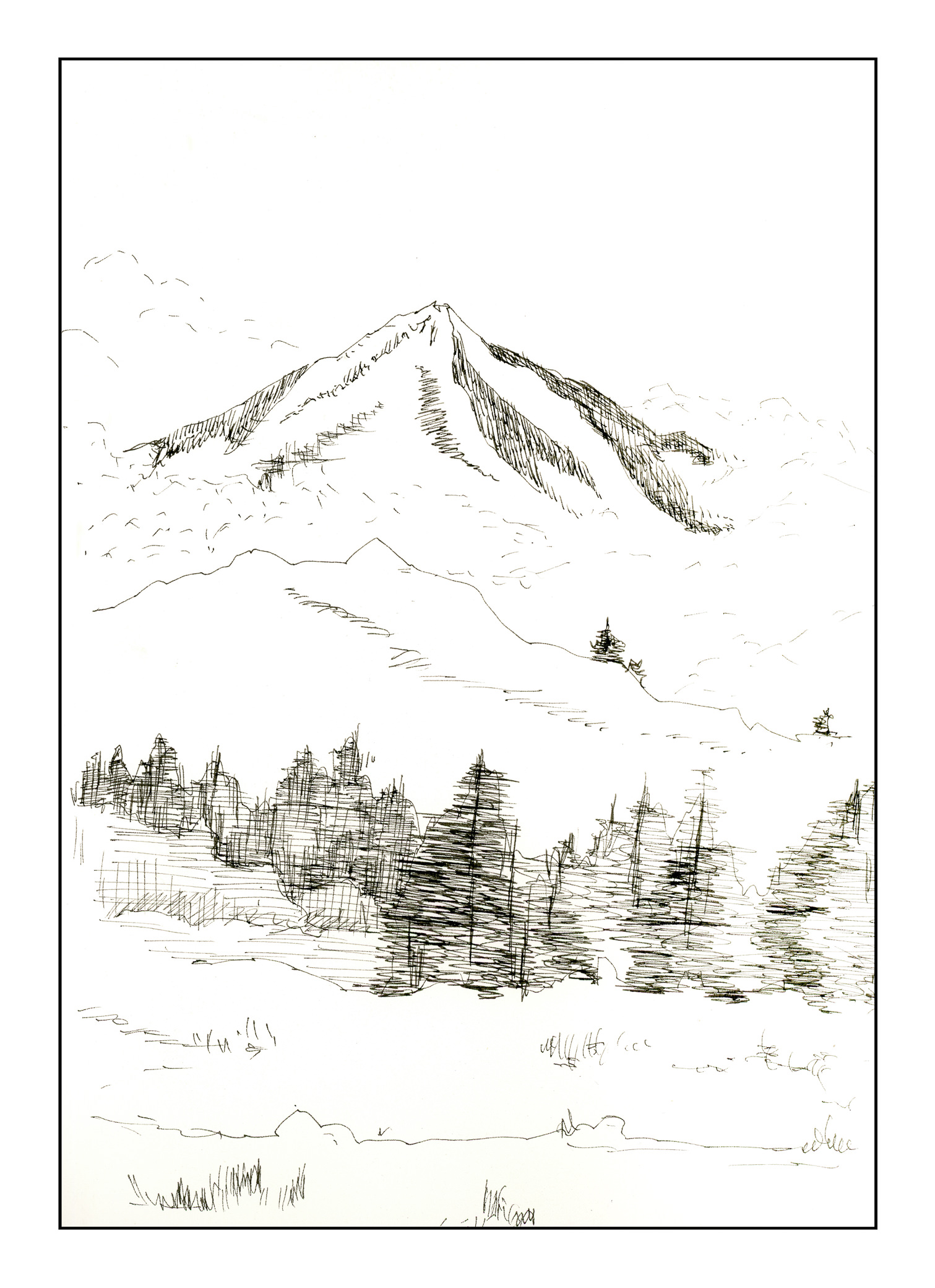
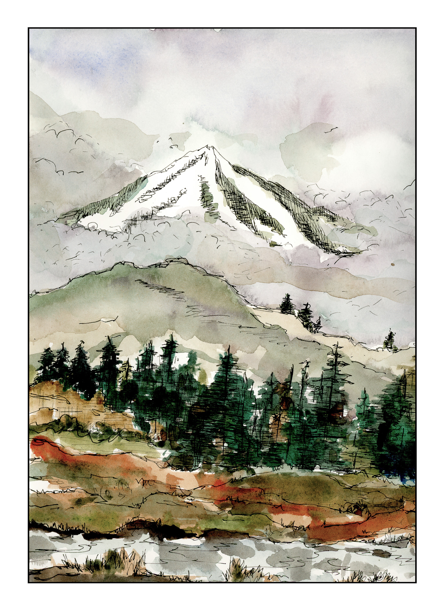
I refilled a pen with some Private Reserve Copper ink, a water soluble ink, to see how it works as a sketching ink.  The pen is an Aurora with a medium nib, one which I like to use when I need a broader line.  For some reason, maybe it’s just me, but the pen is not writing quite like it did with a different ink.  (Hey, maybe it’s the ink!)  The idea is to see how well the ink blends into the watercolors or affects the colors themselves.

From what I can see, it just merges into the paint without polluting the clarity of the colors.  If you look at the trees on the left, you will see a lot of lines representing the directional flow of the bark.  In other areas, I used the pen to outline white spots or fallen leaves.  In the background, you can see the outlines of the tree trunks.

Besides just playing with ink, I am trying to use simpler swaths of color in my painting to convey a sense of depth.  I struggle with depth – and maybe it is because I don’t have any depth perception – and too often I think my paintings are rather flat in appearance.  Luckily, there are “rules” out there to help me, such a lighter colors in the distance, which I do see.  I just don’t have a sense of dimension.

I wonder how many people really do have eyesight problems – just recently I read that Da Vinci may have eye issues, having one eye which turned outward.  Degas, too.  Others?  Interesting thought.


Between Seasons

As we move into winter, I think of the places I lived when I was a kid, where 6 feet of snow was a “mild” winter.  Today, the low was about 56 F, and the high about 78 F.  Very different – and as an adult, I admit to preferring a lack of snow to an abundance!  Nonetheless, the seasonal changes are apparent here, just more subtle – the shift in light, the change in the blue.  Even the air smells different.

Working with Inktober, I can feel a shift in how I am approaching drawing, and painting.  I am simplifying but being more specific about the brush or pen size I choose and how to deploy a line or a brush stroke.  While there is a lot to be desired here – such as a sense of architectural reality and non-topsy-turvey houses – I had a lot of fun looking at areas of color as a suggestion, not a reality, as a plane rather than the detail I normally hone in on.

Maybe there is some hope after all!

Inktober #22: Expensive

Hopefully, back on track with Inktober!  I’m not even going to try to do the ones I missed.

This is a combination of ink and Inktense pencils, which I haven’t really tried to any degree.  I started out with just a simple ink drawing, then I used the pencils, laying down pigment with different amounts – light and dark – to see how it would work to create tones.  It did a pretty good job, I think.  Certainly something to continue to play with.

Below is the ink drawing followed by the pre-wetted Inktense pencils.

Cold & Cloudy

Inktober continues apace, but I have been going 100 mph for the past week.  No time to focus on a theme.  This morning, though, I thought about cold mountains and winter – where I live, it’s in the mid-80s to low-90s, and I could use a bit of blustery weather.

Here is a mountain – inky for Inktober

And here is the same scene, in cold and wintry colors.

I used to do a lot of Chinese painting, and I tried to incorporate the clouds in a  rather Chinese-painting fashion, in ink and watercolor.  Hints, not direct; subtlety rather than blatant.  I’m not sure if it worked for the clouds between the mountains, but I definitely like the chilliness and fogginess of the scene overall.

Tomatoes Gouache

These last few days have been hectic – appointments, rushing around getting things done, cooking for a bunch of people.  As a result, Inktober has (hopefully) temporarily fallen to the wayside.  Despite the craziness, I wanted to do something, paint or draw something, and thus, some Tomatoes Gouache, recipe for which is quite simple:  tomatoes and gouache; to make, just paint.

I wouldn’t eat them as the fiber content is not quite the right kind.

Cheers!