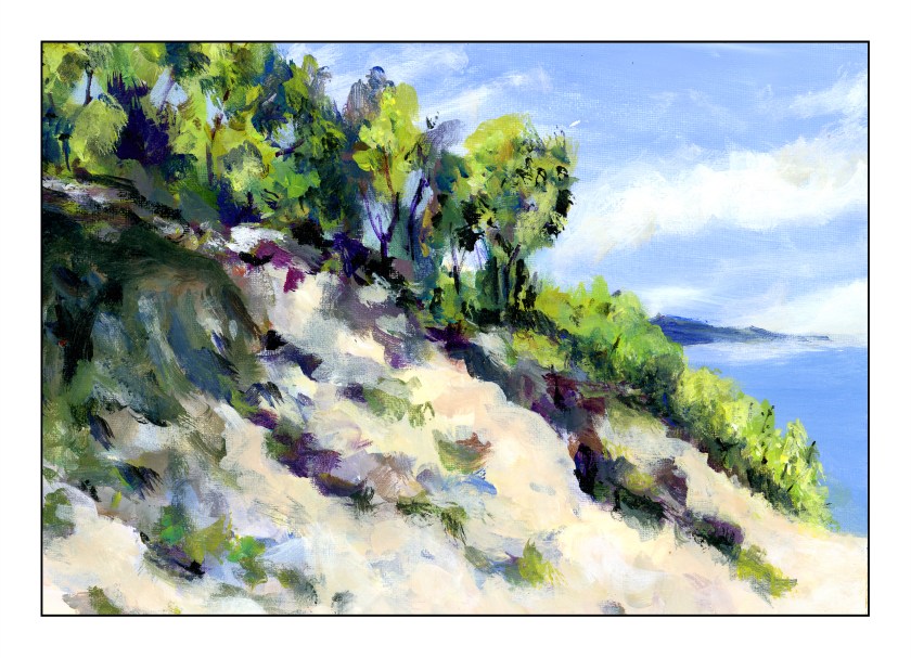
Another attempt at acrylic painting. This time I used a sheet from a Fredrix linen pad. I gessoed it and then used, initially, the Open medium with the paints, but I didn’t like the way it was working, and so switched to regular matte medium to dilute the paints. I tried to use the paints fairly straight out of the tube, blending with white and matte medium. The result was a fairly thick paint that behaved well.
The Carpinteria Bluffs are located in the southernmost section of Santa Barbara County, just above the border of Ventura County, where I currently live. Carpinteria was home for many years and always enjoy returning, especially in summer when the light shifts and everything has a glow of its own. Eucalyptus trees and other plant life make for a wonderful walk along the cliffs above the Pacific, and across the Santa Barbara Channel are the various islands that make up the Channel Island National Park. This might be San Miguel Island, but I can never remember which one is which!
Several weeks ago I started thinking more and more about what I am doing in my spare time. It is then I realized that, for me, the best way to spend my time is to learn new things, in particular, new art techniques. Thus, colored pencils; I signed up for an in-person class with masks and social distancing. I plan to continue this summer with the class.
At the same time, I thought it about time I learned to paint with acrylics, something I always avoided because I just didn’t like the idea of painting with plastic! Add to that, years ago, acrylic paints were not as good as they are now. I was also a considerably more impatient person, and less experienced painter, than I am now. Thus, I enrolled in “Intermediate” painting – I’ve been using gouache, so I have experience!
The first class was yesterday afternoon. I always wonder about teachers and how “good” they are. It takes time to become a good teacher, and honestly, I have found the quality of teachers for arts and languages at adult schools a mixed bag. However, I know I am going to enjoy this painting class. Students I spoke to said they have been coming to the class for 4 years – that says something for the teacher.
I totally enjoyed this first class. People paint what interests them. The teacher helps when asked, offers appropriate and spot on suggestions, and has a really fun personality that doesn’t become overwhelming. Teacher and fellow students are pleasant, delightful, and fun. Can’t go wrong with that, I say.
Because I didn’t know what to expect in class, I decided to bring a kit of paints I’d boughten several years ago, one with about 10 colors, to play with. I used this same kit to begin a painting – after all, play and doing are the best ways to learn. Along with paints and tentative beginnings of a painting, journeying in my cart were rags, water containers, dish soap, brushes, paper palette, an apron, and other bits and pieces.
Above is the underpainting I had done prior to arriving in class. Then days went by – about a week – and I got too busy to do anything with it until I arrived in class.
This is where the painting was at the end of class – nearly there. The sand on the left bank was re-shaped after the river was moved (ah! I feel like God when I get to change geography!) and relocated. And since we are mentioning God, there are two rather eyelike things up in the upper left sky that definitely need removing.
This morning I finished the river, refining this and that. Altogether, I am not displeased for a first acrylic in 40 years. The final painting is the one at the very top. Below you can see them in progression.
The process of learning is often best by doing. By doing, you know what it feels like, you have experience. I struggled here and there, such as with the sky, with the viscosity of the paint, with the shadows and coloring of the sand on both banks. I rather think I like the river in the 2nd version, but decided to change it by adding reflections and ripples for the final version. I took out the “eyes” in the second version, added more fluffy and high-altitude clouds, and worked to create a sense of sand and shadows on the left, along with that wonderfully mucky sand in still water.
This was painted on 11×14 Canson XL, gessoed, and taped to frog board. The kit is by Daler-Rowney, which provides good basic colors for the beginner.
I have a habit of giving things, especially animals, honorifics. Mr. Frog. Mrs. Giraffe. Mr. Happy Pants. Mr. Grumpy Britches. Lady Dilly Dally.
Yesterday was the last of the colored pencil classes, and I signed up for more. I have totally enjoyed this class because we are not taught “how” but, instead, explore. Different techniques, tools, paper, colors, and so on. That is what has made this class particularly fun, besides the fact that the teacher is very nice, positive, and comfortable to be around.
This is a giraffe (obvious?) done on Pastelmat sanded paper by Clairfontaine. The surface has a bit of grit on it, but it is really, really fine grit. If you have used Uart 800 paper, this is finer. We drew our giraffes, then used Gamsol (odorless mineral spirits) to refine the giraffe by blurring the colored pencil and softening the edges. From there, a bokeh background with squiggles of color and more Gamsol. Finally, I decided to add some leaves and branches straight to the image, no Gamsol.
This image is a straight Epson V600 scan without color adjustment. Unlike Mr. Frog, this one is not layers and layers of colors, paint, and who knows what else. Fun and easy to do, and to scan.
Oh glory be to things that grow! That burgeon, blossom, bud and blow In Springtime’s light and airy breeze, Which ruffles softly new sprung leaves.
What tongue there be to justly praise The wonders wrought by Vernal days? These beauties bright which turn, indeed, Each frozen heart to flaming glede.
O Daffodil! O Daffodil! That covers well each downy hill— E’en Solomon was not arrayed In splendour such as you displayed.
Ah! Lovely Tulip, what to you Is all the wealth of Timbuktu? What, then, the gain of dye from Tyre— When Gladdons blaze with purple fire?
Thou Cowslip and thou Daisy fair— Thou Foxglove, Rose, and Lily rare— Much more is your surpassing worth Than all the gems throughout the earth!
Consider well what ecstasy Lies cloistered in each Peony— That dormant wait until the hour Their chains are loosed, then start to flow’r.
Oh Spring, indeed, thou teachest well That man, though wise, knoweth not the spell Which makes all things by beauty bound— That Mystery which none hath found.