Black + White = Grey

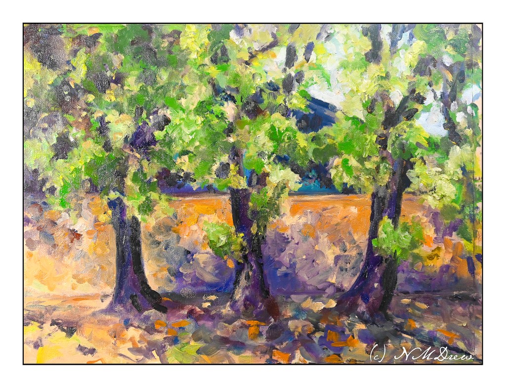
Yesterday was the beginning of new portrait class session with my favorite teacher. Having done 2 sessions with her, mostly with media within my comfort zone, I decided that I am going to conquer my general dislike for acrylic paints and portraits by painting them. So, armed with a black and white photo from Pixabay, I found an interesting man’s face as subject matter, zoomed into one eye, the nose, and the mouth.

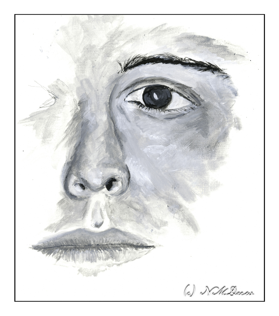
For the surface, I am using Canson’s paper for acrylic and oil paints. It has a smooth, linen-like texture and responds well. The bit of tooth is pleasant under the brush. My colors are heavy-body acrylic paints from Golden and Liquitex and are simply ivory black and titanium white.

I consider this study to be a WIP – work in progress. The mouth is too small and needs to be re-worked. The guy’s nose looks like it was broken a few times in the photo and I have tried to capture its asymmetry. The paint under the eye of the skin is heavier and more opaque than a lot of the rest of the painting. It was applied first but then I realized that working in thinner washes of black and white might make for better shadow and light rendition. This is such a learning process! I am also using smaller brushes than I might otherwise – I want the details to be details, not big blobs of paint for this man’s face.

Overall, I am really pleased with how this is coming along. A couple of fellow students in my general painting class do such wonderful portraits and people that I decided to push myself. Acrylics will be my primary focus for awhile. I want to master them, learn how to work with them, and like them rather than cringe when faced with a tube of plastic paint.

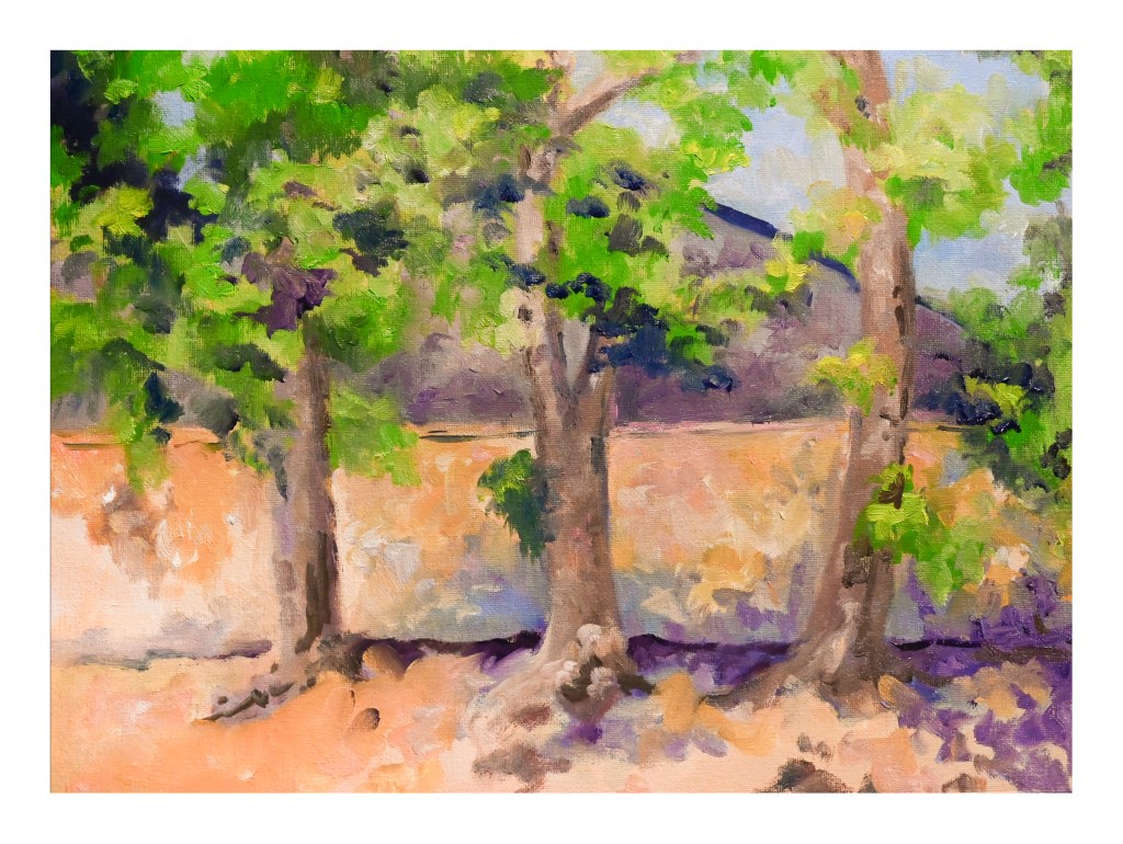
Heavy-body acrylic paint by Liquitex and Golden, limited palette, Canson’s acrylic / oil painting paper, 9×12.

Doing, Doing, Done

I have been busy. Some things I want to do, others things are in process, being forced to listen to really bad jokes (i.e. What do you call a dinosaur with really good teeth? A flossoraptor.), and just sort of shuffling along. Artwork has been rather time consuming as I have been painting in oils and those take time to dry, so no artwork is easily posted. And I have been working on my ukulele practice, which obviously cannot be posted unless I record myself. And who would want to hear that? I am no musical genius and notoriously tone deaf.

Today my next term of oil painting begins. This is the painting – in progress – I will bring to class this afternoon to work on. It’s been drying a bit so I scanned it rather than photographed it, which never really works out well as far as I am concerned.

It’s somewhere in the southwest. I am trying to make things very soft and blended and it is a challenge. We will see what happens this afternoon. Oil on panel, 16×20 inches. I also have a few small, blank canvases to play on should I get stuck or need to stop in class before the class time is up.

The other thing I have done is restrung a ukulele – my very first time changing strings. There are a lot of videos out there which discuss strings (i.e. nylon vs fluorocarbon, low G vs high G and which one is best). Different bridges have different tie-offs. Tools, too, can be used – or not. Me, I have a tuning peg winder, a wire cutter, a pair of pliers, and a Snark ukulele tuner. It took me an hour to replace 4 strings, but I am rather pleased with the results. I watched this video and learned a lot.

The ukulele I had was not an expensive one with nylon strings. I figured it would be a good idea to use fluorocarbon strings as they are easier on my fingers. I used D’Addario strings and pretty much followed along with Cynthia’s suggestions. It worked out quite well. Now I am playing and tuning the uke, and playing and tuning the uke, and playing and tuning the uke as the strings stretch and settle in. Amazing how often this has to be done.

So, there we are. Not an exciting post, but it feels good to write a bit!

Evolution

Several weeks ago I started an acrylic painting of a building at the end of a road. It was sort of painted in a traditional manner, meaning I was trying to represent reality. Truthfully, it bored the hell out of me, but I kept it as it was fairly decent in my opinion, but it did put me to sleep. 

Working with brighter colors of late has really been exciting for me as I feel much more of a connection to the colors I use than I do to subject matter. Subject matter can be anything – but colors express more to me and are more true to who I am (a magpie reincarnated as an old bat) than subject matter in general. So, I took the painting and painted over it. Below is the original.

This is a photograph I took and it is pretty crap (above) as there is a lot of weird stuff going on. I didn’t think it scanning it because of its size. This morning I scanned my current iteration of this painting.

I like this much better, but it is not quite done. I need to work on the road in the foreground as well as details of the building. More windows, fix windows, fewer windows? Create some focus at the end of the road? Fix the road? Cast some shadows – creating light and dark – across the road?

Many things to consider here. I am going to let it sit and ignore it awhile. If you have any ideas, let me know!

Acrylic, canvas, 18×24, scanned on an Epson V600.

WIPs

WIP means “work in progress” – and here are my current ones. Both are causing me no end of frustration – but despite that, I am having fun (or so I keep telling myself).

This is a rose which might be turning into a peony or a flower from another planet. I am using 9×12 Uart sanded paper (600) and a couple of sets of pastel pencils. The larger set has 24 colors, the other has 12. I am trying to paint a light pink rose, but there is no pencil, even combined with white, which will give me what I want. So, I carry on, and eventually I will find a stopping point. It is fun to do, and as I am not taking it seriously, I can blunder off in many directions as I learn the quirks of pastel pencils. I have soft pastels, which would be far easier, but I am determined to finish this with what I started with.

Here, more painting with the fluid acrylics. The point is to paint white on white, and so that means really looking at what is white, and what is white in shadow or with reflected color. The center of the flowers are greenish yellow with a bit of black, and there is one stem which appears greenish in the reference photo, while all the other stems are black. I can see flaws in the paint where it was diluted with water, and the brush work is not the finest. I wonder if I will need to get out the heavy body acrylics for this effort – but, again, I need to practice to learn the quirks of the fluid acrylics.

So, there we are. Done for the day.

WIP: Trees in a Drought #3

I am not sure whether this is done, overdone, or not yet done! Certainly it is more finished than before – and I am not sure I even like it – so it is in the garage to dry and to be ignored for awhile.

Oil paints are proving to be a pleasure to use. Their malleability makes them easy in comparison to acrylic paint. Add to that, they don’t end up looking plasticky.

Compositionally this painting has little to offer. It’s just a study of trees and color and playing with paints. A learning experience by doing. For instance, I finally “got it” when using brushes – and why painters use multiple brushes in oils. You know how you always see the artist holding 2 or 3 or more brushes in one hand, painting with the other? It is – for me at least – a way to keep colors more pure without creating mud. That was an eye-opener. In water based paints it is really quick and easy to clean a brush, but not with oils. Okay, new thing learned.

Below is the photograph I used as the basis for this painting along with all stages of the painting itself so far.