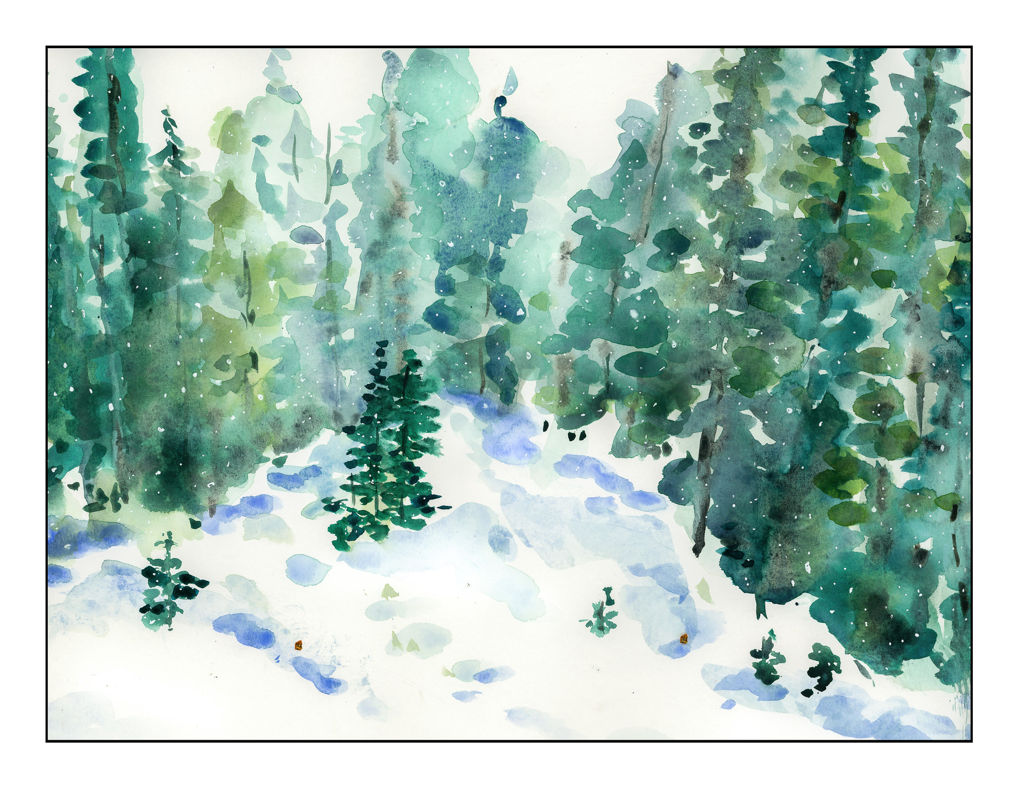
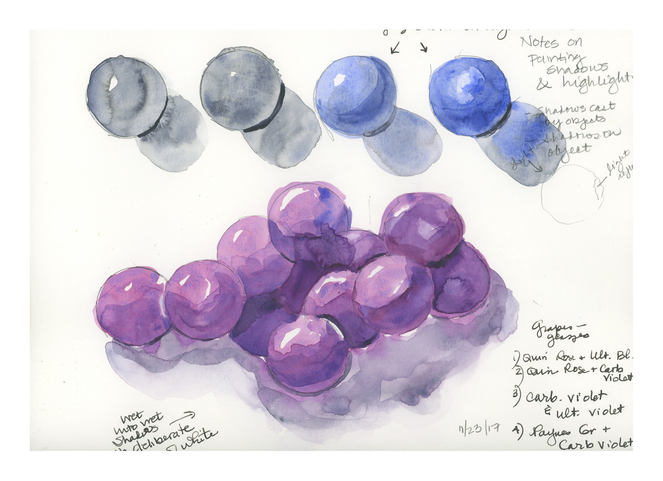
The Book and the Paints
I’ve been doing sumi-e for awhile, and now with my return to my Chinese painting class, the urge to paint is getting stronger, and the need for color is making itself known. However, it never hurts to refresh one’s skills; given this, I dug out a book I’ve had for some time: Watercolour by Patricia Monahan. This is a good book for standard watercolor techniques. So, I’m going through it, front to back, in my spare time. It’s a good refresher. As well, these techniques are important to remember as I know many will be used in any subject done in the Chinese style.
In watercolor, I’ve encountered different approaches to how to work – light to dark (Monahan’s approach) and dark-to-light. Personally, I find that I work more logically light-to-dark, but the truth is that working dark-to-light just confuses me. Maybe it is something I should deliberately try. For now, though, I will hold that thought and practice a few simple techniques.
Monahan’s book is broken down into sections. Currently I am on Washes (having read the introduction and chapter on equipment), which include techniques and then subject matter, such as rain clouds and the beach. I’ve done a solid wash, into which I’ve done
- wet-into-wet
- wet-onto-dry
- dark to light stripes (not a wash) by adding water to a dark color to lighten it
- gradated dark-to-light wash
I’m using pan paints, made by Pelikan, and I think they are technically opaque, but I find that they work fine and have a nice degree of transparency when diluted. They are convenient and easy to use on my crowded desk. For paper, I have a 7 x 10 inch block of hot press, 140 pound, Arches. I’m using both sides of the sheet for the exercises.

Washes: Solid, Wet-into-Wet, Dry-onto-Wet
The very first exercises in the book are reviews, or introductions, of the wash. The solid wash is explained, and demonstrated. From there, the author moves into wet-into-wet. Below, you will see it in the upper left corner of the picture. Wet-onto-dry is also done, with a wash laid down, allowed to dry, and then another color applied over it. This is illustrated by the weird circles in the lower left corner. Finally, layering of color is done, which you will find on the right. I kept the same strength of color for the layers, and applied about eight. The results are quite nice.

Diluting a Dark Wash
This next exercise was actually one I’ve never encountered before. This consisted of creating a fairly dark wash, and continuing to dilute the wash with the same amount of water. Each stripe in the picture below shows what occurs as the intensity of pigment is weakened. I was not scientific because I did not measure out specific amounts of water, but I did add two brushes full of water to the pan as I moved along. It seems to have worked out well.

Gradated Wash Using Flat Brush and Round Brush
Next was the ever-popular gradated wash. Onto dry paper, color is placed at the top and diluted as the color is worked down. I did this twice, using a flat brush on the left, and a large round on the right. Both have their merits.

Two Gradated Wash Methods
This next exercise consisted of placing a gradated wash onto dry paper and moving it into damp. This is on the left side of the picture below. I used a small sponge to dampen the lower half of the paper, and then at the top began my wash on dry paper. As I moved down the dry section, I added a bit of water, and then continued on down into the damp section, moving left to right and back. When I got to the damp section, I did not add any more water, nor pigment, but just let it become weaker. This was a brand new technique for me. On the right I did the dampened paper with a gradated wash. The paper was dampened with a sponge, allowed to dry a bit, and then a standard gradated wash done.

First Exercise: Monochrome Rain Clouds
Finally, the first exercise: monochrome rain clouds. Using black, I laid down a gradated wash onto dry paper. Before I let it dry, I used the sponge to lift up some of the color. I squeezed the sponge out into my waste water jar and continued. After I let this area dry, I laid down some medium and darker washes, doing some wet-into-wet, some lifting, and so on.

I was pretty nervous doing this as I was sure it would all be a disaster, but decided to trudge on rather than freak out! I always over do my watercolors – or nearly. I get sooooo frustrated! However, I am rather pleased with the results, and will do a few more monochromes before moving onto the next exercise which is the same thing – rain clouds – but with a limited palette.