We should get rain for several days because of an atmospheric river traveling through the vicinity, unless it decides to go someplace else. In our drought-ridden county, that is a blessing. Little spots like this are harder and harder to find, and are a real pleasure when you do.
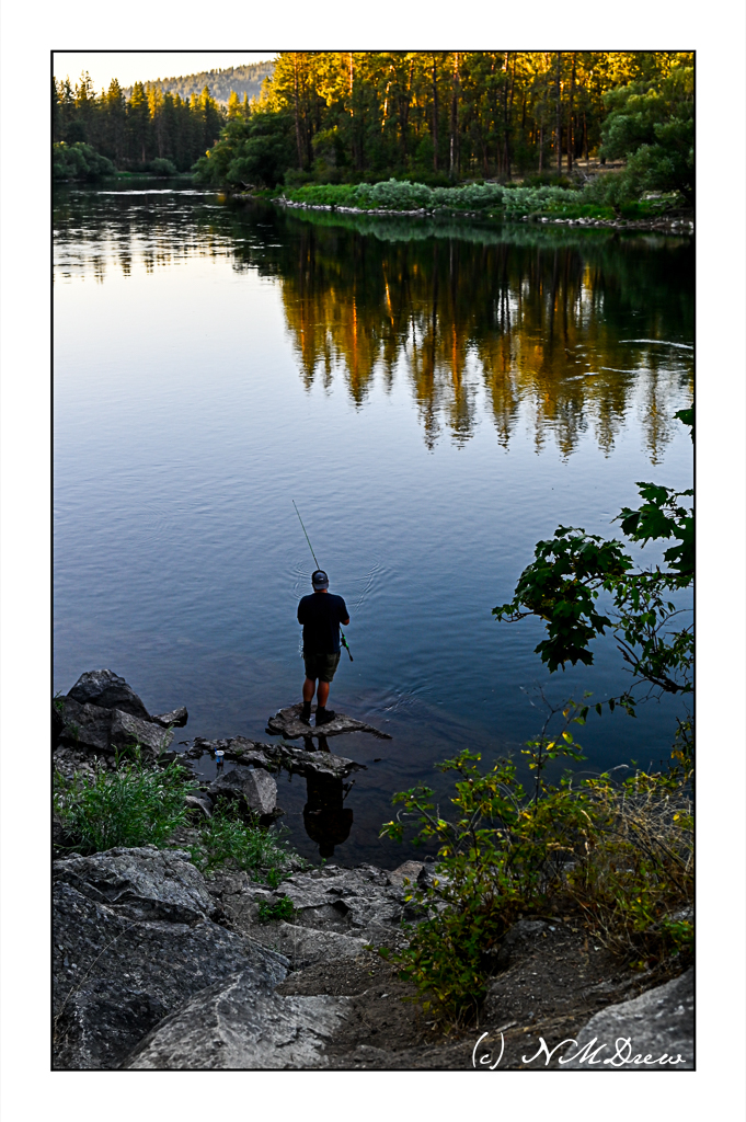
High summer, early evening. What more perfect time of day to take a stroll along a river’s edge, enjoying the reflections in the water, the lowering sun, and sweet scent of a the piney woods?
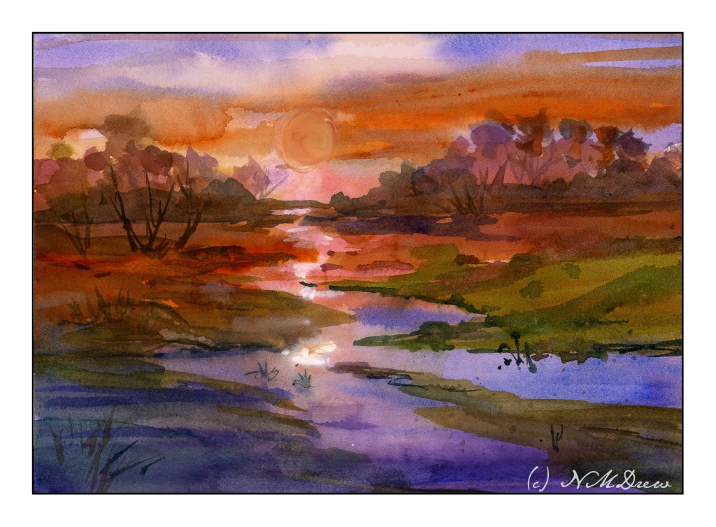
More practice paintings. Negative painting will return in the not-too-distant future. Before all those negative painting exercises came in, I ran across the watercolors of Javid Tabatabaei. He has a wonderful way of painting skies reflected in water. His YouTube channel shows his tricks – definitely watch him if you want to see what magic he creates with a very simple method.
Normally, I paint the sky first, and then I do the distant hills. Water on the ground is left to last. Tabatabaei strokes in the sky and the water where the colors of the sky are reflected, but he leaves areas of bright water white or with a light tint of gold or yellow or blue, depending on his needs. For the sun, he paints around the circular shape of the sun; he does the same for the moon. Other times he will lift the paint. This technique creates a lot of drama.
Below are a couple of studies I followed on YouTube as well as a copy of a painting from Tabatabaei’s Instagram account, to see if I had learned from his demonstrations. I did. And to tell you the truth, this is one of the most fabulous ways I have ever seen for painting water and sky in watercolor – a big thanks to Mr. Tabatabaei for sure! Very simple, very elegant.
The above is my first attempt to follow Tabatabaei’s technique; this is from a YouTube study I seem to be unable to find at present. This is also on HP paper by Fabriano, and I was not really in a comfort zone as far as using it. Still, it worked out quite nicely. Here, I tried to lift out the image of the sun, but it really didn’t work. White gouache failed too. So, a painting lacking in success in a lot of ways but that water and reflections are yummy!
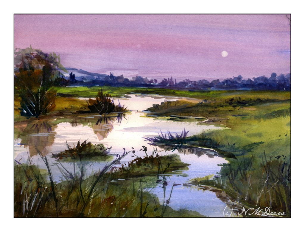
The one above is also from a YouTube video by Tabatabaei. He has a couple of YouTube channels, come to think of it. That may be why I am having problems finding them! This one and the one below are on Arches CP paper.
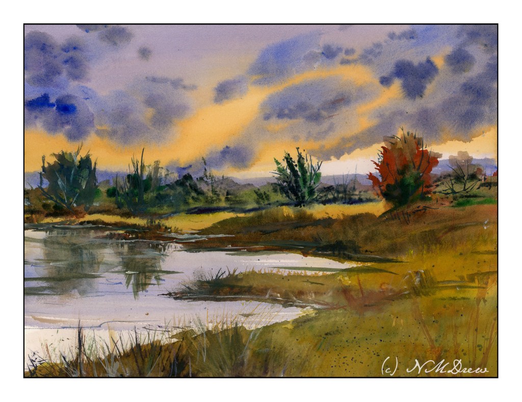
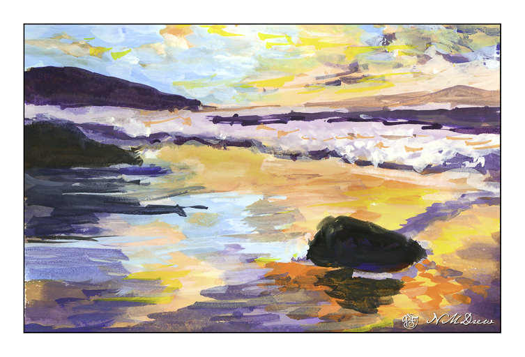
Finally, my version of one of Tabatabaei’s paintings using his water / sky technique. It worked out pretty good, I think, and I can see I am going to have a lot of fun painting water! Expect a monsoon or flood . . . of watery watercolor paintings.
Today I refilled my gouache palette with colors, and then some more colors. I threw in some retardant, too. And I tried to paint. Gosh, it is amazing how you have to reacquaint yourself with something!
I am taking an online watercolor class, and I am sort of this way, that way about it. There is feedback and some great videos, but I find that I like to have a more personal contact than such. Another online class I am taking has weekly Zoom meetings and even though we aren’t all yacking with the instructor, it is more personal.
Anyway, despite what I would like to see different, there is a lot of value in pursuing online learning. To a degree, you have to motivate yourself. You have to have the discipline to do it. One thing that I do find especially hard in all my classes is the making of value studies – oh, how I hate them! I don’t have them as part of my routine when it comes to painting, and the discipline of doing them is what I hate. I expect that doing them will pay off in the future – but it may be a bit down the road as I force myself to do them without appreciating what I know they are supposed to provide.
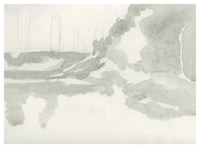
Above, a study from a photo in my watercolor class. Below is the first value study showing the midtones
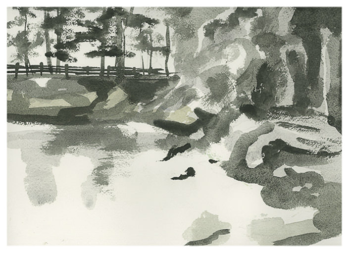
All the white area is supposed to be sky and the lightest areas of the picture. The grey is the middle value. These are used to help shape the painting before refinement with darks and details. Below is my dark-added value study.
I actually really think this idea of doing middle values for the first step of a value study is a good idea. Do these values first, paint your lights and mid values in color, and then move on to the darker ones in the value study and the final painting. Doing this is very nice, really, because the dark values and details get distracting.
Like I said, this is a thing I am not enjoying doing but know it is probably going to reap bigger rewards than I can imagine at present. Values and edges are what I am trying to see in anything I do.