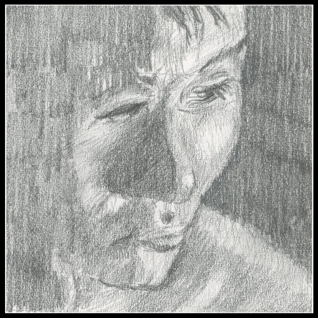
4 x 4 on drawing paper. Not a great sketch, but for values, it was a bit of work!

4 x 4 on drawing paper. Not a great sketch, but for values, it was a bit of work!
I just finished a course on drawing as a preliminary to one on brushwork, and then color theory. Between will be challenges, and the challenge between drawing and brushwork is a 30-day challenge to do small, preliminary sketches in pencil.

One of the things I have enjoyed about the course, taught by Ian Roberts, is the development of drawing as a preliminary to a painting. Initially, as in the first few weeks, shapes were simple and the point was to carve out space on a 2D surface to create a 3D image. We ended with a challenge of doing one such sketch a day for 30 days – or however many sketches we could do. I have time to do 30, so 30 it will be.
I never do value studies, but I admit to laziness and impatience on my part. So, I decided that I needed to do something which will shake up my approaches to painting. As well, values are always hard for me to see as color always gets me. Roberts says, “Color gets all the attention but value does the hard work.” Or something like that. So true!
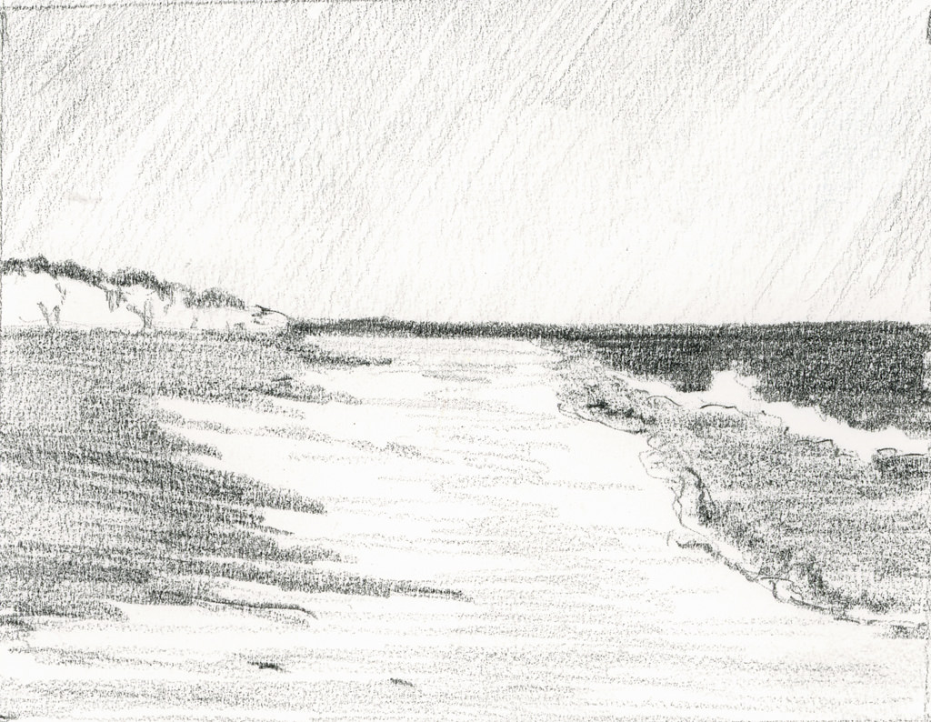
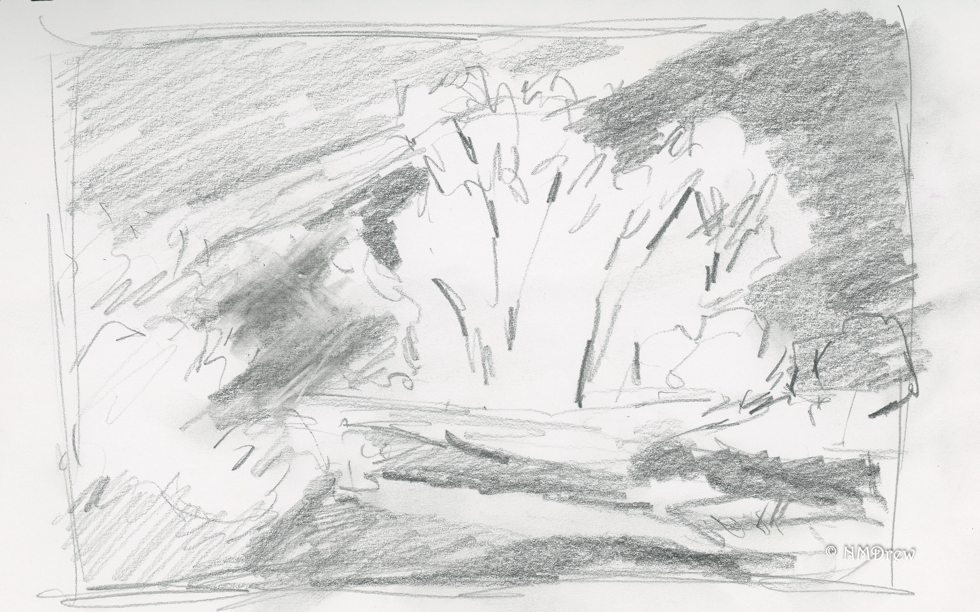
What I have enjoyed in particular is how Roberts approaches composition – leading lines, horizontal, verticals, and all leading to the focal point of the picture. I think I am getting that. The direction of the pencil lines indicates, too, the vertical, diagonal, and horizontal. Brush strokes can indicate the same.
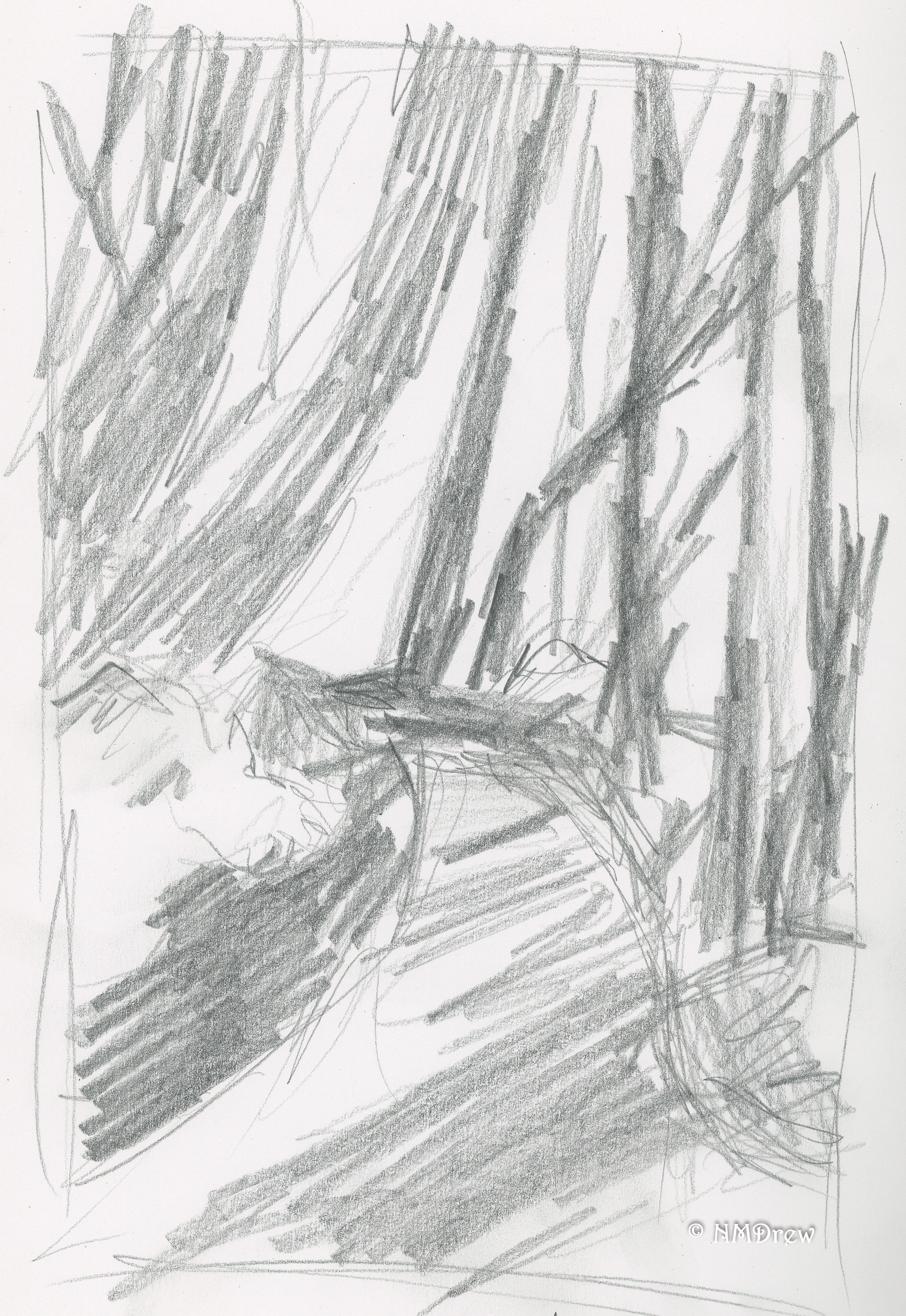
Obviously the first picture has some verticals – and things we expect to be vertical, even if tipsy, such as the fence posts on either side of the road. The second one, a picture of low tide at a local beach, doesn’t seem to have any verticals except in the cliffs. But wait! The lines of the ocean and beach are nearly vertical – something I never considered until Roberts pointed them out.
I admit, I am curious how I will get my black and white studies onto a painted surface in color, but I guess that will come with time and practice. All told, I will be in his class through August, and I hope by that time to see some improvement.

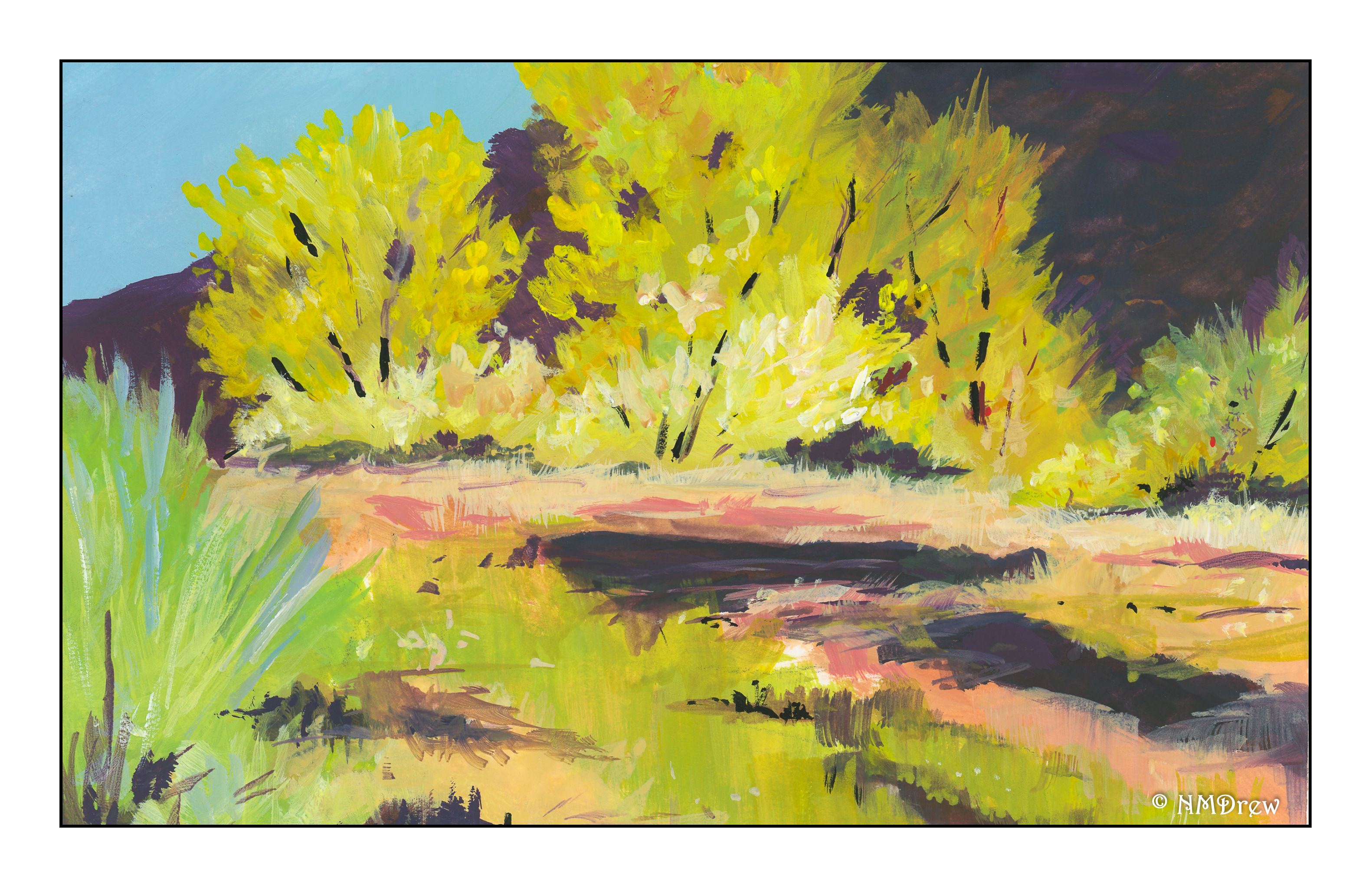
I’d forgotten how much fun painting with gouache can be! Today, a painting of a forest road running through a lot of trees, but not so heavy with leaves that light doesn’t shine through. I began with a value study – again, more for shapes I think in light and dark.
The first layer of the painting had thin washes to set up the light green in the distance. Then, general dark shapes were added after the road was limned. The trees were then painted, dark to light, using long strokes with a round brush. After that, a flat was used for broad sweeps of the road. Finally, dabs of color to create a sense of dappled light on leaves. Final touches included some dashes of white and a blackish mix (purple, green, black) for lines and bits of contrast. What I really liked is the ivy climbing up the trees, creating bright splotches of color. Altogether, I think it worked quite well.
The value study is becoming valuable. Yeah, really. It helps me see where strong shapes against light shapes create visual interest and leading lines. Value studies are general but the painting becomes more specific.
We are pushing 100F today, with east winds adding to the heat and potential fires. Thus, an autumnal desert scene seemed appropriate for today’s painting. As I haven’t worked in gouache for quite some time, I thought it time to dig them out. Variety is the spice of life, for sure.
Before painting, I did a value study before I even sat down to paint.
I used pencil, as you can see below. I like pencil a bit more as I have a good range of pencils of varying hardness and softness, and that helped out in the light and dark department.
I won’t say that the value study did not help. It really did. What it aided in was setting up light and dark areas, of course, but also helped me see shapes, such as the trees against the dark mountain, as well as shapes in the creek in the mid to foreground areas.
I left the sandy bank of the creek and the reflections deliberately vague – hard for me when I want to put in a lot of detail! The focus of the painting is the cottonwoods, so too much detail in the foreground would compete with the more detailed painting of the trees.
Altogether, this was a pleasant diversion, and the value study was worthwhile (not that they take a lot of time – I am just lazy). The creaminess of gouache is fun and a completely different experience than watercolor or pastels. I used Holbein gouache for the most part, CP 140# paper. The painting is about 6×8 inches – the nature of gouache often means smaller paintings than watercolor or pastels.
Here’s to autumn!
Value studies are like knitting swatches: a good habit, but not one I do. However, I did some the other day!
Above is, I think, the first one I did. It’s from a photo of Haworth, the home of the Bronte sisters. Cobbled streets and old houses, especially on a hillside, are not common around here, so always a pleasure to paint. I tried to simplify everything, looking only for value – light and dark – in the monochromatic painting. In the colored version, I used light and dark coupled with warm and cool colors.
Text books say more intense and warmer colors to the front! Cooler and lighter colors to the rear!
I used Hansa Yellow and Cobalt Violet to create the greys.
This is an imaginary landscape. Payne’s Grey used for the value study. I tried to fade, or lighten, colors the further away they got. Less detail, too, is used to indicate distance. Of course, the use of leading lines and contrast helps things out.
The color version was, again, an effort to use warmer colors to the front, as well as more intense colors; the distance used greyed colors. To achieve the greyed colors, I used complementary colors, such as adding a red to green, or making the colors lighter by diluting with water, or else adding a tinge of blue to all or the preceding. (Sounds complicated, bu it’s not!)
Finally, another Payne’s Grey value study for a wintry scene in the mountains using a limited palette. For the colors I used mostly Hooker’s Green and French Ultramarine Blue.
I am still not sure about value studies! For one thing, the value studies are very different from the color studies in my eyes. Values in color never equate values expressed in monochrome. Perhaps I am expecting more than I should from a value study.
Many people use pencil for their value studies. Darker values are more easily achieved. These watercolor value studies were hard to get dark enough.
Ultimately, I think I am going to focus on doing a bunch of them, rather than just a few. This way I can determine if pencils or watercolors are best for doing value studies at all. Which one will give me a better sense of light and dark? As well, the more I do value studies, the more their subtleties should become apparent. Perhaps my color studies will begin to reflect better values to display distance in a painting.
All of these studies were done on 9×12 CP 140# Arches, with two sections drawn out on the page. One was used for the value study, and the other for the color study.
