Hue, Value, Intensity

Since February or March of this year I have been taking a series of online classes, complete with live Zoom meetings, with Ian Roberts. He has been the best online teacher because he is so diverse in his interests and he brings them into the world of creativity. I admire his artwork, too, and think his book on composition is an excellent resource. For me, art is more than a pretty picture – it is an expression of a person, a skill, a view point. All of this, in a painting, is more akin to me than any other form of art, such as photography or music. While I enjoy them, I just am not as I entranced by them as I am by color, paint, and the process of painting.

That said, the first of the three courses was about drawing and values, not as an art in and of itself, but as a means to move forward into preparing for a painting. Next came brushwork, using black and white to render shades of grey and to learn about value. By adding yellow ochre, the next step was discerning warm and cool variants of color – or monochrome. Finally, we have come to the third and final class in this series – colorwork.

What is color? As the title says, color varies with hue, value and intensity. This week our job is to mix greys from complementary colors. Easy enough – or is it? Part of it will depend on medium used, and then, it also depends on warmth and coolness of colors. Our preliminary palette begins with a warm and cool color of each of the primaries, along with white if necessary. Cool colors are Cerulean Blue, Alizarin Crimson, and Cadmium Yellow Lemon. Warm colors are Ultramarine Blue, Cadmium Red Light, and Cadmium Yellow Deep. I have stuck with these three colors and a bit of titanium white gouache where I couldn’t keep the highlights, or lost them in my painting, or forgot about them altogether!

Pretty dull painting! It makes me think of the Upside Down. The point of this study was to take the clashing and garish still life Ian Roberts provided and tone it down – dull down the colors. I am using watercolors here, and I used complementary colors to tone things down but still leave the original color recognizable. The foreground cloth was bright lavender-violet; back behind squash a dark blue, wall on the left a sea green. Bowl is pinkish rose, apples green, and squash an orange with ridges casting shadows. Some shadows were hard edges, others blurred together. It was a hard exercise because I had to test my colors over and over again on a piece of scrap watercolor. This was on Arches 140# CP.

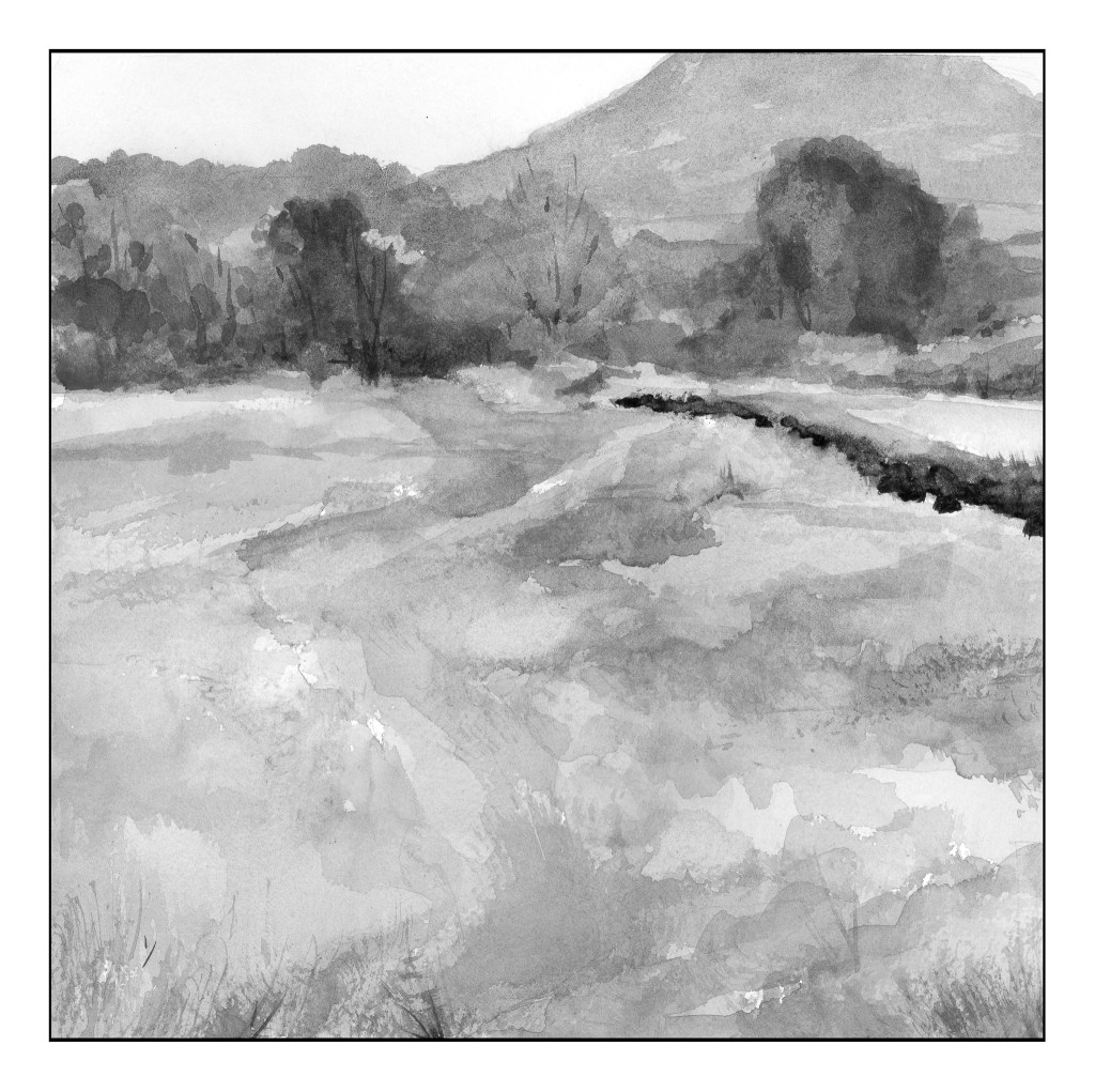
Our next study was a very low key (low key in color intensity) landscape. Evidence of a hazy day dulled all the colors so that while they were warm and cool, they all were similar in tonality. The above scan of my painting in black and white showed me I did accomplish by and large, especially in the field that makes up the lower 2/3 of the painting. The colors were very soft without a lot of bright or intense colors; rather, they all sort of blended into each other when I squinted my eyes. Only a few areas of dark contrast stood out – on the right of the field in the curve, and the bottoms of the trees at the edge of the field.

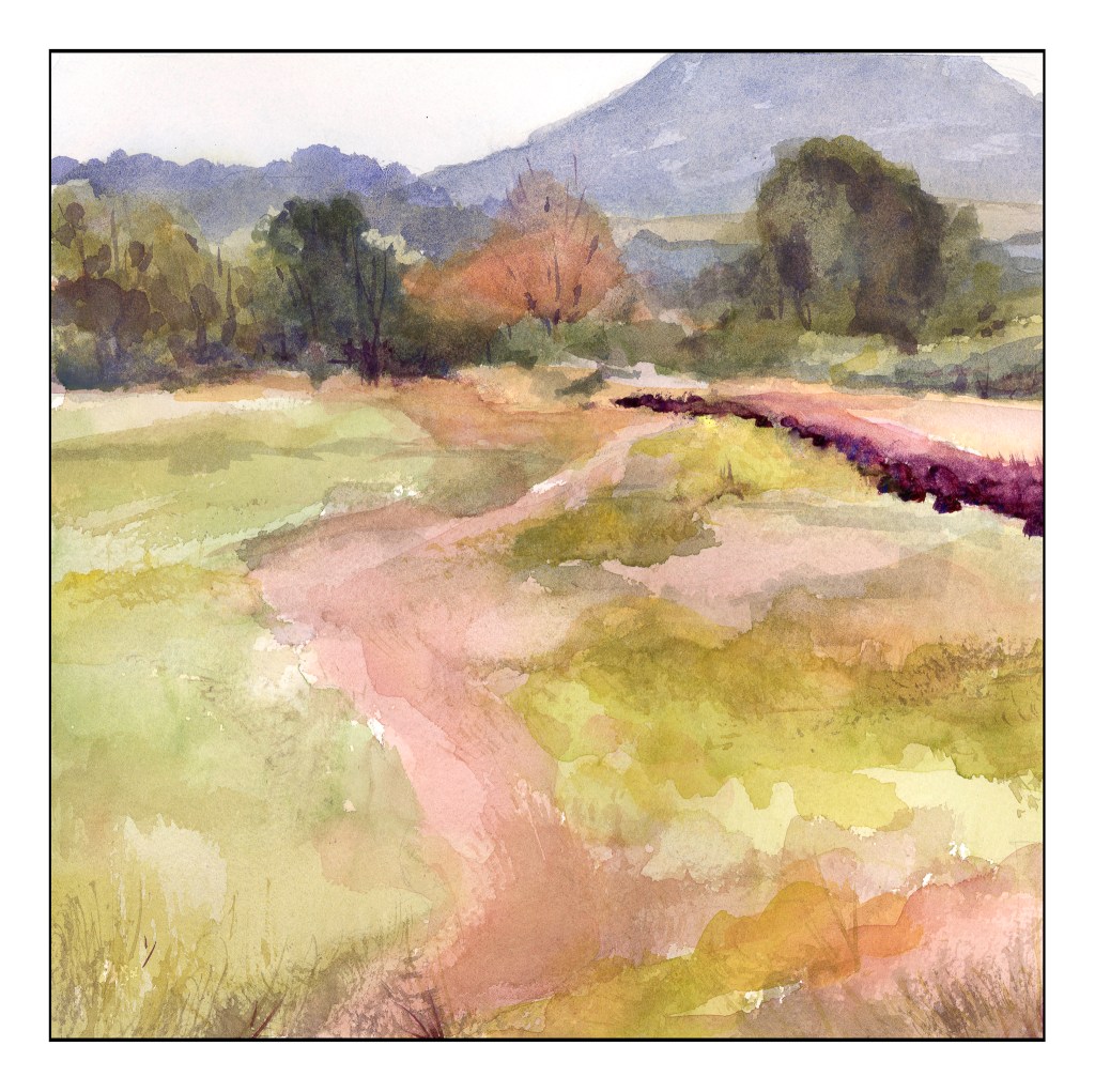
As you can see, there are no colors of high intensity. They are soft and subtle, even when dark. Hue means variations of color – and there are several, and as this is watercolor the colors are transparent and can be laid over one another or blended, depending on the wetness of the paper. The values are all in the middle of the spectrum. I used Kilimanjaro 300# Bright White paper, and this is a 10×10 inch square. My palette here are only the 6 colors I mentioned above, without any white at all.

In many ways, the still life is more “my style” insofar as the colors are laid in rather heavily. The landscape involves a more delicate and patient approach to the colors. Both were very challenging in their own way, but each taught me a lot. I liked the limited palette as I was forced to stay within its parameters, but could still achieve a lot of lovely colors, as well as darks and lights.

More to come . . .

1st Colored Pencil Class

Nothing like learning a few things! I’ve drawn with colored pencils on a very causal basis, but what I learned today included: use of Saral, a waxy transfer paper; use of burnishing and blending pencils. Never heard of those before today, but used all three.

Where to begin? I got there 30 minutes late – I thought class began at 9:30 but, no, 9:00. Oh, well.

Subject was a rose. Place the Saral between the picture you are going to use as reference and the paper you are going to draw upon – like carbon paper. Press hard to be sure it is on the drawing surface. Then, remove the Saral, and use a rubber eraser to blot the lines. This lightens them so you can still see them, but not so dark they are obvious. The paper we used had a bit of tooth, to catch the colors, and we worked from light to dark, white to reds and pinks and into the greens of the leaves. The suggestion was to moosh up a background to keep the rose from floating in space, so I did.

When I got home, I was interested in trying my hand on different papers. I have some bristol paper, which is a very smooth and very white paper.

This paper is so, so smooth that it is actually slick. As a result, colors are blended into one another very easily. I think the Prismacolor Premier pencils may be too soft for this paper and a harder, oil-based pencils, such as Polychromos, may be better suited for bristol.

The next experiment was done on some of my MiTeintes pastel paper; here, a mid-blue. I sketched directly onto the paper, using a very pale yellow pencil to create the general shapes as well as limn in the lights and darks. I decided to look at values the best I could, as well as whether they values tended toward warm or cold. The sunlight was dappled on the leaves, with some bright yellow green, and other a deep, blue-green tending toward black.

Out of all of these, I like the galangal the best. I like it because I had gotten a better sense of how to use the colored pencils, learning some of their characteristics and qualities. The blue background adds to the picture. The light and dark colors worked pretty well, and remembering to use complementary colors to dull down shadow areas I think kept the vibrancy. So, for a yellow-green leaf, the shadow colors were a purplish red, or a layer or two of each.

I don’t know if colored pencils will become a big love in my life, but I do enjoy drawing. My Pencil Portrait class was a real joy. I think I learned a lot in it, and moving to colored pencils is interesting. Shades of grey in graphite now are translated (or attempted to be translated) into values in color – something that is very, very challenging for me.

Pencil Time

After my attempts at a portrait of a person, the realization was that my shading skills are not really good.  Also, my Pencil Portraits class recommences on 2/17, so I thought it might be a worthwhile endeavor to work with a pencil, and work on value with the pencil.  This certainly will benefit any studies I do in the Pencil Portraits class, and perhaps get it into my thick skull to think a lot more about gradation and value than I do!  (Magpie Brain loves bright colors.)

I am very fond of the books by Alphonso Dunn on ink drawing.  His work is phenomenal, and I have learned a lot through his exercises.  Given this, I decided to apply some of his studies to pencil work rather than ink.  All of these exercises come from his Pen and Ink Drawing Workbook.

Above, is the first one I attempted.  If you look closely, you can see the page numbers in the sketches (enlarge the images by clicking on them).  These studies were outlines with a choice of light direction.  You have to use your imagination!

Shapes and shadows – reflected light, cast shadows, highlights.  Simple forms and then a rather pathetic toucan.

I particularly enjoyed employing the pen-into-pencil of these drawings in Mr. Dunn’s book.  His are obviously rendered in black and white, with shades of grey determined by pen strokes.  Here, I took his studies and applied pencil – graphite – to them.  They include a cabbage (I know, it looks like a brain), mushroom, hammer, and bow tie.  Each has a different set of textures.  I started to visualize where the light source was, and that really helped me start thinking more about what I was doing.

For all of these, I used a 2B pencil and a sketchbook, along with referring to Penn and Ink Drawing Workbook examples.

Worthy of My Time and Attention

Retirement is hog heaven . . .

A friend of mine, Stef, said it took her about two years to “settle into herself” after retirement.  I believe it!

People wonder how you fill your day before you retire.  The truth is, you just do.  Sometimes you fill it with activities, and other days you sit down and do not a lot more than loll.  For me, being goal-oriented, I feel like I must accomplish something (what is that something??), but I also am quite capable of just doing nothing.  Rushing to do things takes away from time to listen to that inner voice of the self which provides insight, calm, and direction.  I know I need both.

Oddly, I find I need the company of others more than I used to as well!  At work, I always had someone in my face – a student, colleague, whatever – or something to be done – attendance, paperwork, class prep.  Now, there are me, my husband, and the dogs for regular company, which, at times, is not enough.  Given my desire for other people, I talk to friends and family, connect for lunch, go for hikes.  I am in a few Meetup groups and have one of my own, which has been dormant for about a year – time to resurrect it.

Now, I have things to do, places to go, and people to see.  Choices need to be made and sifted through daily as to the “agenda.”  I have some things I have settled into as routine – getting up, cleaning up myself and the dishes, editing a daily photo in black and white for my 365 Silent Project (missed it a few times).  At times there are appointments or pre-planned activities.  I want to paint or draw daily, but that has been a bit – haha – sketchy of late.  I like to watch about an hour of TV at night before going to bed.

The key word here is value.  What is valuable to me today?  What is worth my time and attention?  Retirement is an adventure that is shaking up a lot of my ideas and solidifying others – and it is fun and tedious at the same time.


Orange Slices

Today, an ink study of orange slices on a bit of peel.

I am / was trying to do a bit of watercolor painting every day, but I find that such commitments, while good, can be stifling.  Drawing is integral to painting, and it is a pleasure to do in and of itself.

I’ve been working on the exercises in Alphonso Dunn’s Book Pen & Ink Drawing Workbook, so an ink drawing after exercises seems like a good thing to do!  I know I certainly enjoy drawing after the practice.  It’s also relaxing and, I find, a good way to loosen up for a painting session.

In addition to using Dunn’s book, I am also working through Tom Hoffmann’s Watercolor Painting:  A Comprehensive Approach to Mastering the Medium.  Right now I am working on simplifying forms and determining the 5 shades of grey – the lights and the darks – in pictures.  I am not very good at that, so combining his exercises along with ink drawing, I think it may sink in.  Then, let’s see if it can be applied to paint.

Thus, a dose of vitamin C for painting health!