A Bow to Loiseau

Not too long ago a painting done by Gustave Loiseau called Les Peupliers (The Poplars), ca 1898, caught my eye. I really liked the composition, colors, and overall atmosphere – a bright, sunny, breezy day in the countryside. I will leave it to find it based on my rendition of Loiseau’s lovely painting.

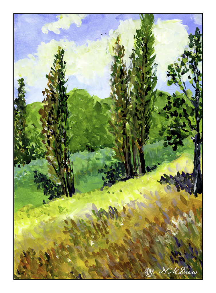
As with yesterday’s painting, this is done in gouache on Strathmore Vision paper. I painted in the underlying colors with an angle brush and then used a finely pointed round to do the remainder of the work.

Gouache is, to me, a rather strange paint, but one which I really enjoy using. The colors always strike me as a bit unreal, but not necessarily in a bad way. They always seem to end up rather cheery, even when I use them to create a rather monochrome or dull scene. It can be used really thin, as a wash, as well as thicker – it all depends on the amount of water you add to it. It is designed to be opaque, but its opacity depends on how much water you add. I think I am on a bit of a gouache streak as I have at least another painting to show you . . . .

Strathmore Vision 140# CP watercolor paper, gouache, 9×12.

Winter Valley

Today I thought I would be a bit self-disciplined and work with only two colors to create a winter landscape. I used MaimeriBlu’s “Faience Blue” and somebody’s artist quality Burnt Umber. Add to that, as needed, some white gouache.

I have never used MaimeriBlu paints, much less Faience Blue. This blue seems a bit of a cold one, which is perfect for a winter day. The Burnt Umber, mixed with the blue, produces a nice dark as well as plays into the coldness I am trying to express.

The first part of the painting was done with the sky – start at the top and work down. This is pure color, diluted, to create a sky. First the paper in the area of the sky was wet, and then the blue brushed in. Before the paper dried I lifted out the color.

Next I painted the distant hills and background area, solid in color, but varying the intensity of the colors and mixes of brown and blue. I painted through where the trees in the mid-ground would be as I knew the tree branches would be a bit darker once painted. Next came the trees in the foreground right and shrubs and grasses on the left as well as under the trees. All dried with the hair dryer. The middles areas were done after these dried.

Finally, the snow was tinted with blue in varying strength, bits of grasses, and final details. The snow on the trees was done with white gouache, as in the front left shrubs. Once the gouache dried, a mix of blue and brown was glazed over it to tone it down. Finally, a light wash was put into give a sense of dimension to the snow.

In the end, I am rather pleased with this painting. Using triads made me recall some other watercolor exercises I have done with limited palettes of color. The cold is much to my liking as is the complexity of the foreground giving way to simpler forms in the distance.

Arches 140# CP paper, MaimeriBlu “Faience Blue” and Burnt Umber. 10×14 inches.

Sparkly Day

The way the light shimmers through leaves on a bright day is something so difficult to capture in a photograph or a painting. The contrasts between light and dark shift and change to be almost blinding.

This is a creek running through the Coconino National Forest in Arizona. It is near Flagstaff and Sedona, and the terrain varies from alpine to the red rocks of Sedona and creeks and forests of Ponderosa pines. The above scan is a VueScan image with some corrections. Below is one using Epson Scan.

Neither scan really does justice to the colors, but the sparkle is caught. I think like a camera a scanner and software has difficulty with subtle variations from light to dark.

Sigh.

So, what did I try to do today? First, a bit of a limited palette. I didn’t do a triad, as with yesterday’s painting. I used (off the top of my head) mostly ultramarine blue, cadmium yellow, and burnt sienna, but into that mix I added Hooker’s green, cobalt teal, phthalo blue. The greys of the rocks came mostly from ultramarine and burnt sienna. Hooker’s provided a basis for some of the more obvious greens, but the cobalt teal mixed with yellow were used for the lighter, brighter greens you seen in springtime. Some titanium white gouache was applied here and there.

Additionally, besides limiting my colors, I tried some of the techniques for the water. Here, there were swaths of shallow water with an ochre coloring, reflections of rocks and trees in the water, and shadows beneath the rocks in the foreground and lower right. I didn’t use enough color and water to create a bead to allow blending – I have been told I would make a stingy bartender! – but still managed to get some of the colors to blend with one another. I also did glazes to show direction of water and movement. It turned out better than I thought it would – if nothing else, I need to be more generous and allow more paint and water than I think I will need. This something we all need to learn – how much is too little, how much is too much. Of course, the Goldilocks effect is best!

Watercolor, Arches 140# CP paper, 10×14.

Oh, hell – here’s another scan!!

Let’s Just Say It’s Colorful!

Autumn along the Virgin River is filled with trees turning orange and yellow from the greens of summer. The sky is bright, bright blue. The red-orange mountains all around are dynamic and rugged. The river is aqua and blue and green.

The light is full of contrast – bright, dark, shadow, reflections. The leaves add texture, as do grasses and trees and rocks. Wind plays through the canyons and trees. The whole world shimmers and vibrates with energy and color. Simplifying it seems impossible.

Watercolor, 10×14, Arches 140# Rough.

Land’s End, SF

I love San Francisco, like so many people. And, like so many people, I am sad to see how challenging it has become as a city in a lot of ways – homelessness, cost of living, among other things. Still, it has a lot to offer, and Land’s End is one of them. Part of the Golden Gate National Recreational Area, it is a beautiful bit of nature on the edge of the Pacific Ocean.

There are paths within Land’s End, and this row of trees on a bluff is a signature landmark of the area itself. Golden Gate National Recreation Area is wonderful, and I have spent time here, and in the city and around the Bay Area often, more so when I was younger. I had friends who lived in the city itself and have great memories of all it has to offer.

This painting was a bit of a challenge. The tree trunks are bright and clear in the foreground and sharply contrast the foliage of the trees and undergrowth. In the distance, the shapes of the trees and their leaves merge into fascinating shapes. What I find so interesting about these trees – I believe they are Monterrey Cypress – is the trunks and branches seem to vanish within the leafy canopy. The hillside is variegated in vegetation, and while I caught some of the bright green and dark browns, the lights and darks were evident.

I tried to paint as directly as possible, putting paint down and then, while it was wet, varying colors within the shapes. The foliage was a good example of this, as was the hillside below the trees. The sky was painted first and brought down between the trunks near, leaving the trunks to be painted later. Bushes were also painted this way. Finally, trunks and foliage, near and far, and final touches such as a bit of titanium white gouache and a few dots and lines here and there.

Watercolor, unlimited palette, Arches 140# CP, 10×14.