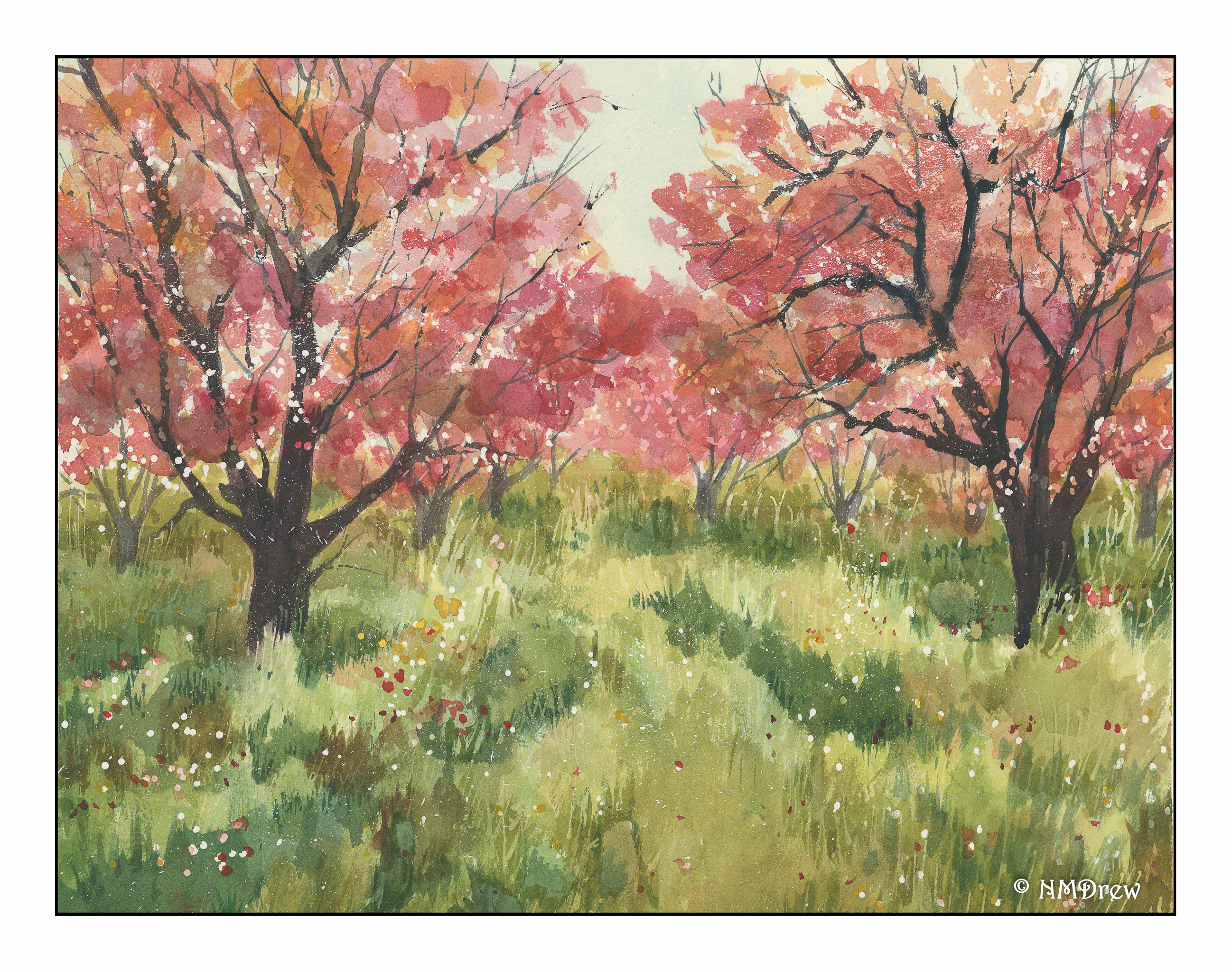
Shadows on snow – blues, browns, limited palette. Cold.
I rather enjoy the winter, as long as I am not mucking about it in reality! As a kid, though, the woods and the new fallen snow on a bright clear day were a true slice of heaven.
More work with water and light. Here I thought about some of the exercises I have followed from Rick Surowicz’s YouTube channel – lines, curves, and dots to capture branches, light, and leaves. I think this painting worked out quite nicely.
Besides considering what I wanted in advance (a way of thinking that has taken a very long time to get to) by applying frisket, I also was determined to paint from light to dark and use glazing and blending. Areas of color were also considered, and rather than trying to paint each leaf, I painted blobs of color to represent the foliage. As a result, I built up layers of color throughout the painting as I moved along, and can say this is possibly the first painting in which I have done this.
I also had to be very patient! Frisket is not happy when you blow dry it – it gets all sticky and you have let it set up again. As a result, this 6×9 painting probably took a couple of hours to do. However, the results, for me, were definitely worth the time it took. Perhaps my impatience is lessening . . .
In a number of circles, there is an “urban sketch” style done with ink and watercolor. Drawing and painting are combined. Some people are masters of it, in my opinion, having a good balance of ink and clear watercolor, with one or the other predominating, and the other not overwhelming its partner. (I hope that made sense!)
I am trying to find that balance. I’d say I am okay with ink, but heavy-handed with color.
Today I decided to try two things. The first is above – a simple “country” scene with trees (and green! remember yesterday?), a fence, and a building. The idea was for the sun – the light source – to be coming from the left, behind the barn. I’m not so sure what that big blue thing is to the right of the (obvious) three shadows of the trees, but it’s too late to do anything about that!
This one is an urban scene, one obviously not in downtown Los Angeles, but in some older part of the world. Here, the light is coming from the right, perhaps, but the alleys and buildings create their own logic. Shadows are broken up with bright spots. One can only imagine that to find the light, looking up will reveal a world much different than the one on the ground. I think this one was fairly successful; there are parts which seem to work, and others that make no sense at all – like, what is that thing? Scribble more ink on it and let the viewer guess!
After playing with yellows yesterday, I decided to try to mix greens. A very green landscape seemed appropriate. Most of the greens were mixed using hansa yellow, quin gold, and cadmium yellow along with cerulean blue, ultramarine, and cobalt. At times, I pulled in Hooker’s green, which I really like, along with some sap green. Others at times, too, mixed with yellow or blue, or even orange!
Looking at the painting, the sky seems to not really match much of the linear quality of the rest of the picture – technique, I expect. I had wanted the trees, foliage, and foreground to be softer, more blurred perhaps, but still full of greens. One thing I should have done is to have not painted the sky across the entire upper portion of the picture – this kept the green foliage from being more discernible or distinct.
Overall, I am rather pleased with the final result. The goal was green, which I certainly got, but the composition and style, while not what I envisioned, are not too bad.