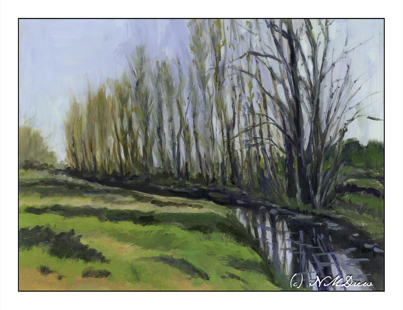
Institution

This is sort of an amalgamation of pictures and buildings. It may be part monastery, part hospital, part something. So, “Insititution”.

A few goals here. First, a building of some complexity. Next, contrast on the building with sunny areas and shady areas. Mission accomplished, sort of!

I also used gouache, white and black, for different areas of the painting.

Watercolors, Arches rough 140# 10×14 paper.

Two Trees in a Field

Once more, it is hot and sticky, but not as miserable as yesterday. Today, I am a bit more energetic but still not running around in the 90F and then some heat. And I am in a far better mood, too! No flies. No mosquitos. And a replacement package for the stolen one arrived today. Now, September is here, and though summer is not yet over, Labor Day (American holiday always on the first Monday of the month) is, for many of us, the official end of summer.

The end of summer means the fields are mown, crops and hay gathered in. Tracks and stubble leave lines behind in the shorn meadow. Heat, light, late afternoon.

That is all that this painting about. I did it after the one I posted the other day and, as with the other “Two Trees”, I am happy with the results here. I like the long shadows in the lower right, but if they are realistic or not is not the point – they just make for a bit more of an interesting picture!

In landscapes, you are the goddess of your painting!

Watercolors, Arches rough 140# paper, 10×14.

2 Trees

With little to do other than post about flies (see yesterday) and gripe about the heat and a missing package, it is always best to move on to things which please you the most. For me, it is waterolors and landscapes. These are two things that usually give me a lot of delight and certainly act as a balm when I am feeling really pissy!

Okay. Heat doesn’t do me well, so I have the air conditioning on and the house has cooled down from 81 F to about 76 F. The latter is manageable. Lots of water and electrolytes, too. And then, watercolor and color and trees and skies and the feel of brush on paper. Even better, a painting I like, and a second one, which will posted after this one.

I am not really sure what to write about this painting. It is pretty simple. It is a simple scene of trees sits on the edge of a sandy bit of land and is backed by a few distant trees, grasses, and shrubs. The palette was simple enough. I worked to make my painting simple, too, and focused on shapes and contrast as well as recall of some lessons learnt from classes. I think it shows summer, too, and a bit of the sultriness I am feeling – humidity, heat, balmy. And very lazy.

Watercolors, Arches Rough 140#, 10×14.

Deep in a Canyon

In the corners of southwestern canyons, near seeps, there is always something growing. These places are subject to harsh conditions, but somehow nature has evolved and beautiful trees and plants provide food and shade and protection for wildlife. And me.

I was really drawn to the contrast of the dark trees and shades of green against an ochre canyon wall. The shadows and the trees and brush create complex patterns in what is often a very barren landscape.

Watercolors, Arches 9×12 140# CP paper.

Master Copy: Erin Hanson’s “Coastal Light”

Erin Hanson painted this painting in 2017 and it measures 24×30 inches. You can find it here on her website. It is called “Coastal Light” and it shows an evening (my opinion) in Southern California sometime in the spring when the rains have come and the hills are green.

I chose this to use as a master copy because the composition is simple, and I felt I could relate to it emotionally. For me, connecting with a painting or subject matter is very subjective – if I don’t like something I am not interested. I also felt I could handle the colors comfortably.

My own painting is in oils and as I worked on my copy, obviously things shifted. This master copy measures 16×20 inches, so of course my proportions are a bit different.

A number of things drew me to this painting. First, as I stated above, was the relative simplicity of the composition. The colors Hanson uses are vibrant and the air shimmers a bit. The leaves seem to flutter in a light breeze. I like the quiet energy of “Coastal Light”. The spring evening is very gentle. Additionally, what also attracted me was the way Hanson subtly outlines the shapes of the tree trunks, vegetation, clouds and terrain. Brush strokes give a sense of direction, especially in the foreground.

Initially, I tried to paint this using acrylic paint. I laid down the initial painting about 6 months ago, and really did not like it. Acrylic paints are not easy to use as they dry so quickly. I found the painting rather harsh and was thinking of painting over it with something else. Instead, it sat in the garage, ignored. And, I think, that was not a bad thing.

When my current painting class began again, I decide to pull the painting out and re-do it using oils. I didn’t have Hanson’s painting to refer to as I had forgotten where I had found the image. So, I just painted over the acrylic paint with oils, using the acrylic painting to guide me into finishing it. This took me about a month of classes once a week, and only last Tuesday did I finally consider it finished and not needing anything else.

I finally found the image of “Coastal Light.” Comparing my version to hers, I found that what I really like with both are the way the tree trunks are delineated using light colors to show light without overdoing details. Foliage, too, was something which pleased me in both paintings, with Hanson’s being a bit more expressive than mine – I am a dabber, and my foliage is definitely dabbed! When it came to bigger areas of color, such as the distant mountain, foliage, and foreground, my dabs got all mushed together to create better color masses and shapes.

For me, a master copy is to learn whatever I learn. I have no goals specifically in mind. What I came away with was an awareness of my need to stop dabbing and become a bit more bold in applying areas of paint. My dabs work well when I mush them together as subtle color variations can show up. I really liked doing the tree trunks and the foliage, working to get a sense of the direction of light on the trunk and the movement of the fluttering leaves. Achieving a sense of depth using the contrast of shadows falling across the path – lighter in the distance – was a bit of a challenge but my lovely instructor, Barbara, really helped me see what I was not seeing.

An oil painting master copy is sort of a luxurious event because time is on my side. Watercolor master copies, such as with Seago, are very immediate as watercolor is simply watercolor! Doing this, my first master copy in oils, I have come away with a better sense of how to paint a mood and light. Even better, my level of frustration was very low once I began working in oils – acrylics really cause me to get agitated because I feel like I have to work so fast to do this or that before they dry. Altogether, I enjoyed this and learned more about how to use my paints. For me, the trees were the best part of this adventure.

Erin Hanson’s colors always appeal to me, and, of course, color is subjective. Her sense of composition is one of her strong points, and her brushwork is enjoyable because it creates an energy that works well with much of her subject matter. I may try another one, working a bit differently than I did here, because the entire process was both challenging and satisfying. On top of that, she loves landscapes and the great outdoors – much preferable to portraits I think!