Studies in Two Colors

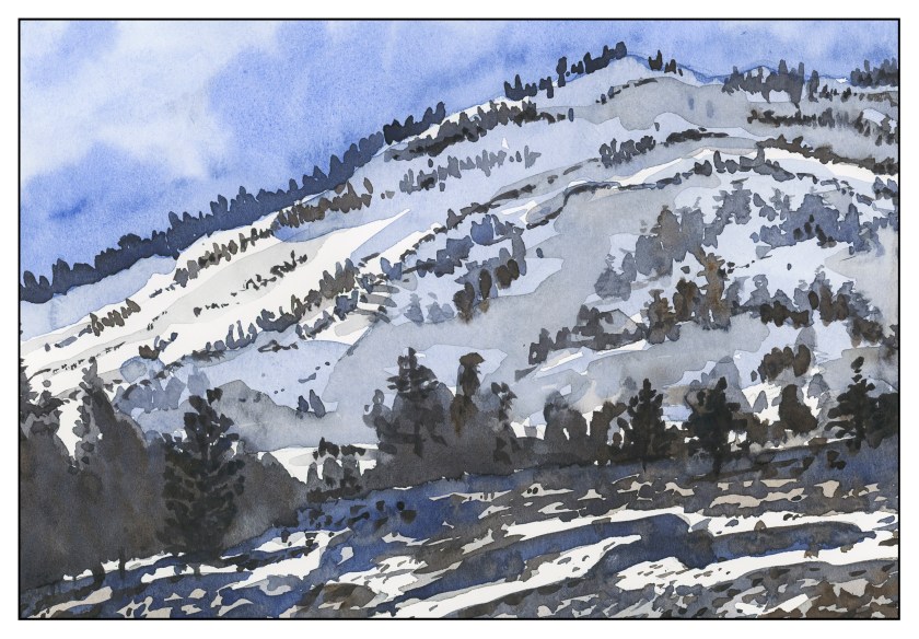
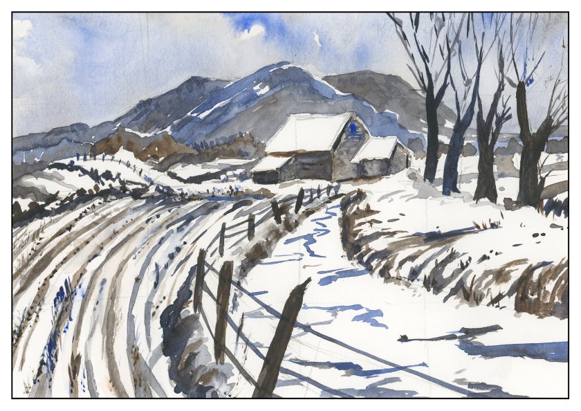
Over the weekend, I worked on numerous simple watercolors, inspired by the 2-color studies found in Ted Kautzky’s classic book Ways With Watercolor.  He suggests beginning with just two colors, Burnt Umber and Ultramarine Blue.  From his book, I did the exercise below.

The umber and ultramarine are considered to be “warm” colors from what I have read, but they work to make wonderfully cold winter scenes!  Here are some I did after the one above, to continue the study.

The beauty of using only two colors is there is little likelihood of making mud.  That’s a good thing!  Instead, I got to focus on value, which is not an easy thing for me.

Values are not just light and dark, but everything in between.  For instance, above, there is bright white, a light grey, a darker grey, and so on, moving into essentially black.

Besides working on value / contrast, the above painting was a work done with a lot of wet-in-wet, particularly at the horizon line, to blur the plant growth into a hazy atmosphere.

From there, another wet-in-wet, accompanied by a gradated wash, in the above painting.  I started with pure Ultramarine Blue, and then worked it lighter and lighter until I reached the bottom of the sheet.  Then, with a dry brush, I worked upward to remove the blues.  You can see some blue streaks left behind.  After the picture was finished, I used white gouache and a toothbrush to spatter snow onto the painting.

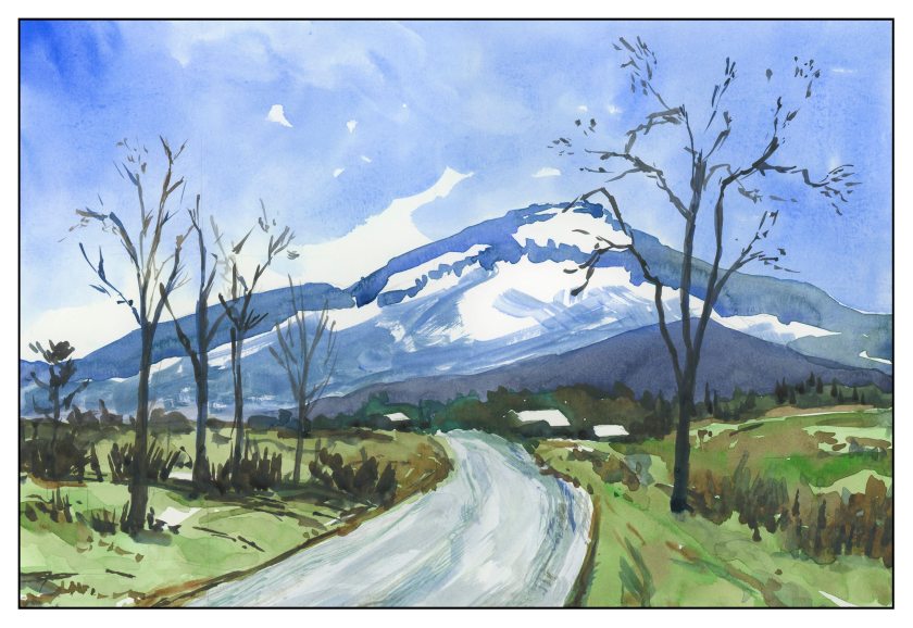
After all these umber-and-ultramarine paintings, I have moved onto ultramarine and Burnt Sienna.  The sienna is much warmer, to my mind, as long as it is not mixed with the ultramarine.  With ultramarine, the color can be as deep as you want – nearly black – as you can see in the trees.
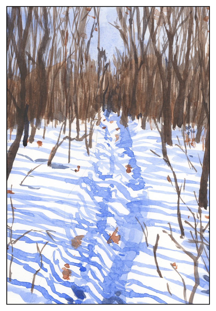
The shadows across the snow, and the ruts, were painted with plain ultramarine, as was the sky.  It’s a great color for shadows, on snow or otherwise.  You will see that the dark colors, such as on the trees to either side in the foreground, are blackish, but of a very different hue than the darks in the paintings above.

This study has been worthwhile.  I may do more in just two colors, or add a green.  Varying just one color produces considerably different results.  I also did the same pictures over again, in different browns or blues, or both; this is also a good way to become familiar with colors and how they interact.

Two Color Studies: The Mountain

One nice thing about working in only two colors, you don’t get mud.  You get dark colors.  You get light colors.  You get medium colors.  I find that this is actually harder to do, in some ways, and easier, too.  Harder because I have to decide on value (light, dark) and which direction to push the color (blue, brown).  It’s easier as the decisions of color are already made for you (me, the painter!).  Here I have limited my palette to Ultramarine Blue and Burnt Umber, as in the earlier studies from Ted Kautzky I did last week.

After looking at the scan, I realize that some of my darker trees in the foreground sort of float in space!  The lighting at present makes it hard to see, but I will probably go back and correct it later on.


Trying, Keeping, Discarding

I’ve returned to watercolor in the past year, trying a lot of things, and realizing that some things are just not “me” and others are “me.”  This means there are styles of painting I just don’t care for – and ones I do – and what to do?

First, I think it is important to try something.  This way you gain a working knowledge.  This means repeat the situation a few times to learn the subtleties.  The brain works on an unconscious level and incorporates that knowledge.  Whether or not you continue down that path, you learn something and it is stored away somewhere in the mystery of the brain.

The painting above is a study I did out of Ted Kautzky’s classical work, Ways with Watercolor, which I bought when I was 16 with babysitting money.  Three colors only, and the variety of colors is amazing.  Restraint, self-control, forethought, execution, results, experience and knowledge.

And then, think about the experience.  Worthwhile?  Did you like it?  Were you a klutz?  Did you hate it?  Did you like it?  Do you want to move on?  My philosophy about work comes into play here:  learn what you hate about your job and what you love – then decide if you want to continue.  That applies to painting and art in general.  I like certain things and find other things not to my liking.

What I don’t like is a sense of constraint.  I like painting to be an experience – but to get good at something, you have to work.  So, I like free-flowing painterly watercolors.  To get there requires practice and experience.

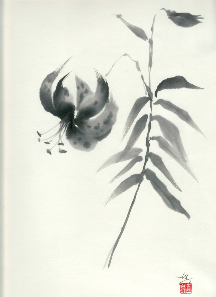
When I was doing a lot of sumi-e, I hated the brushes and the paper – they had their own qualities which, one mistake, could ruin an attempt.  Eventually, though, I found some mastery over paper and ink and brush.  Part of that came from knowing my materials – which paper I liked, which brushes I liked, which ink and ink stone I liked.  Then I could begin mastery.  Poor quality brushes shed hairs; too-porous paper spread the ink to quickly.

The same is to be said for watercolor, which I have been drawn to since whenever.  However, I have scurried away from it, always annoyed with my style, with my lack of ability, with my lack of control.  I still deal with it today, but now that I am on the slippery slope of old age, such things seem like foolish wastes of my time.  Just do it!  Do it as often as possible!  To hell with the results – the experience itself leads to wherever it will lead.

Yes, I do know what I want to be able to produce.  I don’t want to rely on lines to contain a bad composition or execution of color.  If I do ink and watercolor, there will be a purpose for it – a reach for a particular style.  With watercolor, I may need to do (and will do) value studies and use a limited palette of colors to train my eye.  This is a form of restraint, but not an onerous one.

Studies from Kautzky

After the disastrous lilies, I had a good think.  I really am not a decorative painter at heart.  What I love most are landscapes.  The outdoors is to me the most exciting thing . . . mountains, water, trees.  Thus, with this in mind, I pulled out the very first “how to” art book I ever bought, back when I was 16:  Ways with Watercolor by Ted Kautzky.  I still love this book and find his style and words soothing and thoughtful.  To ease my frustration, I did two of his exercises.  The first below is in 2 colors only, ultramarine blue and burnt umber.

The next one is in three colors:  burnt umber, ultramarine blue, and Hooker’s Green.

Kautzky’s palette of colors is one with which I am comfortable and familiar, so it was very reaffirming to feel somewhat skilled after the lilies fiasco.  That really upset my little apple cart!