Water in Watercolor

Today I spent the morning running errands and doing chores, the afternoon playing with a friend and doing some photography. The day went by delightfully, but there is that need to pick up a brush and some paint. I wasn’t in the mood for trying to make a painting of anything, but the idea of waves and oceans has been going through my mind, and now it is time to get some ideas on paper. So, of course, YouTube comes to the rescue, and I found a nice, simple, easy video by Paul Clark.

Paul Clark’s videos are informative and easy to follow – as well, I like his presentation style and his paintings. In the above video, in 20 minutes, he shows how to paint water in increasingly more complex ways.

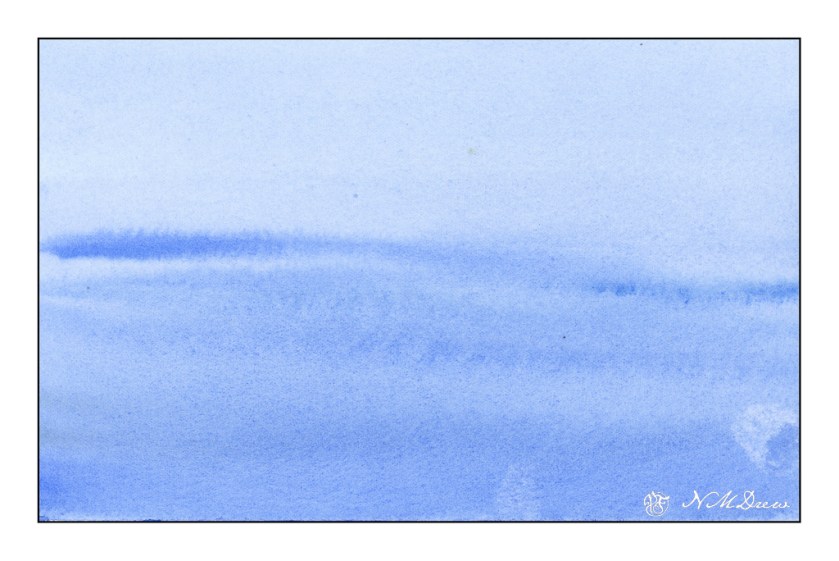
Above is just a simple, gradated wash, with the greatest density of value at the bottom of the page. From there, some paint is lifted, and while the paper is still a bit damp, more lines of color are painted into the blue, wider ones at bottom and more narrow at the top to suggest distance.

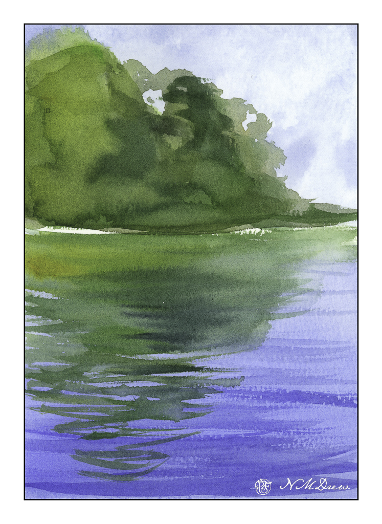
The next is reflections of trees on a lake. The trees and sky were painted first and allowed to dry. The water was then put in, using a gradated wash, darkest at the bottom. Time was given to put in suggestions of waves or reflections – this required waiting for the paint and paper to dry. The hair dryer is perfect for this. Watch how Clark does it in the video as it get a bit more complex than what I am describing.

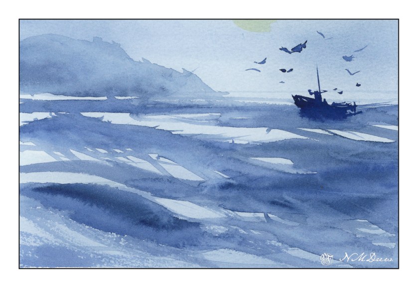
The third one is done with one color of paint. I used a bit of what I had mixed on the palette – ultramarine and indanthrene blues. Clark’s painting is far better than mine, and we will leave it at that! I want to return to the video to watch it again as I know I worked really quickly – too quickly – to catch all the fine points.

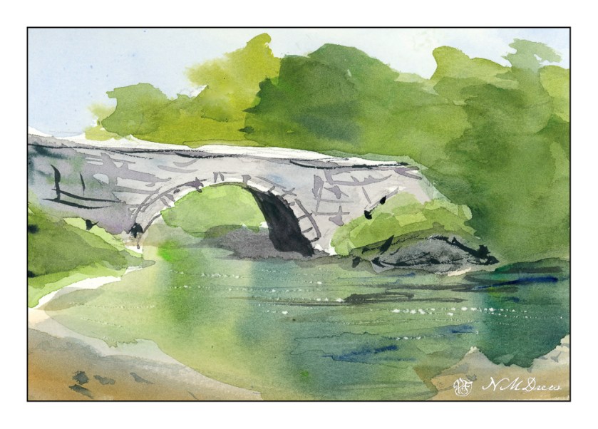
From the ocean we now move inland, to an old bridge spanning a river. I think was my favorite one, and I was quite happy with my results. The white sparkles of light on the water is done by using a knife point to dig a bit into the paper. Techniques varied here; again, refer to the video.

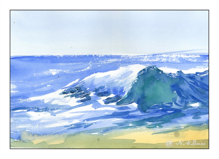
Now, back to the beach. My painting is quite clumsy in a lot of areas. I rather like the sparkly water on the horizon, and the way my white gouache dry brush adds to sparkles. While my painting is definitely that of an amateur, I have a better sense of what to look for, to see, in a wave. The idea I had initially was to learn a bit about crashing waves, and this one is a good introduction to them.

Altogether, I spent about 30-40 minutes doing these studies. I watched and paused the video for each painting exercise, and then went to work. The goal is to do and practice, not create a beautiful work of art. The act of painting is what teaches me initially, and then I can analyze a bit more to hopefully create more successful whatevers – here, waves and water and reflections.

Practice is something a sketchbook gives room for – a playground to explore. Paul Clark’s videos are really nice and I do suggest them. Meanwhile, it is time to go to bed!

Class: Sketching Winter – Capturing the Colours of Snow

There are a lot of watercolor instructors out there. Many are good, some mediocre, and others not worth the time. Among my favorites are Rick Surowicz, Oliver Pyle, and Shari Blaukopf. Most important is if I like their paintings or not! Next is their teaching style. In person classes are hard to find, get to, and can be expensive, but online courses are often repeatable. I am beginning to find this to be the best venue for my own learrning. Blaukopf has a number of short courses, very reasonably priced, which fous on this or that. Shari Blaukopf fits both criteria – great painter, great teacher.

I have purchased a number of her courses. Over time, her classes, already good, have gotten even better with more details and focused studies. You can learn a lot from copying a painting – a long, traditional history for the art student – but when you watch a painter achieve a painting, how they apply paint, when they explain their approach, learning is an even better experience.

I can paint snow and have done it fairly well, I think. What I enjoyed about this class was to see her sequence of painting, understand the logic behind her approach, as well as the fact that her painting is pretty direct. Shari applies her colors directly to the paper, sometimes mixing on the palette and other times on the paper while adding other colors. The key factor in her success is she does not overwork her painting!! She also explains why and where she is using hard and soft edges, as well as warm and cool colors. Not everyone is this clear.

In the end, her painting always have a lively freshness to them, with plenty of detail mixed with a painterly quality. Perhaps a lack of fussiness? Whatever it is, her painting seems very spontaneous to me. Seeing / learning how she achieves this has been the highlight of her classes. She is thoughtful, plans ahead, and yet achieves a looseness that is hard to match. As watercolor – or “watercolour” – is such a challenging medium, good techniques are like gold to me.

Forest Road

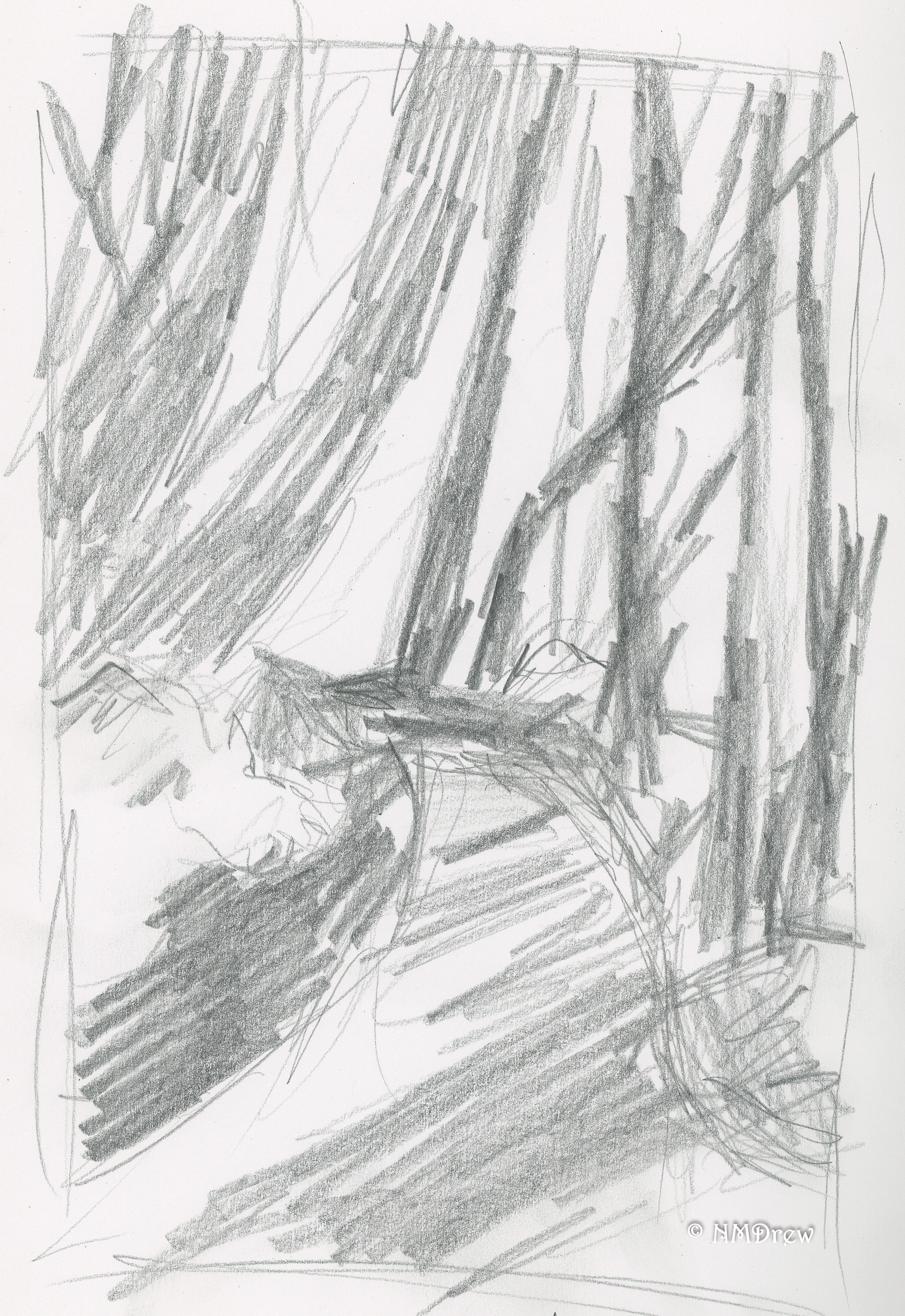
I’d forgotten how much fun painting with gouache can be! Today, a painting of a forest road running through a lot of trees, but not so heavy with leaves that light doesn’t shine through. I began with a value study – again, more for shapes I think in light and dark.

The first layer of the painting had thin washes to set up the light green in the distance. Then, general dark shapes were added after the road was limned. The trees were then painted, dark to light, using long strokes with a round brush. After that, a flat was used for broad sweeps of the road. Finally, dabs of color to create a sense of dappled light on leaves. Final touches included some dashes of white and a blackish mix (purple, green, black) for lines and bits of contrast. What I really liked is the ivy climbing up the trees, creating bright splotches of color. Altogether, I think it worked quite well.

The value study is becoming valuable. Yeah, really. It helps me see where strong shapes against light shapes create visual interest and leading lines. Value studies are general but the painting becomes more specific.

Lavender Field

Pastels are getting to be addictive.  Unfortunately, this scan for some reason came out a bit too yellow-green, but I wasn’t interesting in putzing with it!

I tried a few different things here – in particular how I made marks.  Vertical and horizontal to contrast.  Obviously the lavender is vertical and tilty, but in between, horizontal helps create some interest.  The trees I used a torchon to scumble and blend the colors, as well as push shapes into the sky.

I know I am getting addicted to this – I just ordered a roll of Uart 600 grit sanded paper – 56 x 10 yards.  That should last awhile!  This was done on a 9 x 12 inch bit of Canson Mi Teintes, which is a very nice paper, but unsanded.  I like them both.

A Bit of Color, i

The Book and the Paints

I’ve been doing sumi-e for awhile, and now with my return to my Chinese painting class, the urge to paint is getting stronger, and the need for color is making itself known.  However, it never hurts to refresh one’s skills; given this, I dug out a book I’ve had for some time:  Watercolour by Patricia Monahan.  This is a good book for standard watercolor techniques.  So, I’m going through it, front to back, in my spare time.  It’s a good refresher.  As well, these techniques are important to remember as I know many will be used in any subject done in the Chinese style.

In watercolor, I’ve encountered different approaches to how to work – light to dark (Monahan’s approach) and dark-to-light.  Personally, I find that I work more logically light-to-dark, but the truth is that working dark-to-light just confuses me.  Maybe it is something I should deliberately try.  For now, though, I will hold that thought and practice a few simple techniques.

Monahan’s book is broken down into sections.   Currently I am on Washes (having read the introduction and chapter on equipment), which include techniques and then subject matter, such as rain clouds and the beach.  I’ve done a solid wash, into which I’ve done

  • wet-into-wet
  • wet-onto-dry
  • dark to light stripes (not a wash) by adding water to a dark color to lighten it
  • gradated dark-to-light wash

I’m using pan paints, made by Pelikan, and I think they are technically opaque, but I find that they work fine and have a nice degree of transparency when diluted. They are convenient and easy to use on my crowded desk. For paper, I have a 7 x 10 inch block of hot press, 140 pound, Arches. I’m using both sides of the sheet for the exercises.

Washes:  Solid, Wet-into-Wet, Dry-onto-Wet

The very first exercises in the book are reviews, or introductions, of the wash.  The solid wash is explained, and demonstrated.  From there, the author moves into wet-into-wet.  Below, you will see it in the upper left corner of the picture.  Wet-onto-dry is also done, with a wash laid down, allowed to dry, and then another color applied over it.  This is illustrated by the weird circles in the lower left corner.  Finally, layering of color is done, which you will find on the right.  I kept the same strength of color for the layers, and applied about eight.  The results are quite nice.

Diluting a Dark Wash

This next exercise was actually one I’ve never encountered before.  This consisted of creating a fairly dark wash, and continuing to dilute the wash with the same amount of water.  Each stripe in the picture below shows what occurs as the intensity of pigment is weakened.  I was not scientific because I did not measure out specific amounts of water, but I did add two brushes full of water to the pan as I moved along.  It seems to have worked out well.

Gradated Wash Using Flat Brush and Round Brush

Next was the ever-popular gradated wash.  Onto dry paper, color is placed at the top and diluted as the color is worked down.  I did this twice, using a flat brush on the left, and a large round on the right.  Both have their merits.

Two Gradated Wash Methods

This next exercise consisted of placing a gradated wash onto dry paper and moving it into damp.  This is on the left side of the picture below.  I used a small sponge to dampen the lower half of the paper, and then at the top began my wash on dry paper.  As I moved down the dry section, I added a bit of water, and then continued on down into the damp section, moving left to right and back.  When I got to the damp section, I did not add any more water, nor pigment, but just let it become weaker.  This was a brand new technique for me.  On the right I did the dampened paper with a gradated wash.  The paper was dampened with a sponge, allowed to dry a bit, and then a standard gradated wash done.

First Exercise:  Monochrome Rain Clouds

Finally, the first exercise:  monochrome rain clouds.  Using black, I laid down a gradated wash onto dry paper.  Before I let it dry, I used the sponge to lift up some of the color.  I squeezed the sponge out into my waste water jar and continued.  After I let this area dry, I laid down some medium and darker washes, doing some wet-into-wet, some lifting, and so on.

I was pretty nervous doing this as I was sure it would all be a disaster, but decided to trudge on rather than freak out! I always over do my watercolors – or nearly. I get sooooo frustrated! However, I am rather pleased with the results, and will do a few more monochromes before moving onto the next exercise which is the same thing – rain clouds – but with a limited palette.