Portrait of a Little Girl

Over the last year or two I have been doing pencil drawing with an amazing instructor, Steve Tanaka. He used to teach at our local adult school, but with the pandemic and virtual classes, he decided to try out meeting in the park behind our local library. A small group of us meet at a moment’s notice – well, a week or two’s notice! – on Wednesday morning, weather permitting. The primary purpose of the class is portraiture in pencil, but I have wandered at times to cat faces and trees, others have done horses or owls, but we draw. The doing is the point, and Steve’s tutelage is subtle, available, encouraging. He has a sharp eye and a lot of experience. He is a fine teacher.

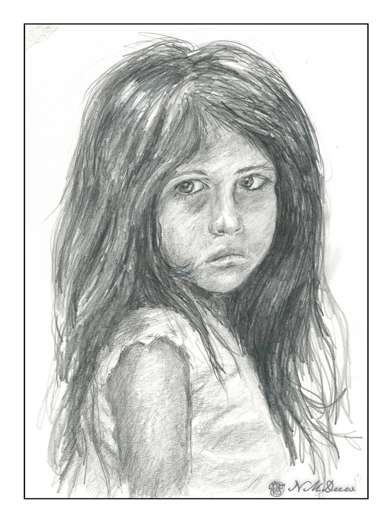
This is a drawing of a portrait of a poor girl in India by a talented Pixabay photographer Aamir Mohd Khan. His portraits have a drama of a place I have never seen and are both fascinating and touching. His portrait is below.
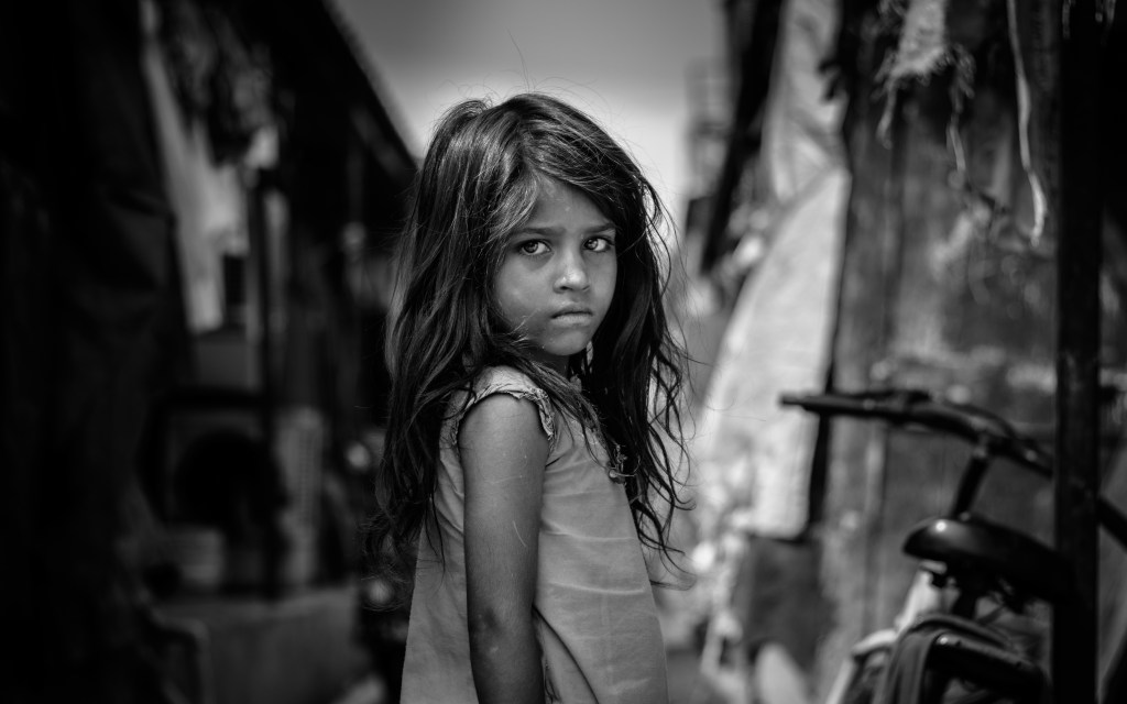
I cropped the portrait to focus on the little girl whose face is so haunting. I wonder what her life is now – I don’t think it is easy at all.

My own drawing is done with pencil – graphite – using HB, 2H, 2B and 4B pencils on bristol paper, 9×12. There is still some work to be done, but I felt a need to post it. I have spent about 5 hours on it altogether.

Suburbia

Suburbia

Sometimes tweaking a photo can make something look a bit better than it does or more interesting. Here I played with various post production software and rather like the balmy look I got. Given the chilly winds we are having today, I think it was a good choice. As well, this just might make a good painting.

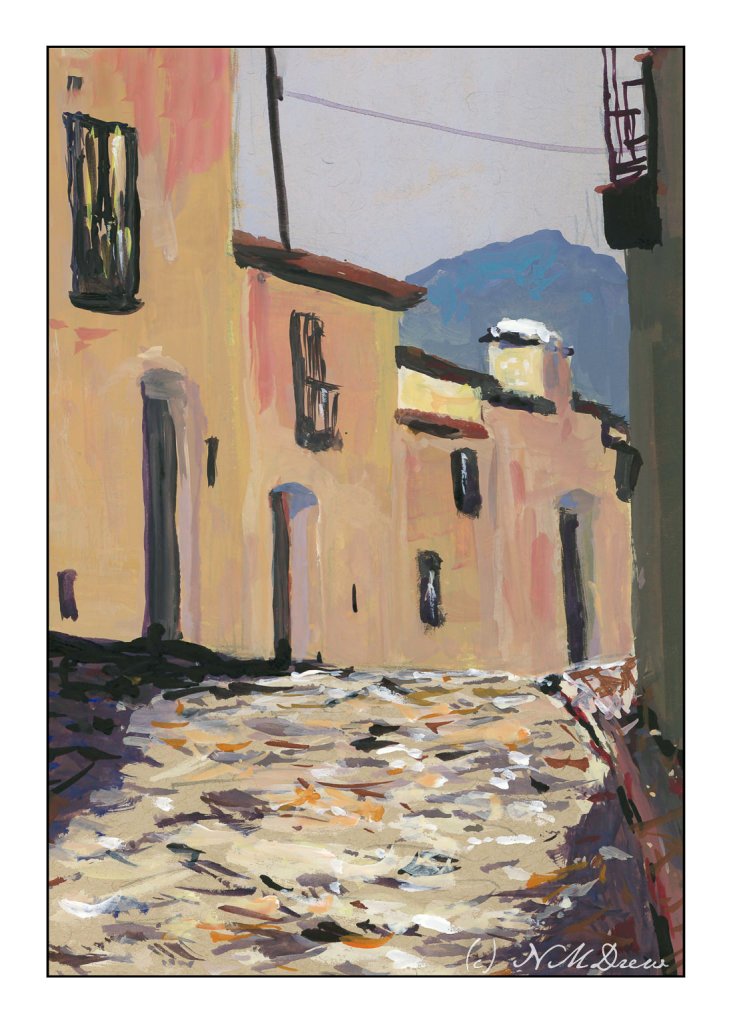
Up a Cobbled Lane

More gouache, this time on toned paper – tan specifically. The tan paper seems to give an extra warmth to the colors applied over it. Besides using toned paper, I am trying to venture into different areas – here I am doing a totally urban scene. One thing nice about painting old buildings is that standardization wasn’t quite like it is now, so my door don’t all have to be the same size, nor my windows! Heck, even the cobbles are rather rough.

I like painting in gouache, but there are times when it gets to be a bit tricky as it re-wets and it is easy to pull up lower layers of color. To help prevent this, you need to start with thinner paint and add the heavier colors later. If a drop of water falls off our brush, you can make a bit of a mess in the area it lands. Most people when they use thicker gouache paint smaller paintings – it is not a paint that spreads out generously and stays opaque. The charm and challenge!

Gouache, Strathmore tan toned paper, 5×7.

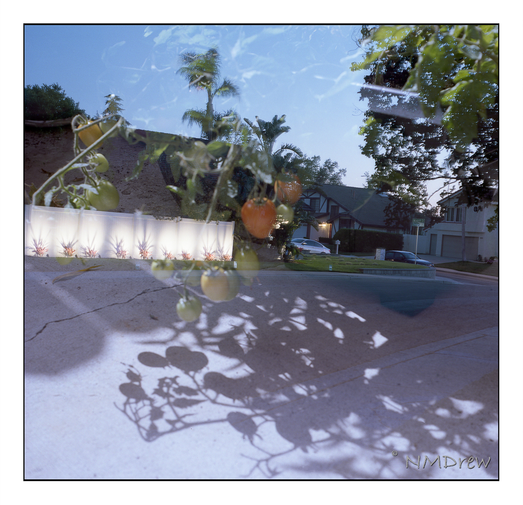
Tomatoes in Suburbia

Nothing like a mistake that is rather a fun one – here, double exposure in my Certo Six folding camera. I forgot to advance the film and thought there was an issue, so released the exposure button again by choosing the “bypass” button. (If you have a Certo Six, you know what I am talking about.) It makes me think that it might be a fun exercise to deliberately, rather than accidentally, create double exposures. Maybe even triple. Or quadruple. Such is possible!!

This is with Portra 400, a film I always find way to delicate in color for my taste, but it could be I will change my mind after cataract surgery. This is pretty much SOOC with just some spot removal in post. I don’t like spotty film . . .