Ink, Color, Paper

For some time now I have been practicing “urban sketching,” which is a fun way to record what you see around you.  Sit down, have a cup of coffee, take out the ink, color, and paper.  Go to a park, visit a zoo.  The world is around you!

Ink and wash in Stillman & Birn sketchbook. Light washes are more successful than heavy washes as far as I can tell.

Part of the process of this style of sketching is to realize the essentials of what you see in front of you.  It is a good way to evaluate and decide what to keep, what to discard.  By the same token, you learn about your materials.  To me, one of the most important elements is the paper – how it responds, how it reacts.  After a bit, paper becomes like an old friend – you know its nuances, when it’s in a good mood, when you are having difficulties.  And, like people, you find you like some paper better than others.
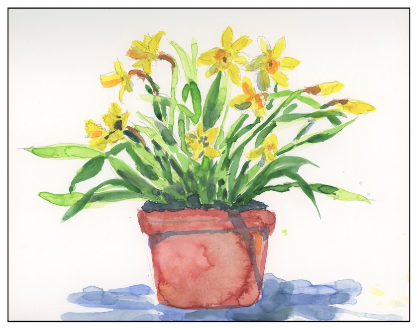
Painted with multiple glazes in a Hand Book. There is some blooming, which can be annoying, but the paper holds up well to repeated washes.

I’ve picked up a number of sketchbooks, many with heavy paper to handle watercolors and ink.  Handling a wash is critical.  However, learning what a paper can and cannot do is also important, and part of that is just using it.
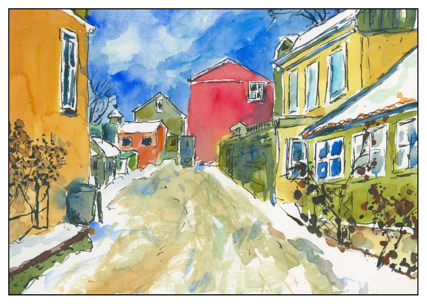
The Pentalic sketchbook holds up really well to repeated wetting. The sky is a good example of this – I went in about 5 times, just because I could, to see how it worked. There isn’t too much blooming with this paper. As well, the paper has a pleasant texture. Both wet-in-wet and dry brush work on this paper. I painted all of this with a flat water brush to get a sense of how to use it more successfully than I have in the past. Ink is both Carbon Ink and pigmented markers.

To date, I have a Stillman & Birn, Hand Book and Pentalic watercolor sketchbooks.  Stillman & Birn doesn’t respond quite like I would like it to for wet washes, but it holds lines well.  I need to practice with it more to get a sense of its personality.  Hand Book seems to have better wash-handling qualities.  Pentalic, so far, appears to be the best.  I also have decided I like spiral bound vs. signatures.

Neighborhood Tree

This is from my Stillman & Birn soft cover (blue) sketchbook with 180# paper. A part of me likes the thing, and another doesn’t. I’m not sure why.

Anyway, this shows what I am trying to do . . . establish shadow, play with color combos or swatches. I used all sorts of brushes on this. In general, it is overworked, and the trunk looks like some tree has landed on an octopus. (Poor octopus!)

This is the final product, with some work on it . . . The contrast is a bit better, but it still looks pretty much in the same key to me – in other words, the grey scale is pretty much the same to my eye when I see it in color. In B&W it is still not quite what I would like to see.

Working with Contrast, or, A Day Without Mud

Today, my little Meetup group was really little.  Initially there were to be 4 of us, but one cancelled, and then the third unfortunately got very lost using her GPS.  She wrote she was 3/4 of an hour late . . . and we waited 10 minutes, too.  Next time I post a Meetup meeting, I’ll spell out directions, so hopefully that won’t happen again.

So, contrast.  I am dreadful with it.  And with painting things so that they look like things rather than blobs of color.  However, that is probably something that time and experience will cure.  Today, though, I did manage to not turn everything into mud – a major accomplishment, let me tell you!

We went to a local place, the trail by the Chumash Museum nearby my house.  (The Chumash are a California tribe.)  We were there for about an hour.  I began with a pencil sketch, and then, color.  We were settled in a small oak grove, with dark and light contrast about as contrasty as you can get.  At the end of the hour, this is what I had painted, knowing full well I would look at it and work it a bit once home.

As you can see, I did leave areas of white!  Another first . . . As I was painting I made a monumental decision, too:  paint long horizontal stripes to represent the grasses under the trees, and the shadows crossing the foreground.  I sat there and painted stripes.  It was nerve wracking.  The blobby white areas were deliberately left for consideration later.

And once home, I looked at the painting.  Still a need for contrast, and a bit more detail.  More pen, more ink brush, more colors, and some warmth.

Overall, the one above came out okay, but if you look on the mid-right, to the left of the furthest trunk, there is a bit of an odd space, so I went in and worked it a bit with ink to try to mitigate it.  I found it very distracting.  Here is the final image below.

The area has a few more lines in it, a bit busier, but somehow more in keeping with similar areas of the painting.

My palette was somewhat unknown!  That is, I was not really sure the names of the colors as I was using them, but I do have a list of how they are laid out on the palette, which is why I can tell you now!  I used Koi watercolor brushes and the following paints:  Quinacridone Gold, Naples Yellow, Hansa Yellow Medium, Cerulean Blue, Cobalt Teal, Ultramarine Blue, Indanthrene Blue, Phthalo Green, and Burnt Sienna.  I used a Stillman & Birn Beta Series 8×10 inch softcover notebook, and scanned the images using my trusty, not rusty, Epson V600.