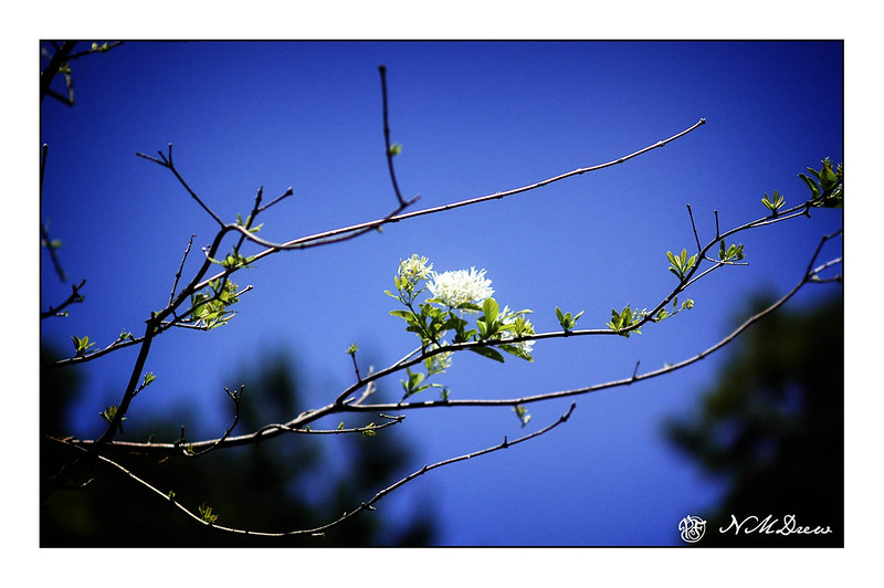
As a kid with blue eyes and blonde hair, everything I wore seemed to be the color blue. So much blue! Too much blue! I really didn’t like it after awhile, but these days it is probably next to greens as a color I enjoy.
Looking through my photo archives this morning, I found a number of pictures I took in the local botanical garden one spring – a brilliantly blue sky with no clouds, but branches blooming and leafing out. This is when I love blue!
Software updates and new versions come out on a regular basis. If you are diligent, you learn the newer versions and discard the old by uninstalling them. Sometimes the newer versions have features added and older ones removed for this reason or that. Usually I just install things and play. Today I decided it was time to really get my proverbial s*** together with regards to Lightroom Classic CC and On1 Photo Raw 2023.
In Lightroom up to the 2021 version of Photo Raw I could use the different modules of On1’s software individually. After that, no. I decided to get into the 2023 release of Photo Raw and figure it out. The first thing I did was to import a bazillion of presets into Photo Raw 2023. That took easily a few hours. Each preset group had to be imported individually. Argh! Why batch imports cannot be done, I have no idea – may be it can be, but I have no idea how!!
Anyway, done with preset importing, I started trying to figure out how I could get the best usage out of my LR and Photo Raw 2023 to edit by exporting an image from LR to Photo Raw. I found a great video, for Photo Raw 2022, not with the individual modules as before, but it works.
If you have struggled with LR and On1, this presents a viable option. It is not as good as the individual modules of the 2021 and earlier versions of Photo Raw, but it works. There are ways to batch edit in both LR and On1, and I do need to learn those as well.
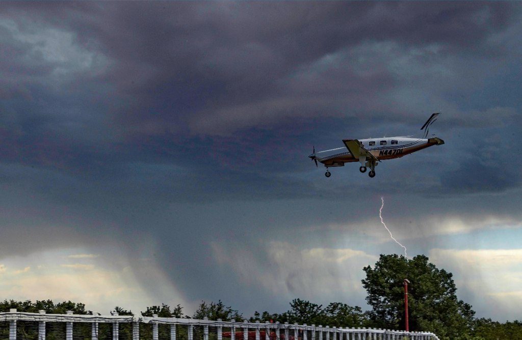
While I was playing with On1 Photo Raw 2023, I started exploring the sky replacement element. It is really fun! Of course, you need to have some sense of matching the sky with the photo or it can look odd, but there are some adjustments it seems that you can make while importing a sky into a photo – ones that adjust the foreground for instance. If you have water, you can put in a reflection. You can also expand and shrink your new sky to a degree, as well as move the horizon and so on. Again, more study is needed.
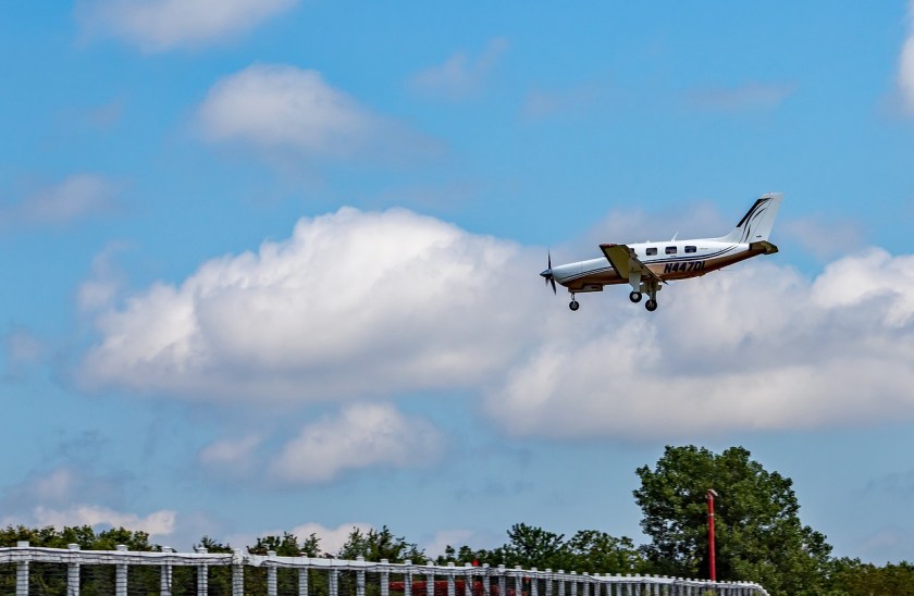
And here is just one of the pictures I played with. Below is one with an original sky – I downloaded it from Pixabay, a website with a lot of free photos for use. Per the description, this is taken in Malibu, CA. Those clouds are not common here – winter storms are usually when we see them.
And here it is with a tornado and rain – not something you are likely to see here in California unless the world really changes!
And that is how I spent today – updating photo software, playing around, and trying to join the 21st century with AI and photography. I like the sky thingy – has potential.
And now – dinner and a walk and something other than computers . . .
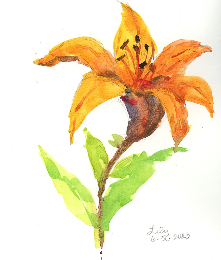
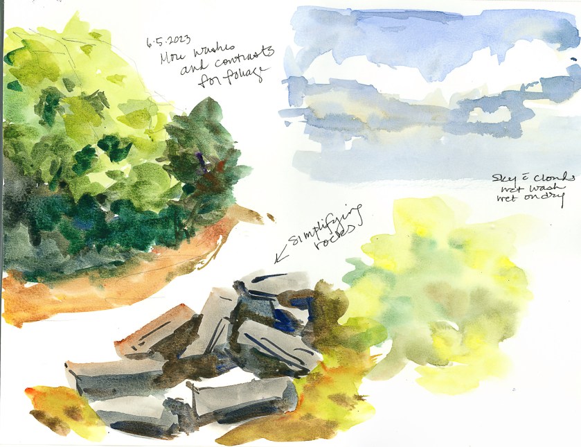
I had a bit of running around to do today, but made sure I had time to play. I am seriously trying to paint or draw every day, not just in between chores and appointments!
Today I was interested in playing with flowers. The first was a plein air painting of one of the lilies currently in bloom on my patio. There are a lot of them in bloom, but I decided one would be enough, to get acquainted with them, even though I see them every day, on a more intimate level. Not a great painting, but it was sort of a warm-up exercise to play with some new colors and palette layout.
I am also using, again, some not-so-great paper, but I am getting used to it. I’ve spent some time getting it sopping wet – not really successful, but I am learning how to handle it. This is important as the next painting – the gladiolas below – was to see if I could manipulate washes on this paper. For skies, this is important especially, or large areas of color. Below, sky, rocks, and mushy trees and a color blob.
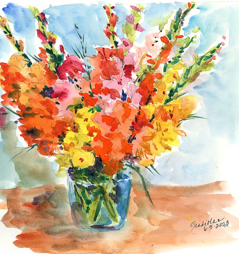
And finally, the one that I spent time and energy on. The idea was to make a painting of gladiolas (which are in a ridiculously short vase given how tall the flowers are!), making large areas of washes, and working in new and different colors as I moved along the flowers. Patience was needed, and a hair dryer helped things along, but thinking and plotting my painting moves with the air of a strategist was also part of the equation.
So, overall, today was a bit of a success. Nothing great, but I am rather pleased with the gladiolas – not the vase, background, or surface, but the point of the whole endeavor. I also am getting more comfortable with the paper and how it responds to lots of water. It is fairly heavy, and described as “rough” so it has a nice bit of tooth, and now that we are getting used to each other, it will definitely be a playground rather than work.
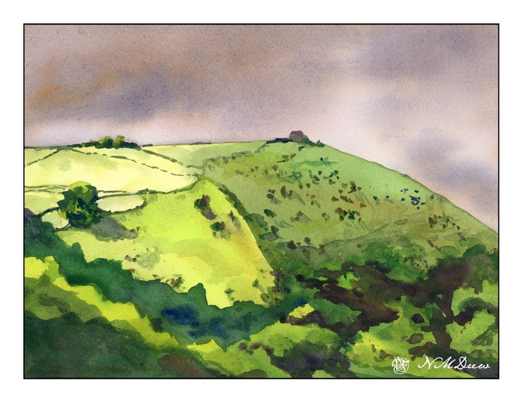
I am having a lot of fun, despite frustrations, with this repeated subject for a watercolor. Today was bit more thought out, and the focus was just planes of washes to create depth, dimension, or at least some attempt at it. I think I am seeing this more and more as an abstract as I work on it – planes of color to suggest the trees along the base of the headland. I dropped a blob of color on the hill that wasn’t in the previous two, and tried to do a bit of a save, but not really successfully. Ah, the joy of watercolor!
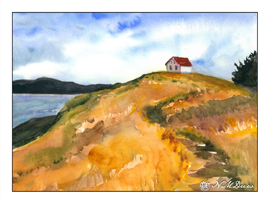
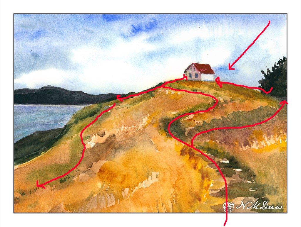
One of the things that is often a point of contention for many who work in watercolor is when to stop – when not to paint any more – when is overworking the painting happening. Today’s study is of a lone building on Saturna Island in British Columbia. It sits on a hill, silhouetted against the sky.
The building itself is not well done – it is overworked. That, though, was not the point of the painting. The point of the painting is the hill up to the house – paint it, work the colors, create depth and dimension and a sense of the vegetation. I worked wet-in-wet; put a few glazes on; re-wet the paper and painted again when I needed to add some detail, such as the shape of grasses or vegetation. I also wanted to create a way to get the eye up the hill to the house, and the pathway itself does the trick.
Composition is also something I was considering. How am I leading the eye to that little building? Above is a an overlay with some of my eye-deas. I can think of more, too, but I could also go nuts analyzing things. The darks acted as a balance on either side of the hill, but the tree on the right is too big as far as I am concerned. It just kept growing – spring??
Finally, values. Lights, darks, mediums. Is my contrast working? If I look, I see the zig-zag of the darker path leading up the hill, but more subtle is the light zig-zag to its left. The darker values on the right of the hill repeat the zig-zag. Various areas of light and dark point your eye toward the building.
I am pleased with the hill in this painting, and that is what I wanted to focus on. It is an oddly shaped mass of color, but within it are variations of all sorts – warm and cool, dark and light – that give it shape and depth.
My current focus on watercolor is planes and dimension. I am trying to break down my ability to create structure, and for me the natural shapes of hills and trees are far easier to work on for now, although buildings will come in the future. Negative painting was a first study, but that surrounds as well as creates other planes and dimensions.