Practice Stones: Fortress in the British Virgin Islands

After working on the cliffs, I also want to work on another item found in nature – rocks and boulders. These are also used as building materials, so why not a building of rocks and such cemented together in the 1600s? I always love stone buildings – or fortresses – constructed of nature’s gift. Stone has been used for millennia, so why not? This is a painting of what I believe is Fort Recovery on the island of Tortola, which I visited some time ago.

The purpose of this picture is not a complete picture but a way of figuring out how the stones might be done. The palm trees are really part of the actual fortress, but I put them in as it helps me see if something works.

The stones are simple but I am experimenting with how to express such rock and stone buildings. I could try to do all of the stones, but what a yawn. More, it is the texture of a building made with the irregular shapes and colors of rocks.

What I have chosen to do here is to simplify the structure – not paint rock for rock – but give an impression of it. The stones in many instances are more round than depicted, but it is on the beach – that gorgeous sand is so bright! – with a few plants and palms and newer construction around it. If I recall, the day was glaring and sunny, very hot and humid as is the norm for the V.I. that time of year, and it was also in July.

Vaduz Castle

We let the butler and staff off for the 4th of July weekend and decided to cruise to Lichtenstein for lunch in the Stratos 714. We needed a break, so we stayed a few days. Beer drinking, fine weather and a bit of plein air sketching with ink and watercolor.

When I draw with ink, I almost never use a pencil. I like the challenge of inking directly onto the paper. I seem to be more successful, too, than drawing in a pencil line and then inking.

Today I used PH Martin’s waterproof India ink. It needs some drying time. Fountain pen ink is almost dry as soon as you write a letter, but because of its nature, India ink needs a bit of time is needed. A hair dryer can help. India ink seems to dry more quickly than iron gall.

The goal here? Play with the ink – an ink I haven’t used since who knows when – see how it performs, and work on perspective, too. That meant buildings. Buildings with right angles are fairly easy to sort out, but I thought a combination of curved walls and right angles might be a bit fun. They were. As well, a bit of distance using varying greens to depict the curve of the grassy hill.

I am pretty pleased with this. Ink first, then color and dry and color and dry and then more color. I had a lot of fun trying to get the slightly uneven rows of stone in the round tower depicted somwhat realistically.

More Podocarpus Trees

I am trying out different ways to paint plein air in my back yard, which is nothing of any beauty being just dirt and podocarpus trees (also called plum pines). It is going to cost an arm and a leg and a first born child to get it done the way I want, but such is life. In the meantime, use it to my advantage – like lots of container plants!

Anyway, I set up a plein air easel on a tripod I just bought for $20.00 and it did a good job. I clipped my large sketch book to the easel and put a lightweight travel watercolor palette on it. I sat on my travel stool. These details are for a future post.

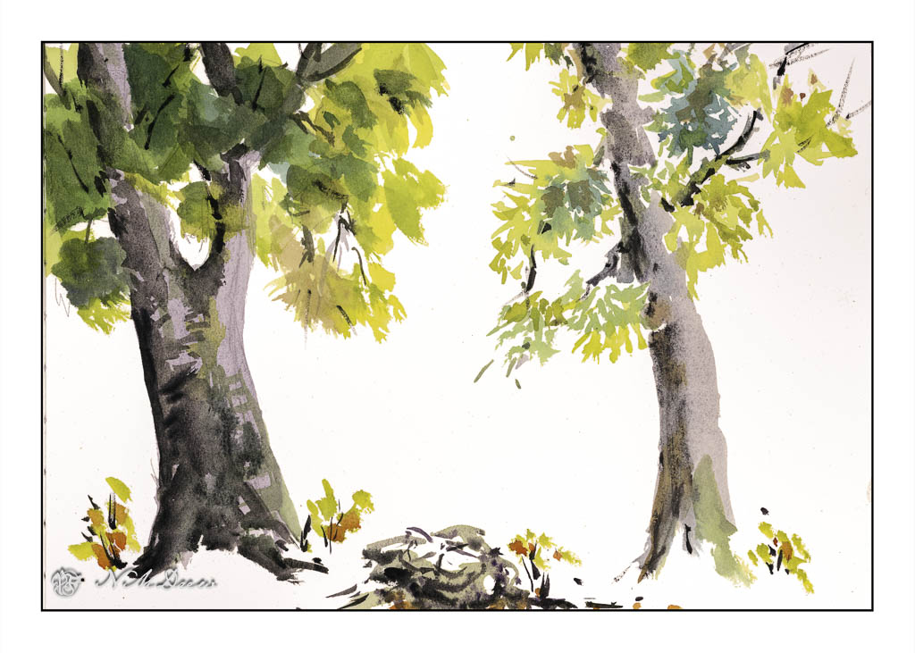
I painted one podocarpus tree with outlines and more traditional ways of applying color in layers; that is the one on the left. The one on the right is direct watercolor. In the middle is a stump in direct watercolor and a few sketchy little camphor tree shoots from the root system still in the dirt.

I painted both trees to practice both ways of painting as well as to check out the plein air set up. With the tripod low to the ground, I could put water and such on the ground next to me. The plein air palette and sketchbook were propped up on the easel attached to the camera tripod. I sat on my stool. Everything was fairly comfortable, within reach and easy to get. The height was good. I think I might not want to sit down for a long time while painting, but it is something I want to experience.

So, though the painting subject is podocarpus trees, the real focus for painting was the plein air set up. It worked pretty good. I have another easel to use, and I think I am beginning to get a nice set up for my future career as an old lady painter in the countryside or patio, depending . . . .

Flower Children, Rocks, Sky, and Mush

I had a bit of running around to do today, but made sure I had time to play. I am seriously trying to paint or draw every day, not just in between chores and appointments!

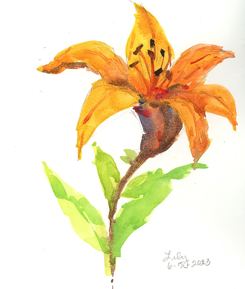
Today I was interested in playing with flowers. The first was a plein air painting of one of the lilies currently in bloom on my patio. There are a lot of them in bloom, but I decided one would be enough, to get acquainted with them, even though I see them every day, on a more intimate level. Not a great painting, but it was sort of a warm-up exercise to play with some new colors and palette layout.

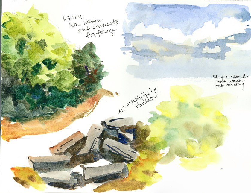
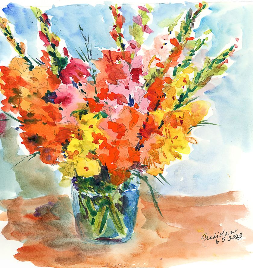
I am also using, again, some not-so-great paper, but I am getting used to it. I’ve spent some time getting it sopping wet – not really successful, but I am learning how to handle it. This is important as the next painting – the gladiolas below – was to see if I could manipulate washes on this paper. For skies, this is important especially, or large areas of color. Below, sky, rocks, and mushy trees and a color blob.

And finally, the one that I spent time and energy on. The idea was to make a painting of gladiolas (which are in a ridiculously short vase given how tall the flowers are!), making large areas of washes, and working in new and different colors as I moved along the flowers. Patience was needed, and a hair dryer helped things along, but thinking and plotting my painting moves with the air of a strategist was also part of the equation.

So, overall, today was a bit of a success. Nothing great, but I am rather pleased with the gladiolas – not the vase, background, or surface, but the point of the whole endeavor. I also am getting more comfortable with the paper and how it responds to lots of water. It is fairly heavy, and described as “rough” so it has a nice bit of tooth, and now that we are getting used to each other, it will definitely be a playground rather than work.

Mas Flores

Today’s post is batch of flowers done in a Hahnemuhle Watercolor Book instead of the sketchbook for yesterday’s post. Today I am using a “real” watercolor sketchbook that has watercolor paper in it. I could work with a lot more water without getting blooms or having the paper buckle as in the other book.

I also used tube paints that were on my palette, but found that the paint, having been there for awhile, was very dry. It was difficult to pick up paint in large quantities – just like on the pan paints. To fix this, I put several drops of water on each color and let it sit for awhile – maybe 10 minutes. Misting water on doesn’t suffice – I needed a small flood!

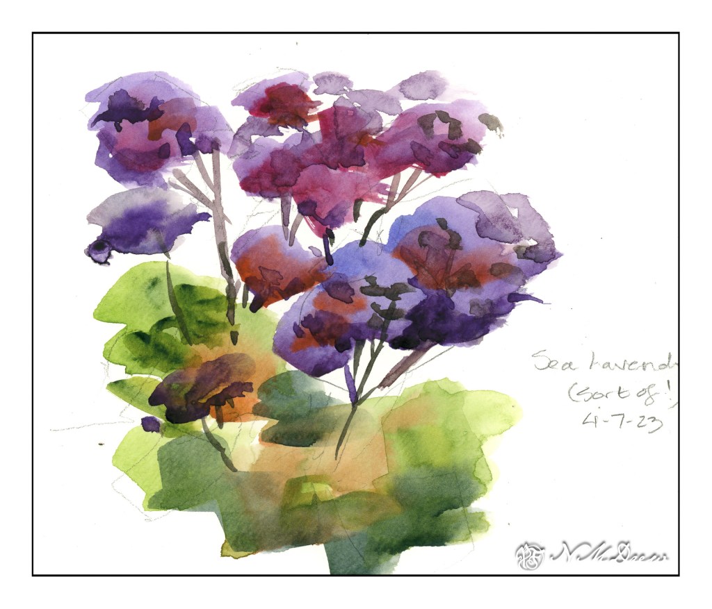
One thing I have done here is to focus on negative painting as well as carrying a plane of color with varying colors along the page. I tried to work light to dark, but other times I worked around the light areas to give them shape. All this is play, experimentation, just doing and then observing, thinking about what I did and what I want to do.

Outcome? Thoughts? A few of my own:

  • quit dabbing!
  • use really wet, saturated paint
  • use paint more directly without glazing
  • values

None of these are any good. They show my painting faults to a glaring degree. However, as practice, it will do very well.

Well, gotta run!