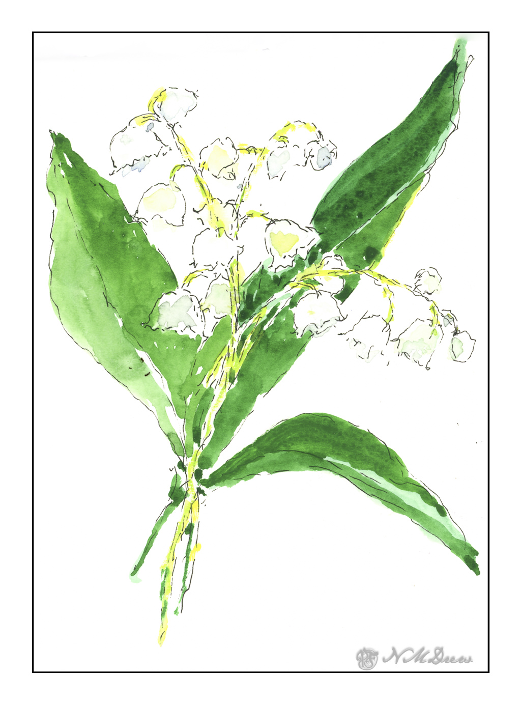
For me, lilies of the valley are spring flowers – late spring, for sure, but spring nonetheless. They are not native to California and certainly cannot survive the heat we get, but you can grow them in cool areas. Short-lived, they add a bit of beauty and mark the transition into summer.
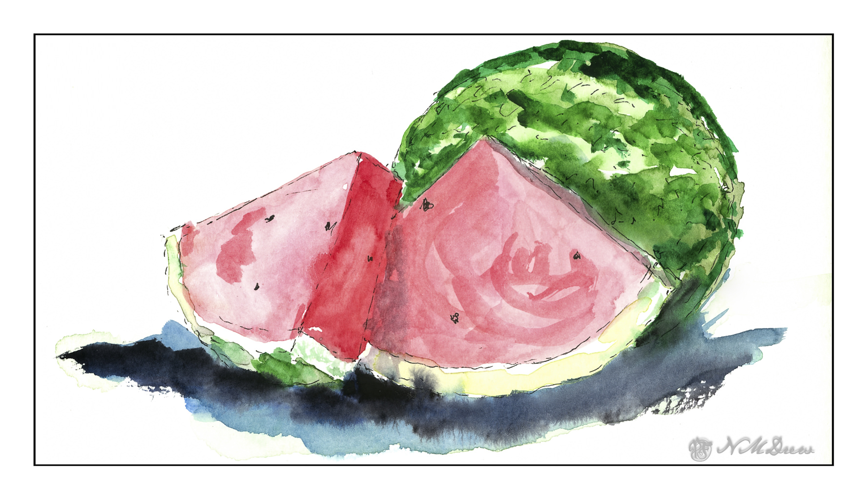
Today is cool and grey – May Grey for California! – but it will warm up later on. The sun will come out inland – we live one valley in from the Pacific – but may not show itself along the coastline. Our spring has been wet and gloomy with bits of sunshine in between, but as we move toward summer, heat and watermelon and cold drinks come to mind. (Meanwhile, I am enjoying my hot morning coffee!)
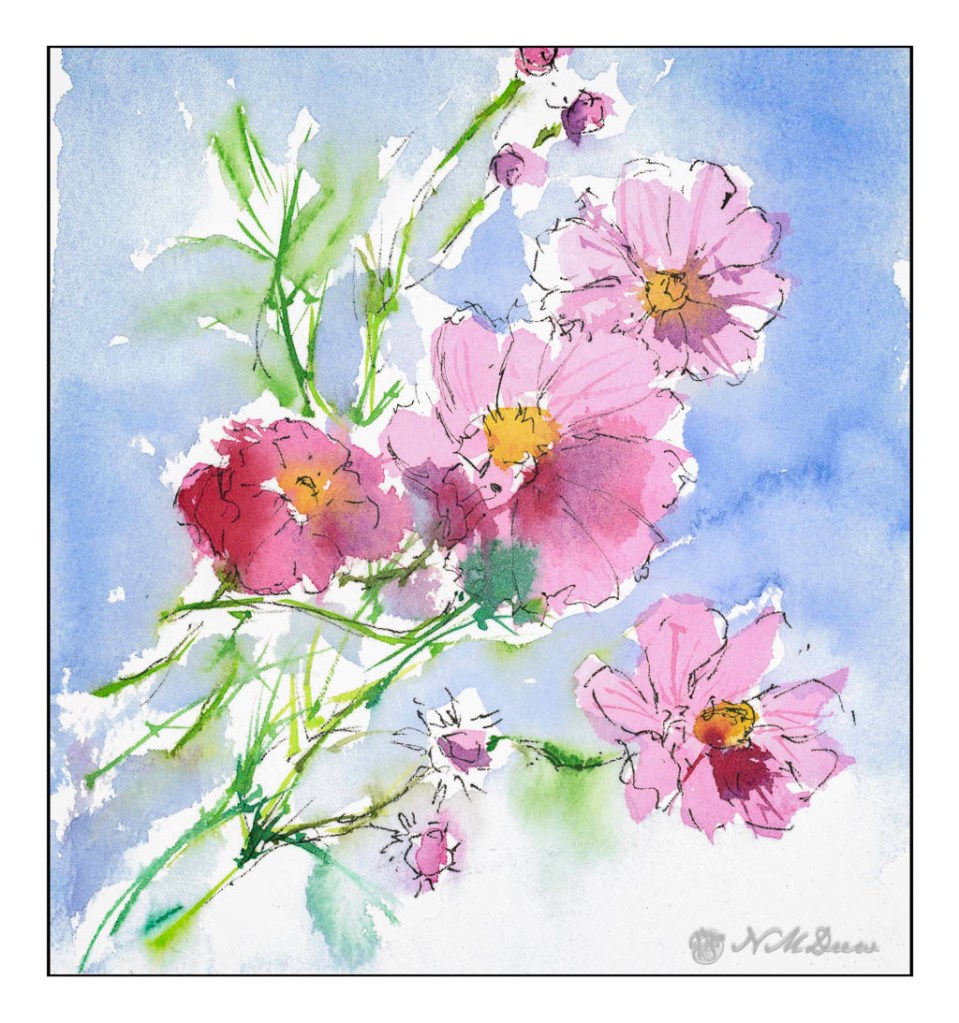
Seasonal transitions – things to say goodbye to, things to welcome. I myself have been in a phase of transition, too. I am learning to play the ukulele, working on oil painting sewing, gardening. All of these take time away from blogging, which is rather nice, really. Still, the fact is that ink and watercolor, individually or together, always beckon, so before I even started the day, my sketchbook came out, colors and ink. It all makes for a good way to start the day, beating dishes and laundry and other housework by a good ten miles!