Cove

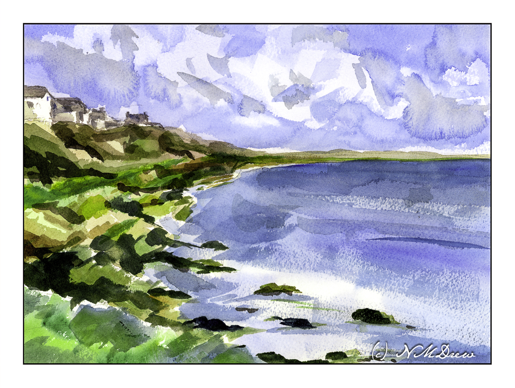
What can I say except this was one hell of a challenge! I wanted simplicity in the form of abstraction combined with atmospheric perspective. Well, the day is crisp and bright, a bit windy, and the light is harsh. Somewhere in there lays a bit of compromise.

The largest areas of the painting -sky, water – were laid in with very wet washes and allowed to dry.

The clouds were lifted out later and more blue, wet paint applied over the initial light wash. Shadows and shapes were created during this step.

The sea was a light wash with simple areas of white left behind in the foreground. Somehow the rest of it sort of happened using a large, flat brush. I find using flats really helps push the abstraction. The same can be said with the shoreline, using color to indicate plants, rocks, cliffs. The most “planned” part of the coastline were the houses and roofs. Dry brush with darker blues were applied with a wide 1″ brush to give the sea some dimension.

I had no idea how this painting would turn out. I like it for the simple fact I did achieve my desires for a simple, abstract painting which still has recognizable subject matter.

Wouldn’t it be great if we all liked everything we did? Maybe not – then we would probably never progress!
Outgoing Tide

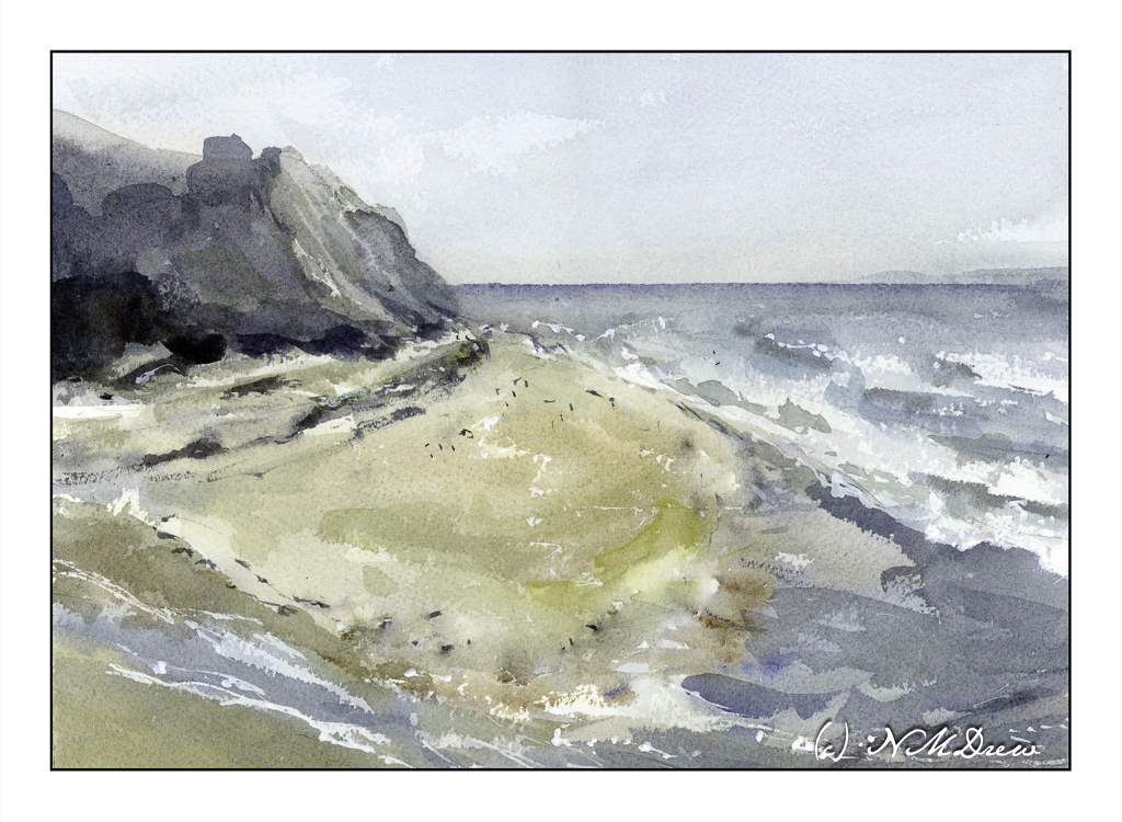
After considering the intensity of colors of my last posted painting, I thought about trying something a bit more subtle. In landscapes that usually means fog and damp – and that can be a challenge in itself. Muted colors, subtle gradations, diffused light, soft edges – with watercolor, a lot is chance and a lot is forethought, and a lot is knowledge acquired by experience. I see each watercolor painting as an experiment and adventure and while sometimes things “just happen” or I am too impatient, a bit of thinking ahead doesn’t hurt.

Here, a pretty limited palette of indanthrene blue,ultramarine blue, yellow ochre, burnt umber, and perhaps a dab of this or that. I use carbazole violet often when I make deep darks, sometimes a bit of ivory black to neutralize a color a bit. Here, I also used a bit of liquid frisket to keep some areas of paper white, such as in the water and along the shore. Titanium white gouache also was applied intermittently for a bit of bright white.

Watercolor, 10×14, Arches Rough 140#.

Above the Bay

Back to California, Edward Seago as a mindset.

Up north along the Pacific are many beaches with dramatic cliffs, sandy beaches, fog, and it is always exciting to drive along the coastal route – usually Highway 1 – to enjoy the scenery. Sometimes you need to wander a bit off the beaten path to find a bit of paradise, but exploration is always fun!

I don’t remember what colors I used specifically, but I do recall ultramarine and cobalt blues, burnt sienna, yellow ochre, cadmium yellow, Hooker’s green, and possibly a bit of alizarin. The scene is a bit soft because the coastal fog, prevalent along the California coast, is in the distance. The air is moist. And, it is chilly! Mark Twain supposedly said the coldest winter he ever spent was a summer in San Francisco. You know what I mean if you have experienced it!

We all have our own styles and methods of painting, and in some ways I like the way I paint, in other ways I dislike it a lot. Here, I focused on simplification but in some areas did a bit more working of a subject than I should have, such as on the right distant cliffs, ocean, and sky. The estuary below the headland is simple enough – at least I realized that and didn’t do anything more to it. My bush is also okay, but perhaps it could have been simpler – or the foreground, too – but when something is close to the viewer, details do become important. Each leaf and blade of grass, though, would be excessive.

Hahnemuhle 9×12 140# CP paper, watercolors, Northern California.

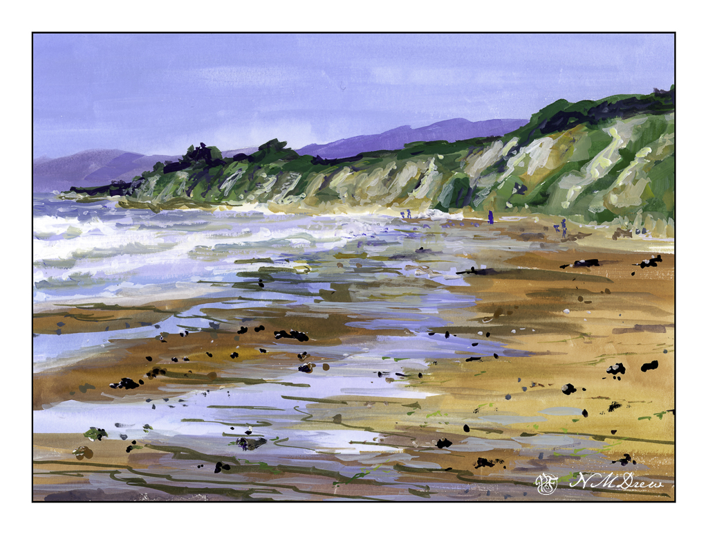
Coastal Beach

Where I live there are so many wonderful beaches in our county, to the south, and to the north. Just pop onto Hwy 1 / 101 and off you go! Some are wide and flat, such as in Carlsbad, others are easy to get to even if they have cliffs, and others are quite rugged.

Santa Barbara County has a lot of really great beaches. When I lived there, I had a lot of favorites – Butterfly, Hendry’s, and Goleta Beach. This is a view of Goleta Beach facing north. It is very typical of this section of California – sandy beaches, friable cliffs, Mediterranean vegetation. The coastal range is often right at the ocean’s edge and can create some dramatic views from the shoreline. I really like our beaches!

The biggest challenge here was the water, both waves and the damp water on the sandy shore. Putting people in was not too hard – just a few blobs to make the blobs people shaped. The foreground rocks were a bit of a challenge – I wanted enough detail to make them believable but not too detailed. I am pretty pleased with the cliffs, distant mountains, and sky. Overall, I think this painting turned out pretty good.

Gouache, Strathmore Vision 140# CP paper, 9×12.

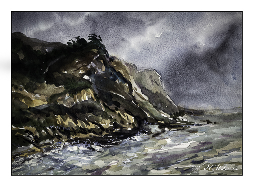
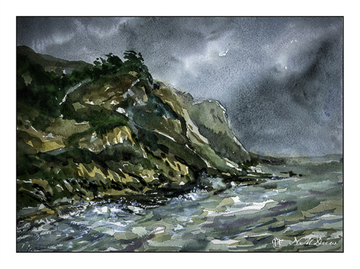
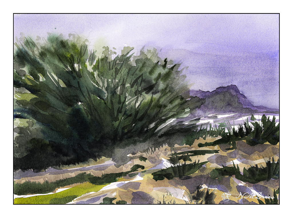
Impressions of San Gregorio State Beach

Scanning – sometimes I love it, sometimes I hate it. It is usually better than trying to take a photo of a painting though . . . .

I used Epson V600 Epson Scan on one of these; VueScan on the other.

Above was done using VueScan. It captures the colors better but is a bit dark. Below, the greens of the trees and bushes are better captured.

More of the colors show up using Epson Scan, but they are a little too intense.

Sigh.

The fact is that scanning and post-production can really influence how a painting looks. This goes whether the painting is scanned and interpreted using software, or photographed, and then interpreted and adjusted using software. If you look up a painting on the internet and then look at all the images of it, you know what I mean – colors can vary dramatically.

All this techno speak aside, I like them both for different reasons. Both do capture the moodiness of the original watercolor, which I like. Perhaps that is the most important thing – the mood is caught?

Watercolor, Arches 140# CP, 10×14.