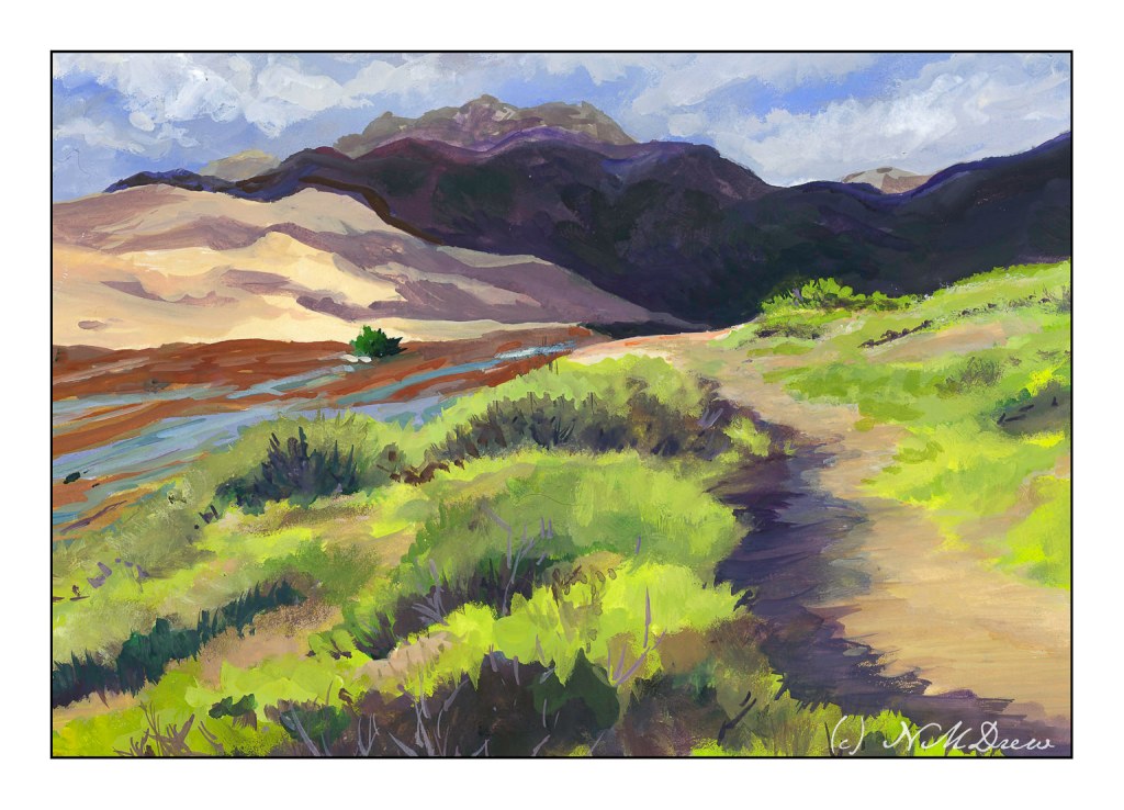
The tallest dunes in North America are the centerpiece in a diverse landscape of grasslands, wetlands, forests, alpine lakes, and tundra. Stay on a moonless night to experience this International Dark Sky Park’s starry skies.
I never ceased to be amazed by the beauty of the natural world.
I cannot believe it has been over 3 weeks since I last posted here! Suffice it to say I have been busy with learning how to handle oil paints and some drawing, and really not in the mood to look at the computer much.
That said, today a trip down to Pasadena’s Blick store was a fun morning’s journey and got my mojo going again. I didn’t spend too much, but did pick up some colors in oil and watercolor from brands not available locally (and that is not to say we don’t have a fantastic store nearby), and just had fun wandering around a well-stocked art store. The esposo did the driving as I am not a big fan of driving in L.A., even on a Sunday morning.
Anyhoo! I am trying a more subtle approach to my watercolors – perhaps less bright, more delicate? As well, trying to convey depth better along with leading the eye of the viewer where I want to go. Not too sure if it is working, but the process is fun.
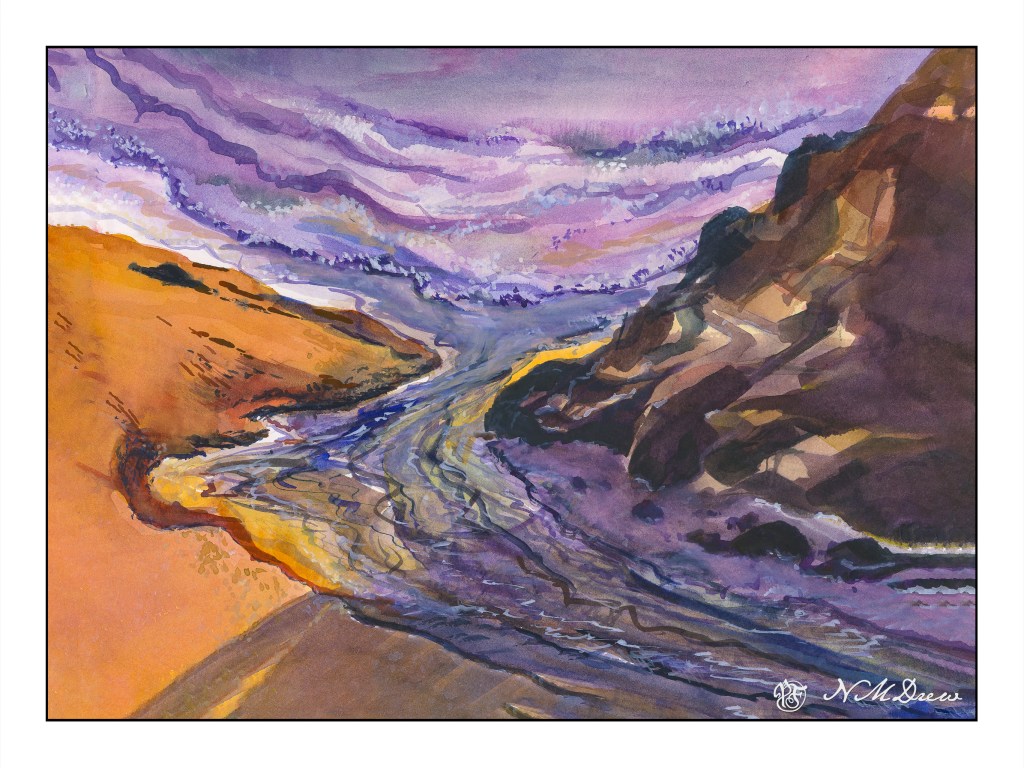
It is always worthwhile looking at the works of various painters, regardless as the medium in which they are creating. The works of Edward Seago have a charm to them which is old world, peaceful, and hearkens to a quieter and simpler time. This painting is based loosely off one of his oil painting of the eastern English coastline. What attracted me was – and is – his vast skies. The low lying shoreline beneath such a magnificent sky is worth trying out. The same may be said of the watercolors of Edo Hannema – he, too, finds the work of Seago, and Edward Wesson, as sources for inspiration.
In Southern California, the sky, where I live, is almost always blue. No clouds, little haze. Humidity sits at zero. (I won’t discuss the vast amount of lotion I use!) However, the big skies of the midwest with towering clouds, or the piles of clouds over New Mexico, are in my memory, and so the clouds and moist skies of a wetter clime draw me.
Here, I used the 1.5 inch flat brush for 90% of the painting, resorting to a small flat brush – 1/4 inch – for some detail. Large washes, wet into wet, some glazing. Paper is Arches 140# CP, 16×20. The large brush is becoming a favorite for sure!
The large brush helps me keep my colors clean and think about masses rather than details. Big to small. I am also refreshing my water as I move along – this took about 2 or 3 refreshes – and cleaning off my palette, too. With a large brush, large washes, a lot of color is used. Clean palette, clean water, and, of course, a clean brush. The results are beginning to be seen.
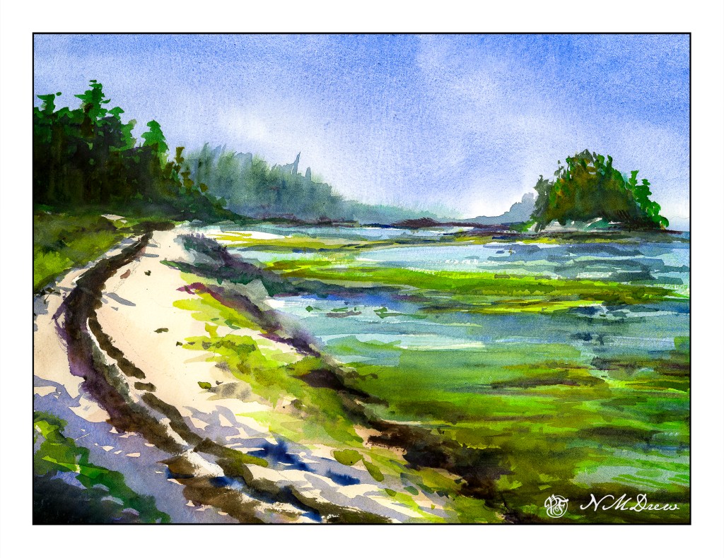
The same painting, scanned with an Epson V600 and merged. However, two different software were used to merge. One was Microsoft Ice. The other was the photo merge bit of Lightroom. It’s hard to really tell which software impacted the final image more as both were manipulated a bit in post. However, the difference was that the LR version had dark paper around the edge and was rather muddy. The MS Ice was lighter and more clean in overall appearance.
This is the image merged in Lightroom. .
This is the one merged in MS Ice.
It’s hard to see the difference in some ways, but I think either is fine to my eye.
Anyway, I am rather pleased with the result here. I think I got the depth of field properly done for once. Perspective doesn’t seem off. The sandy berm really pleases me because sand is hard to do! I mixed together ochre, alizarin, and cobalt blue and then added a gallon of water to make the wash. The shadows are ultramarine with a bit of carbazole violet.
Another thing I like is the murky, seaweed filled foreground on the right that fills the shallow water. And, too, I did some justice to the reflections of the island in the right background. In the end, I applied a light glaze to the foreground water on the right and to the grasses to the left of the sandy shore in the middle left background. Painted on 300# Kilimanjaro from Cheap Joe’s.
I have few other WIPs, but they need a bit more consideration at present.