Flat

I normally tend to use pointed round brushes for watercolors, but every now and then I pick up a flat brush and use it throughout a painting. The other day I noticed some inexpensive flats on sale in a variety of sizes, so I picked up a couple to add to my collection. Now I have .25, .5, .75, and 1.0 inch flats, some firm, some soft. And tested them out.

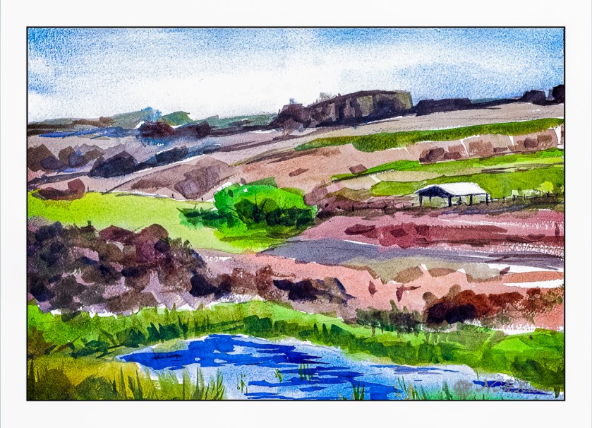
Epson Scan used here – too lazy to putz around. The blue in the sky is granulated and light in color, but the blue in the water is too blue. The rest of the colors seem to be okay.

A flat brush is rather versatile. The longer edge makes for wider strokes, obviously. You can also load your brush with one color on one side and another color on the other side, and when you paint on wet paper, the results can be interesting. I didn’t do that here, but am writing this to remind myself I need to do it a bit more! The narrow side of the brush can give very nice straight lines, as you can see in the hay canopy in the mid-ground. Sharp edges, like in rocks can be easily expressed. Squiggly lines can also be achieved as seen in the too-blue-to-be-true water.

Watercolors, flat brushes, limited palette.

At the End of the World

Today and yesterday were really rather discombobulating. Does getting older mean you are more set in your ways and less able to adapt to changes in the daily routine? Either that or my allergies just make me a bit crazy – this morning I had one of my sneezing fits where I sneeze about 30 times in a row. That is exhausting to the point I need a nap.

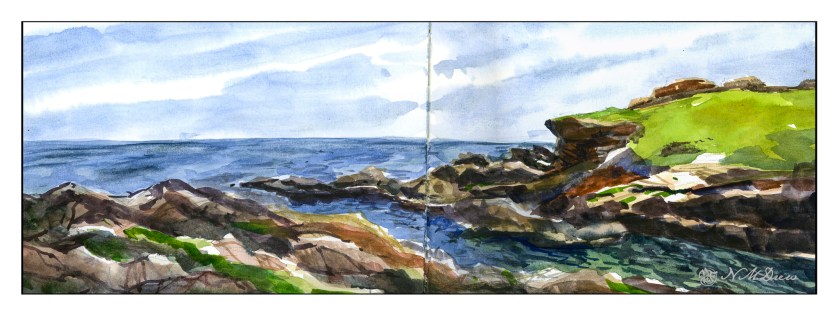
And nap I did. But then I decided to do something creative, and back to watercolor (my real first love in painting) and work on something idyllic, wet and watery, full of rocks, and put it in my sketchbook so I won’t take myself too seriously.

Click on the image to enlarge!

The Strathmore Vision paper works really well with little re-working of any part of the painting. I decided to see how the sketchbook would do with the same approach, as well as the more personal challenge of being more direct in color application.

With watercolor, many artists work with very wet paper, and while I like that, I prefer to have wet paper – as for the sky and the sea – but I also like to have layers. If you paint into wet color, your next incursion must be more pigment and less water than you are moving into, otherwise you get what are called blooms or cauliflowers. You can also paint onto dry paint and these won’t occur, and you can use thinner or thicker paint – less or more pigment combined with water. My sketchbook has good paper – far better than the Vision paper – so I could do all these things, and did.

First, wet the sky area, then drop in stripes of blues. Next, wet in the water, from horizon to the inlet area, all in about the same shades of blue, but darker than the sky. Let that dry. While that is going on, I painted in the greens on the right, blending colors into each other for gradations of green. The rocks, too, were painted with varying colors, working to leave bits of unpainted paper for a bit of pop and to indicate areas with more sun that shadow. Slowly I put in details, such as the waves or ripples in the lower right of the inlet, cracks in the rock, and so on. Large colors and masses first, finalized with contrast and detail.

I am pleased with this painting. I accomplished my task of direct painting with some modification – not a lot – later as I moved into detail. I drew in the general shapes with a pencil. The foreground rocks on the left and bottom were a challenge, but I think I have enough detail to make them interesting but not distracting. The same with the land mass on the right. Overall it took about 2 hours to do complete this watercolor.

Watercolor sketchbook, watercolor, about 7 x 18.

Red Building on the Pier

After playing around with the Strathmore Vision watercolor paper, I used it for today’s painting. Knowing its strength lies in painting directly on it with little to no lifting or scrubbing, I had to reset my thinking for this painting.

First, I did a pencil sketch on the paper, working to get proportions and placement of the bits and pieces in fairly good proportion to each other. From there, I worked as directly as possible to get values and colors the way I wanted them. I moved around the paper, too, laying in big washes and areas of color before adding detail.

First, the foreground rocks. The wash was laid down to get the ranges of tonality and vary the colors within them. Once dried I added the darker areas to create shadows. If you look, you will know the sun is coming from the upper right, and thus shadows will be toward the left.

Next, the sky. It is a very flat sky so I did a wash of a blue mix once I had dampened the paper, carefully working around various shapes. From there, the red of the building on the pier, working around the light uprights. Then, the green of the trees in the distance, being careful about the roof. Finally, the water.

Once all this was dried, the little things began, such as sorting out the supports and boards on the pier, some rock details, and the ripples of darker blue on the water.

This painting took me quite awhile as I tend to splish-splash and be quite impatient. This time around I worked hard to consider the colors and the paint before placing them on the paper. My mind is fried! Still, even though it is not by any means a great watercolor, I do like the way it looks – there is a bit more freshness to it than some of my other ones. I ordered some Sakura Gelly pens in white for better details for more delicate areas – I couldn’t find mine at all.

More watercolors to come, but I am going to use my 100% cotton Arches and try this same approach – more direct and thoughtful. I am curious as to how I will feel about Arches absorbency vs. the Vision. The Vision paper works rather well in this area – a good balance of absorbency without drying out. Surprisingly, even with a fair amount of water, Vision does not buckle as much as Canson XL does, and it seems quite capable of handling water when applied over the entire sheet without a problem.

Both Canson and Vision have problems with lifting color or scrubbing, and in many ways I think continuing the usage of Vision will force me to retrain my painting techniques a bit by requiring patience and forethought.

More Rocks – A Rocky Shore

It is always good to break up your routine. I have been sewing a lot over the last few days, and I am now ready for a change. I am also contemplating modifications to what I was making, namely pockets for a kit car. While I contemplate that, other things prevail! Today, I did all those fun things you have to do – specifically, clean house. A friend is coming in from overseas tomorrow, and I have no idea if he will be coming to visit, so I figured I better get it done. Who wants to welcome a guest to a dusty, dirty mess?

But messes are not really interesting to me. Color is.

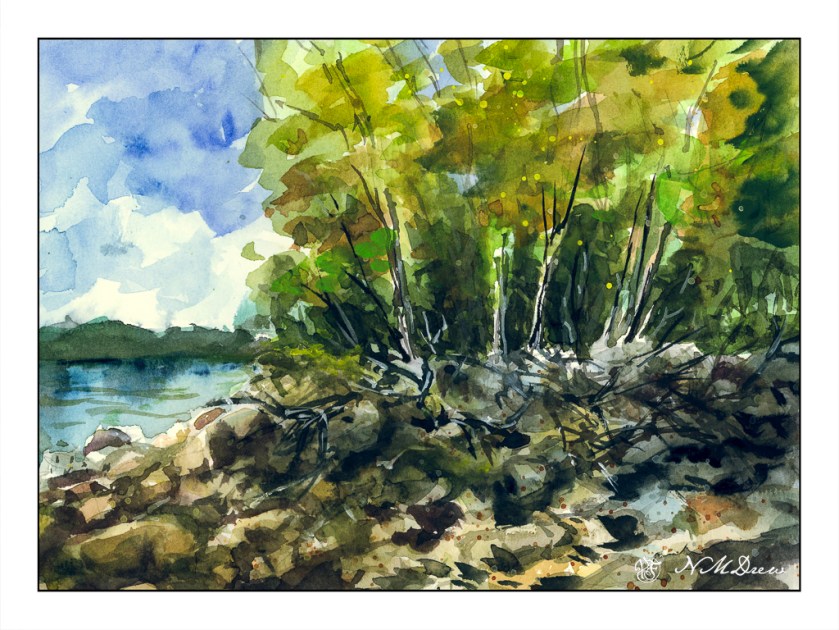
So, back to the rocks in a quick sketchbook painting. In the US and elsewhere, some lake shores are not covered with soft sand, but are home to boulders and rocks at the edge of a forest. Trees fall and die, water freezes and thaws, snow and ice and heat and sun all wreak havoc as storms of all sorts come and go. I love the wildness of these places and their lack of order and tidiness imposed by civilization.

Today I wanted to express rocks in a more abstract manner – suggesting boulders and rocks. Fallen trees, too, and the edge of the summer as it moves into autumn. I splashed on some light washes in the trees and on the shoreline after doing the sky, and from there worked with negative painting to create the rocks and boulders.

I rather like the rocks, but in general, the painting is nothing much – I just like to paint some sort of picture when I am practicing things.

Misty Coast – 2 Versions

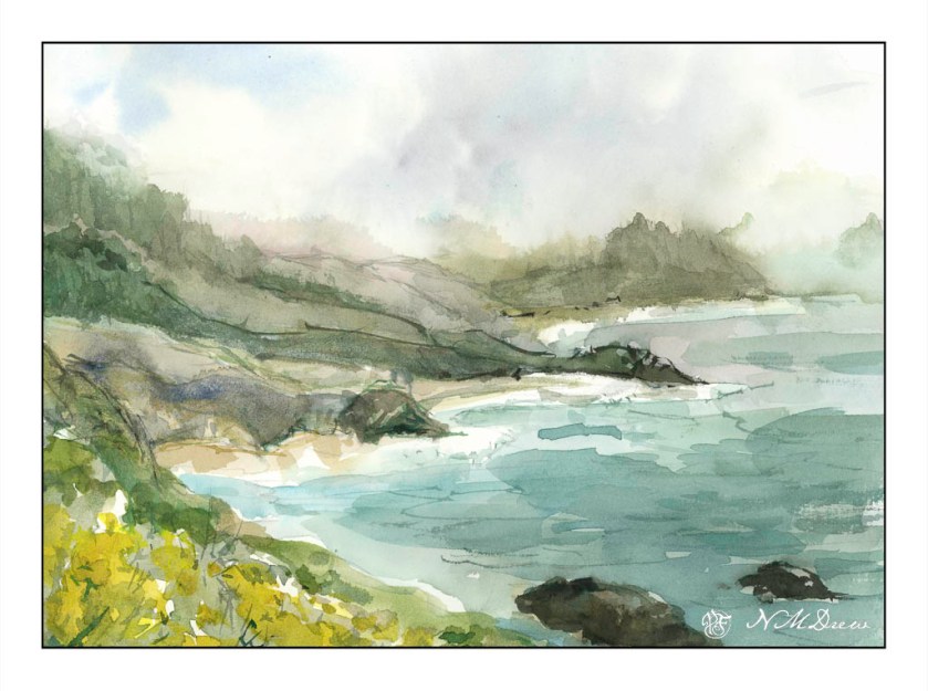
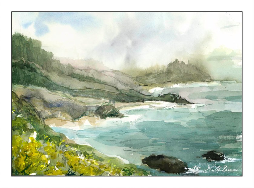
Seldom are my watercolors subtle in color. Instead, they tend to be bright and rather garish. Today, I focused on a softer color while painting, meaning more delicate colors, more muted tones. The reason for this is I was driving down to the Valley for an appointment, and I was noticing the soft, hazy qualities of the air. Greens were light and delicate, flowers alongside the roads, while strong, were not a brilliant yellow. In the distance hills and mountains were soft, blurring into the distance – still clear, but very, very soft.

This motivated me to see if I could accomplish something a bit more subtle. I looked at a picture of the northern California coastline, which can be rugged and foggy, with mists rolling in and out, obscuring and revealing at any given time.

Below, is the first painting. I used a lot of water to paint with as well as dilute my colors. This makes them more pale. It seems to have worked fairly well.

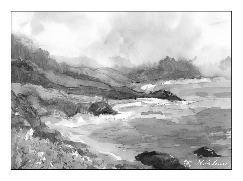
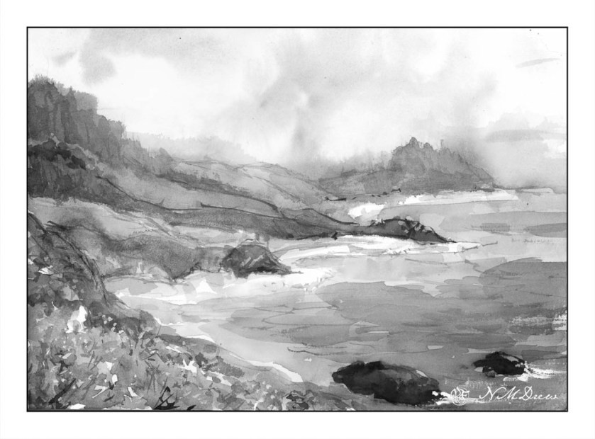
To test my theory of a softer, more grey image – longer grey scale – I turned the painting into a black and white image by both desaturating the same image above, as well as removing all vibrancy.

As you can see, there are a few areas which are very dark, but there are a lot of shades of grey, most of which fall into the arena of middle values.

Below is the “revised” version of the first. Here I added some white gouache to the rocks on the lower right, helping define them and to give a sense of breaking water. I cleaned up – removed – the turquoise streak sitting in the middle of the painting. Finally, I mixed some bright yellow and gouache to add dots of color to the lower left of the painting, creating a bit more defined foreground and to break up some of the edges.

I prefer the second version. However, you will note that the values remain the same for the most part below.

To tell the truth, delicate watercolor frighten me! They require a more delicate approach to the paint and water combinations. This was really a good exercise for me and I can see some more follow up paintings along this line. They do not even need to be misty, but just perhaps more pale but still with good contrast.

Where I live, it is quite dry, so those of you who live in more wet and damp climates have more water vapor in your atmosphere than we do. You can see this when you compare watercolorists’ work from other parts of the world, such as Britain or Holland.