Today I spent the morning running errands and doing chores, the afternoon playing with a friend and doing some photography. The day went by delightfully, but there is that need to pick up a brush and some paint. I wasn’t in the mood for trying to make a painting of anything, but the idea of waves and oceans has been going through my mind, and now it is time to get some ideas on paper. So, of course, YouTube comes to the rescue, and I found a nice, simple, easy video by Paul Clark.
Paul Clark’s videos are informative and easy to follow – as well, I like his presentation style and his paintings. In the above video, in 20 minutes, he shows how to paint water in increasingly more complex ways.
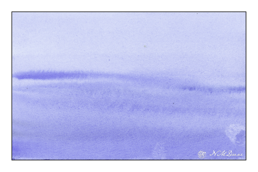
Above is just a simple, gradated wash, with the greatest density of value at the bottom of the page. From there, some paint is lifted, and while the paper is still a bit damp, more lines of color are painted into the blue, wider ones at bottom and more narrow at the top to suggest distance.
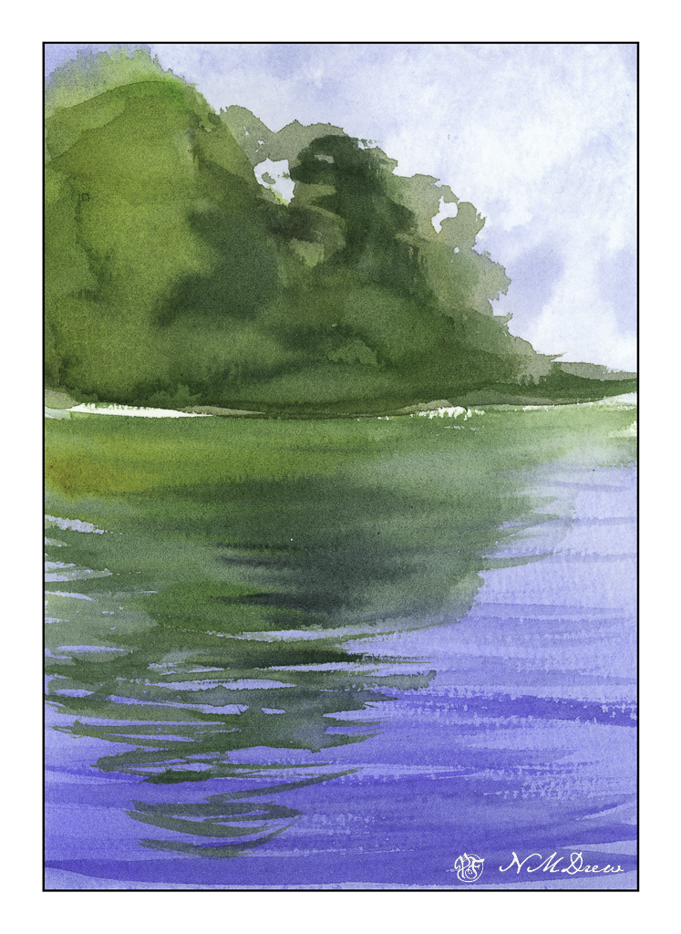
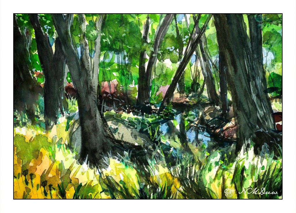
The next is reflections of trees on a lake. The trees and sky were painted first and allowed to dry. The water was then put in, using a gradated wash, darkest at the bottom. Time was given to put in suggestions of waves or reflections – this required waiting for the paint and paper to dry. The hair dryer is perfect for this. Watch how Clark does it in the video as it get a bit more complex than what I am describing.
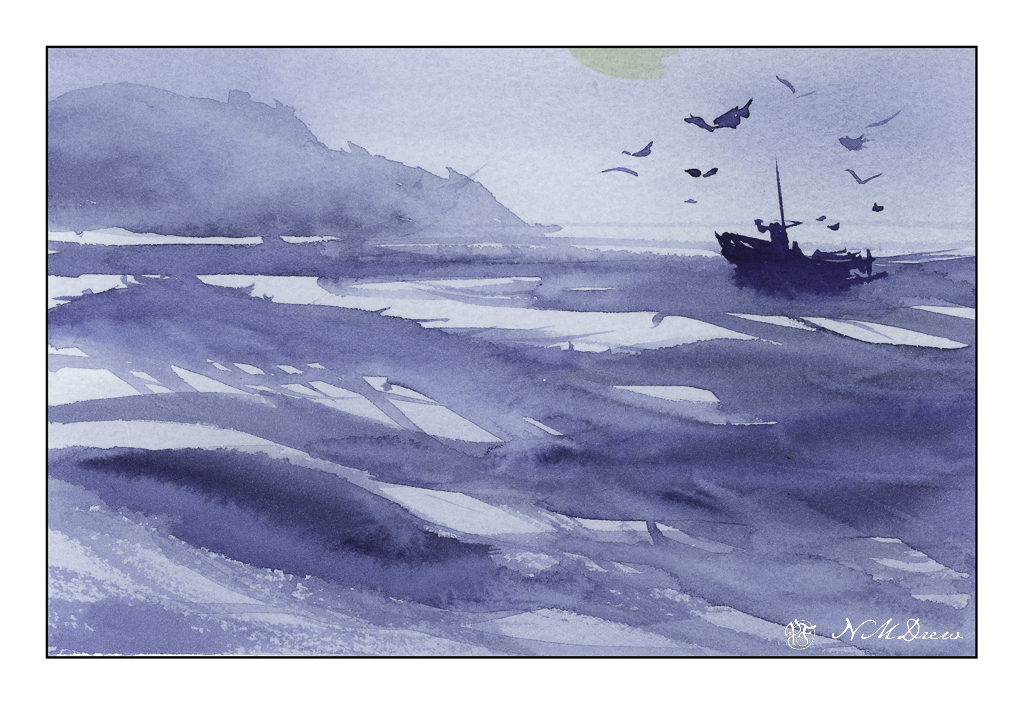
The third one is done with one color of paint. I used a bit of what I had mixed on the palette – ultramarine and indanthrene blues. Clark’s painting is far better than mine, and we will leave it at that! I want to return to the video to watch it again as I know I worked really quickly – too quickly – to catch all the fine points.
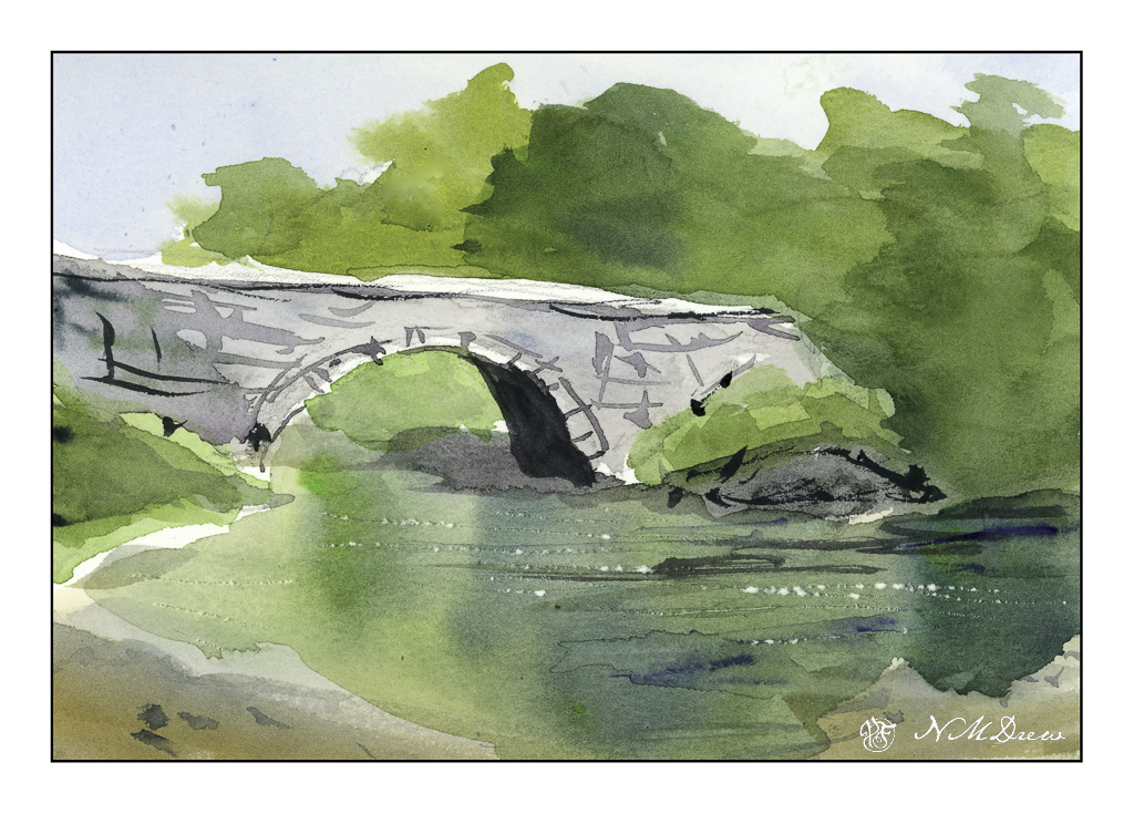
From the ocean we now move inland, to an old bridge spanning a river. I think was my favorite one, and I was quite happy with my results. The white sparkles of light on the water is done by using a knife point to dig a bit into the paper. Techniques varied here; again, refer to the video.
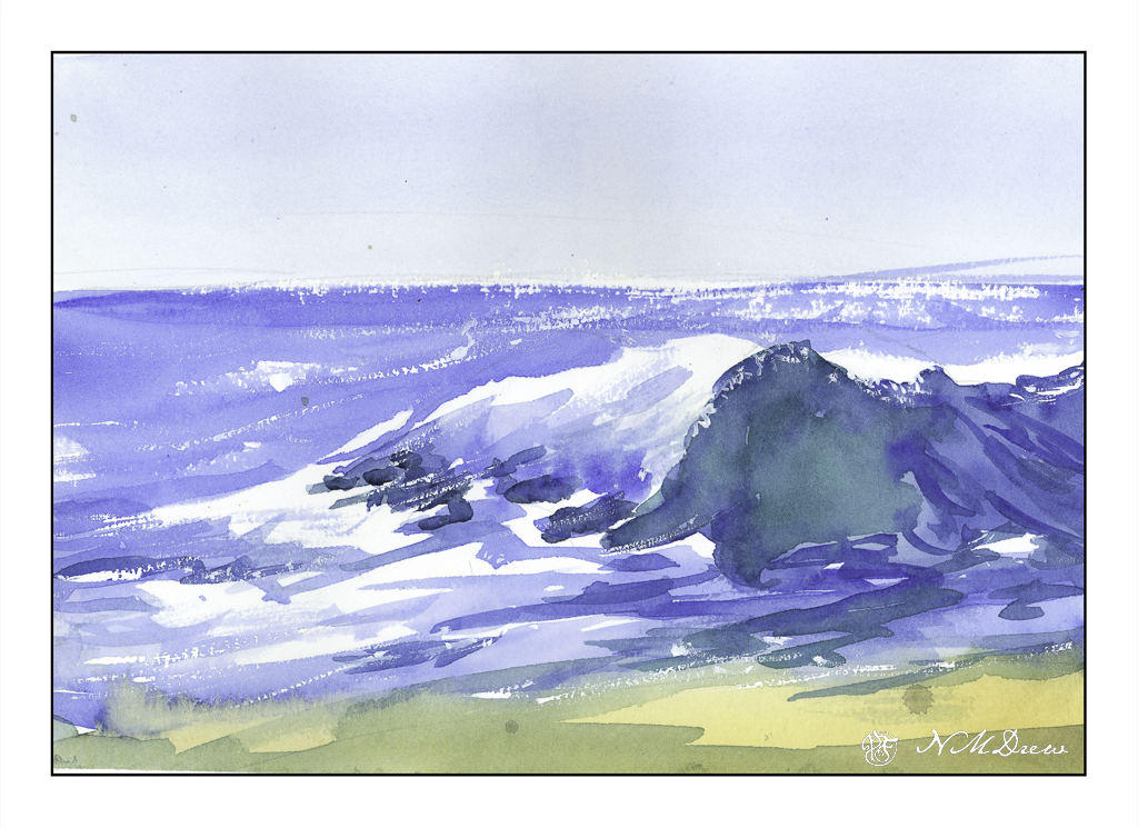
Now, back to the beach. My painting is quite clumsy in a lot of areas. I rather like the sparkly water on the horizon, and the way my white gouache dry brush adds to sparkles. While my painting is definitely that of an amateur, I have a better sense of what to look for, to see, in a wave. The idea I had initially was to learn a bit about crashing waves, and this one is a good introduction to them.
Altogether, I spent about 30-40 minutes doing these studies. I watched and paused the video for each painting exercise, and then went to work. The goal is to do and practice, not create a beautiful work of art. The act of painting is what teaches me initially, and then I can analyze a bit more to hopefully create more successful whatevers – here, waves and water and reflections.
Practice is something a sketchbook gives room for – a playground to explore. Paul Clark’s videos are really nice and I do suggest them. Meanwhile, it is time to go to bed!