Scanning my watercolors shows me the flaws so readily – ones I don’t see when painting!
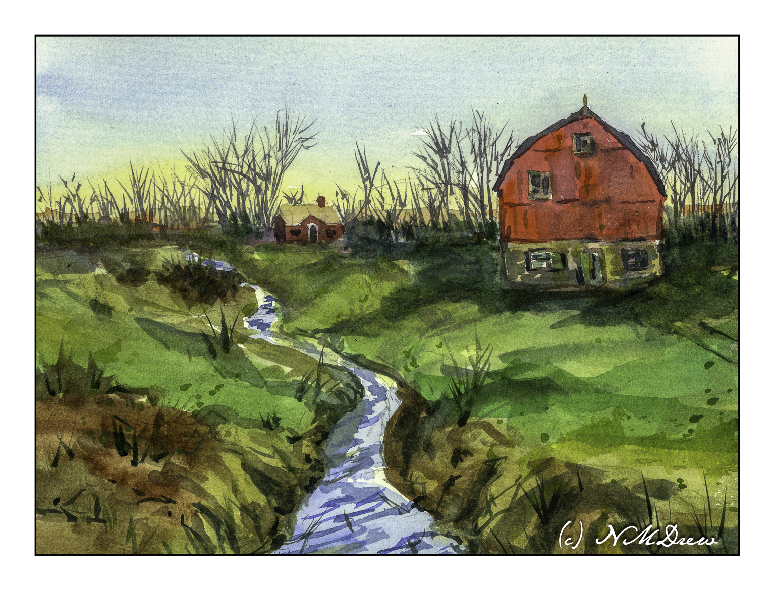
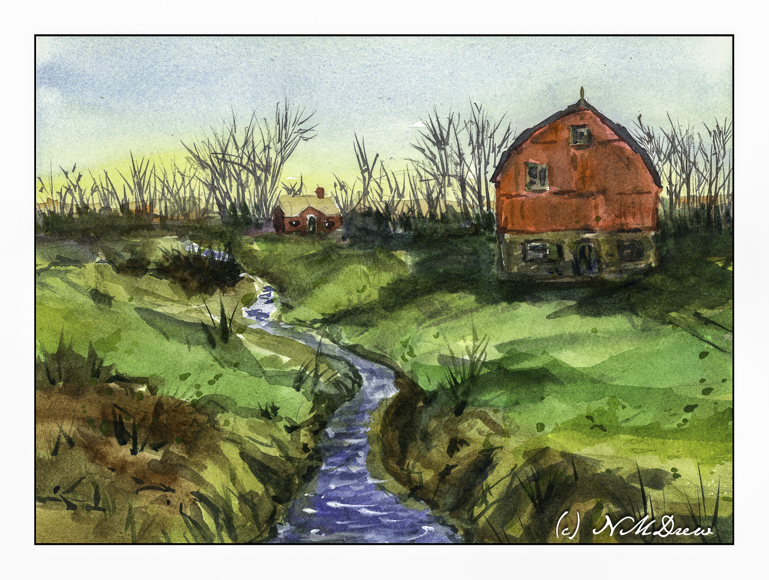
When I looked at this scan, the creek in the foreground looks definitely off! I went in and repainted it, and the second scan showed more wonkiness. Finally, just a heavy application of blue on the river / creek (whatever!) and some zinc white gouache in straight lines, and the geographical problems were somewhat solved.
Overall, not really thrilled with this painting. I like my sky and the spindly trees in the distance. The barn and house were one of my rare attempts at buildings. The barn seems really out of place for the environment – too big or something. The little house is okay. I tried to show the banks of the creek and the terrain leading down to it using color swaths in directional lines, horizontally and vertically. Meh.
I cannot believe it has been over 3 weeks since I last posted here! Suffice it to say I have been busy with learning how to handle oil paints and some drawing, and really not in the mood to look at the computer much.
That said, today a trip down to Pasadena’s Blick store was a fun morning’s journey and got my mojo going again. I didn’t spend too much, but did pick up some colors in oil and watercolor from brands not available locally (and that is not to say we don’t have a fantastic store nearby), and just had fun wandering around a well-stocked art store. The esposo did the driving as I am not a big fan of driving in L.A., even on a Sunday morning.
Anyhoo! I am trying a more subtle approach to my watercolors – perhaps less bright, more delicate? As well, trying to convey depth better along with leading the eye of the viewer where I want to go. Not too sure if it is working, but the process is fun.
Module 2 – Study 2 – Andy Evansen’s “Watercolor for All Seasons” Class
This is my second foray into the series of photos Andy Evansen has posted for studies in the second module of his watercolor class. Here the focus is on value studies.
One of the things I am attempting to do, from both my classes with Evansen and with Ian Roberts, is to work on value. Evansen is a watercolorist and Roberts is an oil painter. Evansen demonstrates the use of a value study on his YouTube channel by creating the middle value(s) as large shapes. Roberts emphasizes shapes rather than things as well. Unlike Roberts, though, Evansen begins his value study with simply the middle value, leaving lights as white. After he has painted the middle values in his painting, he returns to the value study to put in darks and perhaps details.
I managed to do the middle value study, and then painted in what I considered to be the middle values, working left to right as I am right handed. But, before that, I laid in the sky with paper turned upside down as I wanted to have a darker value at the horizon.
I am not sure if the paper is improperly sized, but the paint and paper did not interact well. This is a 300# CP Kilimanjaro paper, natural white, and the first time I have used it. I also wet both sides of the paper, which is a habit I have for watercoloring with 140# paper. I need to see what happens in the future with other paintings.
I don’t really think this painting has a focal point, but that is not the purpose of this study. This module is to paint left to right, working in midvalues and sky first and leaving areas of white or light colors intact. From there, darks.
Evansen has provided a number of photos as references for the basis of a painting, and for values, I think I will work on that and try to apply what I am learning from Roberts and Evansen to create some things worth the time I spend. The reference photos range from landscaapes to cityscapes – animals and people. I will begin with the landscapes and then try the harder subjects for me. Here, there are cow shapes – blobby things. I have also done geese – more blobby things. All thesse blobs have characteristic shapes for the critters.
So! I am dipping my toe into new territories . . . let’s see where it takes me!
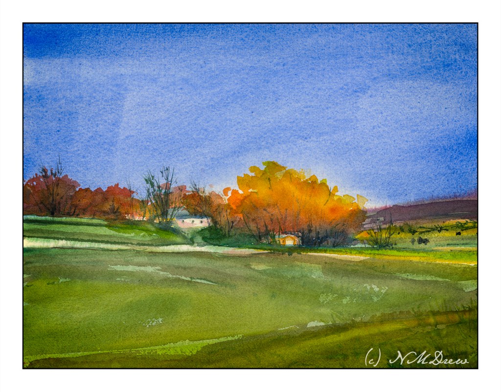
If you have never lived on the prairies or traveled through the vast middle section of the U.S., you have missed some majestic land and sky. The weather can change in an instant, you might see it coming, you might not. Flat, lonely, filled with a terrible beauty.
Flat land is like a calm sea. Few things break it up – perhaps a tree or a whale breeching. It is a challenge to compress the lines of the landscape into the narrow space seen to convey depth, space, and a sense of the land’s geography. The vast sky can dominate.