Today there is a bit of running around to do, so this morning I was in a blithery mood. Things to do – like the usual morning stuff – but I also know I won’t feel too focused on any one thing, so sketching with ink and watercolor seemed to be the best of all choices. (After all, life is not all about dishes and making the bed!)
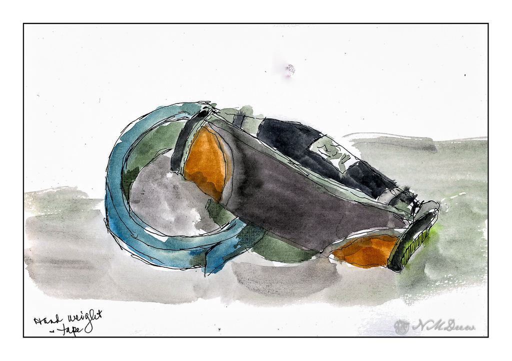
On my desk is a small hand weight and roll of painter’s tape. Warm-up. And now immortalized.
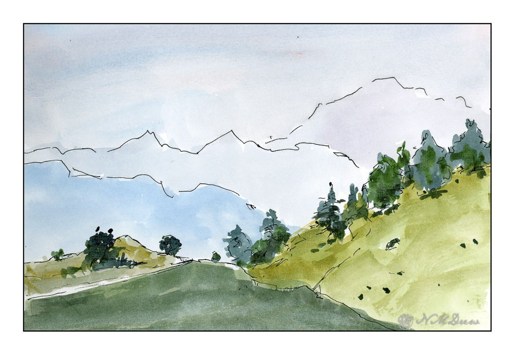
Next, the great outdoors. Mountains and trees. I would love to be walking around here, but sadly my ankle is keeping far more stationary that I want to be. I am getting better, but I have to just keep all to a minimum. I can go to the store and walk a bit, but I need my heel to get better more than anything.
So, the painting. Goal is to get a sense of distance with the gradations of the mountains as they recede into the distance. Accomplished!
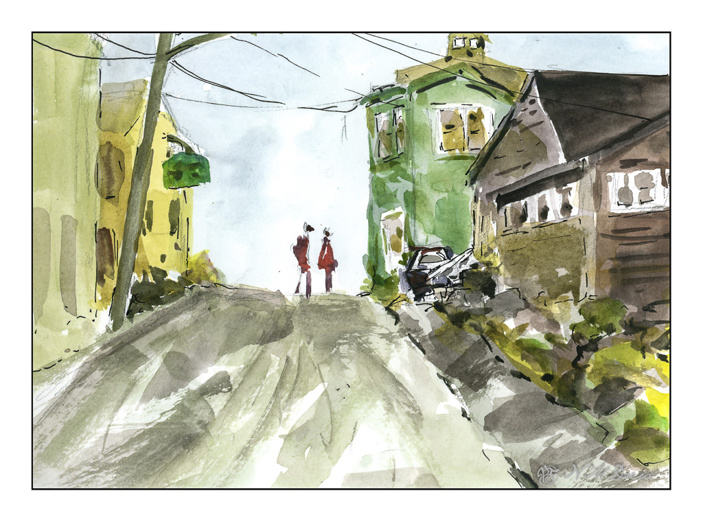
Finally, a scene with some complexity. I figured my warm up and splashing of paint were ready to meet my next challenge which is to paint buildings, people, perspective. Landscapes are comfy but I really want to push myself a bit more, as I did the other day, with direct painting and more patience and planning.
The first two sketches were done in very short order, but here I pulled out my pencil, limned in lines and worked on perspective and size. I think my people are a bit too tall, and I put them in before I did the painting of the buildings and the road. The buildings, too, are a bit wonky, but they work fairly well. I painted everything and then, once okay with the picture itself, I decided some black lines here and there would be good to help pull the painting together. Not perfect, but pleased with the results as I did meet my challenge.
Pentalic Aqua Journal, about 7×10, watercolor, Uniball micro pen.
I am kind of a cheapskate at times, especially when it comes to paying for educational experiences. Too many times I have been disappointed by the experience, especially when it comes to art classes. Cost vs. course value and content are a big issue for me, and more often than not I am very disappointed.
One person, though, from whom I have taken online courses, and who has never disappointed me, is Shari Blaukopf. She is a Canadian watercolorist with quite a following – her workshops are always sold out – who provides economical and informative online classes in various subjects. Subjects have included snowy urban scenes, wintery scenes, flowers. Her courses last from an hour or so to more, depending on how you do them, for very good prices of about $30 US. I ain’t complaining!
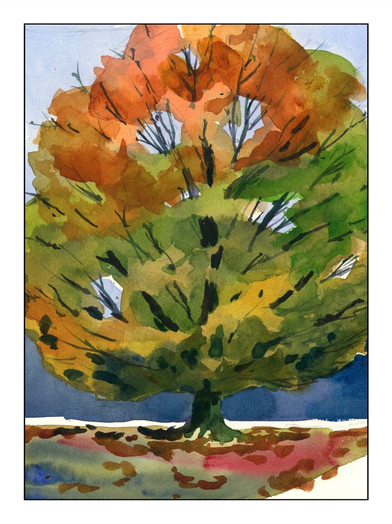
Let’s begin with her most recent course on trees throughout the seasons. I think this is one of my favorites. What did I learn? As a dabber – tiny brush strokes – this class was perfect for me. I got a better grip on painting foliage, not a leaf at a time, but as color masses. Most instructors will tell you “paint foliage as a mass of color.” Okay, clear enough, except it doesn’t really sink in well for me. Shari’s method of drawing an outline of the areas in question is brilliant, and a lightbulb-going-off-in-the-head experience for me. My samples from this enlightening experience gave me quite a bit of pleasure.
While she is painting her tree she says that midway through, when the tree is just a bunch of colors, she begins to wonder if it is going to get any better – and it does. My own thoughts were the same, but continuing on, the results were pleasing.
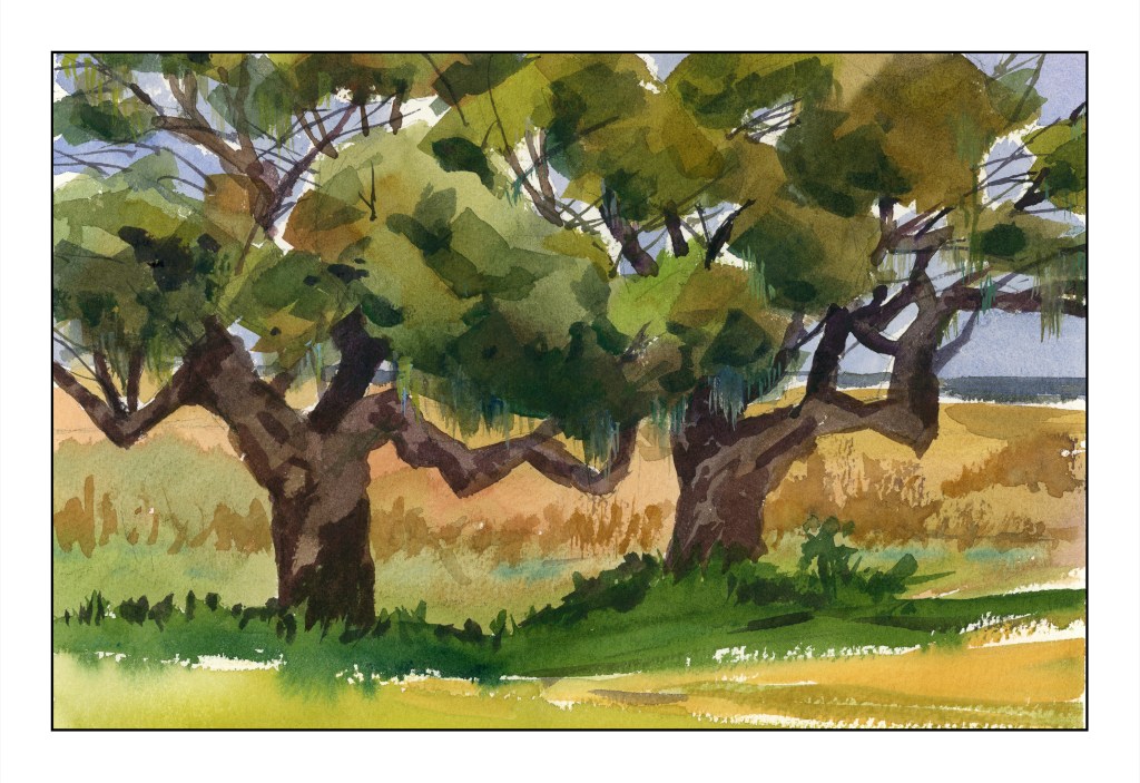
These southern live oaks (above) were also done with masses of color, but a bit more detail. The maple tree was a great segue into the oak trees.
The standard or classical “way” to do watercolor is light to dark. I have followed this “rule” with mixed success, and as a little automaton, I do what is “expected” far too often. However, Shari often does the sky, then darker areas, or outlining certain areas with color.
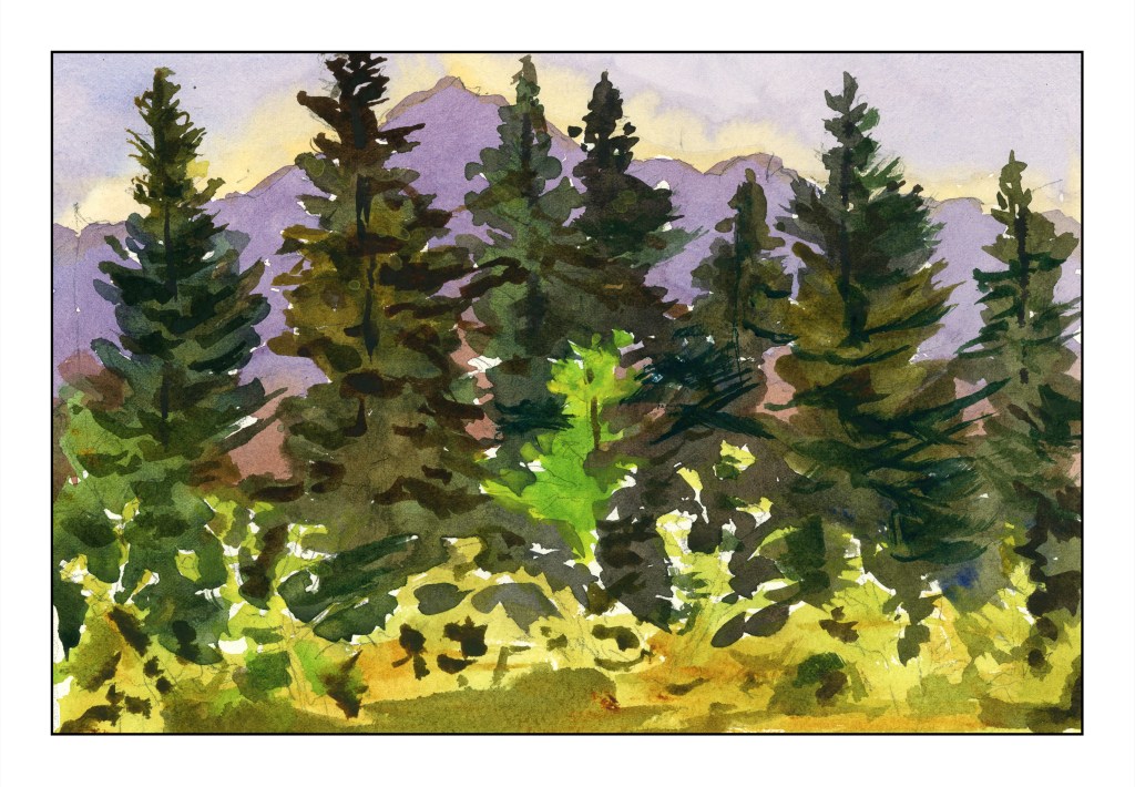
Above was the very first tree study – a vast area of pine forest against a mountain and sky. Sky and mountain were both worked around a lot of the treetops. From there, the very dark pines were painted with the lower edge of lighter vegetation done last.
What?! That is the “wrong” sequence!
Working around the trees leaves areas of white paper, and this this gives a sparkle to the end painting as well as keeping colors more pure and fresh. Painting around the bright green tree was also a challenge – and to remember it was there. Shari had to remind herself, and did so as we moved along. I didn’t quite succeed, but caught myself in time.
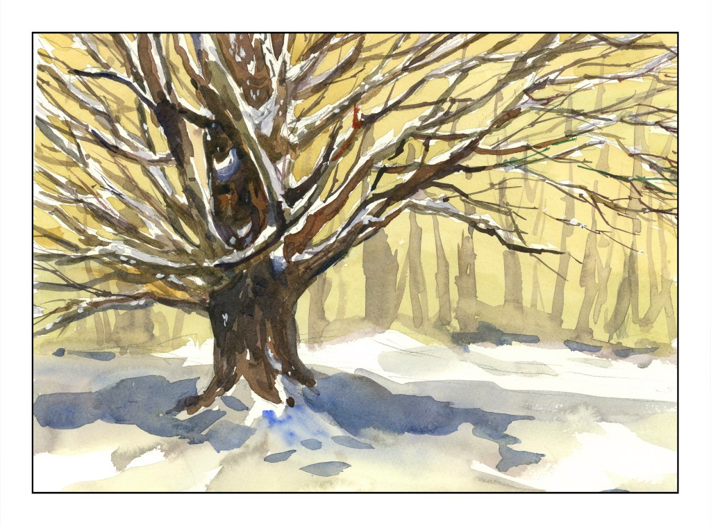
This snow-laden maple – the brightly colored one from earlier, now in winter – was the last study. No frisket was involved to leave the snow fresh on the tree. Instead, hints on how to leave snow areas apparent in the drawing – put a dot on the snowy areas to remind you – worked very well. I’ve done such things myself, but it is a good reminder of little tricks.
In many ways, this winter tree was perhaps the most challenging of the studies because so much advanced thinking was involved in the journey to the final result. Snow on so many tree branches was sort of a logistical nightmare, but oddly enough easier for me than masses of colored leaves. Titanium white covers up a few mistakes, too, where the snow was painted over. Blue, too, was added very lightly to make shadows on the snowy branches, giving more dimensionality than without that subtle touch.
Shari even returns to her trees to add a bit more here and there to improve them. I like these little forays into imperfection or dissatisfaction – so many workshops don’t show these little bits of humanity.
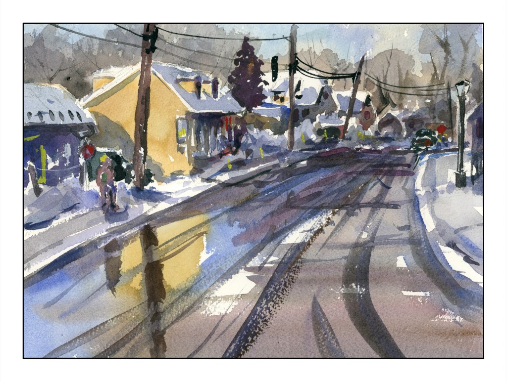
If you like watercolor, need some good instruction, and are on a budget, Shari’s classes might be the answer. She doesn’t teach you the basics but assumes you know how to do washes and use colors and what a paint brush is. Her classes range from pretty straightforward to more sophisticated and complex subjects. No matter what, she leads you through the process quite nicely. For example – buildings terrify me. Perspective is not my forte and suburbia throws it at you from all directions. But, I did this, and learned that even I, who has no depth perception to speak of, can actually produce a painting with buildings!
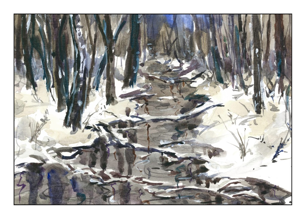
I managed to produce the above – albeit with some glitches – by following her along with her “Urban Winter” class – which you can find here. Check out her work and courses – I don’t think you can find better value and better education almost anywhere. And as a final plug, here is my painting from her course “Winter Woods and Stream”.
And, for my own frugal heart, Shari offers course bundles that discount her already fabulous prices a bit more. Check her courses out and sign up if you are interested. Some courses allow you to upload your work – the later ones in particular. She always leaves feedback, too, even a bit late as she travels a lot. The personal touch is so nice, and being able to see what other students produce is good, too.
I started this painting a few weeks ago, at the first class at the local adult school with a new teacher. This is from a photo I took some time ago. I was at the bottom of a hill, looking up.
This painting has taken a lot of time – several hours – but the work has been worthwhile. I have been applying the various principles I am slowly garnering from hours at the proverbial grindstone, memorizing techniques, concepts, whatever. For instance, I think this painting actually has a nice sense of depth and perspective – something I have struggled with for a long time. The light on the trees also pleases me, as do other bits and pieces of it.
I have also learned just through doing how to get the heavy body acrylic paint into a more viscous and enjoyable mess to paint with, and that is a big help! It’s a combination of matte medium, water, and the paint itself. I dislike the plasticky quality so often that accompanies acrylic paints, so even thought my colors are bright, I think they moosh together fairly well.
I’ll ask my teacher’s opinion when I see her next week. Meanwhile, here is (to my eye at present) finished work. Below is the photo which is the basis for this painting.
Somewhere, a corner turned. It is becoming easier to simplify a picture, throw out unnecessary things and perhaps adding something else to make it more interesting or work more than a photo can.
Day 17
I’ve been wanting to draw a cloudburst and finally did. After looking at lot of pictures, I realized that the drama comes from the soft rain blurring what is behind it. However, there is also contrast – light and dark. To achieve this, I drew everything in with graphite and then used a grey rubber eraser to create the streaks, lifting the graphite. From there, I smudged it in. Values remain but the messy nature of graphite sometimes defeats itself for value studies!
Day 18
I am pretty pleased with this study. There are nice, subtle areas in a photo that was basically very high contrast in the tree and vegetation in the foreground. The ocean is in the middle right and extending into a misty sky.
Day 19
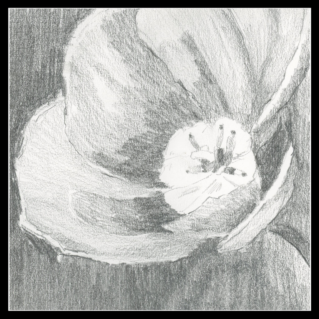
I took a picture of a tulip years ago – pale pink and backlit. The blurry quality of my drawing is just a value study, not a drawing to show what a tulip looks like. This idea is really challenging at times because I have done portraits in pencil and details abound then! It is important to remember this is to be a simple reference, not a finished work of art.
Day 20
As I progress in this 30 day challenge, I find I am running out of subject matter! So, it is time to work with other things. The flower was one. This one is perspective.
I actually got out a ruler and for the sketch created a grid, and then worked hard to put things in both perspective and in proportion to each other. As well, I wanted to create a nocturne.
Commentary
So, the days are rolling by, little shifts are occurring, and as my confidence in value studies grows, so is, it seems, my patience for doing preliminary work before trying to execute a painting. Not easy for me at all!d
I have been painting every day for the past two or three weeks. I enrolled in a couple of online courses, both of which I have totally enjoyed. However, my poor drawing skills keep flying in my face. Yes, I can render things realistically quite often, but all too frequently I tumble when it comes to proportion of multiple objects together, and a lack of ability to convey perspective.
So, after doing a bit of research, I decided to get myself some help. Not online course here, but a jan-yoo-wine book. Ebook, admittedly, but nonetheless, a book. The book is called Keys to Drawing by Bert Dodson. I have other books on the basics of drawing, perspective, pen-and-ink, the right side of the brain. I just wanted something that starts out with basics and straight-forward writing. I think this will be a good choice to rediscover drawing.
I am not going to get into this book in depth here online, but I am planning to follow it and see how my skills evolve. I need to renew my knowledge, and baby steps and exercises are the key. I plan to continue to paint every day, too, so I will be a little nutso I expect – but who isn’t without people to socialize with in person or being able to go for a hike? This seems like a perfect time.
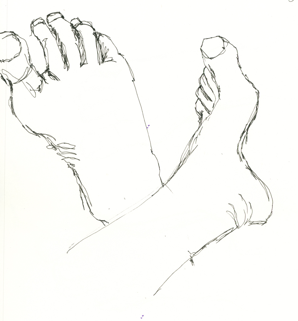
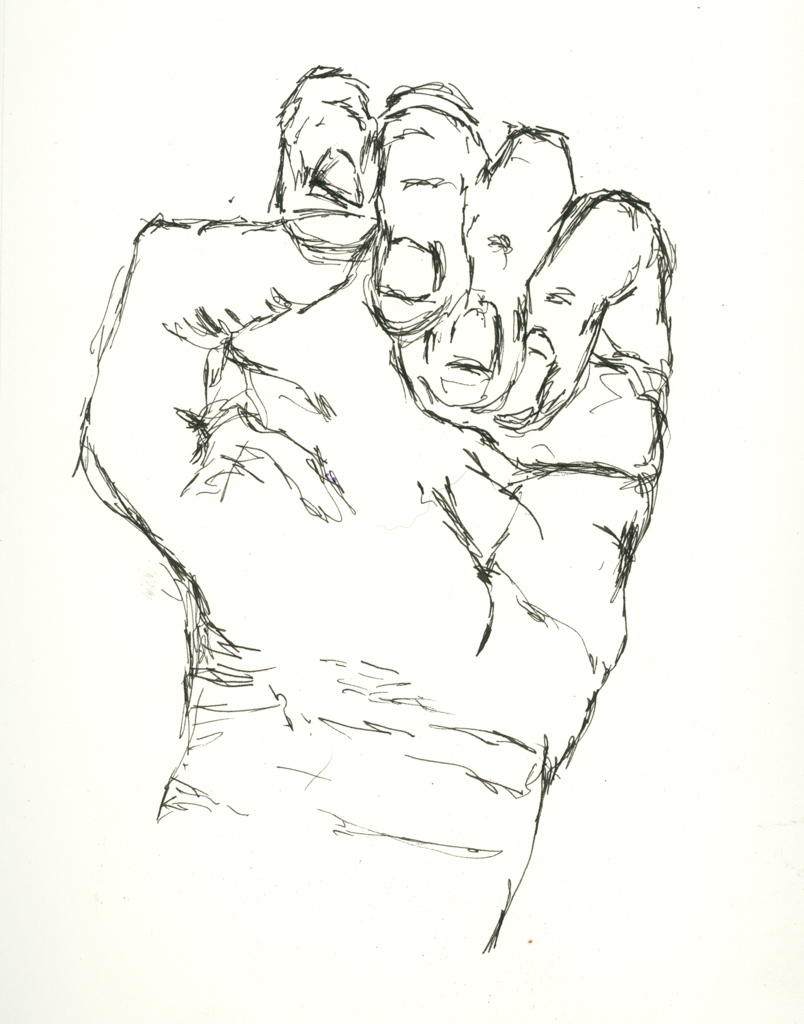
Thus, with no further ado, here are my beginning exercises from Keys to Drawing: Contour drawings of my feet and left hand.
Yeah, I really do have a big gap between my great and second toes!
The first exercise was feet – I did three but did not include the first. Dodson says, “Look, hold, draw.” Look at whatever you are drawing, observe the curves and angles, and put them down. Spend more time looking at the subject matter to see if you are getting the lines correct, not if you have a good drawing. (Ah, monkey mind!) As I progressed, things got better and I began to look at relationships of this to that, and things began to improve.