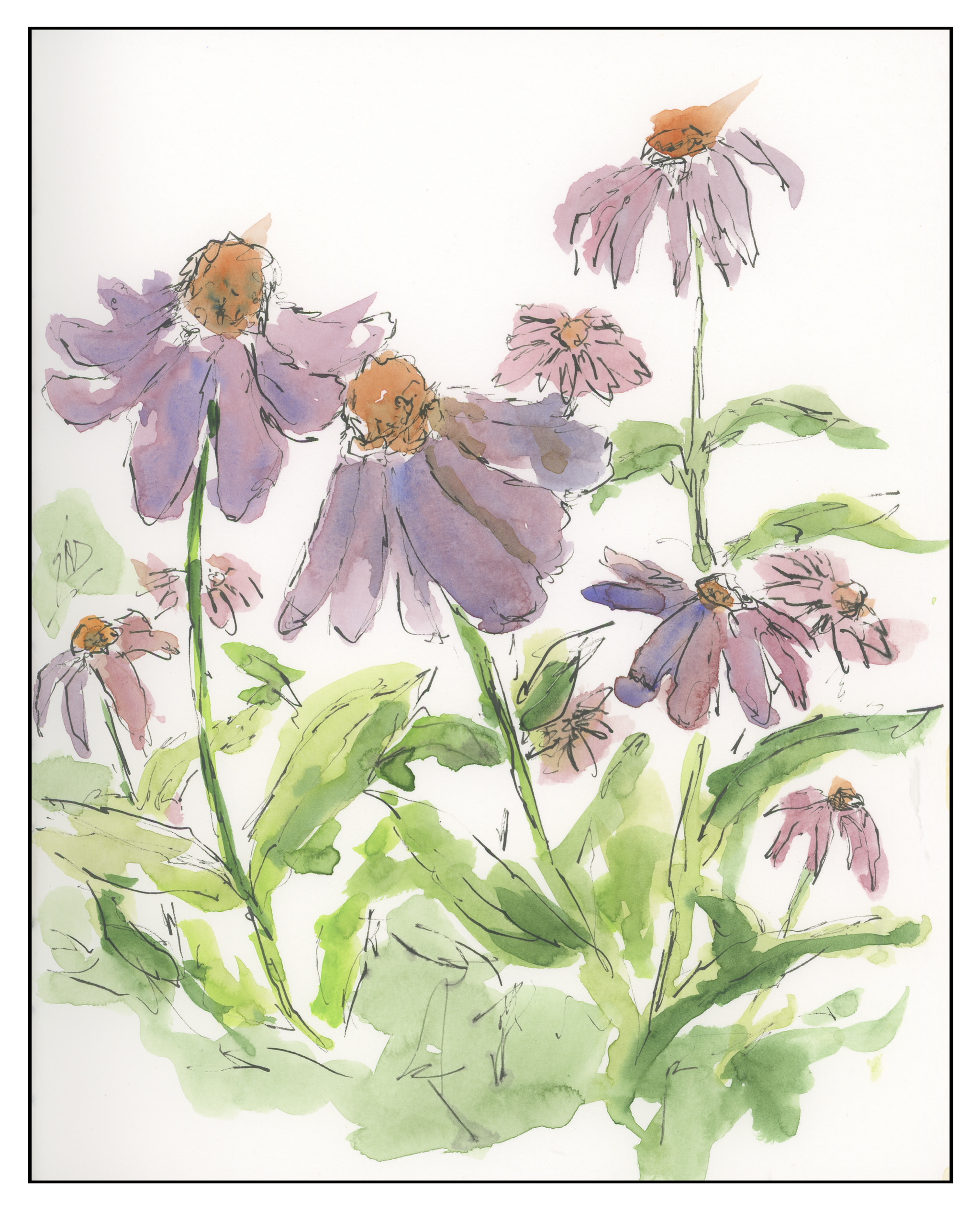
After doing the work and pre-work for the Mesa, Sunrise painting, I was feeling pretty burnt out. It was an intense experience as I needed to exercise restraint. So, a loose drawing of echinacea did the trick of clearing my brain.

After doing the work and pre-work for the Mesa, Sunrise painting, I was feeling pretty burnt out. It was an intense experience as I needed to exercise restraint. So, a loose drawing of echinacea did the trick of clearing my brain.

Well, I don’t live in an interesting old village, but I think I could quite happily. Suburbia just doesn’t make it when it comes to interesting lines, stones, and such. Macadam and stucco and neatly cropped lawns are my daily world, so I always have to run off someplace else! Not that suburbia doesn’t have its good points, like modern plumbing and electricity, but it’s not that visually exciting.
Okay, so I got our my Faber-Castell watercolor pencils. I have a tin of 60 that I have been meaning to try on a serious level. So, here is the first layer. I used iron gall ink on a dip pen for the lines, and then just a quick scribble of pencils to lay down the basic colors. Next, I will wet the pencils and let it dry. Then, off to work. Bye!
Last night I went to the local book store with a fellow sketcher. It was fun! Good conversation and drawing are a pleasant way to spend a few hours in the evening.


Today I ventured out on my own, influenced by practice sketches by Peter Sheeler and his videos. This is from a photo I took in 2016 up at Bodie, California, when it was moving toward noon on a hot, hot day in August.
I rather like the composition, particularly the lines of poles marching over the hill in the distance. If you ever have been to Bodie, you know it’s a long drive down a long and bumpy washboard road. The telephone poles and lines emphasize the town’s isolation. As far as painting the subject matter, I started out with a line drawing, painted, and then came in again with the ink pen. It was so, so, so hard to not try to draw and paint every line and rock. Simplification was a big challenge for me.
As I painted, I worked hard to recall what I have learned doing the practice studies. Keeping things simple also meant keeping the palette simple, and the brush choice as well. I started out with sky in Cobalt Blue after wetting it down with a big round brush. Then I kept myself isolated to a dagger brush – first time to use one, too. The remainder of the palette included Quin Gold, Burnt Sienna, Ultramarine Blue, Sap and Hooker’s Green, and by accident, a tad of Indrathene Blue. The paper is 5×7 Arches Hot Press and taped down with a 3M painter’s tape with specialized edge-sealing qualities, which really worked to keep the tape from pulling up as it got wet.
Overall, I like the lack of mud and the contrasts I developed between light and dark. Pen and ink come to save the day again!
Once again, a demonstration from Peter Sheeler which I used for a card for my sister-in-law.
Peter’s is far more masterful than mine! Who’d have thought a simple leaf could be so difficult? I went in afterwards and inked in some extra lines and put a frame around the picture – the leaf looks like it is floating in space.

