In the Style of Urban (Not the Pope)

In a number of circles, there is an “urban sketch” style done with ink and watercolor.  Drawing and painting are combined.  Some people are masters of it, in my opinion, having a good balance of ink and clear watercolor, with one or the other predominating, and the other not overwhelming its partner.  (I hope that made sense!)

I am trying to find that balance.  I’d say I am okay with ink, but heavy-handed with color.

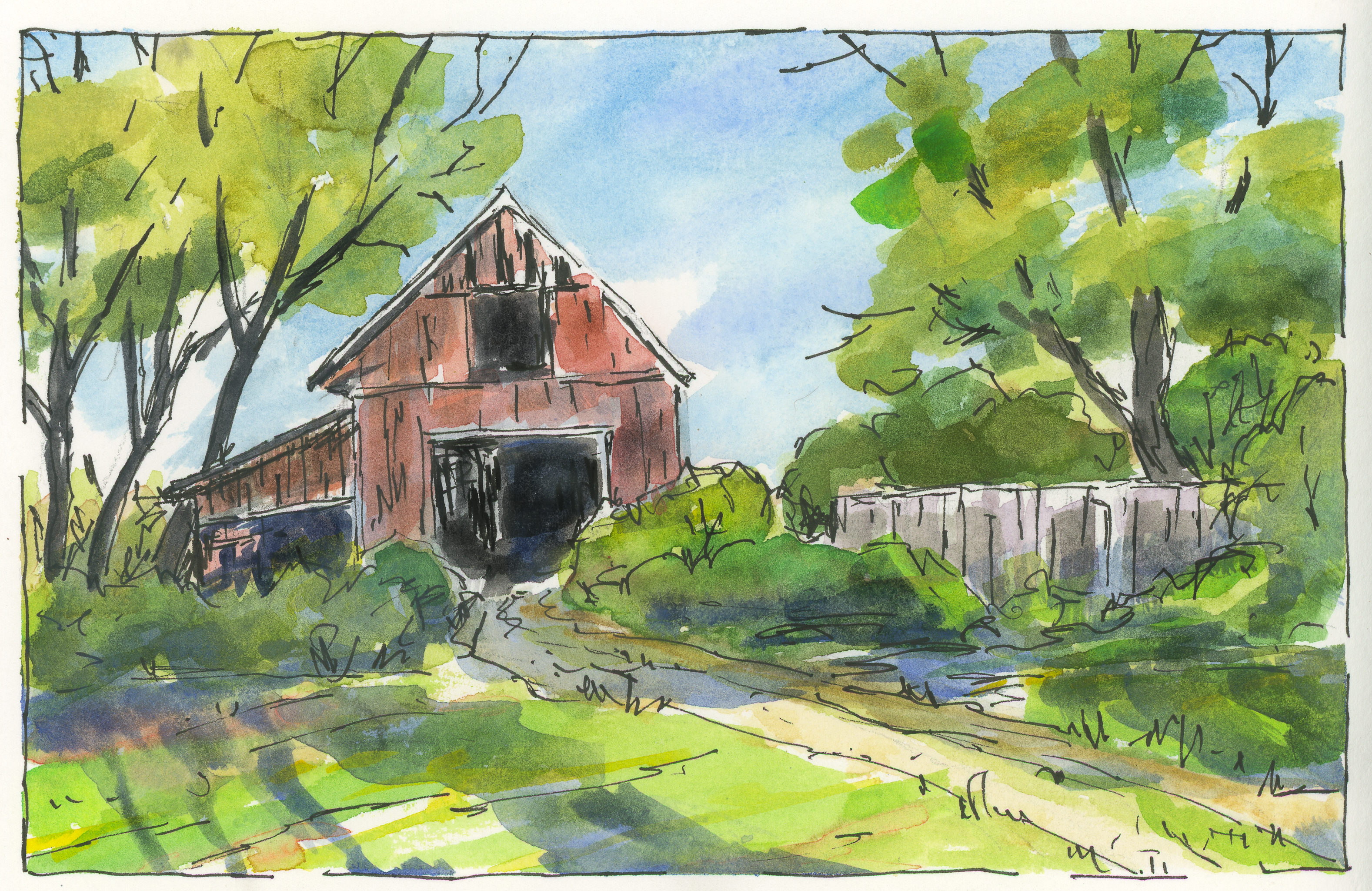
Today I decided to try two things.  The first is above – a simple “country” scene with trees (and green!  remember yesterday?), a fence, and a building.  The idea was for the sun – the light source – to be coming from the left, behind the barn.  I’m not so sure what that big blue thing is to the right of the (obvious) three shadows of the trees, but it’s too late to do anything about that!

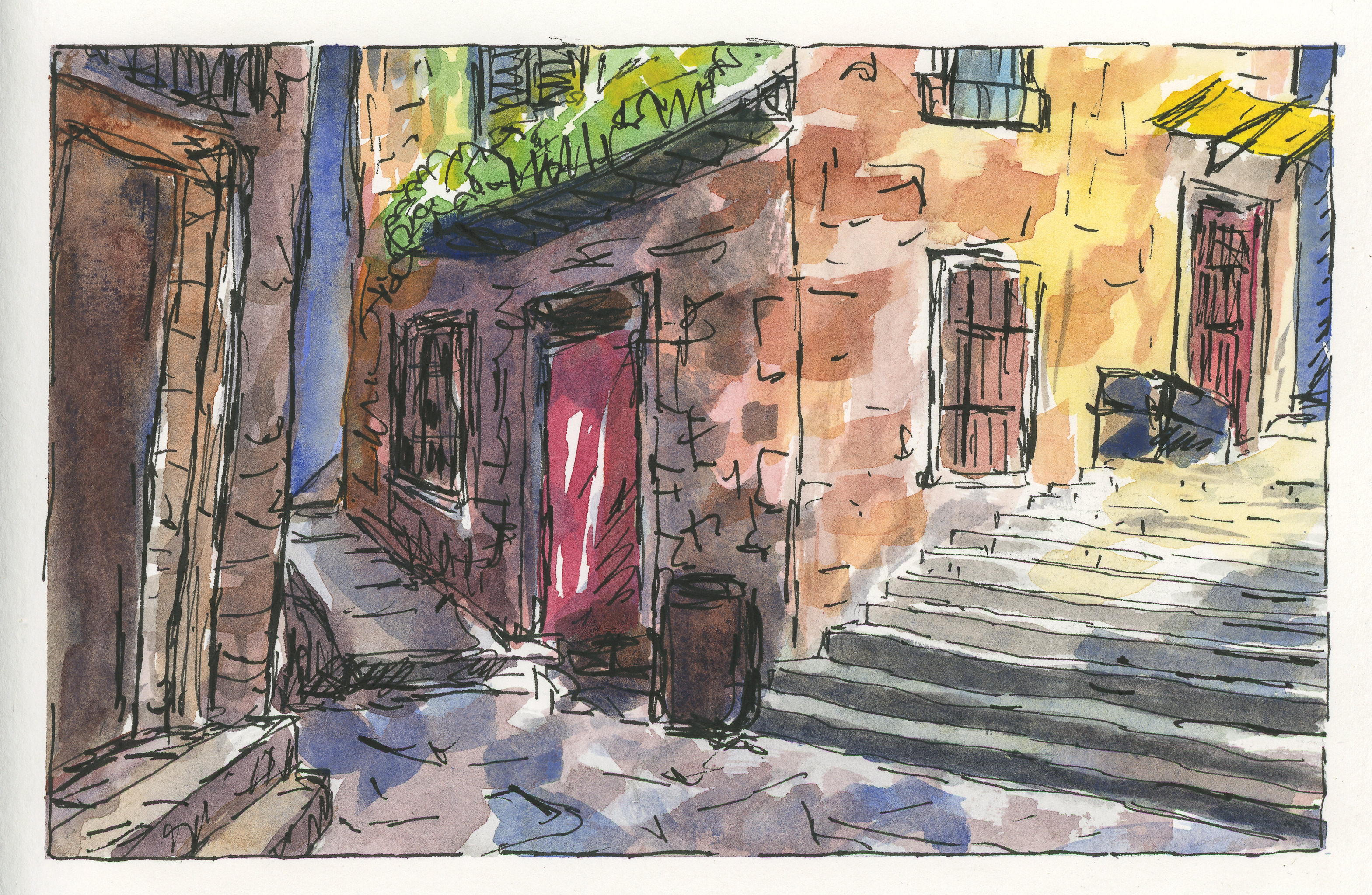
This one is an urban scene, one obviously not in downtown Los Angeles, but in some older part of the world.  Here, the light is coming from the right, perhaps, but the alleys and buildings create their own logic.  Shadows are broken up with bright spots.  One can only imagine that to find the light, looking up will reveal a world much different than the one on the ground.  I think this one was fairly successful; there are parts which seem to work, and others that make no sense at all – like, what is that thing?  Scribble more ink on it and let the viewer guess!

A Bowl of Tulips

Today I had a morning appointment.  After I came home, I had lunch, took a nap, and then migrated all sorts of toys to the patio.  My neck got sunburned!  Amongst the toys were a set of Albrecht Durer watercolor pencils by Caran D’Arche, a bowl of tulips, a brush pen, ink pen, and paper.

This is probably the third time I have used these pencils, and this time around I am happier with the results.  I have watched a few videos from YouTube on using them, and the tips were worthwhile.  For example, layering and laying down glazes to get better results.  Being patient!  My own painting skills are better than they used to be, so my sense of light / dark is not as klutzy as it was a few months ago.  And, without having the need to produce some work of art, I was a lot more relaxed.  Of course, sitting in the sun didn’t hurt any.

In general, my own experience with watercolor pencils is that they are not strong enough in color to produce the type of strong contrast I seem to prefer visually.  Maybe it’s just my limited experience.  Nonetheless, I am happy with the results demonstrated in this little study.

This Morning’s Disaster

This morning I set out to do a couple of things.  First was to do another ink / pen drawing.  I used the same sketchbook as I did yesterday, one with lightweight paper that worked very well yesterday.  Second, the attempt to stretch myself a bit and do a beach scene.  I find waves incredibly difficult.

The sketch itself was okay – nothing particularly challenging in and of itself.  I rather liked the composition.  However, if you look at the sketch above, do you see those little greyish streaks in the lower left and center?  That should have clued me in then and there – the paper is very thin.  Water?  What was I thinking of?

And here we are, with washes applied with a lot of water.  Even though you cannot see it, the paper became mottled in appearance, buckled and crumpled.  Ugh!  But, what the hell, I may as well try something.  And thus, I picked up my box of Caran D’Arche’s Neocolor II crayons, and carried on . . .

Having never really used the Neocolor crayons before, I will say I liked them.  I scribbled in colors which I thought might work, and then laid other colors on top of them to blend before using water.  And then with a waterbrush – not a laden brush – I smoothed and shaded.

I am not pleased with this picture at all, but I still learned something about a medium I haven’t really explored – the watercolor crayons. On a heavier paper designed to take water, there is a lot of potential here.  I love coloring, so I can see myself moving into this area, perhaps more so than with watercolor pencils, which seem more delicate to me in their color rendering, but perhaps that is wrong as I have limited experience with them as well.

Oh, well.  The picture was a disaster, but the potential far outweighs it.


Daffodils

Today was just too nice of a day to stay home, so I headed out to the local botanical garden, cameras in hand, pen, and paper.  Bulbs are up and beginning to blossom; the ones in the shade are getting there – more for later visits!  Birds, butterflies, bees, cool breezes.

Since I have been playing around with the exercises in Alphonso Dunn’s fine book today, I decided to continue the adventure and draw some daffodils with pen and ink, but follow through using watercolor pencil.

I laid down the major lines in pencil, and followed through with a fine pointed Namiki pen with waterproof ink.

Next, direct application of Faber-Castell’s Albrecht Durer watercolor pencils.

And finally, using a water brush, I wet the colors, taking time to use a light touch.  A few lines of extra ink, and it was done.  Below is a gallery if you wish to cruise through the sequence from pen, pencil, and water.

Lines

Every now and then an outstanding artist and instructor shows up on the scene.  When they write books that are accessible and practical, it’s even better.  Alphonso Dunn is one such person!  He has a personal website, a YouTube channel full of information and wonderful tutorials, and two fantastic books.

The workbook was published after the simple guide, but is used in tandem with the exercises found in the workbook.  Besides using the two together, head over to YouTube for a really great set of instructions.

Today, rather than paint, I finally sat down and did some exercises from Dunn’s books.  The exercises were on lines – direction, shape, shift.  It takes a bit of patience and time to understand what may be going on.  I had to think about how I had my pad of paper, how far up or down my fingers were on the pen, whether to use my fingers, my wrist, or more of an arm movement.  In many ways, doing these exercises made me think of learning printing and cursive back when I was a sweet young thing.  Lines, repetition, thinking about how to do things, and doing them over and over.

Skill is bought with repetition – but repetition of itself is rather dull.  Rewards sure help!  Thus, a few drawings – one of a hat from Dunn’s book, and one of a Christmas cactus on my patio.  In each, I used straight lines, or slightly curved ones.  I thought about light and dark, repetition and straight or curved lines, or placing more lines over ones already laid down.  

To aid with the line studies, I ruled pencil lines onto my sketch paper.  It helped.  Sometimes I also drew vertical lines, or extra horizontal lines, either in pencil or pen.

Nothing like a pen in hand to make me happy!  Altogether a pleasant way to while away an afternoon.  I shall continue!