Boring Waterproof Ink

I had hoped to have a nice dark ink on this paper, using a fountain pen filled with waterproof ink. The ink is waterproof, but it is so pale I fell asleep. If you are going to do a line drawing and then color it in, you need to have a dark ink. The ink was definitely waterproof, but so what if I don’t like the result?

I also used my cellulose paper sketchbook for this, and once more I am not happy. All these blobs of unabsorbed color and a few more than many times using the hair dryer.

Maybe I am not being realistic about the paper, but I am realistic about the point of this study – is the ink waterproof? And that answer is yes. Goal met.

The Slough (Watercolors)

Above is the first in pen and iron gall ink.   Some watercolor, too.

First watercolor, on cheap paper.  No lines.

On Arches 140 CP.  No birds – they all flew away.

Given I haven’t done any watercolors for weeks, I decided to begin with pen and ink – not thrilled with results.  From there, straight watercolor without any preliminary drawings or pencil lines.  Got me loosened up and made me remember how much I like drawing and painting in any format except maybe acrylic and oils.

I think an abstraction in watercolor is on tomorrow’s agenda.

World Watercolor Month 2019 – Days 7-12

World Watercolor Month 2019 continues, and amazingly, I have been able to keep up with the daily prompts, even with plumbers tearing out and fixing a leak, and just other life things that conspire to keep me from painting! Some paintings are quick and easy to do, but others may involve several hours, especially the ones in gouache.  Some are easy to do in that ideas come to mind rather quickly, others more challenging.  For instance, the 13th one is “Glassy” – glass?  mirrors?  reflections on glassy water?  Those are the challenges – how to interpret the prompt.  The interpretation can be literal or figurative.

Here are my interpretations for prompts 7 through 12.

WWM #7: Shiny Things – Reflections on the Ocean

WWM #8: Flying High – Migrating Monarchs

WWM #9: Shadow Play

WWM #10: Ocean Creatures

WWM #11: Simple Pleasure – The Natural World

WWM #12: Blossoming – Vine and Flower-Covered Buildings of Yore – All in Bloom!

Right now, most of my art supplies are hidden in shelves inside boxes!  Funny how things just vanish.  I am really frustrated in some ways, and rather amused in others.  I still have to make a final choice in paint for the damaged wall, but that is easy enough.  The real work is repairing the wall, putting in the drywall, mud, tape, sanding, taping, painting, painting, painting, moving back in . . . leaks are expensive, not just in money, but in time.  Oh well!

Working with Contrast, or, A Day Without Mud

Today, my little Meetup group was really little.  Initially there were to be 4 of us, but one cancelled, and then the third unfortunately got very lost using her GPS.  She wrote she was 3/4 of an hour late . . . and we waited 10 minutes, too.  Next time I post a Meetup meeting, I’ll spell out directions, so hopefully that won’t happen again.

So, contrast.  I am dreadful with it.  And with painting things so that they look like things rather than blobs of color.  However, that is probably something that time and experience will cure.  Today, though, I did manage to not turn everything into mud – a major accomplishment, let me tell you!

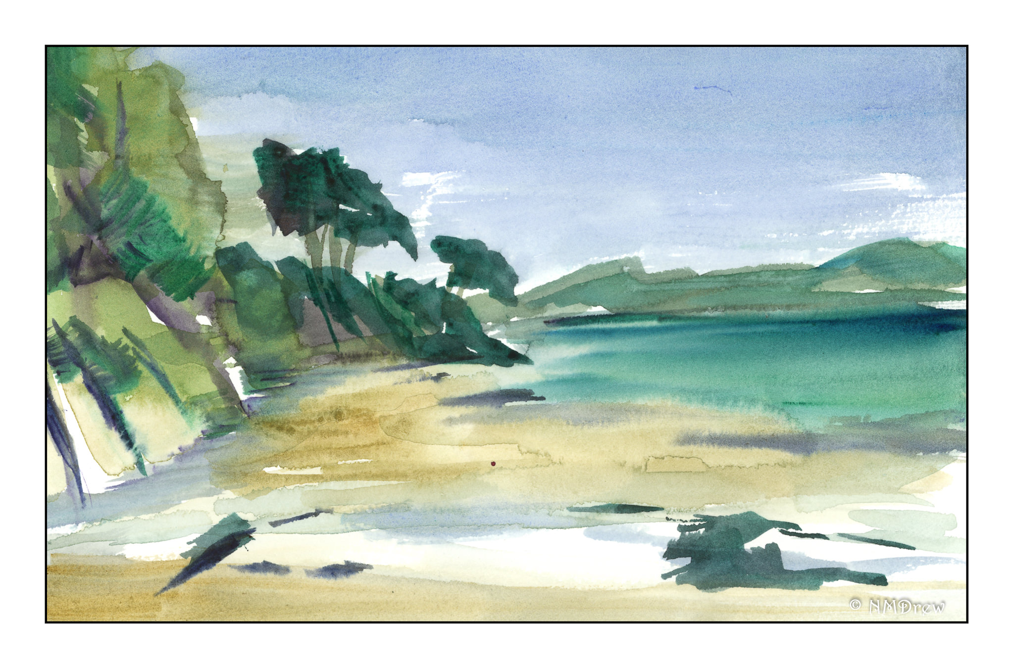
We went to a local place, the trail by the Chumash Museum nearby my house.  (The Chumash are a California tribe.)  We were there for about an hour.  I began with a pencil sketch, and then, color.  We were settled in a small oak grove, with dark and light contrast about as contrasty as you can get.  At the end of the hour, this is what I had painted, knowing full well I would look at it and work it a bit once home.

As you can see, I did leave areas of white!  Another first . . . As I was painting I made a monumental decision, too:  paint long horizontal stripes to represent the grasses under the trees, and the shadows crossing the foreground.  I sat there and painted stripes.  It was nerve wracking.  The blobby white areas were deliberately left for consideration later.

And once home, I looked at the painting.  Still a need for contrast, and a bit more detail.  More pen, more ink brush, more colors, and some warmth.

Overall, the one above came out okay, but if you look on the mid-right, to the left of the furthest trunk, there is a bit of an odd space, so I went in and worked it a bit with ink to try to mitigate it.  I found it very distracting.  Here is the final image below.

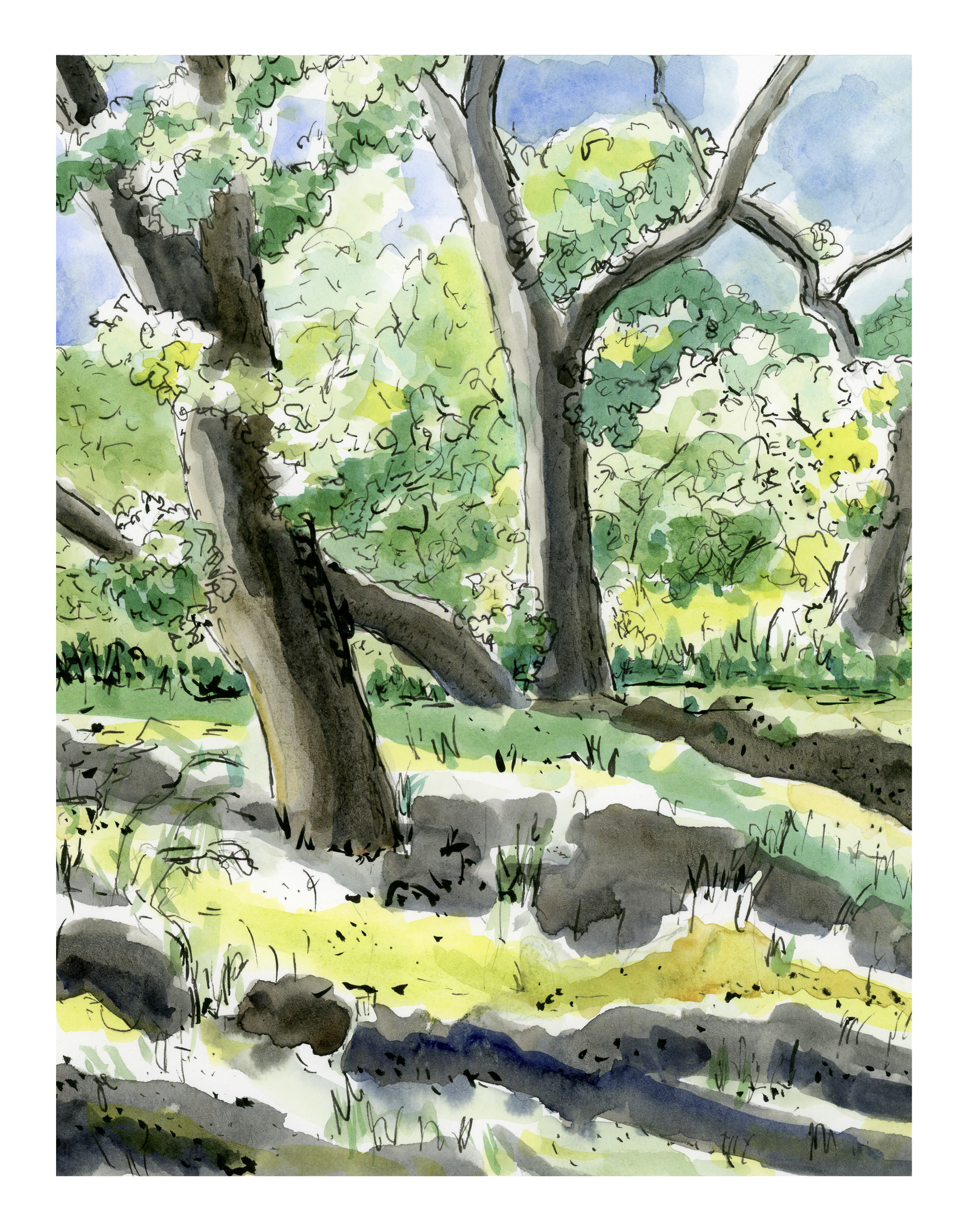
The area has a few more lines in it, a bit busier, but somehow more in keeping with similar areas of the painting.

My palette was somewhat unknown!  That is, I was not really sure the names of the colors as I was using them, but I do have a list of how they are laid out on the palette, which is why I can tell you now!  I used Koi watercolor brushes and the following paints:  Quinacridone Gold, Naples Yellow, Hansa Yellow Medium, Cerulean Blue, Cobalt Teal, Ultramarine Blue, Indanthrene Blue, Phthalo Green, and Burnt Sienna.  I used a Stillman & Birn Beta Series 8×10 inch softcover notebook, and scanned the images using my trusty, not rusty, Epson V600.