Pigeon Point

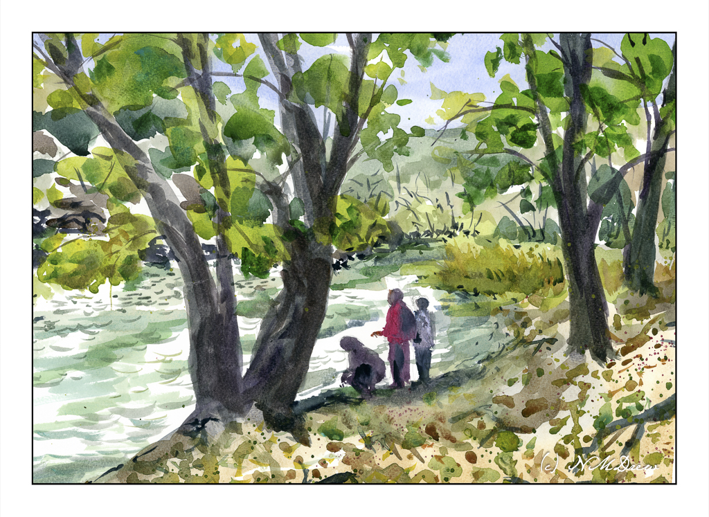
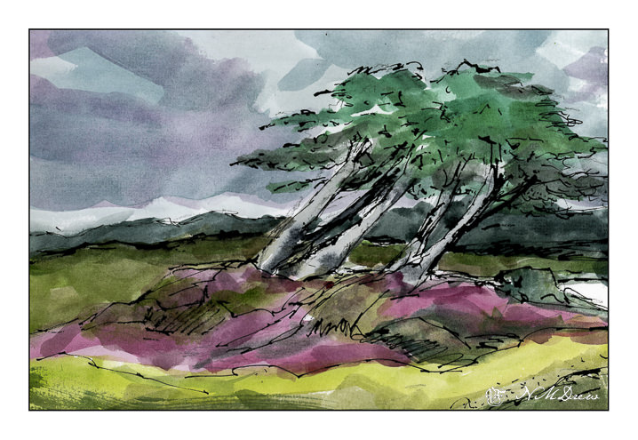
California has a wonderful number of coastal state parks. Pigeon Point is one of them. This park features a lighthouse, coastal cliffs, hiking trails – all the usual attractions. It is located south of San Francisco and worth the time to visit.

I tried to capture a bit of the wildness here with a sense of a windy day. Simplification of the foreground was a challenge. The first step was to lay down a very wet wash of yellow and green and letting them dry. From there, a bit of detail, using both dry brush and wet-into-rewetted paper.

The sky was laid in with clear water first, and from there the sky and clouds were given shape using mostly ultramarine blue in varying strengths. Once laid in, nothing was done.

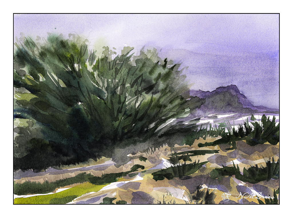
The ocean was a bit tricky. There were multiple colors of blue and green and aqua. Sea foam and waves, too, added to the scene. The protruding rocks and boulders near and far add a bit of drama, and a bit of a problem! First I laid down a clear water puddle, avoiding the rocks in the foreground and the distant lands. From there, slow layering of colors, sometimes wet-in-wet, sometimes rewetting and adding color.

The distant coast was laid in with a number of simple washes, eventually building up contrast and shapes. The same was done with the rocks in the foreground, between the green slope and the horizon, but the washes were a bit darker. Once the foreground rocks were dry, increasingly less wet and more intense paints were done.

The final touches were to use titanium white gouache to get a sense of sea foam, hide a mistake or two, and complete details. I tried to work with a good sense of contrast that conveyed distance – in some ways it worked, and others it did not. This being watercolor, I think I finished in time!

Watercolors with some gouache, 11×14 Arches 140# rough paper.

North Coast

Rocky coastlines are always fascinating because the first time I ever saw the ocean was along a wide, sandy beach with gentle waves. Not so here! You can see the debris – fallen trees stripped to bare logs, rocks, erosion. You can only imagine what it is like during a storm.

Years ago, we drove up the California coast, heading into Oregon and points north. It seems once you hit the central coast, about 100 miles from where we are, the coastline begins to change. Highway 1 leads into Big Sur, that fabled and beautiful land, and it is here you see rugged cliffs. Then, north of San Francisco, you move into the wide beach sands of Stinson Beach and move further along to the rugged Mendocino coast and then beyond. This picture is based on a photo I took there years ago – no idea where we were, but it was stunning.

Ink, watercolor, bristol paper.

Above the Bay

Back to California, Edward Seago as a mindset.

Up north along the Pacific are many beaches with dramatic cliffs, sandy beaches, fog, and it is always exciting to drive along the coastal route – usually Highway 1 – to enjoy the scenery. Sometimes you need to wander a bit off the beaten path to find a bit of paradise, but exploration is always fun!

I don’t remember what colors I used specifically, but I do recall ultramarine and cobalt blues, burnt sienna, yellow ochre, cadmium yellow, Hooker’s green, and possibly a bit of alizarin. The scene is a bit soft because the coastal fog, prevalent along the California coast, is in the distance. The air is moist. And, it is chilly! Mark Twain supposedly said the coldest winter he ever spent was a summer in San Francisco. You know what I mean if you have experienced it!

We all have our own styles and methods of painting, and in some ways I like the way I paint, in other ways I dislike it a lot. Here, I focused on simplification but in some areas did a bit more working of a subject than I should have, such as on the right distant cliffs, ocean, and sky. The estuary below the headland is simple enough – at least I realized that and didn’t do anything more to it. My bush is also okay, but perhaps it could have been simpler – or the foreground, too – but when something is close to the viewer, details do become important. Each leaf and blade of grass, though, would be excessive.

Hahnemuhle 9×12 140# CP paper, watercolors, Northern California.

California Coastal Cypress

Stuck at home for the most part because of my ankle, I need to find things to do. It turns out that my ankle, while a mess of historical injuries, has no tears in the soft tissues. That is good. However, my heel bone has “microfractures” from the hard landing dodging the car last month. This is a bone bruise, and it is painful! I finally got into see the orthopedist, got a walking boot, and return in a month. The boot makes a big difference though it does take some getting used to wearing and using. I have to be careful not to pitch forward or backward. And you can hear me coming a mile away – squish, squeak, squish, squeak.

Of course, painting is the first choice! I am still tired intermittently from Covid, but I don’t have brain fog (at least I don’t think so), and look for things to enjoy but not be a source of frustration. Thus, ink and watercolor.

The Monterey Cypress is a tree that is common along the northern central coast of California. It is shaped by the environment as it moves with the wind and seems to grow away from the prevailing winds. To me, this quality is what makes it so beautiful and eye-catching. The coast is also subject to foggy days, damp and dreary, even in the height of summer.

Carbon ink, watercolor, Koi pan paints, about 8×10.

Misty Coast – 2 Versions

Seldom are my watercolors subtle in color. Instead, they tend to be bright and rather garish. Today, I focused on a softer color while painting, meaning more delicate colors, more muted tones. The reason for this is I was driving down to the Valley for an appointment, and I was noticing the soft, hazy qualities of the air. Greens were light and delicate, flowers alongside the roads, while strong, were not a brilliant yellow. In the distance hills and mountains were soft, blurring into the distance – still clear, but very, very soft.

This motivated me to see if I could accomplish something a bit more subtle. I looked at a picture of the northern California coastline, which can be rugged and foggy, with mists rolling in and out, obscuring and revealing at any given time.

Below, is the first painting. I used a lot of water to paint with as well as dilute my colors. This makes them more pale. It seems to have worked fairly well.

To test my theory of a softer, more grey image – longer grey scale – I turned the painting into a black and white image by both desaturating the same image above, as well as removing all vibrancy.

As you can see, there are a few areas which are very dark, but there are a lot of shades of grey, most of which fall into the arena of middle values.

Below is the “revised” version of the first. Here I added some white gouache to the rocks on the lower right, helping define them and to give a sense of breaking water. I cleaned up – removed – the turquoise streak sitting in the middle of the painting. Finally, I mixed some bright yellow and gouache to add dots of color to the lower left of the painting, creating a bit more defined foreground and to break up some of the edges.

I prefer the second version. However, you will note that the values remain the same for the most part below.

To tell the truth, delicate watercolor frighten me! They require a more delicate approach to the paint and water combinations. This was really a good exercise for me and I can see some more follow up paintings along this line. They do not even need to be misty, but just perhaps more pale but still with good contrast.

Where I live, it is quite dry, so those of you who live in more wet and damp climates have more water vapor in your atmosphere than we do. You can see this when you compare watercolorists’ work from other parts of the world, such as Britain or Holland.