Just A Bouquet

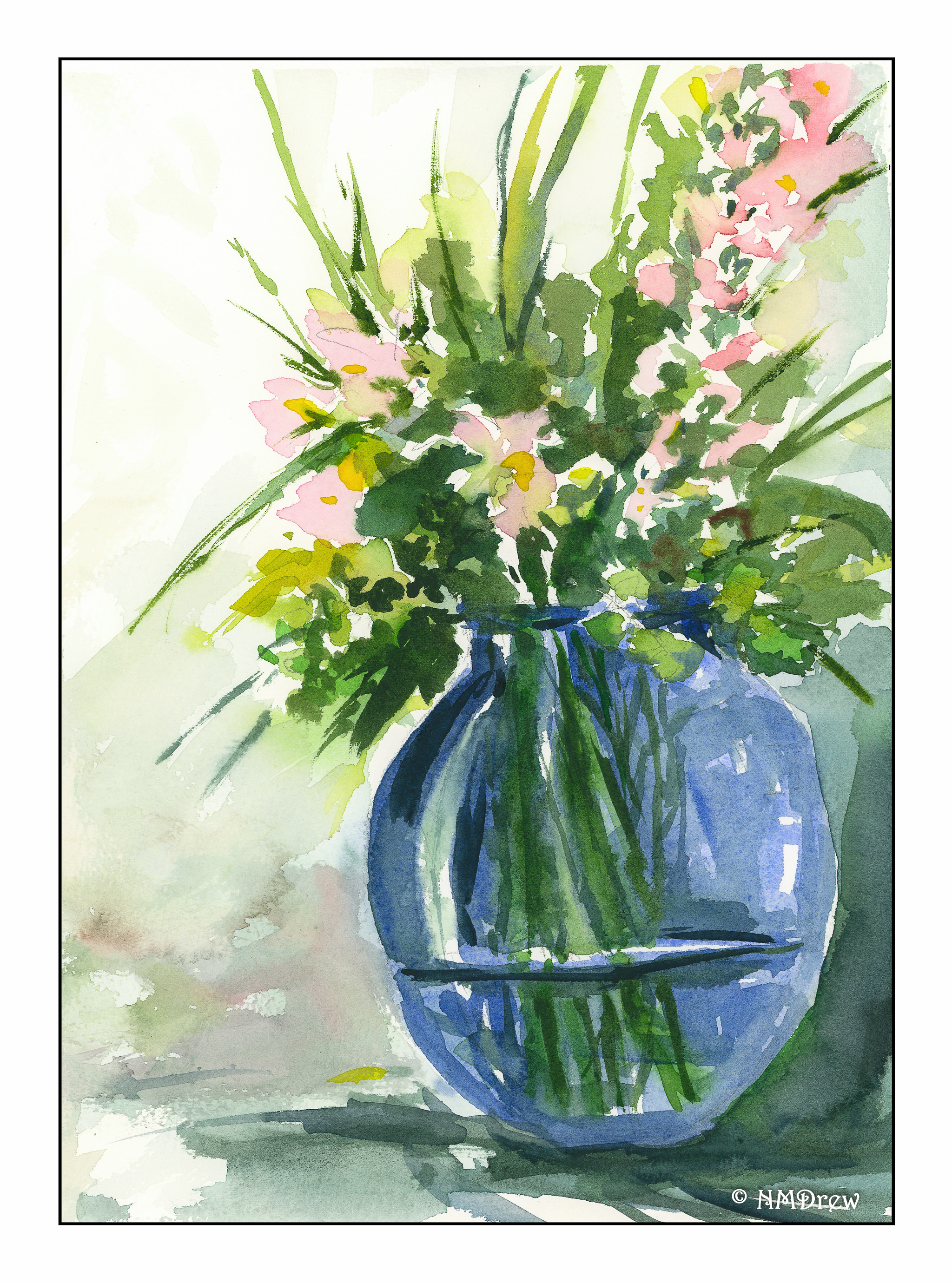
Yesterday was one of those days filled with things to do, with more things to do added last minute.  Toward the end of the day, I really was not in the mood to do much more than veg out, be a blob, and sink into a stupor.  Nonetheless, I girded up my proverbial loins, and sat down with an imaginary bouquet in my head and a reference picture for light and shadow to use with the imaginary bouquet.

I didn’t set out to do too much – but in the end, it worked out pretty good.  I kept in mind light to dark.  I also kept in mind working over the whole painting, shifting back and forth from one area to another, and applying a hairdryer when things needed to dry out a bit more than my patience was willing to wait for.  All of a sudden, I swear, my mind said, “Hey, let’s paint around these flowers!”  There were not any flowers in that area, but I did negative painting without too much thought.  Wow!  That was a big shift for me – I’m still quite the newby in this area.

So, here we are.  Colors include sap and Hooker’s greens; Payne’s grey; ultramarine and cobalt blues; hansa yellow; quinacridone rose.  There may be a few others.  I used one brush, too.  The paper is Fabriano’s 100% cotton Artistico, and that alone helped a great deal – evident as the other side of the paper was already used for a wash-heavy exercise!

Orange Lilies

After “getting” negative space yesterday, I decided to make a complicated drawing and “work” at negative space.  I have orange lilies blooming in pots on the patio every year, and they are brilliantly orange with piles of leaves in all directions.  What better source of light and dark, overlaps, medium shades?  And in the afternoon sun.  So, here you go.

Watercolor Pencil Studies

Even though I am trying to be a good patient and wear my splints all the time, it just isn’t possible.  I am still limping around, too, so I am not doing much hiking as my knee still hurts from the fall.  Rather, I am on the patio in the warm afternoon sun, away from those dangerous dogs!  I had a few pictures, a bit of imagination, and some watercolor pencils.  I decided to try them out in some rather different ways to learn how to better use them.

Above is a Black Phoebe.  They live in the trees around here.  Their feathers are darker om the head, and their faces are not quite so fat.  I tried to get in line detail and then used a fine  brush.  Darkest blacks were from an ink brush.

Next, just a simple Japanese maple leaf, no lines, only pencil and water.  I laid it on pretty thick, but it is still paler than what I would like to see.

Finally, Queen Anne’s Lace.  Here I wanted to draw into negative space, so what better subject than white flowers?  I used ink, and for the paler flowers in the background, I dipped my brush in water and took color off the pencil tips before painting onto the paper.

Tree Ferns

When I first posted the outline of these ferns, a reader, Sharon, suggested in her comment to fill in just the background.  I was going to fill in the stems and leaves, but her idea was intriguing.  I had thought of using watercolor with a brush, or watercolor pencils, or even just colored pencils.  Instead, I thought brush pens (like Tombow, but not Tombow) might work.  So, I ordered them from Amazon.  Fun to use, and a lot of colors!  And a great excuse to buy some art supplies, don’t you think?  I rather like the results.  Thanks, Sharon!

In a Pickle!

Pickles - 1

If it weren’t for Elizabeth Fluehr, I wouldn’t be in such a state.

I did a search for negative painting on YouTube, and came across a series of three videos on the subject which she did.  The first one is pretty simple – it explains what negative space is, and what it is not.  Very clear explanation.  The heart of the matter is in the second video, all done with a pile of pickles.  The third is the actual painting, time lapsed a bit because of the time needed for paper and paint to dry.  Check out her website as well as her YouTube channel.  You will see some lovely work at her website.

Pickles 2

As Elizabeth defines it, you are painting a defined edge, and painting away from it.  You can have a lot of edges, or a few.  A whole painting may be made of negative space, or integrated inside a painting with positive space.  Her suggestion is to paint what is closest – in the video’s case, and in my practice sample, the pickles on the top of the pile.  Then work to the next layer, on down, until the very bottom layer is done.  She explains, too, that in a landscape, it would be the object closest, such as a barn, and the last painted would be the horizon.  I think that would apply for a landscape done entirely in negative painting, which might be worth a try, and could create a really interesting abstract.

Pickles - Finished

For me, negative space is a hard thing to address. Working in sumi-e, one does some work with negative space, but its handling, from my perspective, is a bit different. Partly this is because of color, which for me is altogether a big distraction. However, Elizabeth Fluehr’s pickles are a great exercise, and one which I intend to follow up on with more paintings.

Hard Edges & Negative Space

And while I was doing the pickles, in between I tried a bit of a still life, painting around the flowers in the background, and some of the edges, working wet-into-wet. Not a nice painting, but the practice was the purpose.