

Tag: mountain
Spring Comes to the High Plains

I have to admit, I am on a winter kick. Cold, chill. And loneliness. I don’t tend to paint or photograph people or civilization, but as far as painting goes, I need to get into painting them. I’m doing okay with moving inland water. But buildings, people, and oceans leave me baffled for now.
So, the open spaces of the flatlands between mountain ranges. Harsh weather, blasted heaths, winter and wild weather. The hint of spring.
Cold & Cloudy
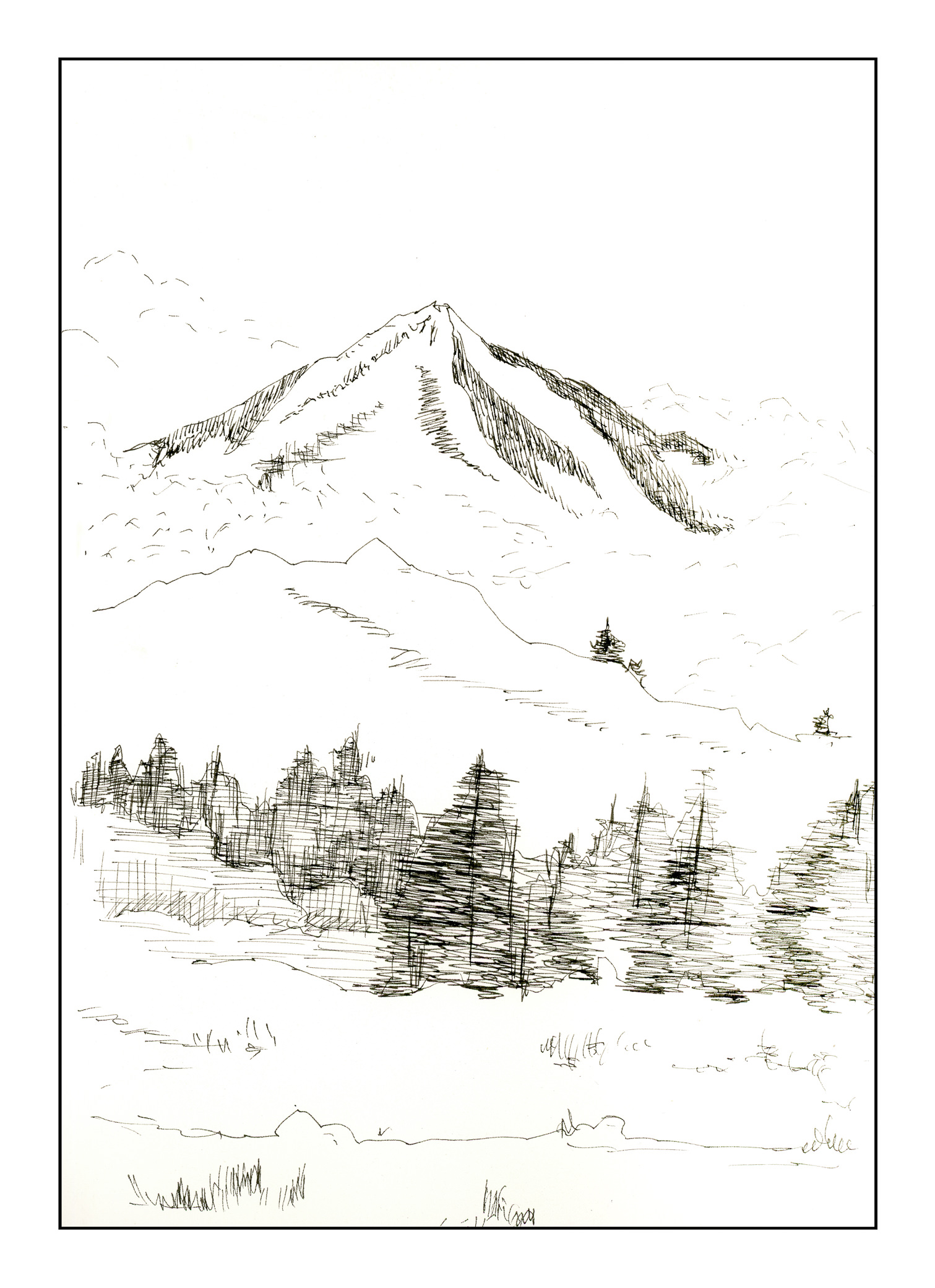
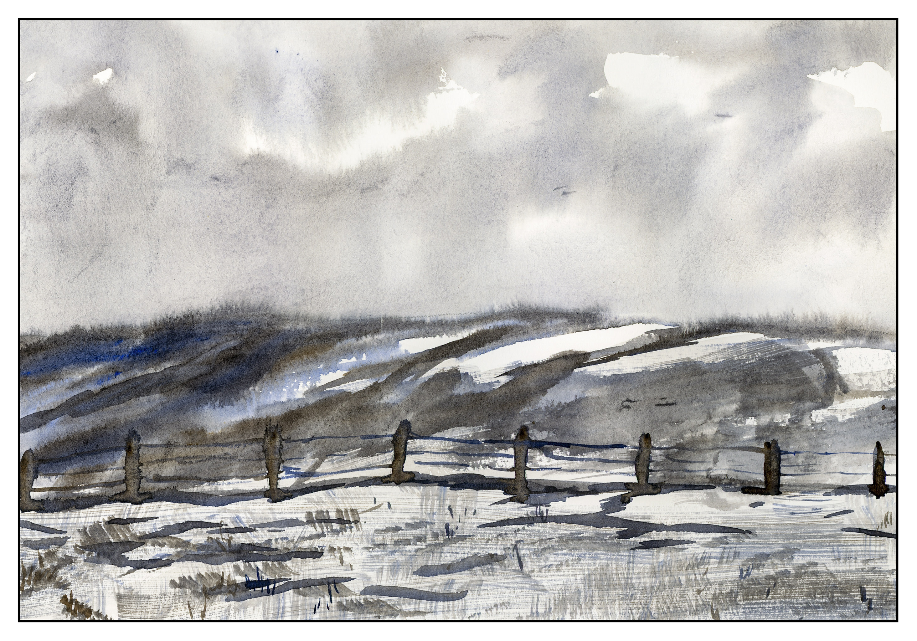
Inktober continues apace, but I have been going 100 mph for the past week. No time to focus on a theme. This morning, though, I thought about cold mountains and winter – where I live, it’s in the mid-80s to low-90s, and I could use a bit of blustery weather.
Here is a mountain – inky for Inktober
And here is the same scene, in cold and wintry colors.
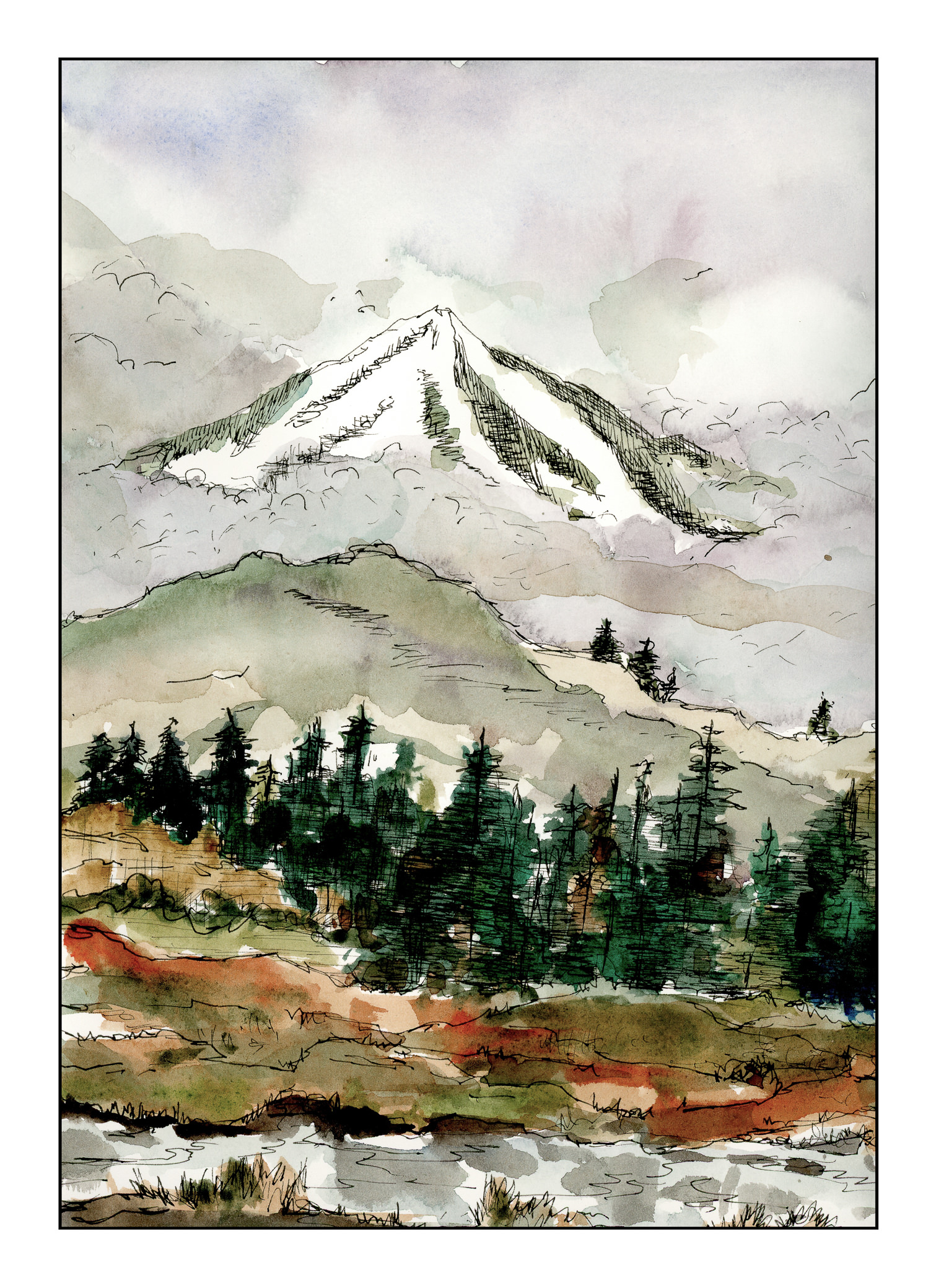
I used to do a lot of Chinese painting, and I tried to incorporate the clouds in a rather Chinese-painting fashion, in ink and watercolor. Hints, not direct; subtlety rather than blatant. I’m not sure if it worked for the clouds between the mountains, but I definitely like the chilliness and fogginess of the scene overall.
Studies in Two Colors
Over the weekend, I worked on numerous simple watercolors, inspired by the 2-color studies found in Ted Kautzky’s classic book Ways With Watercolor. He suggests beginning with just two colors, Burnt Umber and Ultramarine Blue. From his book, I did the exercise below.

The umber and ultramarine are considered to be “warm” colors from what I have read, but they work to make wonderfully cold winter scenes! Here are some I did after the one above, to continue the study.
The beauty of using only two colors is there is little likelihood of making mud. That’s a good thing! Instead, I got to focus on value, which is not an easy thing for me.
Values are not just light and dark, but everything in between. For instance, above, there is bright white, a light grey, a darker grey, and so on, moving into essentially black.
Besides working on value / contrast, the above painting was a work done with a lot of wet-in-wet, particularly at the horizon line, to blur the plant growth into a hazy atmosphere.
From there, another wet-in-wet, accompanied by a gradated wash, in the above painting. I started with pure Ultramarine Blue, and then worked it lighter and lighter until I reached the bottom of the sheet. Then, with a dry brush, I worked upward to remove the blues. You can see some blue streaks left behind. After the picture was finished, I used white gouache and a toothbrush to spatter snow onto the painting.
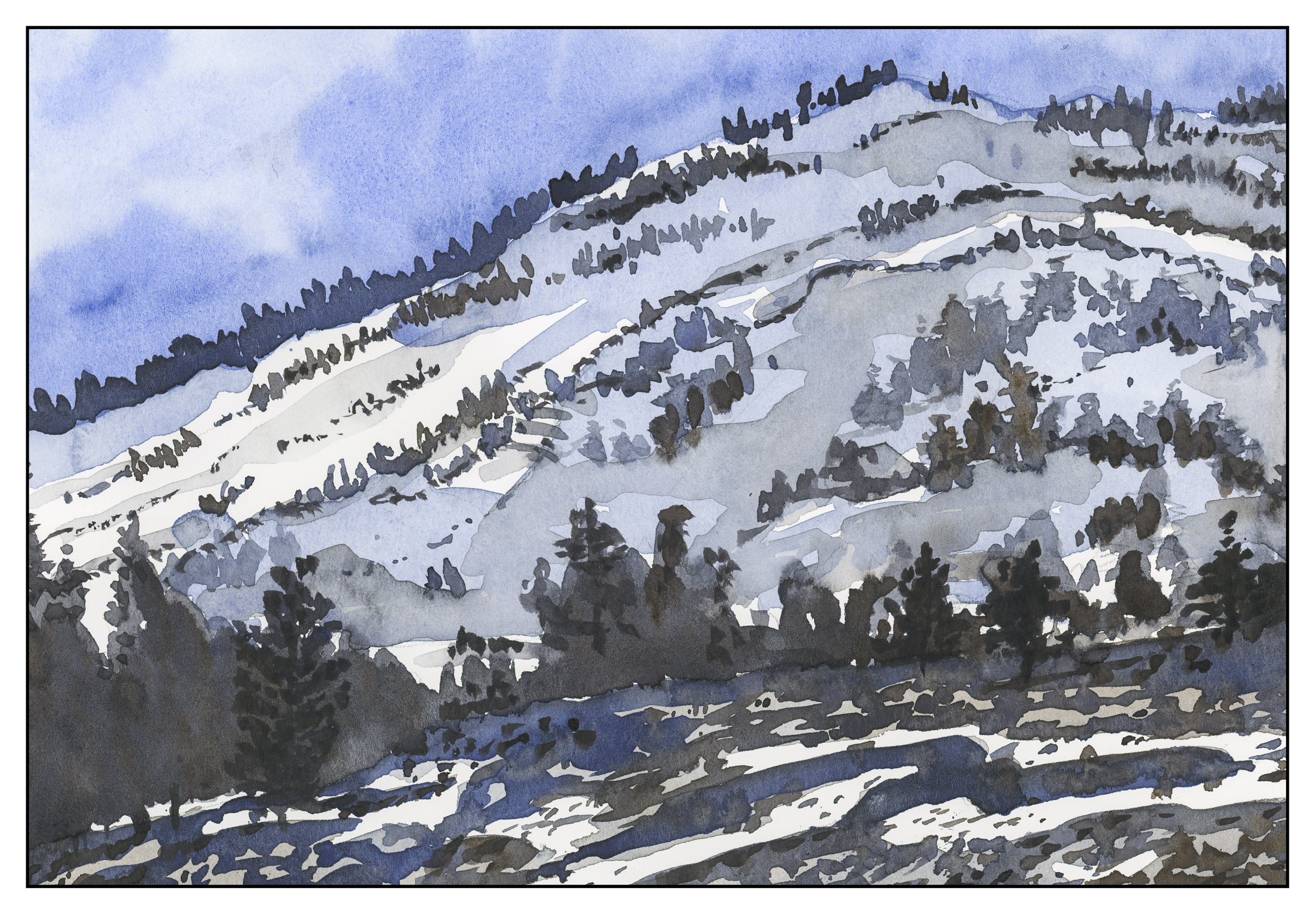
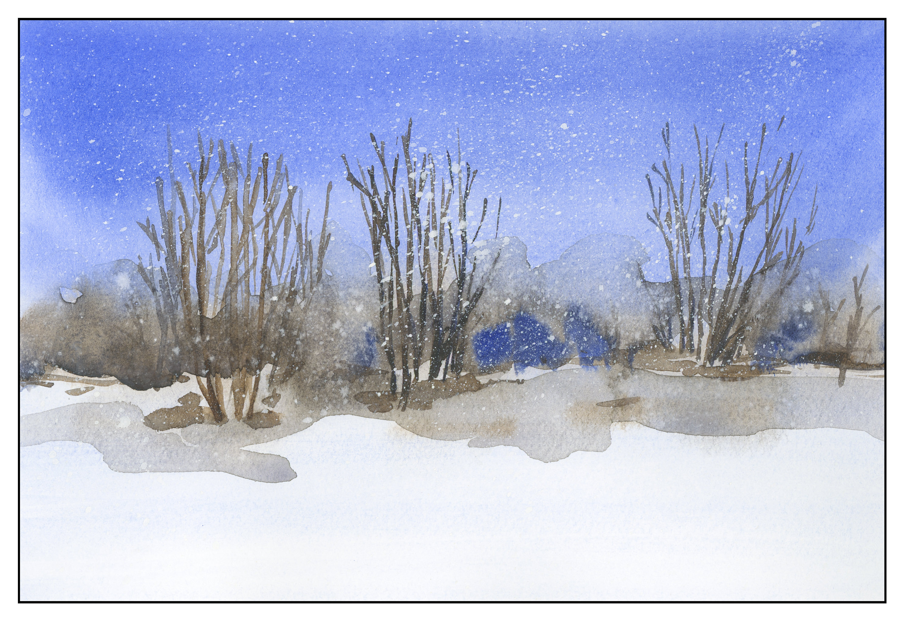
After all these umber-and-ultramarine paintings, I have moved onto ultramarine and Burnt Sienna. The sienna is much warmer, to my mind, as long as it is not mixed with the ultramarine. With ultramarine, the color can be as deep as you want – nearly black – as you can see in the trees.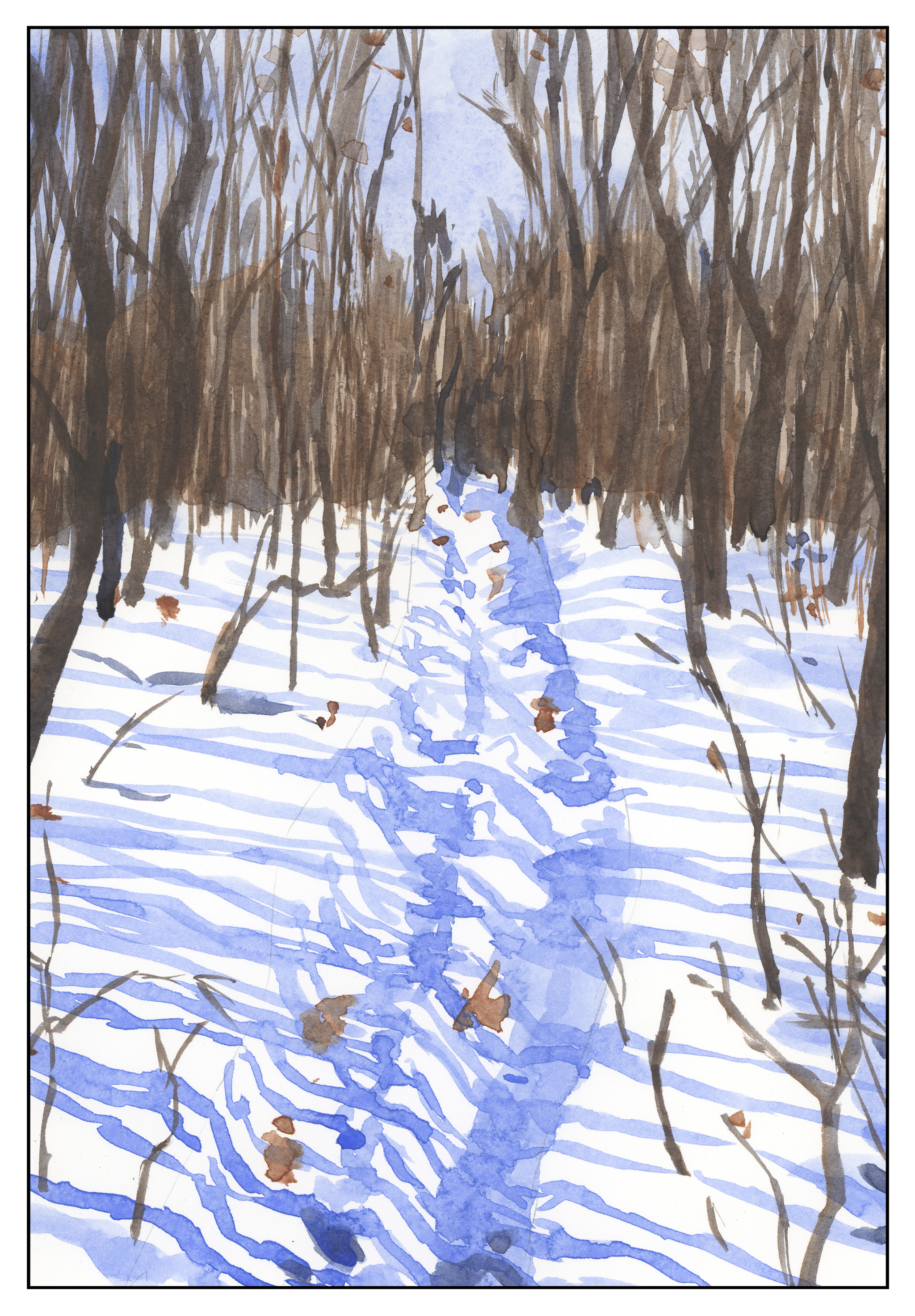
The shadows across the snow, and the ruts, were painted with plain ultramarine, as was the sky. It’s a great color for shadows, on snow or otherwise. You will see that the dark colors, such as on the trees to either side in the foreground, are blackish, but of a very different hue than the darks in the paintings above.
This study has been worthwhile. I may do more in just two colors, or add a green. Varying just one color produces considerably different results. I also did the same pictures over again, in different browns or blues, or both; this is also a good way to become familiar with colors and how they interact.
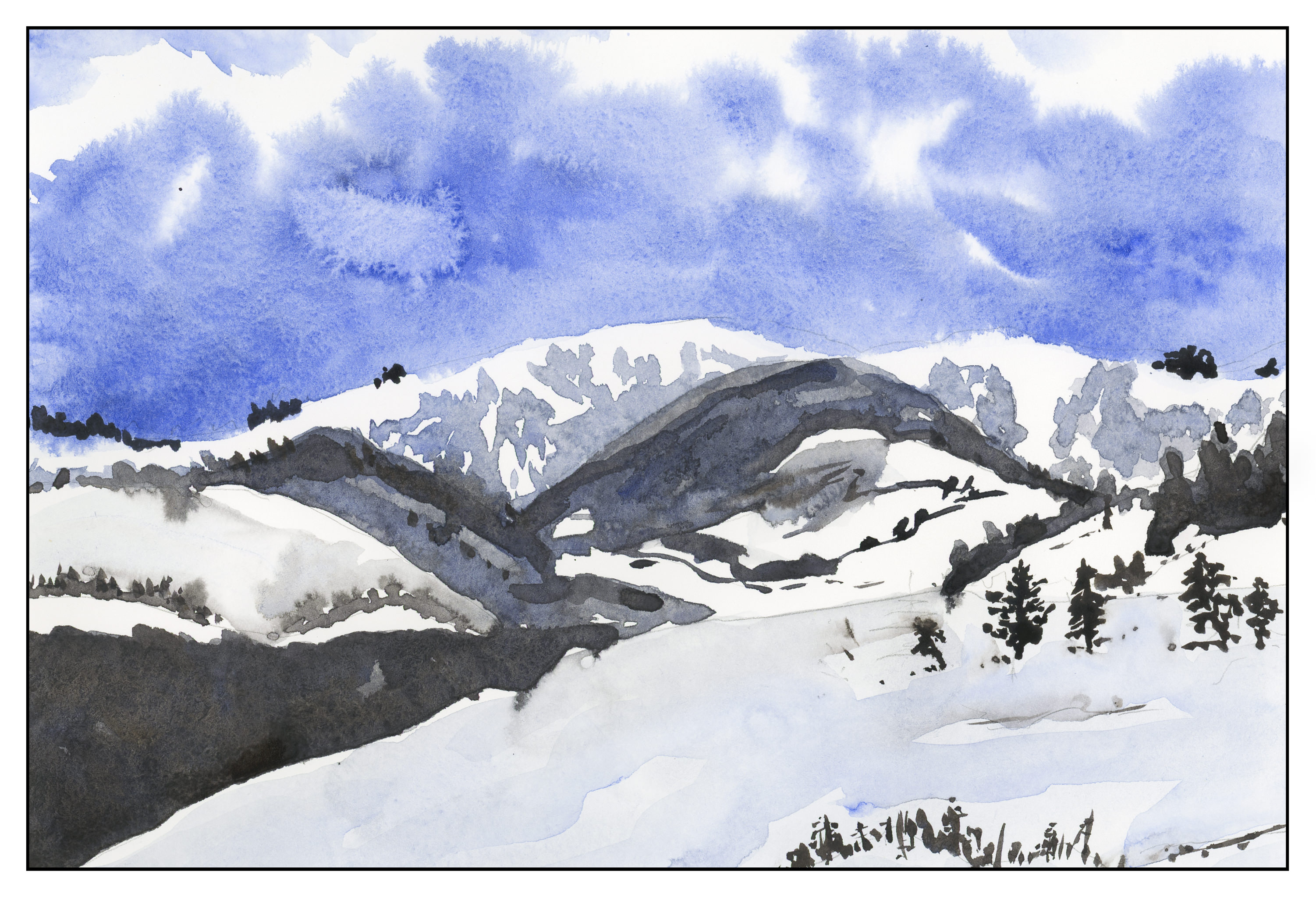
Two Color Studies: The Mountain
One nice thing about working in only two colors, you don’t get mud. You get dark colors. You get light colors. You get medium colors. I find that this is actually harder to do, in some ways, and easier, too. Harder because I have to decide on value (light, dark) and which direction to push the color (blue, brown). It’s easier as the decisions of color are already made for you (me, the painter!). Here I have limited my palette to Ultramarine Blue and Burnt Umber, as in the earlier studies from Ted Kautzky I did last week.
After looking at the scan, I realize that some of my darker trees in the foreground sort of float in space! The lighting at present makes it hard to see, but I will probably go back and correct it later on.
