Thoughts on Brushwork

In my last post, I looked at both portraits and brushwork. Doing both is sort of a new adventure for me – portraits, certainly, but brushwork is something I play with periodically. Two artists I admire for both their subject matter and brushwork are Maggie Siner and Hashim Akib. Both have very clear brush marks as well as a strong sense of graphics and color. Siner’s work often displays wide swaths of color and Akib’s often does the same, as well as creates movement and light with brush strokes. Their portraits are striking.

That said, I am a dabber and a rather haphazard (okay, very haphazard) painter in my approach. I paint and putz, sometimes getting it right, sometimes getting it wrong. I will draw in a general idea, but don’t do much more. In particular, I don’t do value studies as I want to look and decide on the scene. I want to train my eye to see them in the picture or landscape or person. It is far more difficult than I think it will be. Slowing down helps, looking and then going into the painting process.

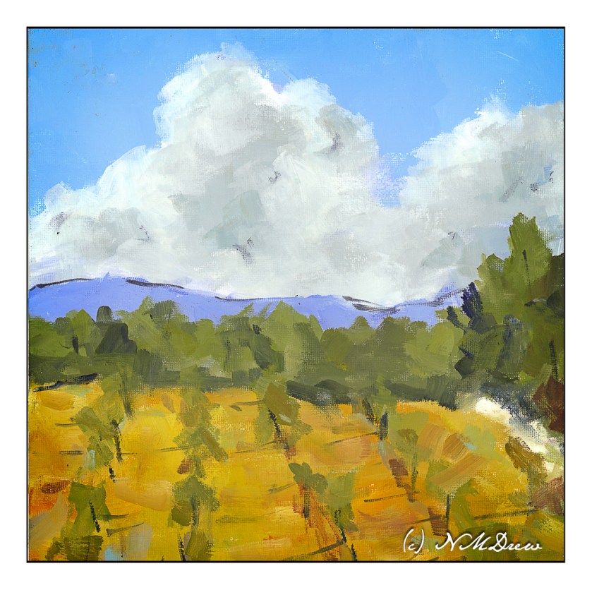
I did the painting below vaguely based off a paining by Siner called “Golden Cumulus”. You can find it on her website. Siner’s brushwork is deliberate, and she says she scrapes her oils off until her brushstroke is as she wants it. She doesn’t paint over things.

What I was looking at in her painting were her brushstrokes. They are directional, sometimes heavy with paint, sometimes not. At times she smudges and edge into another to break things up. For my variant, a wide brush, a square canvas, and either oils or acrylics using the colors found in Siner’s palette, which is very limited.

A lot was learned here: A limited palette makes color choices easy and harder – gotta mix those colors! A big brush – here a flat – allows far more mark making than I thought possible. And a big brush forces me away from my dab-dab-dab with a pointed round.

I don’t remember when I did this painting nor what media I used, or even if I published it here before. I found it the other day and remembered what my goals were. Brushwork then, brushwork now. I’m trying to clean up my oils / acrylic painting skills like I worked on with (and sort of succeeded with ) watercolors.

Oil or acrylic on cotton canvas board, 12 x 12, sort of a master copy of Maggie Siner’s “Golden Cumulus” ca. 2018.

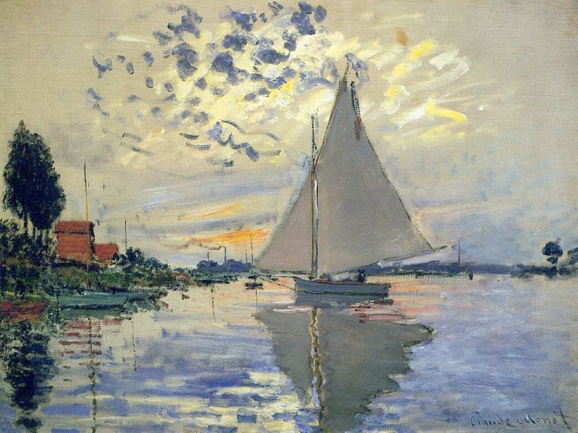
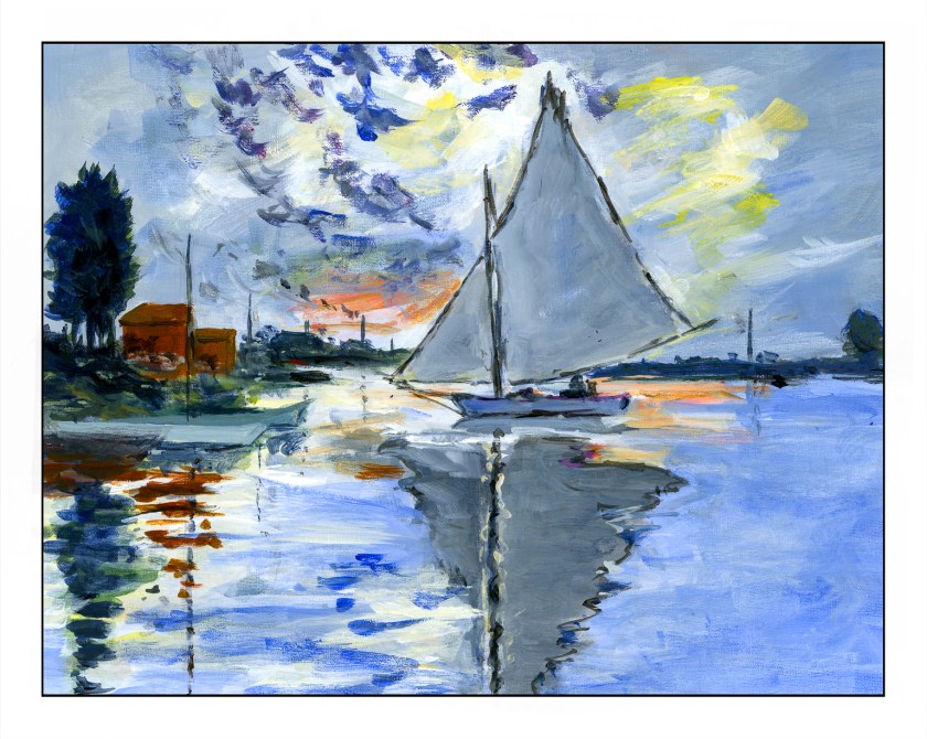
Master Study of Voilier au Petit-Gennevilliers by Claude Monet

The original painting by Claude Monet was painted in 1874 and measures approximately 22 x 29 inches. My painting measures 11 x 14 inches, so it is close to the same proportions. I left out a few things simply because I was not trying to replicate Monet’s painting but catch its sense of spontaneity. This spirit is what I found refreshing, and while Monet probably finished this painting alla prima, I spent about 6 hours in the studio. He used oils. I used fluid acrylics.

As I started to look more closely at Monet’s painting, I saw that his brushwork was very quick in many areas. The smudges of smoke in the left middle ground, the dark, wispy clouds used up a rather dry brush, one where paint was nearly gone. The white-blue swash across the sky seems like a quick thought. As well, it was interesting to see how the dark bits of clouds worked with the yellow and white areas to focus the viewer’s attention on the sailboat itself.

My own painting is more blue than Monet’s, but I saw a lot of blue in my reaction to his painting. Comparing the two is really interesting when I compare my scan to the Wikimedia online image presented here. It is hard work to get a good, warm grey and I did struggle with it. I also had to work on observing little things, such as the boats on the left middle edge – I couldn’t figure them out initially. The chimneys on the horizon also needed to be considered – what were they? The smoke on the left horizon gave it away. Once I had the boats on the left sorted, the vertical lines reflected in the water made a lot of sense.

What I really love about this painting is how it catches the light, which, of course, is the idea behind Impressionism. The moody sky with bits of cloud and fog and light as evening descends is what caught my attention. Even now, as I compare my master copy to Monet’s painting, I see even more subtleties which I could have caught. But, at some point, you just have to stop!

Fluid acrylics, Centurion OP DLX linen canvas pad, 11 x 14.

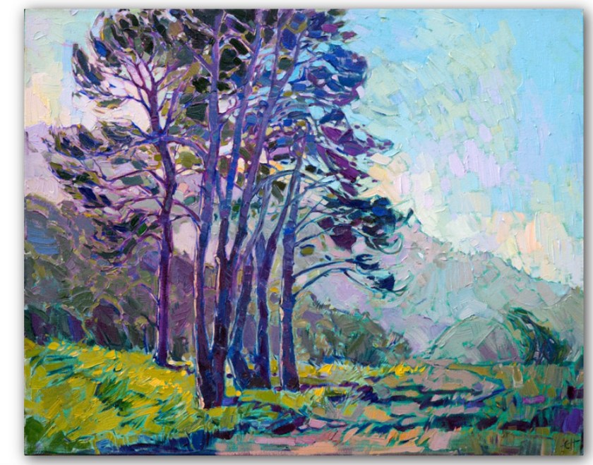
Master Copy: Erin Hanson’s “Coastal Light”

Erin Hanson painted this painting in 2017 and it measures 24×30 inches. You can find it here on her website. It is called “Coastal Light” and it shows an evening (my opinion) in Southern California sometime in the spring when the rains have come and the hills are green.

I chose this to use as a master copy because the composition is simple, and I felt I could relate to it emotionally. For me, connecting with a painting or subject matter is very subjective – if I don’t like something I am not interested. I also felt I could handle the colors comfortably.

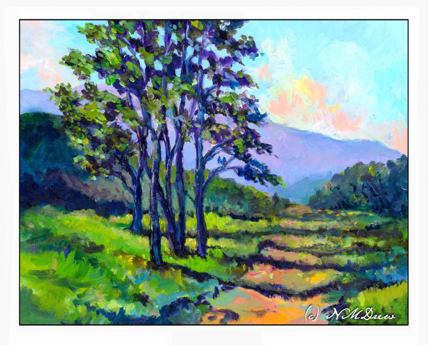
My own painting is in oils and as I worked on my copy, obviously things shifted. This master copy measures 16×20 inches, so of course my proportions are a bit different.

A number of things drew me to this painting. First, as I stated above, was the relative simplicity of the composition. The colors Hanson uses are vibrant and the air shimmers a bit. The leaves seem to flutter in a light breeze. I like the quiet energy of “Coastal Light”. The spring evening is very gentle. Additionally, what also attracted me was the way Hanson subtly outlines the shapes of the tree trunks, vegetation, clouds and terrain. Brush strokes give a sense of direction, especially in the foreground.

Initially, I tried to paint this using acrylic paint. I laid down the initial painting about 6 months ago, and really did not like it. Acrylic paints are not easy to use as they dry so quickly. I found the painting rather harsh and was thinking of painting over it with something else. Instead, it sat in the garage, ignored. And, I think, that was not a bad thing.

When my current painting class began again, I decide to pull the painting out and re-do it using oils. I didn’t have Hanson’s painting to refer to as I had forgotten where I had found the image. So, I just painted over the acrylic paint with oils, using the acrylic painting to guide me into finishing it. This took me about a month of classes once a week, and only last Tuesday did I finally consider it finished and not needing anything else.

I finally found the image of “Coastal Light.” Comparing my version to hers, I found that what I really like with both are the way the tree trunks are delineated using light colors to show light without overdoing details. Foliage, too, was something which pleased me in both paintings, with Hanson’s being a bit more expressive than mine – I am a dabber, and my foliage is definitely dabbed! When it came to bigger areas of color, such as the distant mountain, foliage, and foreground, my dabs got all mushed together to create better color masses and shapes.

For me, a master copy is to learn whatever I learn. I have no goals specifically in mind. What I came away with was an awareness of my need to stop dabbing and become a bit more bold in applying areas of paint. My dabs work well when I mush them together as subtle color variations can show up. I really liked doing the tree trunks and the foliage, working to get a sense of the direction of light on the trunk and the movement of the fluttering leaves. Achieving a sense of depth using the contrast of shadows falling across the path – lighter in the distance – was a bit of a challenge but my lovely instructor, Barbara, really helped me see what I was not seeing.

An oil painting master copy is sort of a luxurious event because time is on my side. Watercolor master copies, such as with Seago, are very immediate as watercolor is simply watercolor! Doing this, my first master copy in oils, I have come away with a better sense of how to paint a mood and light. Even better, my level of frustration was very low once I began working in oils – acrylics really cause me to get agitated because I feel like I have to work so fast to do this or that before they dry. Altogether, I enjoyed this and learned more about how to use my paints. For me, the trees were the best part of this adventure.

Erin Hanson’s colors always appeal to me, and, of course, color is subjective. Her sense of composition is one of her strong points, and her brushwork is enjoyable because it creates an energy that works well with much of her subject matter. I may try another one, working a bit differently than I did here, because the entire process was both challenging and satisfying. On top of that, she loves landscapes and the great outdoors – much preferable to portraits I think!

Why a Master Copy?

Copying the work of a master painter, as I have been doing with Edward Seago (and others) of late in watercolor, is a time-honored tradition in learning how to do things. There is a lot to be learned while doing a master copy, and doing a master copy imprints itself on the copy-ist in many ways. Search “why make a master copy” on the internet, and you will find a million bazillion results.

Here are some reasons from Cecile Yadro’s website:

  • Beat the art block
  • Develop your skills
  • Get creative inspiration
  • Learn to self-critique
  • Improve your observation skills
  • Develop patience and focus
  • Develop muscle memory
  • Build confidence

These are all great reasons, and some you may not even expect, such as muscle memory! For me, these are salient reasons, and even more importantly, open my mind up to a way of doing things and seeing things that I probably never have otherwise considered. By nature, I am not analytical but reactive – patience is not one of my virtues and frustration is not something I like reacting to. As a kid, well, let’s just say my inability to handle frustration made me the “bad” child!

Watercolor master copies are easy enough to do, as is with any water-based medium which dries quickly. I say “easy” because once done, I can scan them and look at them, and critique them more objectively. I see things I miss when looking at a non-digitized painting. (Need to work on that!) Oil painting, though, is a different story. Oils you can paint over, you can use quick-drying mediums, you can take forever to decide something is finally “done”. I have been working on three oil paintings, master copies of three different artists: Erin Hanson, Michael Chamberlain, and Maggie Siner.

Today let’s learn a bit about Erin Hanson.

I first came across the work of Erin Hanson about 3 years ago. Cruising through who knows what, I found her site and learned that she created a painting style called “Open Impressionism” which, as her website states, “continues the work of impressionists and post-impressionists.” It does insofar of the radical use of color to capture light and movement. There is a freshness here that I rather like, and the bright colors appeal to me. Her ability to create good composition is evident, too, and these make for attractive paintings. Below is a lengthy YouTube video which will acquaint you with her work:

YouTube has a number of videos by and about Hanson. Explore at your will. As well, check out her portfolio of paintings on her website – you can see her evolution over time as well as decide for yourself if you like her style. As with any artist, some paintings will appeal to you more than others.

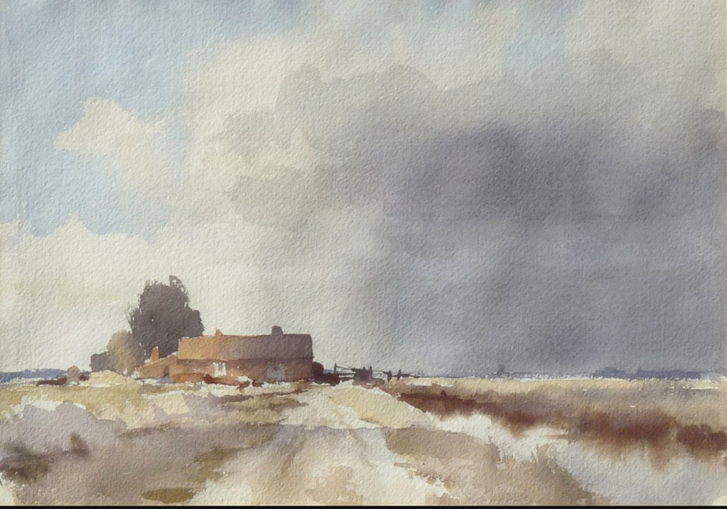
Edward Seago: A Norfolk Farm

Quite a few years ago I read a really great spy novel that took place during WW2 in Norfolk, England, and this just happens to be the place Edward Seago lived most of his life. Looking at a lot of his paintings, I get the feeling that sky is quite amazing and huge over relatively flat countryside. I’ve never been there but a bit of research shows it is largely rural and has about the same population as my own county here in California.

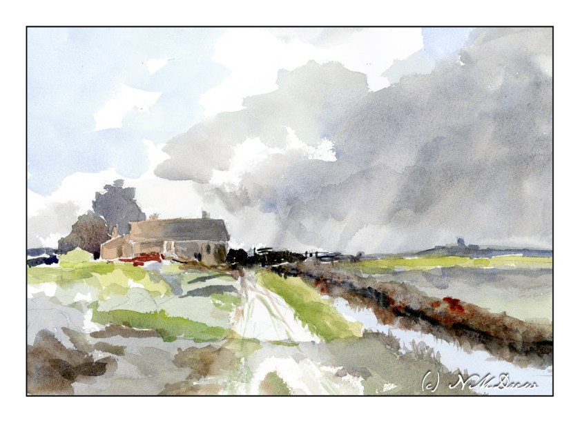
Once more, a study from a watercolor Seago did. I think, as with the one yesterday, the paints have faded a bit and so I tried to replicate them to a degree, but also chose to make them a bit more intense, as perhaps they were when he originally painted the farm.

The use of wet washes works really well here. In the building, the light from left to right on the roof and building show excellent control – the gradation from light to dark is subtle. This take a bit of work – getting the paper and paint at the right stage of moisture to make this work. My own attempts were quite awkward and it shows. The sky to the right of the building has what appears to be very gentle streaks of rain coming down – maybe it is just warped watercolor paper – but I thought I might as well give it a shot! What I find especially wonderful is the foreground – a cloud shadow drifting across the scene.

In many ways I am pleased with my master copy of Seago’s “Norfolk Farm”. I managed to maintain a bit of subtlety in color. I also tried to match the values of light and dark and mine is a bit stronger than the reference image. As well, my steeple or whatever to the right of the farm house is a bit too big and a bit too dark. The simplicity of Seago’s painting was challenging to replicate but I think I managed.

The colors I chose are ones I know to be available in the time period in which Seago painted this watercolor. I used cobalt blue and ultramarine blue for the sky and water reflection. Burnt umber and burnt sienna are my browns. Yellow ochre and cadmium yellow helped make greens, but I do use Hooker’s green a lot as a stepping stone for green, and my preferred on is made by Winsor Newton. Additionally, the info I have on Seago’s painting indicates it is about 10×14 inches, so I used rough 140# Arches paper in the same size.

Master copy, Edward Seago, limited palette, Arches 10×14 rough 140# paper.