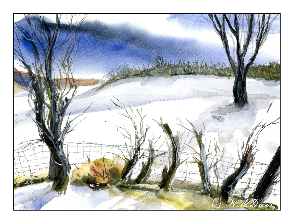
Once more – should I put something in or take it out!?!? The original of this painting, along the northern coast of California, is originally painted with a small island offshore. Looking at it I didn’t like it – perhaps too close to the tree on the left overhanging the beach. Thanks to Photoshop, I removed it.
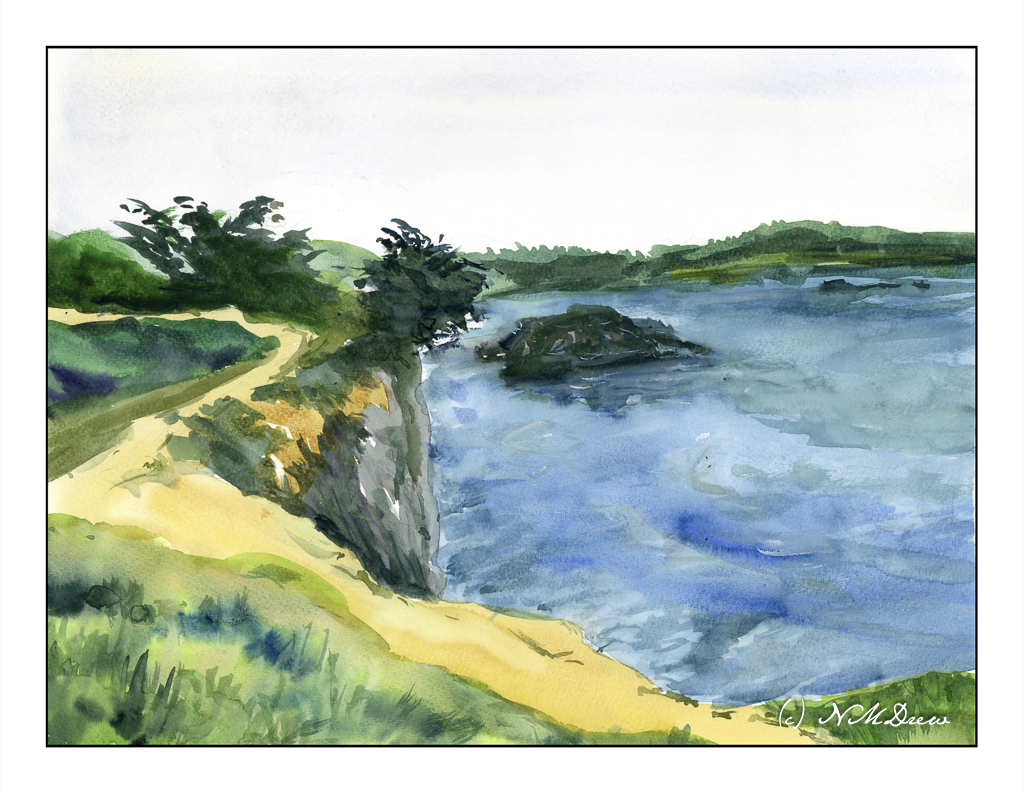
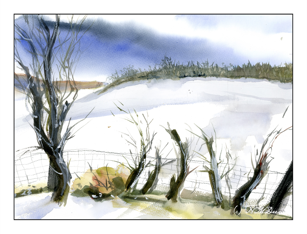
The above painting is the one that exists in the real world. The one below is the one edited with Photoshop’s “generative fill” – poof! No island.

Because I am feeling kind of spartan these days, sometimes I think I have too much in a painting. Maybe it goes along with limiting my palette of colors?
And my palette? A bit more expansive than the previous, but the subject matter seemed to need a bit. I used umbers, sienna, ochre, Indian yellow, phthalo blue, a touch of ultramarine, a bit of dioxazine purple, and Hooker’s green.
My technique was to use oodles of water as I wanted to see how well the Bockingford non-cotton paper would hold up. It did quite well! Every large area – sky, ocean, land above the cliff – was wet with clean water, and then painted with the colors. The sky had one wash, but the ocean had multiple wet washes. The land in foreground and distance had a big wash later accented with dry on wet.
I am also pleased with this painting, even with my thoughts about the island.
St. Cuthberts Mill, Bockingford 140# CP, 12×16.
And what are your thoughts – island or no island?