
Podocarpus

Our backyard was filled with about 18 trees, far too many for the allotted size.  We had 5 trees removed and the remaining pruned backed.  Eventually all but 2 will be removed, roots dug out, stumps ground down.  I don’t know what this guy was thinking when he put in all these trees – I had neighbors I didn’t even know I have stop to tell me how much nicer it looked and they had “told” him he was putting in far too many.  We can actually see the sky at night!

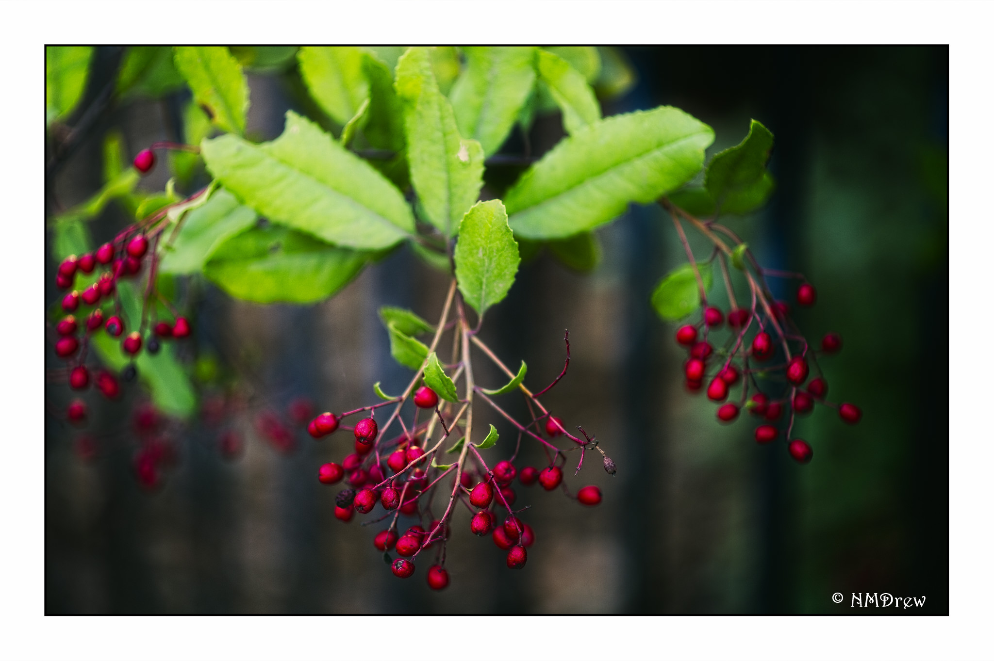
That said, after the crepe myrtle, I moved onto the podocarpus, which are rather lovely or ugly trees, depending on my mood!  For now,  I’m just doing simple things – not that these leaves were simple.  The leaves of the podocarpus in our yard have leaves that grow in clumps, rather like bamboo in shape, but totally not bamboo.  Still, the leaves may be painted with the tip of the brush, a bit of downward pressure, and then a rise to complete the shape.

I tried to paint around highlit areas – making a leaf or leaf shapes with green, and then working toward the darker areas.

I keep forgetting what a challenge watercolor can be, but it makes me so happy to do it, whether or not I am especially successful!
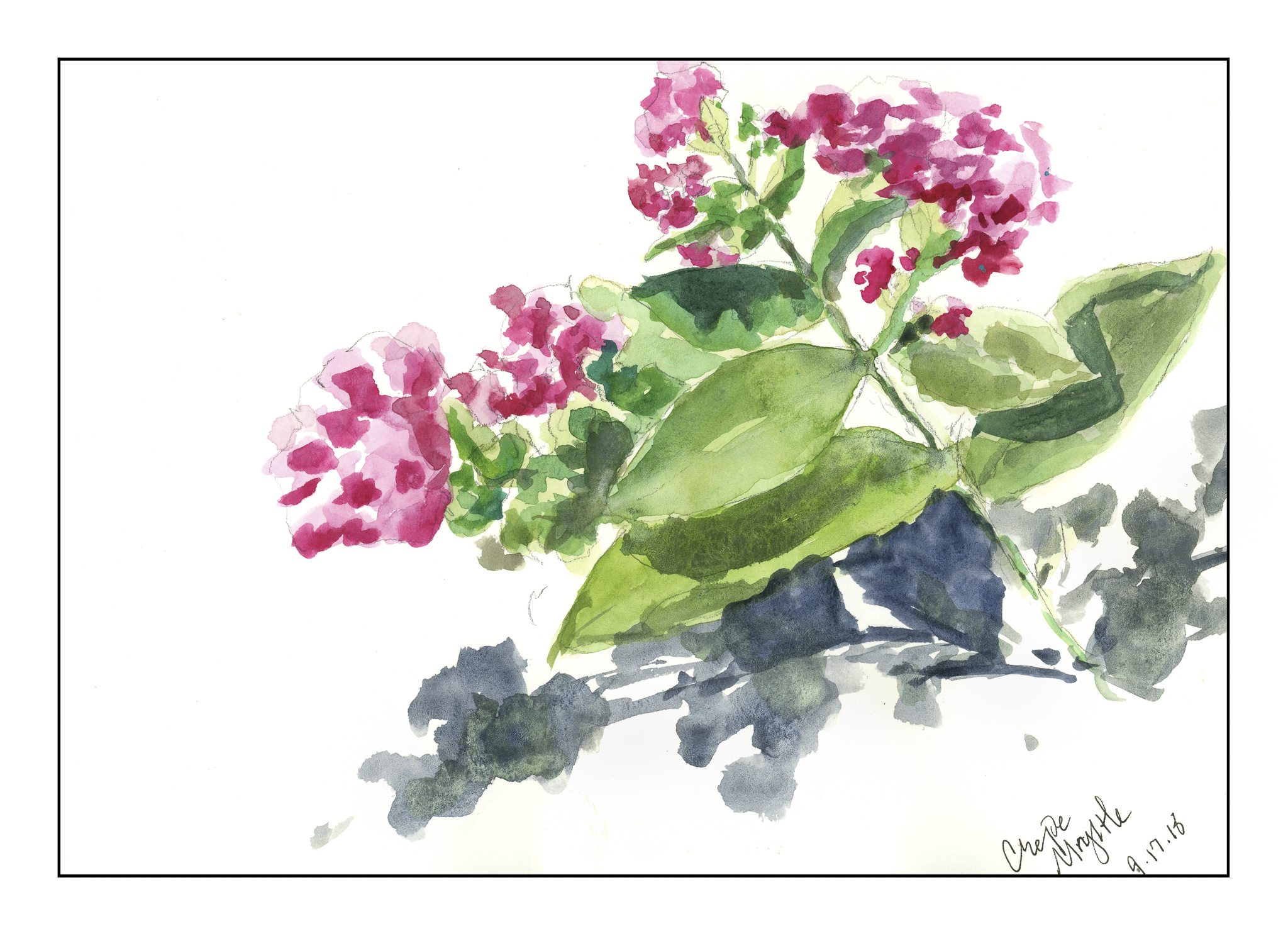
Crepe Myrtle

For the first time in weeks, I have had the wherewithal to paint.  These past few months have been rather nuts, and the mental space to focus on the simple pleasure of painting has not been mine to enjoy.

This morning, I sat down under the big umbrella in the back yard, pulled out my iPad, and took a few pictures of some low-growing crepe myrtle branches and flowers.  A water brush, a sketch book, and no expectations.

Parts are good – parts not so good – contrast is lacking – but I am feeling pleasantly surprised about this small sketch.

More tomorrow!

Sunday Morning

This morning I had one goal in mind:  paint.  With a gloomy sky here on the California coast, the damp and cold penetrate you to the bone.  Once it leaves, it’s a great big sunny day ahead!  So, while waiting for the fog to dissipate, I took a few pictures of a bouquet I put together of chamomile flowers and small, red carnations in a rectangular glass base.  I didn’t do a value study because I wanted to look at the colors – light, dark, and so on – to see what I could produce.

I penciled in the basic drawing, took some notes of the colors and mixed this and that, testing them on a scrap of paper.  Looking at the vase, I saw the different shades of color through the glass with water and without water, as well as the water line and edges of the vase.  Chamomile leaves are multi-lobed and floppy; carnation leaves are rather spiky.  Chamomile flowers are happy, daisy-like flowers, and quite small.  Carnations are upright.  Both are really lovely!

Process was like my last two flower paintings – start with the large areas of color and move into details.  Overall, it worked here, until I started getting into the hodge-podge of leaves.  I think I should have simplified their masses of color, but I didn’t.  I like the negative painting I accomplished for the chamomile flowers, as well as the edges along the bouquet where the white flowers have to merge into something.  The carnations were far more difficult than I thought, and once more, I made something more complicated and tight than I would like to see as “my” style.

Nonetheless, I feel that this painting is a moderate success.  I was patient and let the washes dry, working from lighter to more dark, thinking about white space and negative painting.  And I still have a bouquet of flowers to enjoy!

Orange Lilies

After “getting” negative space yesterday, I decided to make a complicated drawing and “work” at negative space.  I have orange lilies blooming in pots on the patio every year, and they are brilliantly orange with piles of leaves in all directions.  What better source of light and dark, overlaps, medium shades?  And in the afternoon sun.  So, here you go.