
NIMBY

One thing I love about California is the fact that the geography varies so much! Oceans with flat beaches, oceans with cliffs, mountains with snow and mountains with pine trees, and deserts stretching flat and hot, surrounded by mountains and creating a secret world fascinating and forbidding. Worldwide, deserts host animals and plants and insects which survive on little water, are stark and seemingly dead – but of such beauty. Deserts are not for everyone – familiar and comfortable landscapes full of trees and greenery are very different. It took me a long time to appreciate a more stark landscape than the rolling green hills and woods of the midwest and eastern seaboard.
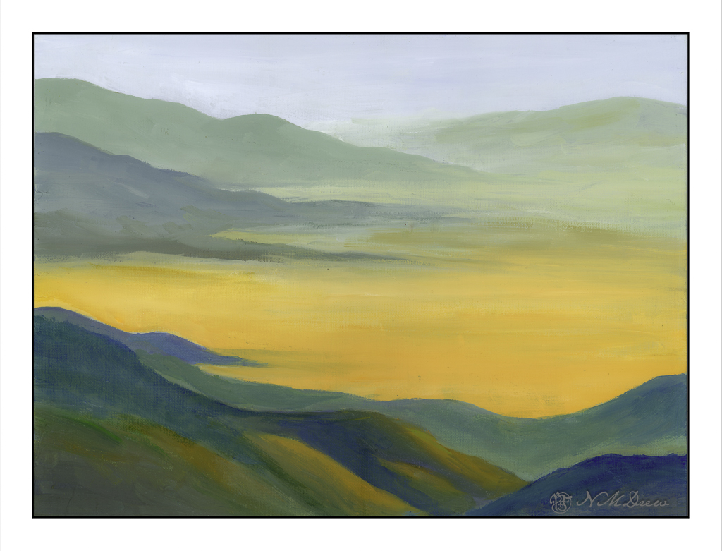
This is a painting I have been working on in my weekly class, inspired by multiple memories and photos taken. I had a limited palette of white, ultramarine blue, Indian yellow, and light green. I tried to catch a golden glow as well as give a yellow-orange cast to the desert floor and hillsides – and create a softly blended painting.
Oil, 12 x 16 canvas panel.
I normally tend to use pointed round brushes for watercolors, but every now and then I pick up a flat brush and use it throughout a painting. The other day I noticed some inexpensive flats on sale in a variety of sizes, so I picked up a couple to add to my collection. Now I have .25, .5, .75, and 1.0 inch flats, some firm, some soft. And tested them out.
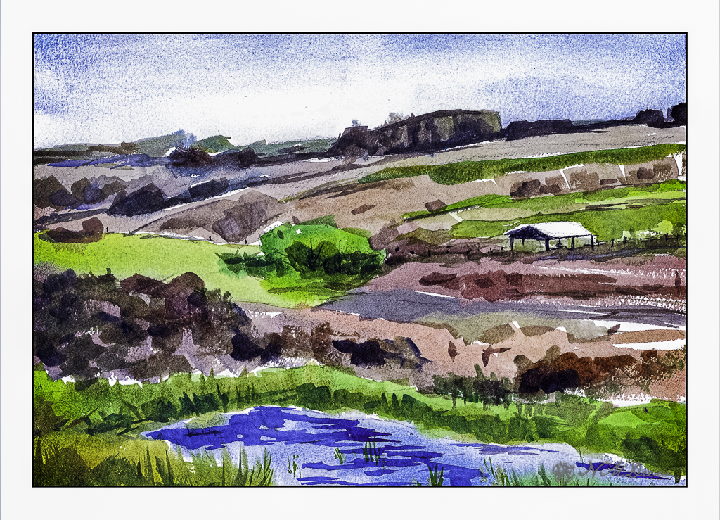
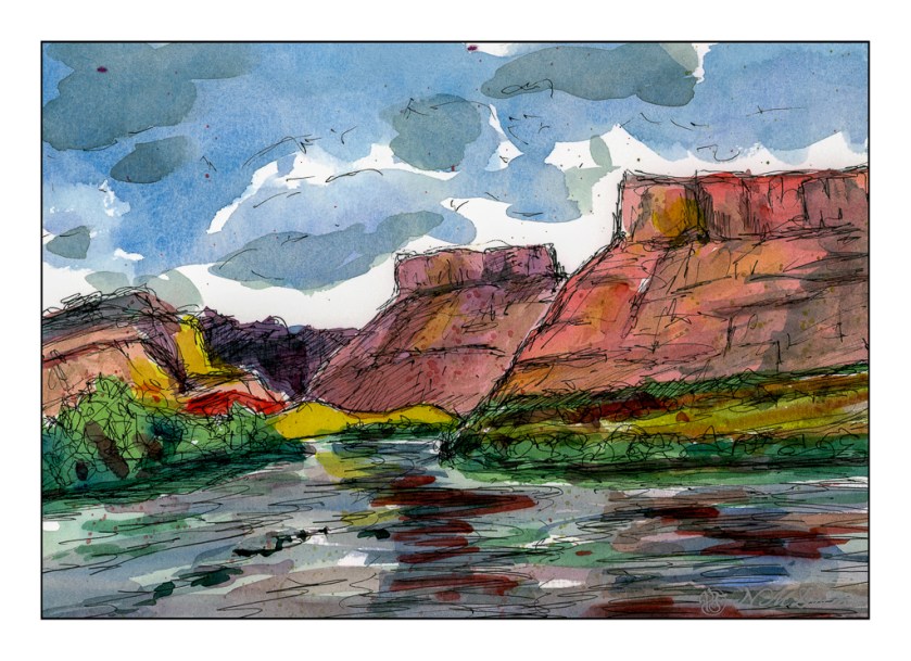
Epson Scan used here – too lazy to putz around. The blue in the sky is granulated and light in color, but the blue in the water is too blue. The rest of the colors seem to be okay.
A flat brush is rather versatile. The longer edge makes for wider strokes, obviously. You can also load your brush with one color on one side and another color on the other side, and when you paint on wet paper, the results can be interesting. I didn’t do that here, but am writing this to remind myself I need to do it a bit more! The narrow side of the brush can give very nice straight lines, as you can see in the hay canopy in the mid-ground. Sharp edges, like in rocks can be easily expressed. Squiggly lines can also be achieved as seen in the too-blue-to-be-true water.
Watercolors, flat brushes, limited palette.
Today I thought I would be a bit self-disciplined and work with only two colors to create a winter landscape. I used MaimeriBlu’s “Faience Blue” and somebody’s artist quality Burnt Umber. Add to that, as needed, some white gouache.
I have never used MaimeriBlu paints, much less Faience Blue. This blue seems a bit of a cold one, which is perfect for a winter day. The Burnt Umber, mixed with the blue, produces a nice dark as well as plays into the coldness I am trying to express.
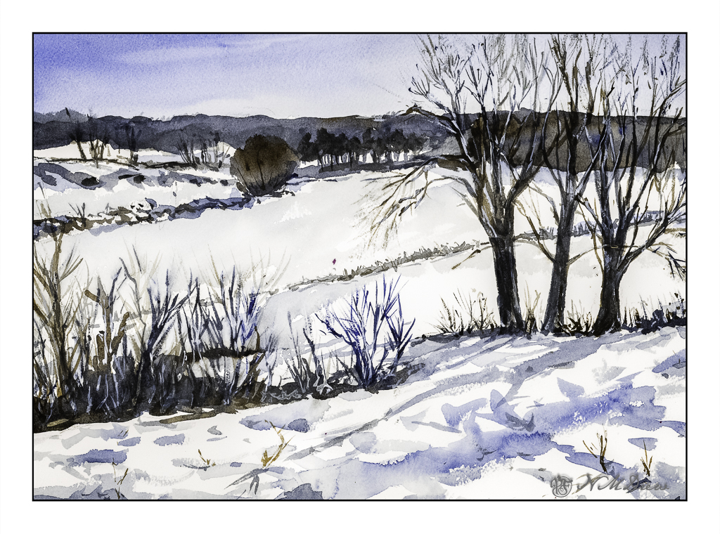
The first part of the painting was done with the sky – start at the top and work down. This is pure color, diluted, to create a sky. First the paper in the area of the sky was wet, and then the blue brushed in. Before the paper dried I lifted out the color.
Next I painted the distant hills and background area, solid in color, but varying the intensity of the colors and mixes of brown and blue. I painted through where the trees in the mid-ground would be as I knew the tree branches would be a bit darker once painted. Next came the trees in the foreground right and shrubs and grasses on the left as well as under the trees. All dried with the hair dryer. The middles areas were done after these dried.
Finally, the snow was tinted with blue in varying strength, bits of grasses, and final details. The snow on the trees was done with white gouache, as in the front left shrubs. Once the gouache dried, a mix of blue and brown was glazed over it to tone it down. Finally, a light wash was put into give a sense of dimension to the snow.
In the end, I am rather pleased with this painting. Using triads made me recall some other watercolor exercises I have done with limited palettes of color. The cold is much to my liking as is the complexity of the foreground giving way to simpler forms in the distance.
Arches 140# CP paper, MaimeriBlu “Faience Blue” and Burnt Umber. 10×14 inches.
Two different scans, and neither is truly exact. That was planned. I decided to change the mood of the scans – one in Epson Scan and the other in VueScan. Don’t remember which is which. The moods were to be bright and sunny, breaking through rain clouds perhaps, and the other just rather cold and gloomy when the sun has vanished behind heavy clouds.
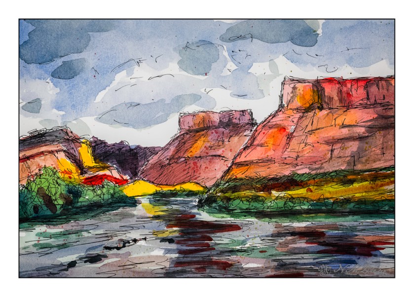
Above, the warm colors are being pushed – yellow, orange. A bit of glow to try to express that sudden brightness you see when the light changes rapidly because of the weather.
And now the light has changed – potential rain and bad weather. I expect there is a bit of wind, too!
Technically, I drew in the landscape with a waterproof pen, painted, and then drew some more. The mesas’ slopes are a bit steeper than reality as these are about 45 degrees, and in real life, I think they are more shallow, about 30 degrees. Artistic license?
Watercolors, ink, Hahnemuhle 300gsm CP paper, about 9×12.
