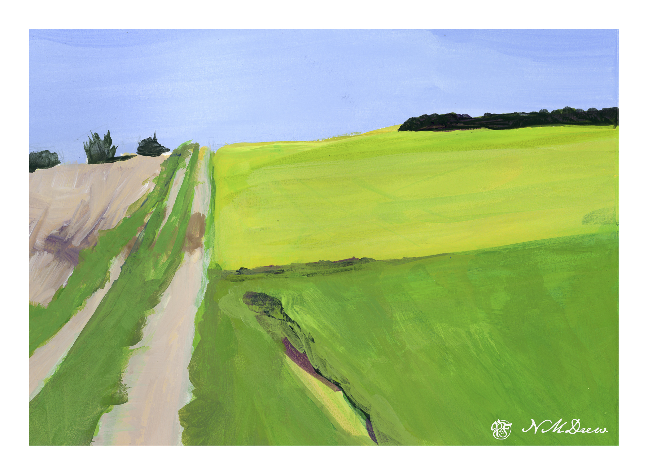
Into the Blazing Hills

One thing I enjoy about a retrospective show of an artist’s work is to have a sequential progression of his / her development. As an erstwhile “artist” I find myself is bopping around. It is my erratic personality – my magpie personality – drawn to this and that. That is probably why I like Hawaiian print shirts – colorful and rather crazy. When I look at my own paintings over time, color is always the primary theme. Sometimes my color usage is quite bad – nay, awful! – and sometimes very much to my liking.

In this vein, I decided to just paint with the Golden fluid acrylics, spreading around colors and creating shapes. I figured it would make itself known to be whatever it is to be. As someone who likes landscapes, I figured it would become one. My thoughts were, as I progressed, a flower meadow, hills of flowers, trees, and then just putz. Using acrylics means putting paint down in a way which works with their quick drying qualities, but I did use matte medium. A lot of times I just dumped color on the palette paper, mixed, added white, and then mooshed it around on the paper. The matte medium creates a bit of transparency, and it makes a sort of glaze over underlying colors.
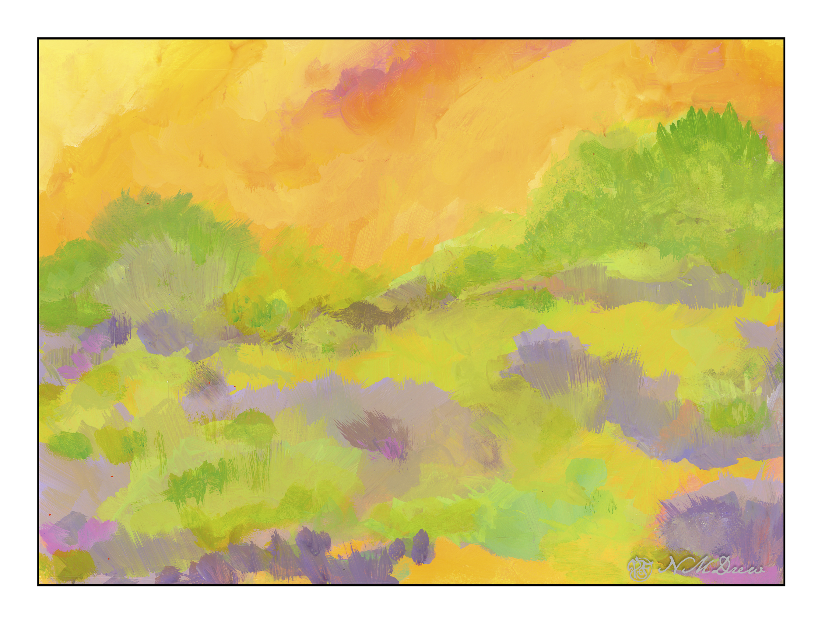
Painting was done with wide, flat brushes – 3″ and 1″ flats – later a large round – and my fingers encased in nitrile gloves. It took about 3 days and 6 hours to paint this on 15×20 watercolor paper. Golden Fluid acrylics, matte medium.

Colorism is something that truly appeals to me. Not Fauvism, which I find a bit too loud for my taste, but colors to create an emotion or feeling more than reality, with a bit of a suggestion of reality.

A Touch of the Fauve in Cinque Terre

Cinque Terre is located in Liguria, in northwest Italy, and comprises 5 villages built into the steep cliffs along the coastline. You can find all sorts of articles, videos, photos about it, and to my thoughts it sounds like an incredible place to see. However, it is not something I will get to do next week, so I thought it would make a good painting study. The idea of living in a house, built on a cliff at the edge of the ocean – I don’t know, but it seems quite a fascinating way to live!

I was more interested in playing with the paint and experiencing how to use the Golden fluid acrylics than I was in making a finished work of art. I am finding I like them when they have dried a bit and become rather sticky but still maintain the consistency of cream. Opacity seems to improve as the paints become more viscous. This stickiness makes for some rather nice ways of creating color combinations – one on another – and texture. This is all play, and play is the best way to learn how to use something, I think. The plan is to continue and come up with an opinion about if I like them – I think I do, sometimes more than other times – as well as just exploring painting with them.

This painting was inspired by a photo taken offshore and looking landward. The houses cling to the cliffs, and if you look closely at the photo, you can see pathways and stairs leading from one area of houses to another. There were more outcroppings of rock in the photo than I have here, and I think it would have been a better painting to have included them. It looks like I have two rock columns madly in love, and having a good smooch! Despite that, I had fun playing with not just the colors, but ways in which to apply the paint – like rubbing it in with a paper towel in addition to a paint brush. Soft and hard brushes also have and impact, as does using a filbert, flat, or round brush. So much to learn . . .

Golden fluid acrylics, a bit of a fauvist or colorist approach, 15×20 paper.

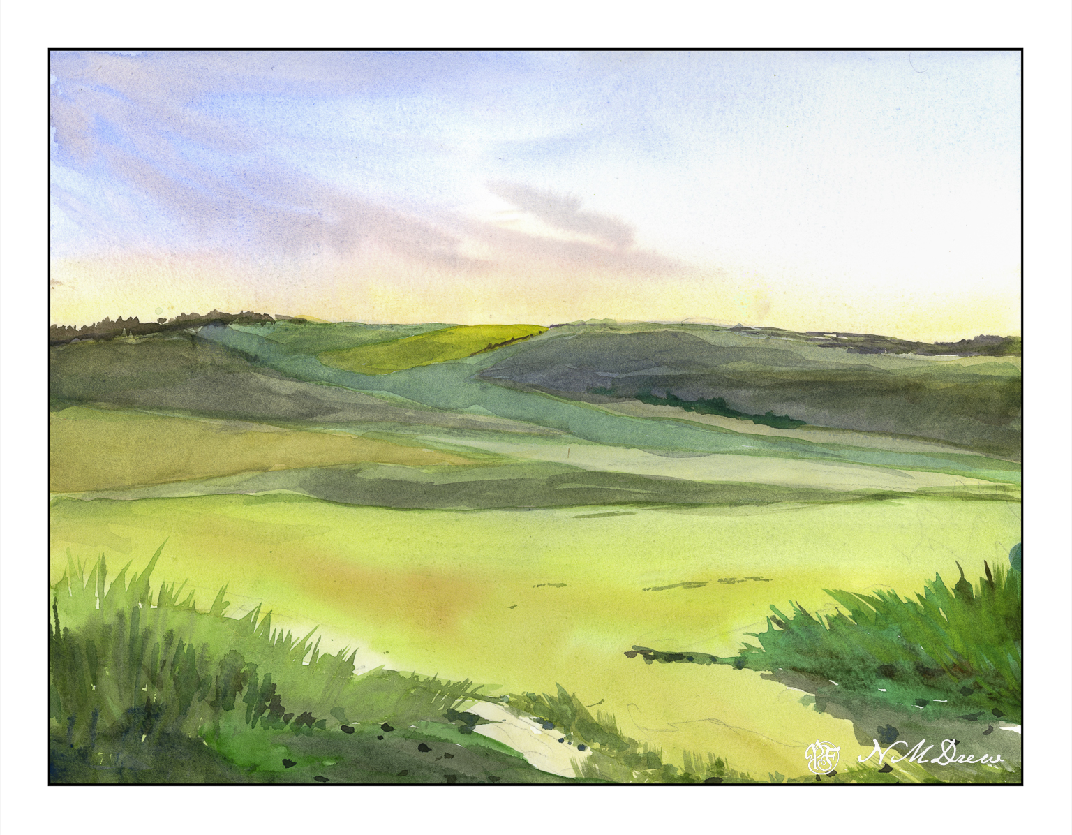
A Touch of Morning Light

Most of my watercolors tend to have intense colors that are rather bright. With the underwater rocks and floating leaves of the other day, to get the effects I did, I used a lot of thin layers of colors – glazes – to create the desired effects. I was pretty happy with the results, so today I decided to work at creating a painting with good contrast but with many delicate ares of color.

My intention here is to create the effects of early morning with sun just beginning to brighten the landscape. This needs a delicate sky. I had drawn in my sketch first and from there began with thin washes of cobalt, quin rose, and Naples yellow. The wispy clouds were painted wet-in-wet using cobalt and umber. Pleased, I again used pale washes to create the fields in mid and foreground.

Looking at the picture, I realized that the lower 2/3 of the painting were essentially all the same value even though different in color. A scan of the painting and a desaturation of color showed my assumptions were correct.

Sooooo??

A bit of thought. In the end I applied thin glazes of quin gold along the hilltop horizon and a number of layered glazes on thew lower hills in cobalt and umber. This gave depth and distance.

Another painting done slowly and with more deliberation. And I am pleased with the results as well as even learned a few things!

Watercolor, 9×12, Fluid 100% cotton CP paper.

Practice

With any art or craft, familiarity with it makes it easy to do. With familiarity and understanding comes the ability to explore using the knowledge you have acquired. I am pretty comfortable with watercolors and oils, but acrylic has always been a point of frustration as it dries so quickly and, to me, doesn’t have the qualities of oil paints. Gouache can be opaque or transparent, depending on how used; acrylics can be used in the same way. The difference between artists gouache (vs acryl gouache) is that the colors underneath the other colors can be re-moistened, and used to dissolve and create other colors. Acrylics, while they can work similarly to artists gouache, once dried, are dried, and there is no going back.

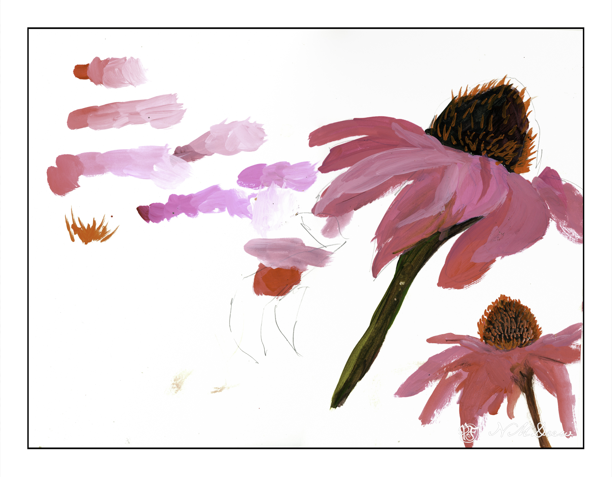
What I am trying to learn is how to use acrylics in ways that make sense to me. This is not coming easily. I like being able to sprawl my colors all over the place without drying, but this doesn’t work quite well with acrylics – unless using the heavy body paints on a sta-wet palette, the fluid acrylics I am using dry very quickly. To use them well I am trying out different ways of painting and mixing paints. Above, on the left, are colors straight out of the bottle and then mixed with white on the palette, increasing the amount of white with each brush dab. From there, I played a bit with painting cone flowers; the one on the lower right is more successful.

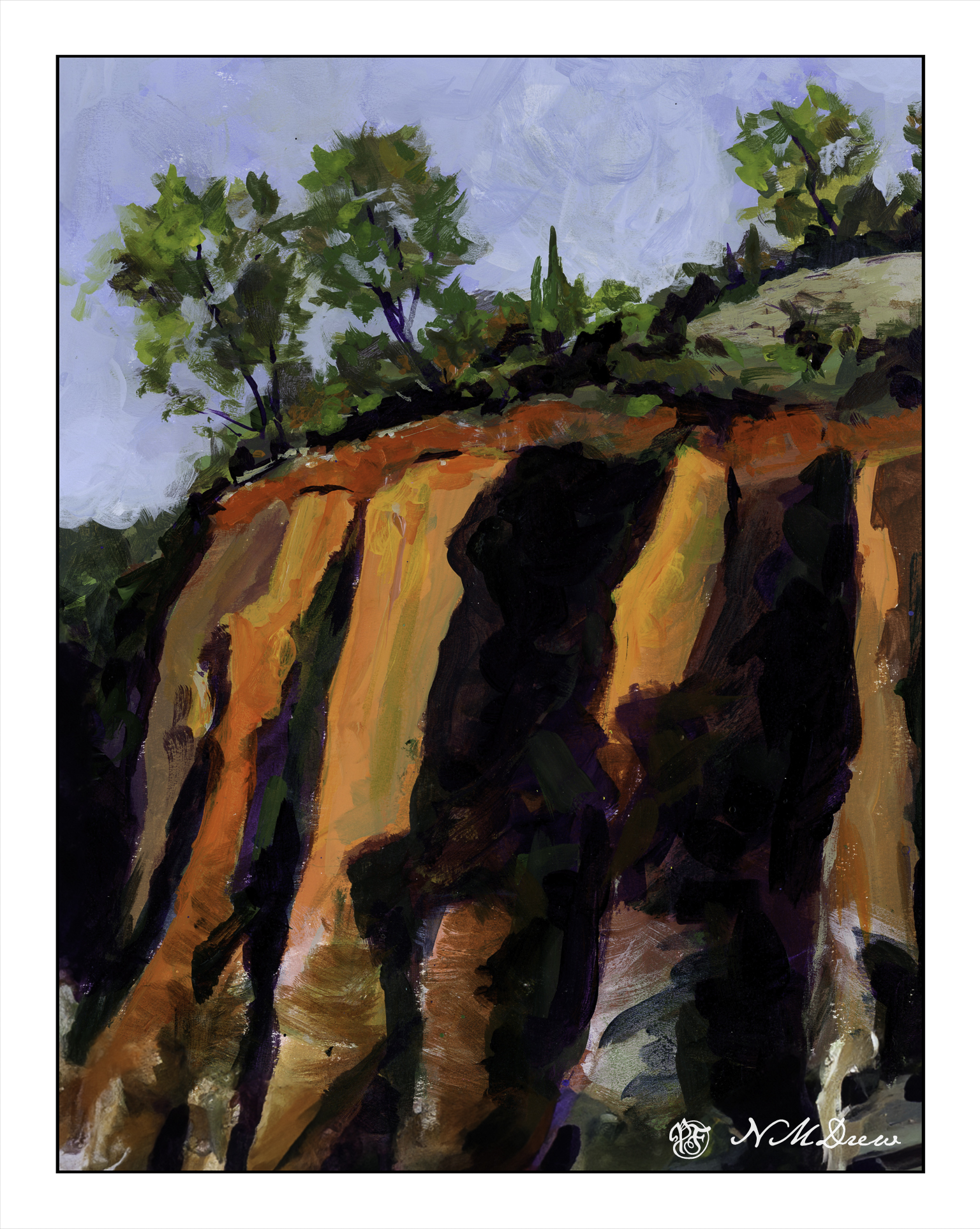
Playing is a way to explore. Above was play. Below is a “more serious” foray into painting with acrylics. I worked hard to make layers, and then return to add more color as I moved along. I just painted directly onto paper in a sketch book and practiced both painting and blending, painting directly on other areas, and bouncing around to work at making a bit of a harmonious or connected picture with similar / same colors used in various parts of the painting.

There used to be 4 trees in a row on the top of the cliffs – but then I looked at it and they were all the same shape and height. I decided to paint out the 3rd from the left. I had to paint the sky in a number of times, building up layers to hide the tree. It worked pretty well. I also played with my brush – I tend to dab, using the point of the brush – but here, especially for the tree foliage, I worked on using the sides of the brush. Additionally, I changed between very soft brushes and more firm brushes. These change how the paint moves and blends over the paper.

Practice can be fun – in any art – and by practicing and playing, new doors and experiences add to the skill set of the artist or craftsman.