Hurricane Hilary is supposedly barreling toward SoCal, so after battening down the hatches and getting a virus and sleeping for more hours during the day and night than normal, running a fever, I finally emerged with some sense of clarity today and accomplishment insofar and I am awake-ish and my mind may be capable of functioning. And, I am bored with being so uncreative and dedicated to duty and chores that need to be done despite the desire to crawl back into bed.
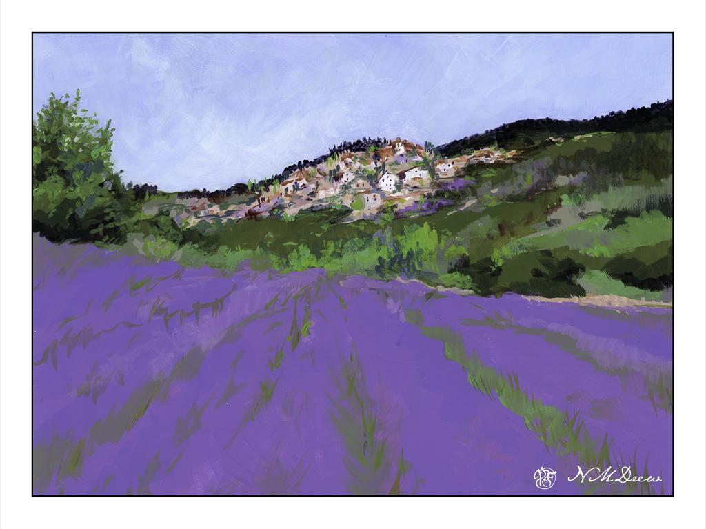
So, more lavender. Let’s just call it Lavender #2 for now, as I am sure there will be other versions sometime in the future. Stage One is below.

I am using the Golden Fluid Acrylics again, and really do like them the more I use them. The paper is some badly sized watercolor paper which is fine for acrylics and dreadful for watercolors. It is 15×20. I mounted it on a piece of coroplast with some tape and went to work. Because of its size I put it on my easel.
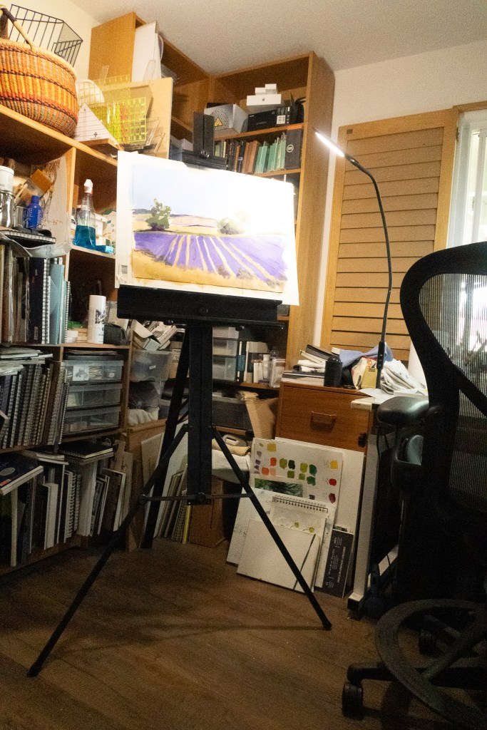
I have my paints to the right, with the window facing east. Lots of LEDs with variable lighting – I hate overheads! Anyway, I adjusted the easel to my height and find I rather like this set up. The easel is lightweight aluminum and folds flat. The esposo is kind enough to fetch it when asked as it resides on a shelf in the garage, up high and out of the way.
Colors, at this point, are limited. So far I have used yellow ochre, chrome green, carbazole violet, titanium white, cobalt blue, ultramarine blue, and a drop or two of cadmium yellow medium. My palette is a mess. I just cannot create a tidy one like other artists . . .
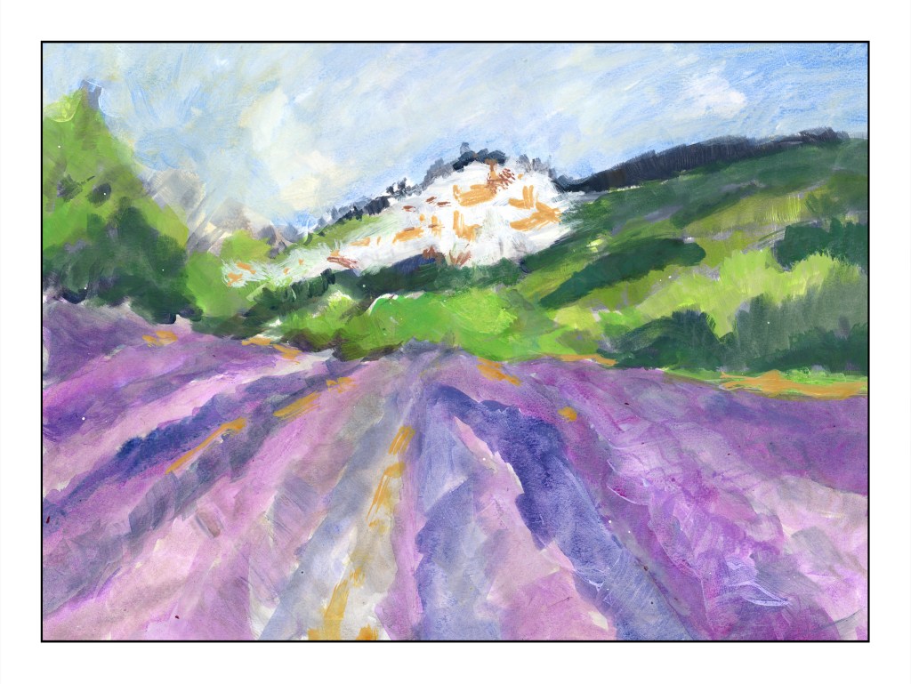
For today, I am done. I am getting tired, but painting is refreshing! That is definitely good for the soul.