Today there is a bit of running around to do, so this morning I was in a blithery mood. Things to do – like the usual morning stuff – but I also know I won’t feel too focused on any one thing, so sketching with ink and watercolor seemed to be the best of all choices. (After all, life is not all about dishes and making the bed!)
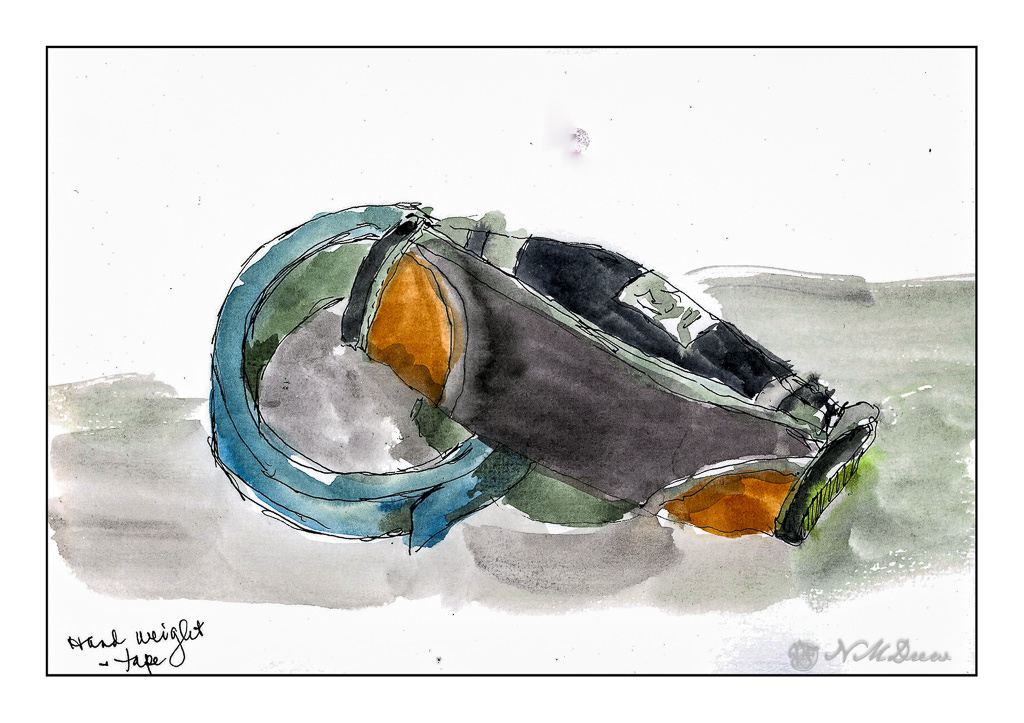
On my desk is a small hand weight and roll of painter’s tape. Warm-up. And now immortalized.
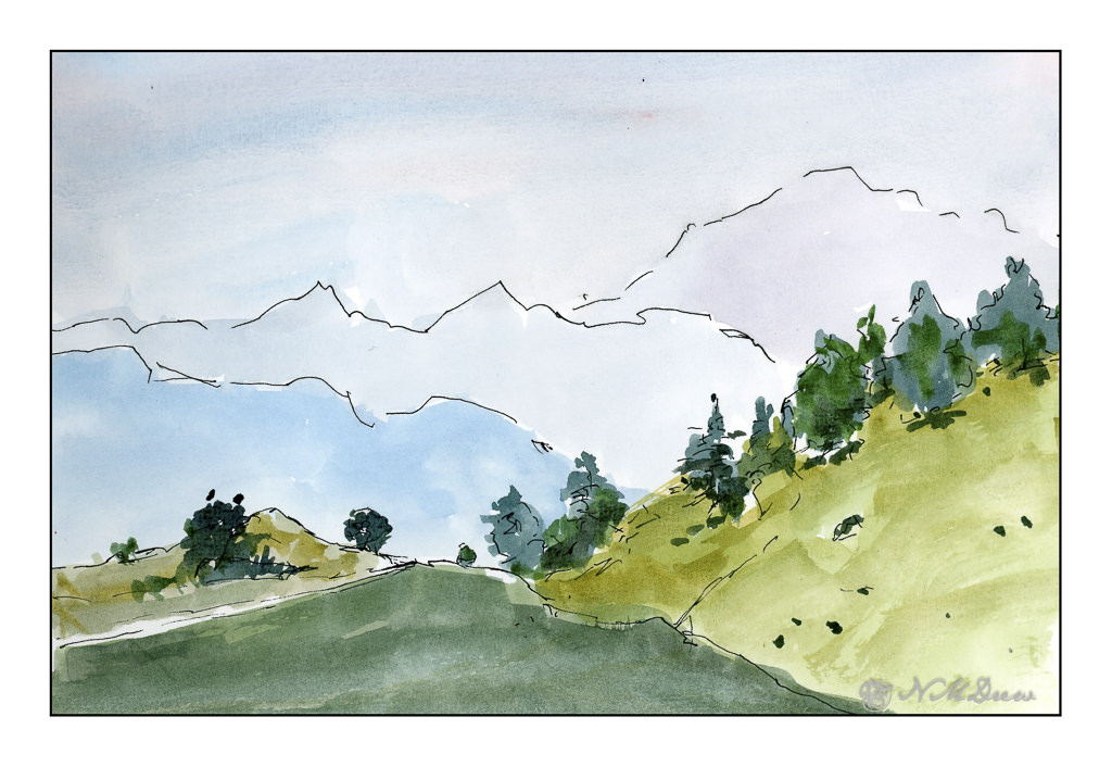
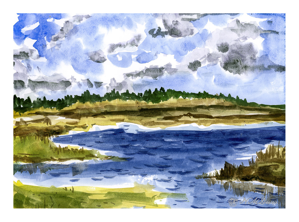
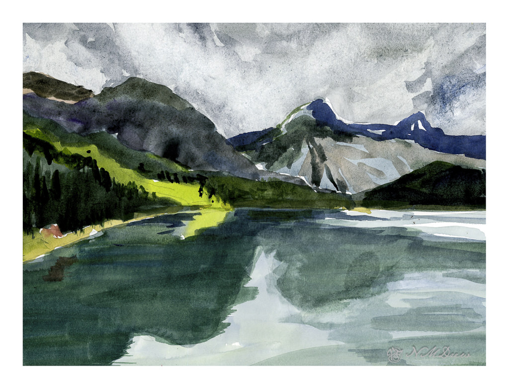
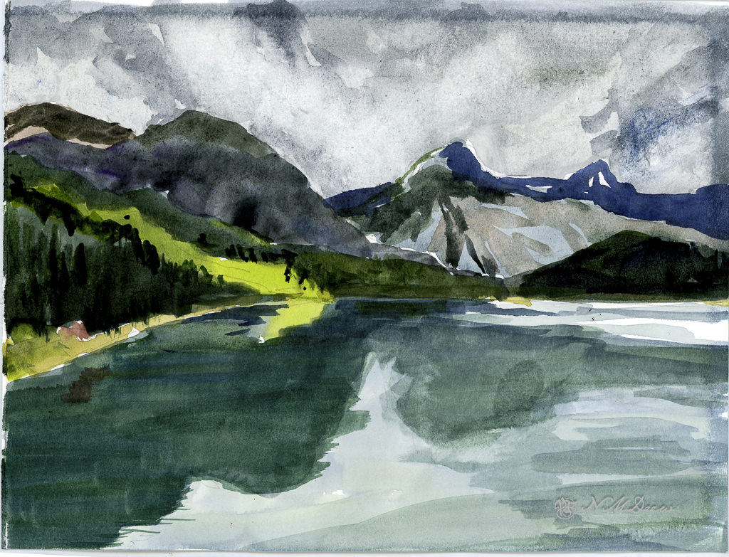
Next, the great outdoors. Mountains and trees. I would love to be walking around here, but sadly my ankle is keeping far more stationary that I want to be. I am getting better, but I have to just keep all to a minimum. I can go to the store and walk a bit, but I need my heel to get better more than anything.
So, the painting. Goal is to get a sense of distance with the gradations of the mountains as they recede into the distance. Accomplished!
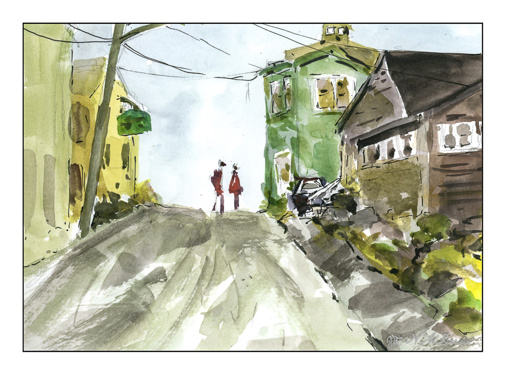
Finally, a scene with some complexity. I figured my warm up and splashing of paint were ready to meet my next challenge which is to paint buildings, people, perspective. Landscapes are comfy but I really want to push myself a bit more, as I did the other day, with direct painting and more patience and planning.
The first two sketches were done in very short order, but here I pulled out my pencil, limned in lines and worked on perspective and size. I think my people are a bit too tall, and I put them in before I did the painting of the buildings and the road. The buildings, too, are a bit wonky, but they work fairly well. I painted everything and then, once okay with the picture itself, I decided some black lines here and there would be good to help pull the painting together. Not perfect, but pleased with the results as I did meet my challenge.
Pentalic Aqua Journal, about 7×10, watercolor, Uniball micro pen.
I have had a tablet of Strathmore’s Vision watercolor paper, 140# CP, lying around for some time but did not try it out until today. There are some things I liked about and some I didn’t like. Strathmore watercolor papers and I do not get along at all for watercolor painting, yet I really like them for acrylic and gouache. The papers’ textures never agree with me and with the Vision sizing seemed questionable. Canson XL is another watercolor paper I don’t like for watercolor painting but really enjoy for a lot of other things.
This is the first study I did – simple, free-flowing watercolor. The purpose was to lay down color with a bit of density, not overworking either paper or painting. I found it handled direct painting without any lifting or scrubbing quite well. I could paint over dried paint easily – such as where the darker blue wave shapes are – and add gouache to create a bit of sea spray or foam. Blending colors into each other as I moved the brush along in a wash worked well, too. Off to a good start!
This was the second painting. As with the first one, I did direct painting for the most part – specifically the middle and foreground – and used many of the same techniques I used in the first one. However, on this one, I did the sky differently to see how a specific technique could work with this paper.
Clouds are white, right? Well, yes and no. Upper clouds can be quite bright and the paper is usually left untouched in watercolor to show it. To paint a sky with clouds you can use a lot of techniques, but here I chose to wet the paper around the cloud shapes and drop in the blues for the sky and then move the paint around a bit. Once dried, I dropped fresh water into the cloud shapes, at the lower ends, and then added greyish blues to represent the shadow on the underside of the cloud. I have not really worked with this technique, but I have been meaning to check it out, so this seemed to be the perfect opportunity.
I think Vision paper might be able to handle this technique for painting clouds, and I want to practice this technique more before deciding it will or won’t work with this paper. I know that scrubbing the paper will mess it up and as a result I have to be prepared to work very directly. This keeps a watercolor fresh and clean rather than overworked and ugly.
Here, I tormented the paper! I laid down a wash on the upper portion of the painting and then scrubbed out the paint for clouds. Then I came in a few more times and did the same. Some of the paper peeled a bit with the harsh treatment. This is good to know – how much damage can I do??
From there, I did the middle and foreground. The middle ground was pretty directly painted in one go, meaning one layer of color for the most part. I like the way this paper allows heavy paint to merge and blend as it makes for more interesting color areas. The foreground water and reflections is a series of washes, one laid atop the other once the underlying one is dry. I think in some areas I did up to 5 layers of glazing. Other areas I did a bit of wet-in-wet without a lot of scrubbing – just a gentle swipe of the brush.
Now here comes a complaint. In the lower right area of the painting you can see what looks like a thumb print. This is not – it is an area where the paper sizing is not good. You can also see problems with sizing around the upper and right edges of the paper. Poor sizing can ruin many a painting, and this is why professional watercolorists and amateurs alike go toward 100% cotton rag papers from reputable manufacturers.
Overall, I like this paper. I think it is really good for direct painting. Pleasingly, the paper does not buckle and ripple with fairly wet paint, but I have yet to lay down a traditional wash that covers a large area of the paper. That will be another experiment for a future posting. The sizing issue bugs me, but that is okay as this tablet of paper was not expensive. I prefer Vision to the Canson student watercolor paper for a lot of reasons, but in particular the way it handles pigment on its surface. I can see using this paper for practice, for studies, for preliminary work on a “serious” painting. Would I recommend it? Yes – but with some caveats.
Today has been a lot of fun. Being immobile is making me quite dull and uninterested in doing anything, but at least the boot is making life a lot less painful. Yesterday morning I met up with a friend, hobbling a short distance and then basking in the beautiful outdoors for several hours with a good bit of chit chat, croissants, and delicious coffee. Socializing and watercolors always make my day . . .
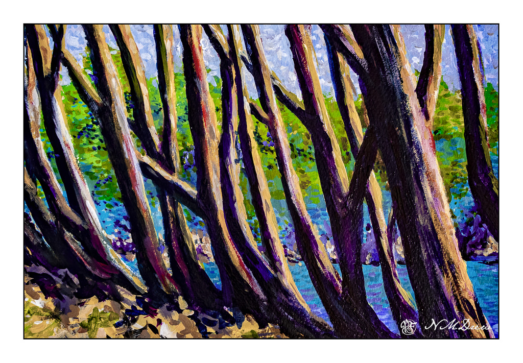
Another view of Lands End in the SF area – this time through the trunks of the cypress trees along the ridge line.
This was a day’s project using liquid acrylic paints on Strathmore 300 watercolor paper. Neither photographs or scans really did this painting justice as far as the colors go. That sometimes happens when there is purple in a painting it seems. I like the composition but not sure about the final colors. In real life it looks better. And, it may be, too, the acrylics just never quite sit well with me. Both acrylics and gouache tend to be a bit too bright for me. Maybe I’ll try it in oils.
Acrylic on Strathmore 300 watercolor paper; about 11×14.
I was rummaging through some LR photos this morning while the gardener weed whacked and mowed away. I came across this one, taken from the car as we drove to or from Tucson, AZ, to get our Global Entry cards verified. When I saw this, I was thinking about “my photographic style” – something I never really think about. I did realize I prefer rather stark things, or bits of something, seldom people unless it is street. I also know I have a lot of fun making a photograph into more than a photograph – something which appeals to me artistically. Heading out next week, I will be bringing a small camera with me as where we will be and where we will be going has a lot of stuff to look at.
The last few days have been the quintessential spring days in Southern California – and I have been outside, but never enough. I planted some tomatoes and cleaned up some plants in the patio garden, basked in the sun, and have done very little. Today, though, pen and watercolor beckoned with the morning coffee, and the colors of spring and the outdoors called.
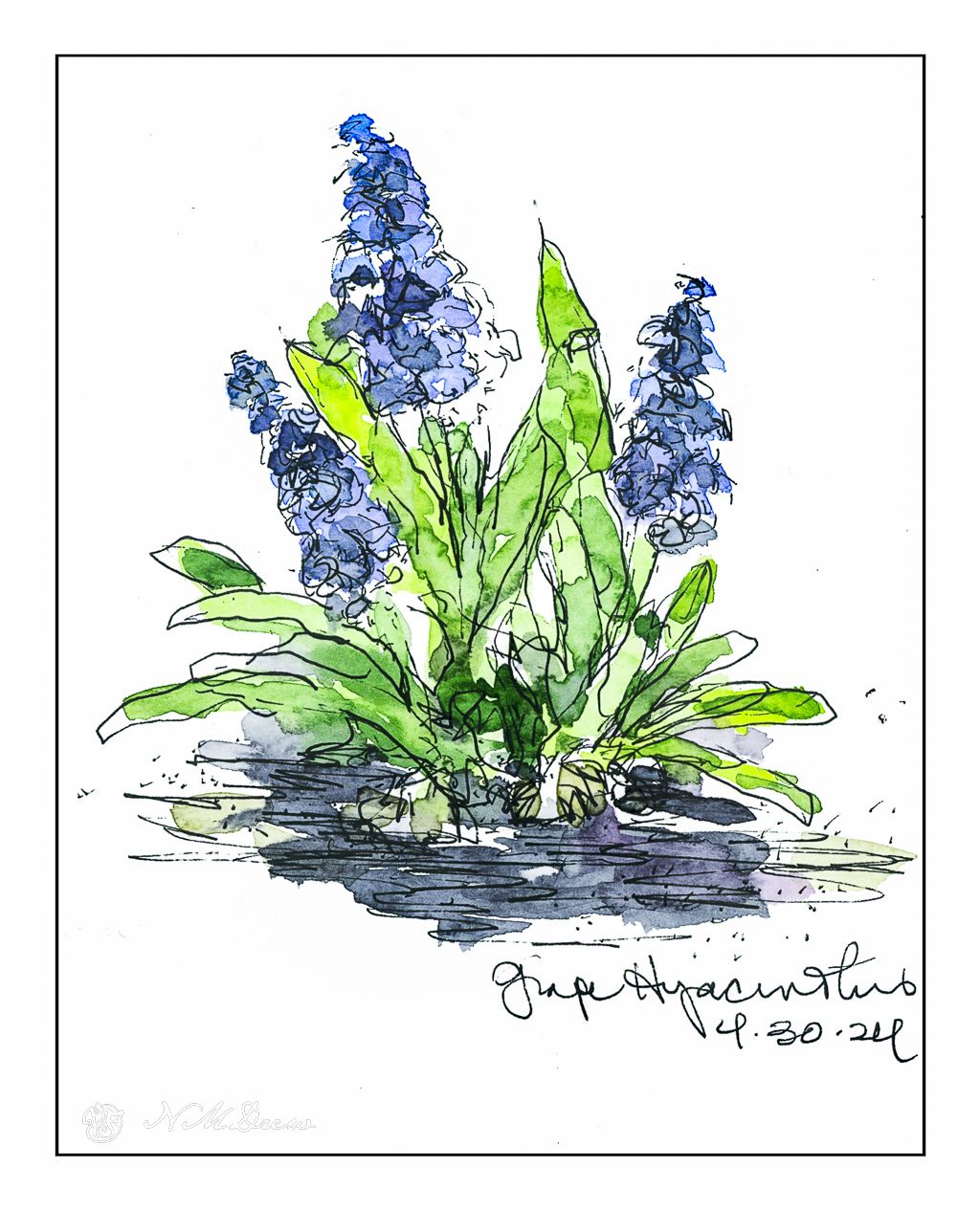
Grape hyacinths are so odd to me! I am used to the big ones, in pinks and blues and flower petals which curl outward. Grape hyacinths make me think of little bells. This is the first year I have ever grown them, and short-lived as they were, they were so much fun to see. Bulbs always make me happy, and I have a variety of them, such as iris, ixia, daffodils. Bulbs need to be hybridized for our warm California winters, so they are not so rare as they used to be, but never seem as exciting as they do when they flower in a patch of snow.
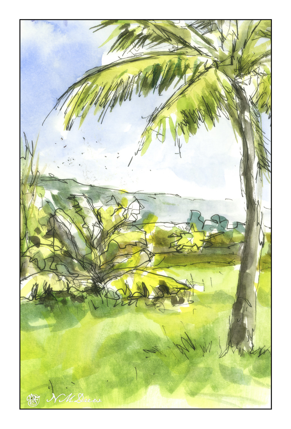
I was poring over some photos I have, taken by me or collected through Pixabay and other free online royalty sources. Palm trees and banana plants. I did this to practice dry brush on a wedge brush – nothing great but it accomplished what I wanted – a soft bit of blending, such as in the foreground.
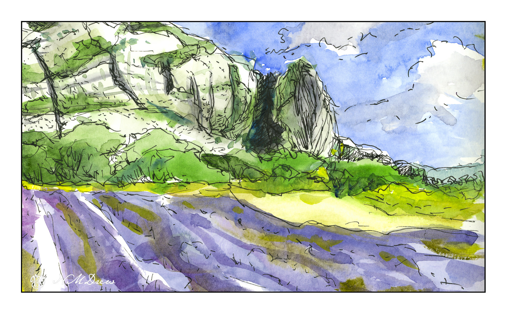
Once more lavender fields in Provence and other areas of southern France. In particular, mixing lavender that is bluish is a challenge; here, in watercolor, I diluted my purples with some blue and rose, as well as some greenish colors to suggest the lavender’s foliage. The scan didn’t do a great job. Additionally, I wanted to capture the texture in the rocky faces of the mountain, cracks vertically and horizontally in the bare stone.
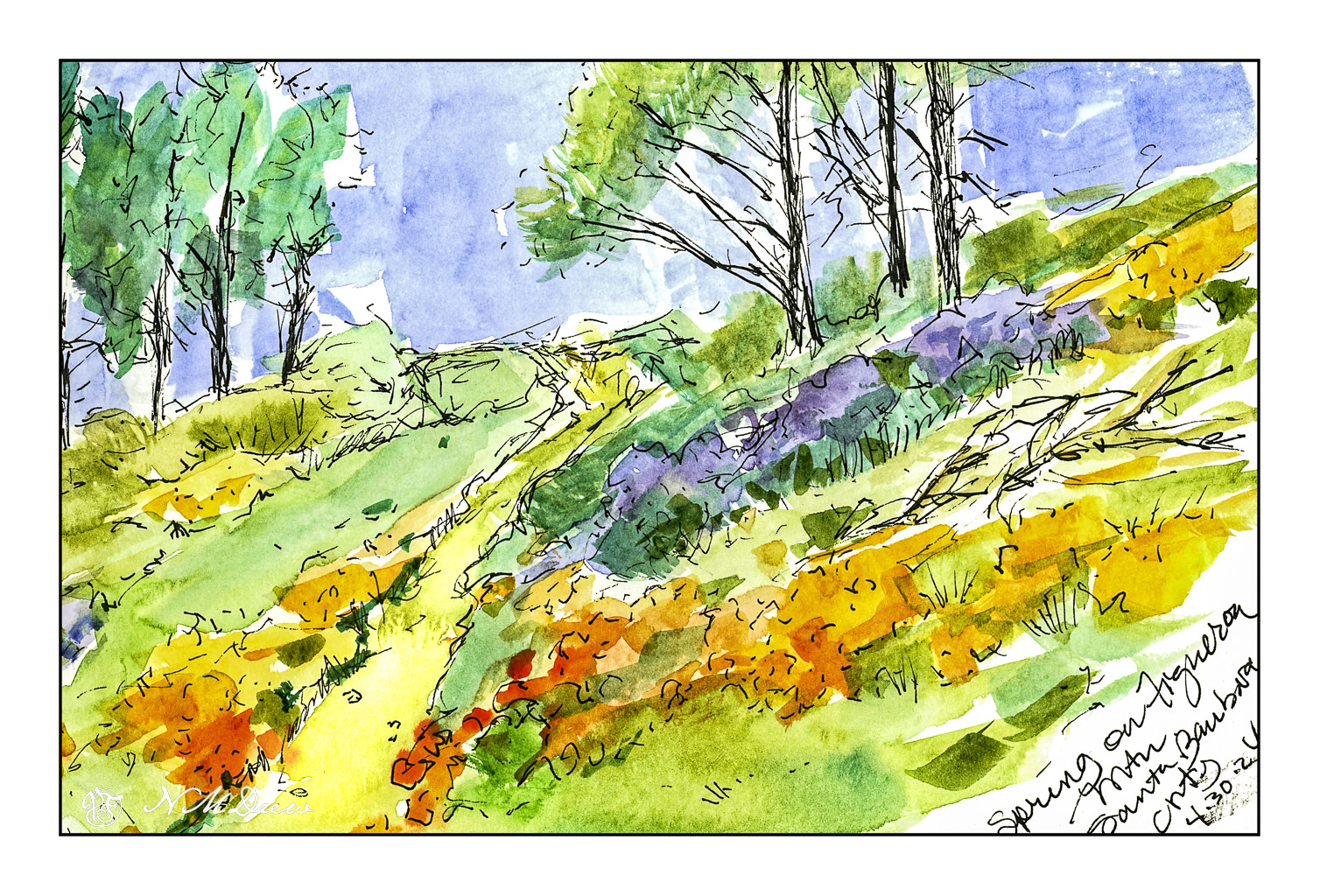
Finally, a favorite place of mine – Figueroa Mountain in Santa Barbara County. In the spring, lupines and poppies bloom, and the view across the Santa Ynez Valley extends for miles. To me, this is the epitome of a wonderful time of year in California. It is when the rains turn the hills from brown and dull to an intense display of yellow, gold, and purple.
Drawing with ink and watercolor is pleasant and relaxing, and doing it in a sketchbook takes away the desire to create a masterpiece. Here, exploration, play, practice.
Carbon ink on watercolor paper; Rosa pan watercolors.