Today I am entertaining myself by watching watercolor videos on YouTube, along with ones on ink drawing, sewing, and whatever. As I watch – looking up here and there from my practice – I decided after a couple of pages it was time to draw. Why not an artist’s palette with watercolors waiting to be used?
Tag: ink
Orange Slices
Today, an ink study of orange slices on a bit of peel.
I am / was trying to do a bit of watercolor painting every day, but I find that such commitments, while good, can be stifling. Drawing is integral to painting, and it is a pleasure to do in and of itself.
I’ve been working on the exercises in Alphonso Dunn’s Book Pen & Ink Drawing Workbook, so an ink drawing after exercises seems like a good thing to do! I know I certainly enjoy drawing after the practice. It’s also relaxing and, I find, a good way to loosen up for a painting session.
In addition to using Dunn’s book, I am also working through Tom Hoffmann’s Watercolor Painting: A Comprehensive Approach to Mastering the Medium. Right now I am working on simplifying forms and determining the 5 shades of grey – the lights and the darks – in pictures. I am not very good at that, so combining his exercises along with ink drawing, I think it may sink in. Then, let’s see if it can be applied to paint.
Thus, a dose of vitamin C for painting health!
In the Style of Urban (Not the Pope)
In a number of circles, there is an “urban sketch” style done with ink and watercolor. Drawing and painting are combined. Some people are masters of it, in my opinion, having a good balance of ink and clear watercolor, with one or the other predominating, and the other not overwhelming its partner. (I hope that made sense!)
I am trying to find that balance. I’d say I am okay with ink, but heavy-handed with color.
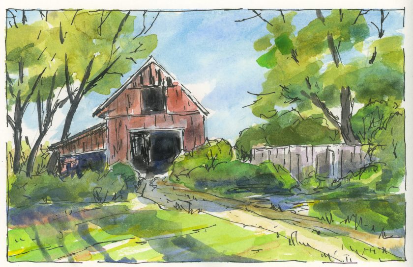
Today I decided to try two things. The first is above – a simple “country” scene with trees (and green! remember yesterday?), a fence, and a building. The idea was for the sun – the light source – to be coming from the left, behind the barn. I’m not so sure what that big blue thing is to the right of the (obvious) three shadows of the trees, but it’s too late to do anything about that!
This one is an urban scene, one obviously not in downtown Los Angeles, but in some older part of the world. Here, the light is coming from the right, perhaps, but the alleys and buildings create their own logic. Shadows are broken up with bright spots. One can only imagine that to find the light, looking up will reveal a world much different than the one on the ground. I think this one was fairly successful; there are parts which seem to work, and others that make no sense at all – like, what is that thing? Scribble more ink on it and let the viewer guess!
Temple Sunrise
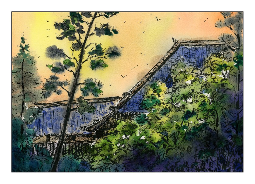
This is a rather eclectic picture as far as technique. Pencil drawing, ink, watercolor, more ink, more water, and so on. Paper is Arches cold press 140#, 9×12 inches. I thought I would use a better quality paper this morning because I knew I would be using a lot of water. It paid off. A picture of a Japanese temple was the inspiration for this mish-mash, as well as the fact I felt like drawing more than anything else.
A Bowl of Tulips
Today I had a morning appointment. After I came home, I had lunch, took a nap, and then migrated all sorts of toys to the patio. My neck got sunburned! Amongst the toys were a set of Albrecht Durer watercolor pencils by Caran D’Arche, a bowl of tulips, a brush pen, ink pen, and paper.
This is probably the third time I have used these pencils, and this time around I am happier with the results. I have watched a few videos from YouTube on using them, and the tips were worthwhile. For example, layering and laying down glazes to get better results. Being patient! My own painting skills are better than they used to be, so my sense of light / dark is not as klutzy as it was a few months ago. And, without having the need to produce some work of art, I was a lot more relaxed. Of course, sitting in the sun didn’t hurt any.
In general, my own experience with watercolor pencils is that they are not strong enough in color to produce the type of strong contrast I seem to prefer visually. Maybe it’s just my limited experience. Nonetheless, I am happy with the results demonstrated in this little study.


