Something Different

I really prefer landscapes to nearly anything when it comes to artwork. Part of it is pure laziness – no one will point out the inaccuracy of my rendering! I can make it anything I want. Portraits, of someone you know or is famous, are inherently more challenging. With this challenge in mind, I decided to enroll in an 8-week portrait class led by my painting instructor. Yesterday was the second class.

For a number of years now I have sporadically met up with a small group of artists in a nearby park. Originally the group was for a portrait class, in person, sans masks, during the Covid days. Eventually it evolved / devolved, but now it is once more on track as a portrait class. No problem – I think i will happily return. The reason is simple – I am beginning to enjoy portraiture – at least in pencil.

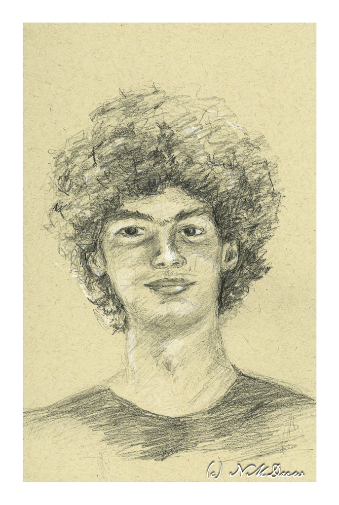
We did a graduation party for Dakota, new high school graduate and soon to be university student. I decided the photo Auntie Am took was perfect for subject matter in yesterday’s class. Tan paper, hard and soft pencil, white Prismacolor pencil for highlights.

I listened to my Portraits-in-the-Park teacher, Steve, whispering in my ear as I drew, recalling words of advice and hints. Barbara, too, refreshed the “rules” of portraiture last week. And so, a portrait of Dakota emerged with the help of my two wonderful instructors.

My own observations tell me my noses are improving but need work, my ears still suck, and the rest is not too bad. All done in about a 45 minute session once the class instructions were completed.

Now, let’s be honest here. Pencil is easy to use. Barbara’s class is to soon move into value studies on canvas and a painted portrait may emerge in the next several weeks. That is going to be pure experiential hell. I have never painted a person in my life. At least I am somewhat comfortable with oils and other media. I am considering oil paint or pastels. Oil is slow drying and can be modified. Pastels are like drawing with a pencil. Watercolor requires a bit more skill than I have and in a classroom I don’t think I would be comfortable, but may decide to do at home where I can wade through paper if need be. Colored pencils may or may not be on the agenda.

Onward!!

A Baby Cup and a Lily

Today has been one of those days when daily chores fill up life: laundry, housework, and so on. While there is still time to do some creative things, I need to get out of the house before I scream! Playing domestic goddess gets really old really fast, and the best cure for that is a bit of a change of scenery. Even though it is grey and gloomy outside, it is still better than 4 walls and one more load in the dryer.
I have a baby cup – a sippy cup – on my desk, filled with water which I use to dilute my iron gall ink as needed. It is a very important item of stationery intent. Certainly it warrants memorialization.

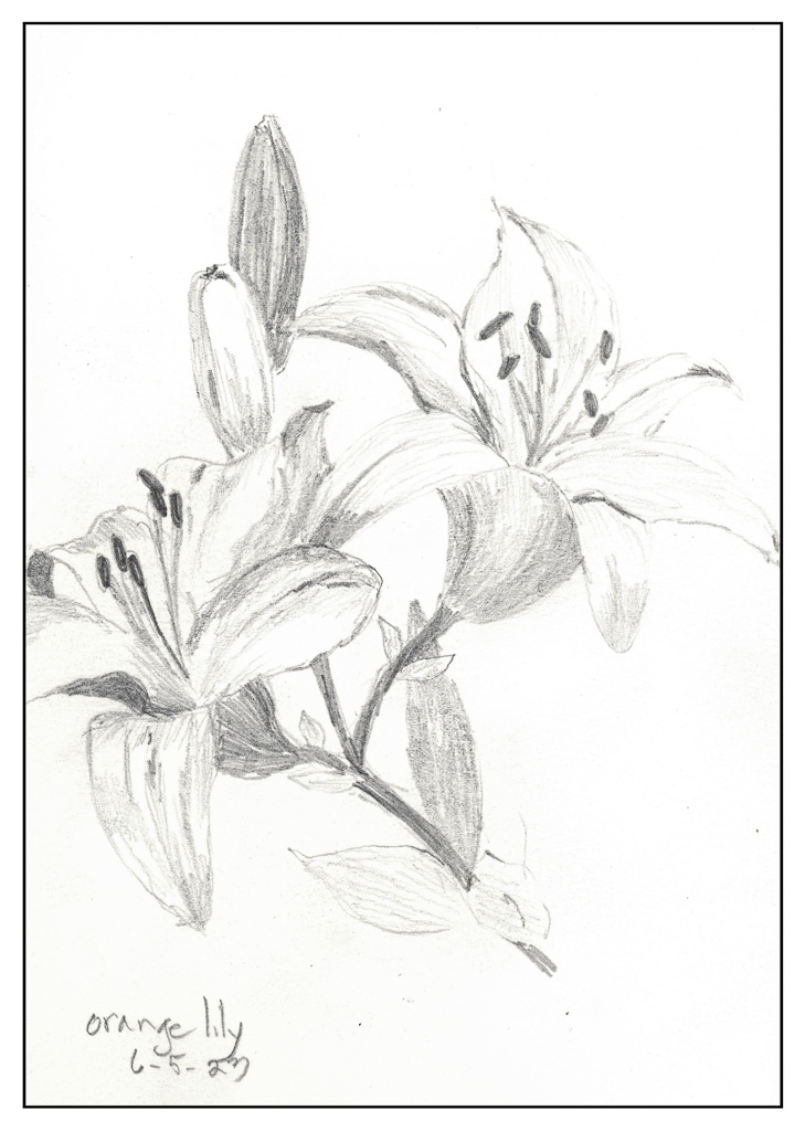
And then there are lilies. I have gobs of these orange lilies all over the place in pots. They get pretty rangy if they are in semi-sun conditions – like over 3′ tall. The yellow ones I have are shorter. Neither are fragrant like Asiatic lilies, which are a definite favorite, but they do endure and bloom over a long time period. Still, they are a lovely flower, bright and cheerful, and rather fascinating to look at – they are just so orange or so yellow it is hard to believe. In pencil, they are certainly more subdued.

The sippy cup had some subtle shadings which were a challenge. What I was especially intrigued by was how much I learned about the lilies when I started to draw them – the petal shapes, number of stamens and pistils, and colors of the same. Observation is rather surprising at times.

Sycamore

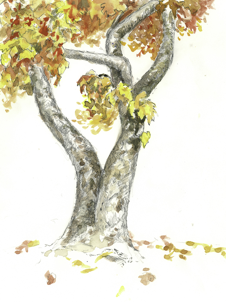
Yesterday was a meeting of the Pencil Portraits in the Park group, but drawing people held little appeal for me. So, I decided to try something I had briefly seen somewhere and thought interesting: during their travels in the 19th century, many people sketched in pencil (graphite) and then colored the drawings with watercolor. These days most people sketch with waterproof ink and then color things in, but I rather liked this idea. A sycamore tree in our park, dressed out in autumn finery made a nice portrait, methinks.

9×12, hot press 140# Arches. Graphite and watercolor.

30 Days in 30 Days

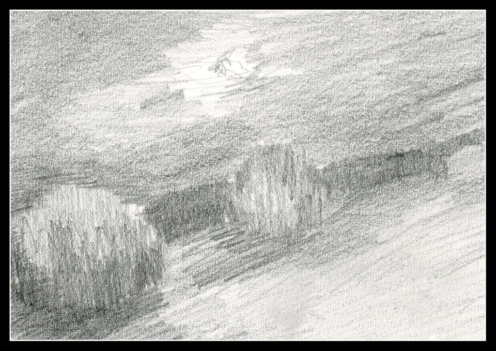
Awhile back, I started a 30-Day drawing challenge. The goal: Create 30 small drawings, value studies, to see shape, value, and ultimately a focal point for a painting. The last means thinking about how you want to lead the viewer into the picture and keep him there – it’s a compositional element I am still learning to implement. I have benefited in the arena of shape and value, so now the focal point is becoming another element to work on.

But, I blither. Here are the 30 pictures.

Today is the last of the Zoom meetings until the next class begins. I have already enrolled in it, so expect to see a few things as time goes by.

You can see more of my artwork, if you are interested, at Journey By Paper.

21-24 / 30

I am getting burnt out on these drawings! I decided to take a few days off and will pick up again tomorrow. Since I have committed to 30, I only 6 more to go by 4/17. I think I can handle that!

Day 21

Cannon Beach, Oregon. Figure is too big, some foot prints too dark and too big in the distance.

Day 22

Initially I had drawn this shack so that the beach and waves in the distance were parallel to the edge of the paper. After scanning it, I realized it looked better with a bit of an angle to it. Interestingly, a comment said it made no sense because the ocean is out there, straight ahead. Obviously, too realistic of a person, or someone who hasn’t taken a photo. Really, to me, a very interesting and odd comment and viewpoint!

Day 23

Here is a scene of looking down onto a beach. The distant cliffs look okay, but the descent to the shore in the midground is definitely confusing.

Day 24

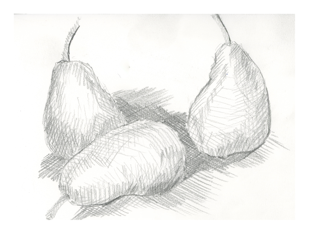
During last Saturday’s zoom meeting, Ian talked about cross hatching. I use it a lot in ink drawing, but not in pencil since the idea for a lot of this 30-day challenge is to limit marks to horizontal and vertical. The idea is to create value studies, not finished drawings. Interesting lines do not make for good value studies of light, medium, dark. However, a simple use of lines, cross hatching, vertical, diagonal, horizontal, helps delineate shapes, such as curves. I based this drawing off a study of 3 pears by Cezanne.

Commentary

These studies are making more sense and getting easier to execute so that shapes have shape, even if not always understandable.