Gouache Sample Cards with Zinc White

I am not the kind of person who likes to swatch things, colors, paints, knitting, and so on.  I just like to dive in and do things.  To a degree, this is good as it allows me to spend time learning about something before working on the theories, if that makes sense.  With painting, experiencing it first is for me a better way to understand something.  Afterward I can get analytical.

Since I feel comfortable now with gouache, I made up a series of swatch cards.  I took each color I have (which is far too many most likely!), painted a pure out-of-the-tube bit of color, and then, from right to left, added more white to see how the color changed.  It took a bit to figure out the best way to swatch, but that is how I like to do things – just do!

Each swatch card below can be enlarged so you can see the name of the paint color and see how it responds to the addition of white.

I found this to be a really helpful exercise. Some colors are so different when white is added, some for the better, some for the worse, and some are just plain surprising. For instance, I love Hooker’s Green in watercolor, but am not at all enamored with it in gouache. It could be the brand, too, but it came as a surprise.

My next exercise is likely to be adding black to the colors, or choosing a complementary color. I like the idea of working with complements for greys, and while blacks will dull a color, it is not the same as making a grey. I can also try my Holbein Grey #2 as well. Today, though, enough with analysis, and on to painting!

WWM 2019: Days 27-31

What a wonderful, fun-filled month World Watercolor Month 2019 has been!  It’s been work, learning, improvement, crazy, fun, creative.  I think it has been a worthwhile endeavor altogether.  Those prompts were provocative and simple at the same time – literal, figurative.

Let’s begin!

27:  Fruits

Both of these are in gouache.  I painted the figs first and then the grapes and apricots.  I worked hard on trying to create a sense of depth with the second painting in particular – looking for light and dark, shadow and colors.

28:  Metallic

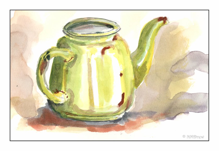
Metallic items, reflective surfaces – in others words, shiny things – can be very challenging to paint.  In many ways, the mind rebels.  It’s shiny!  I can’t paint that!  But, in reality, metallic and shiny objects are simply shades of colors, sometimes similar, sometimes varied.  Once you think about it like that, it becomes much easier.  I chose an old enameled metal kettle, a spoon, and a key.  Each one has different colors, with the spoon simply being varying shades of the same color, Payne’s Grey.  The kettle was difficult because of its shape (it’s rather mangled) and the key because of the varying shades of brown, golds, reds, and oranges of the brass.

29:  Glorious Greens

Pretty amateur, I think, but it was fun to do.  I saw a photo of a single tree silhouetted against a stormy sky, and the greens of the field were electric.  Colors under a stormy sky always seem more intense (while it’s not raining), and greens especially so.

30:  Wild Things

As we were finishing up patching, painting, and refurnishing the studio, I was in a foul mood. Crabby to be specific. Guess what motivated this subject?!

31: Favorite Colors

I had thought of making color swatches of all my gouache paints, but once more, life got in the way. Some thought and I chose magenta, turquoise, and green. Bougainvillea is the perfect subject for all these colors.

Some Thoughts

As I said, #worldwatercolormonth2019 has been a wonderful experience.  I learned something each day, even if I couldn’t tell you what.  Improvements are visible in color handling and brushwork in both watercolor and gouache.  Daily painting is work – and love!  It’s a challenge and play.  Today (8/1) I haven’t done a bit of painting, but like everything, we need to walk away from something to get a new perspective, to refresh, to let the subsconcious work its magic.

WWM #31: Favorite Colors

When I thought about this prompt, “favorite colors”, for #WorldWatercolorAMonth2019, I was rather overwhelmed.  There are just so many beautiful colors out there!  I also have added a dozen new colors to my palette, and I was of the mind I should put together a swatch of the colors to see them separately and pure, not mixed up with others on my messy palette.  This would answer “favorite colors” because I don’t think I have met a color I don’t like.

It seemed like a task too daunting for me today – I have spent the past two days putting my house back together as we have finished all the repairs from the slab leak of earlier this month.

So, what are some of my favorite colors?  Truth be told, greens and magentas and turquoises.  These are the ones I like the best – light, dark, brilliant, quiet.  Sky, leaf, flower.  Bougainvillea against a bright, sunny sky hits the spot!


WWM #29: Glorious Green

In spring, bright new greens fill the world. In summer, greens are darker, interspersed with flowering crops and wild flowers. Color is everywhere, but all dotting a verdant landscape. In brilliant sun, the greens shimmer, but under the electric sky of a thunderstorm, the sudden bursts of sunlight render greens into a strange intensity . . .

“Glorious Green” – prompt #29 – #WorldWatercolorMonth2019.

California Back Country

Even though summer is moving through July, soon into August, the rains we had over the spring are still leaving waves of color in the hills of the California back country.  Usually at this time of year beige is the predominant color, and in really dry years, a dark dirty brown.  This summer is a delight of colors – pale compared to spring – with wildflowers still hidden amongst the grasses.