Somewhere

Yesterday I got to class to paint and realized I had left all my white and black artist gouache sitting on the table. Everything else had come with me.

I need white for gouache, so I got some acrylic titanium white paint to use from the supplies counter in the classroom and blended it in with the gouache. Because it is acrylic, I made sure my mixes of gouache and white paint occurred on a disposable palette as well as made sure I used cheap brushes which I rinsed all the time. Acrylic is plastic and I don’t need ruined brushes or metal palette. And the fast drying quality of acrylic made me work far too quickly.

Sigh.
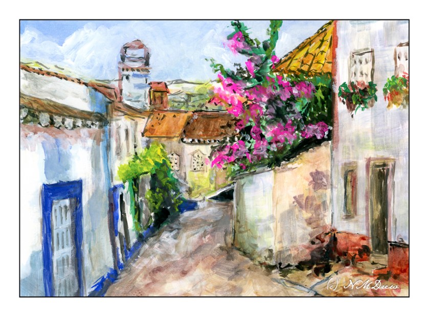
I have no idea where this photo came from, just knowing it is somewhere in southern Europe, like in Spain or Italy or France, or elsewhere. The white plaster buildings are rather decrepit and worn. The streets are more like alleys than a 5-lane L.A. freeway.

The bright blue doors, rampant bougainvillea, and rusty red just make you want to paint it. So, I did, and my haste shows – nasty, quick-drying acrylic paint! – crooked lines rather than straight, poor perspective. My usual faults! In reality, the detail was a challenge to reproduce, even what little I did, and because I knew this would not be a masterpiece, I could play.

I have mixed artists gouache with watercolors, and been happy with the results. Mixing acrylic paint with water soluble paint is a bit of a different story as speed is part of the issue with acrylics. As an experiment, this worked as I could lighten my paints as necessary, but it is not something I want to repeat. My brushes mean a lot to me, can be hard to replace, and my palette is also something I value. Dried acrylic paint would not be a happy blend with enameled metal.

Acrylic paint with artists gouache, 9×12.

WWM #31: Favorite Colors

When I thought about this prompt, “favorite colors”, for #WorldWatercolorAMonth2019, I was rather overwhelmed.  There are just so many beautiful colors out there!  I also have added a dozen new colors to my palette, and I was of the mind I should put together a swatch of the colors to see them separately and pure, not mixed up with others on my messy palette.  This would answer “favorite colors” because I don’t think I have met a color I don’t like.

It seemed like a task too daunting for me today – I have spent the past two days putting my house back together as we have finished all the repairs from the slab leak of earlier this month.

So, what are some of my favorite colors?  Truth be told, greens and magentas and turquoises.  These are the ones I like the best – light, dark, brilliant, quiet.  Sky, leaf, flower.  Bougainvillea against a bright, sunny sky hits the spot!


WWM #2: Sunny Sky

I truly love scenes of the Caribbean and the Mediterranean and Southern California – places where the sun is brilliant, walls are white, shadows are blue and glowing, palm trees clack in the wind, and bougainvillea brightens the day with shades of mauve or pink or salmon.

Two people come to mind when I think of painting such scenes – classically, Winslow Homer, and more in our own era, the recently passed Charles Reid.  Both men caught the flavor of such scenes, and I hope I did here, too.  The beauty of the Caribbean cannot be denied and its sunny days are memorable for their clarity and stunning colors of sky, sea, and land.

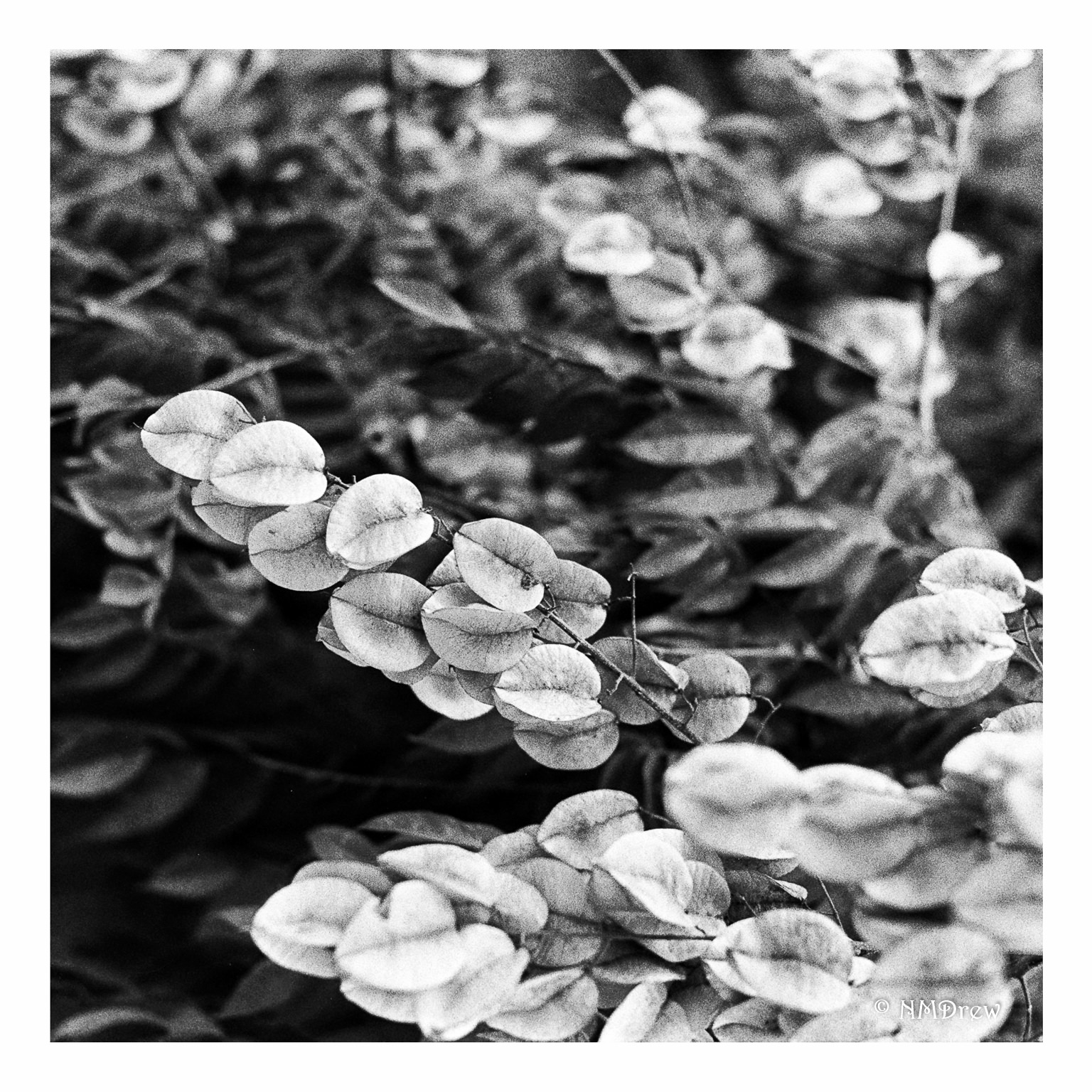
Leaves or Petals?

I’ve been a bit off the grid for the last few weeks, focusing a bit on some other things rather than photography.  I actually never thought I would miss out on looking at my photos and taking them – but I do!  I guess I do like photography more than I thought!

These are – I think – bougainvillea flowers, but as they were shot on Kentmere 100 awhile ago, I don’t remember.  Taken with a Nikon FM2n, an Elicar 55mm f2.8 manual-focus macro lens, and, obviously, B&W film.  Another surprise is that I really like the quality of image with the Kentmere.  Ya learn something new every day.