Master Study of Voilier au Petit-Gennevilliers by Claude Monet

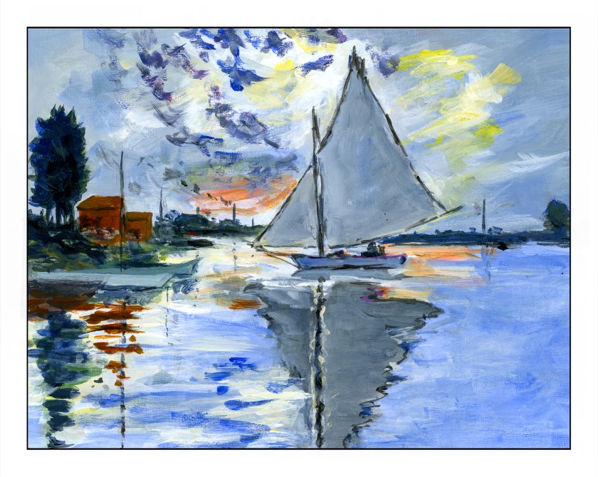
The original painting by Claude Monet was painted in 1874 and measures approximately 22 x 29 inches. My painting measures 11 x 14 inches, so it is close to the same proportions. I left out a few things simply because I was not trying to replicate Monet’s painting but catch its sense of spontaneity. This spirit is what I found refreshing, and while Monet probably finished this painting alla prima, I spent about 6 hours in the studio. He used oils. I used fluid acrylics.
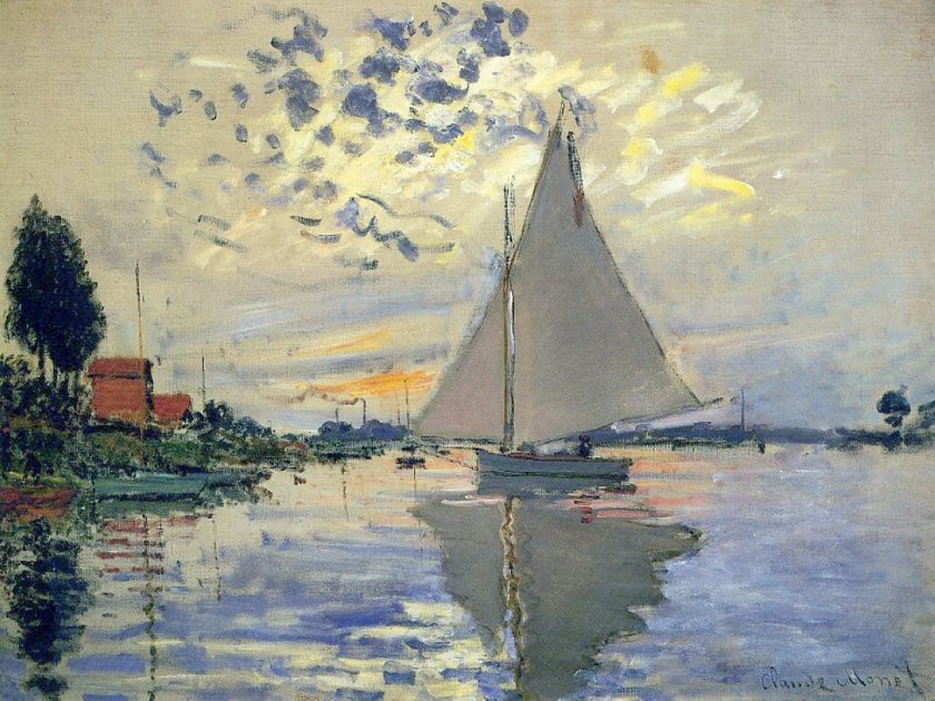
As I started to look more closely at Monet’s painting, I saw that his brushwork was very quick in many areas. The smudges of smoke in the left middle ground, the dark, wispy clouds used up a rather dry brush, one where paint was nearly gone. The white-blue swash across the sky seems like a quick thought. As well, it was interesting to see how the dark bits of clouds worked with the yellow and white areas to focus the viewer’s attention on the sailboat itself.

My own painting is more blue than Monet’s, but I saw a lot of blue in my reaction to his painting. Comparing the two is really interesting when I compare my scan to the Wikimedia online image presented here. It is hard work to get a good, warm grey and I did struggle with it. I also had to work on observing little things, such as the boats on the left middle edge – I couldn’t figure them out initially. The chimneys on the horizon also needed to be considered – what were they? The smoke on the left horizon gave it away. Once I had the boats on the left sorted, the vertical lines reflected in the water made a lot of sense.

What I really love about this painting is how it catches the light, which, of course, is the idea behind Impressionism. The moody sky with bits of cloud and fog and light as evening descends is what caught my attention. Even now, as I compare my master copy to Monet’s painting, I see even more subtleties which I could have caught. But, at some point, you just have to stop!

Fluid acrylics, Centurion OP DLX linen canvas pad, 11 x 14.

Sketching with Shari, ii

It seems as if my life has been in a frenzy with multiple little tasks to be done before the day’s fun can begin! Today is no exception – banking, bills, dishes, housework – and then little petty things that pop up, like buying a bit of something for dinner as we have no leftovers today. Yes, we have no leftovers! And no bananas.

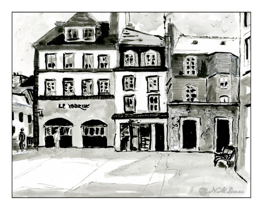
Nonetheless . . . I did complete the second exercise series in Shari Blaukopf’s most recent online class of pen and ink. This time we have a square somewhere in France. I know because she said so! This time it was to be done with a water soluble ink, of which I have none, so I again played with diluted permanent ink. In a few areas I wet the paper and then drew with a permanent pen, but I don’t like that as it seems to mess up a pen’s nib.

This is done on Bristol paper, very smooth but fairly heavy. The lack of tooth can be very nice when drawing with pen and ink as well as washes. My lines are a bit wonky here and there – earthquake? – and people are not well done, but I struggled most with the park bench on the right!! I will say I don’t like my results as much as I did the first exercise, but this is also a far larger drawing, taking up the entire sheet of 11×14 paper. Still, it was fun and satisfying to do.

Bristol paper, 11×14, ink, pen, ink washes.

A Bow to Loiseau

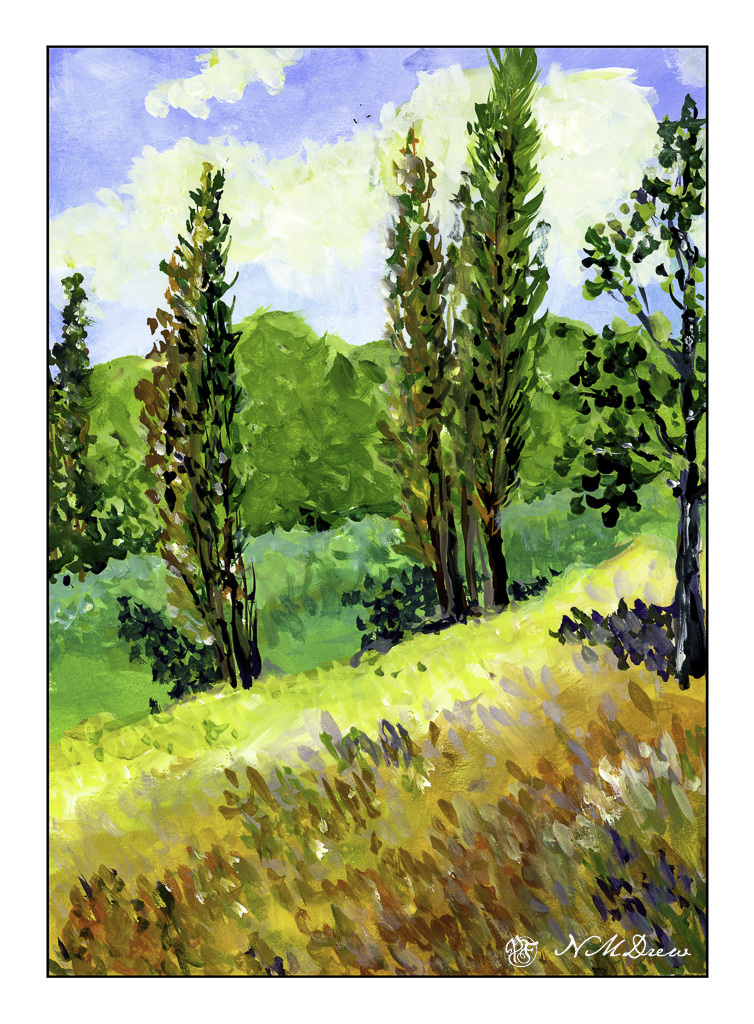
Not too long ago a painting done by Gustave Loiseau called Les Peupliers (The Poplars), ca 1898, caught my eye. I really liked the composition, colors, and overall atmosphere – a bright, sunny, breezy day in the countryside. I will leave it to find it based on my rendition of Loiseau’s lovely painting.

As with yesterday’s painting, this is done in gouache on Strathmore Vision paper. I painted in the underlying colors with an angle brush and then used a finely pointed round to do the remainder of the work.

Gouache is, to me, a rather strange paint, but one which I really enjoy using. The colors always strike me as a bit unreal, but not necessarily in a bad way. They always seem to end up rather cheery, even when I use them to create a rather monochrome or dull scene. It can be used really thin, as a wash, as well as thicker – it all depends on the amount of water you add to it. It is designed to be opaque, but its opacity depends on how much water you add. I think I am on a bit of a gouache streak as I have at least another painting to show you . . . .

Strathmore Vision 140# CP watercolor paper, gouache, 9×12.

Beach at Saint-Malo

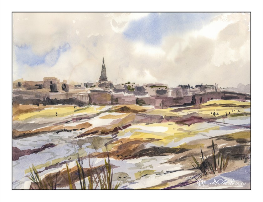
Remember the story All the Light We Cannot See? Ever since, the city has intrigued me. The story is worth reading, and if I remember, the movie was decent as well.

This painting was a quick one, and it turned out pretty good in my opinion. The point was to just paint, as well as to try out a new-to-me watercolor paper. This paper is St. Cuthberts Mill’s Bockingford paper. It seems to be a fairly soft paper as the tape around the edges of the painting pulled up some of the paper even though the tape was on the paper itself for only a short time. Using the heat of a hair dryer solved this problem, like it usually does. I liked this paper, though it does buckle a bit more than I expected when wet, but in the end it has proven to be well behaved.

Initially I scanned this painting on my Epson V600 scanner using the Epson software. Contrast was harsh and the sky barely showed up. I have had issues with watercolors and the software before – not at all pleasant to see – and then I suddenly remembered I have VueScan by Hamrick. I closed out the Epson software and fired up VueScan – and, oh, what a beautiful difference! This software is something I bought years ago, and I never really thought about using it for watercolors – I use it for photos I plan to run through Negative Lab Pro. Well, I guess I will have another use for it as well! Sheesh.

Watercolor, St. Cuthberts Mill Bockingford, 12 x 16, CP 140#.

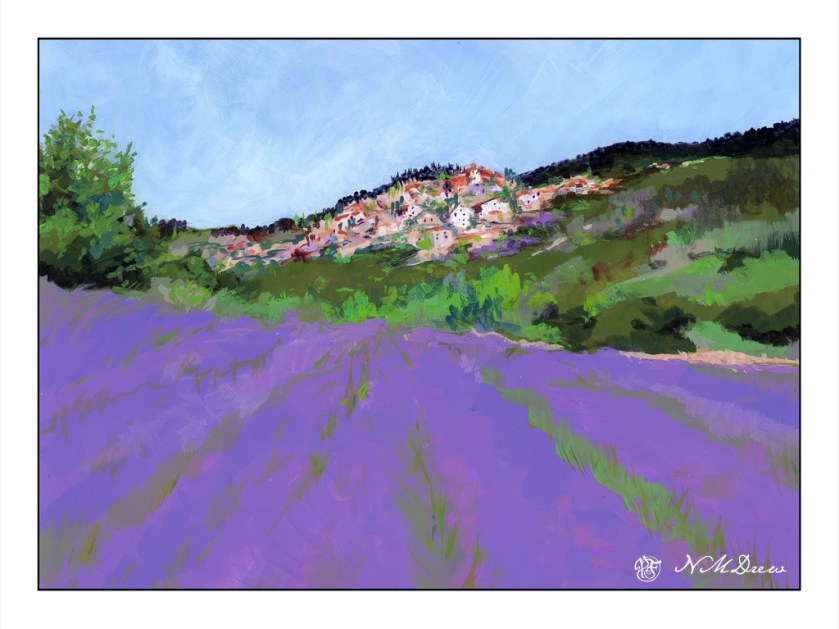
Lavender Field

Pixabay provides such a wonderful range of photos for free! This is based on one, a lavender below a village in France, which I think may be Bonnieux.

Yesterday I bought a number of fresh bottles of Golden Fluid Acrylic Paints. These are thinner than traditional heavy body acrylics, and unfortunately their color range is not equal to that of the tube paints. However, I have a number of small bottles, but my fresh ones are 4 oz. in size, and that will give me a lot of paint for some time. After playing a bit yesterday with the colors, mixing some, and then finding the ones I had did not meet my color needs, I ordered a few more from Amazon. This allowed me to get brighter spring greens and a good color for the lavender.

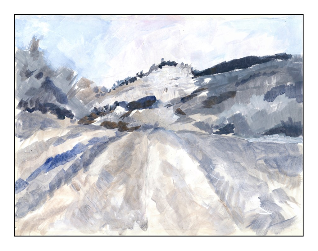
Yesterday I taped 1″ wide tape along the borders of a pieces of Canson XL watercolor paper in block format – 16×20 I believe. Then, I sketched in with pencil and laid down a foundation of values which gave me a sort of road map as to what I was going to do.

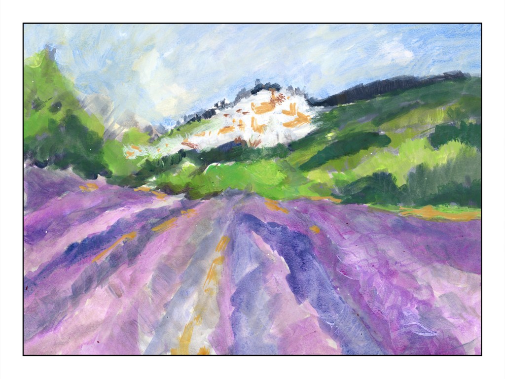
This is my second layer – colors this time with some values. The idea I had when I started out is I did not want to do a bunch of dabbing, which is my normal style, but instead make large swaths of flat color in the foreground lavender with some detail, and lead the eye to the village on the hill. To do this I used the lines of the lavender to lead the eye to the middle ground, but then chose brighter and warmer greens to sort of point to the village – lookie here!

I am not too sure how successful this is as a painting per se, but I am quite pleased with it. This is my first attempt at a big painting with the fluid acrylic paints, and as with all acrylics, I had to work with the quick drying time of the medium. The fluid acrylics were easier to use in a lot of ways than were the regular tube paints just because I didn’t need to work at diluting them. Straight out of the bottle, they work quite well. Shaking them a bit before use is a good idea, too. I will be ordering more titanium white as I have used a lot of it to just make this painting.

I hope you like this! More to come!