Winter Storm

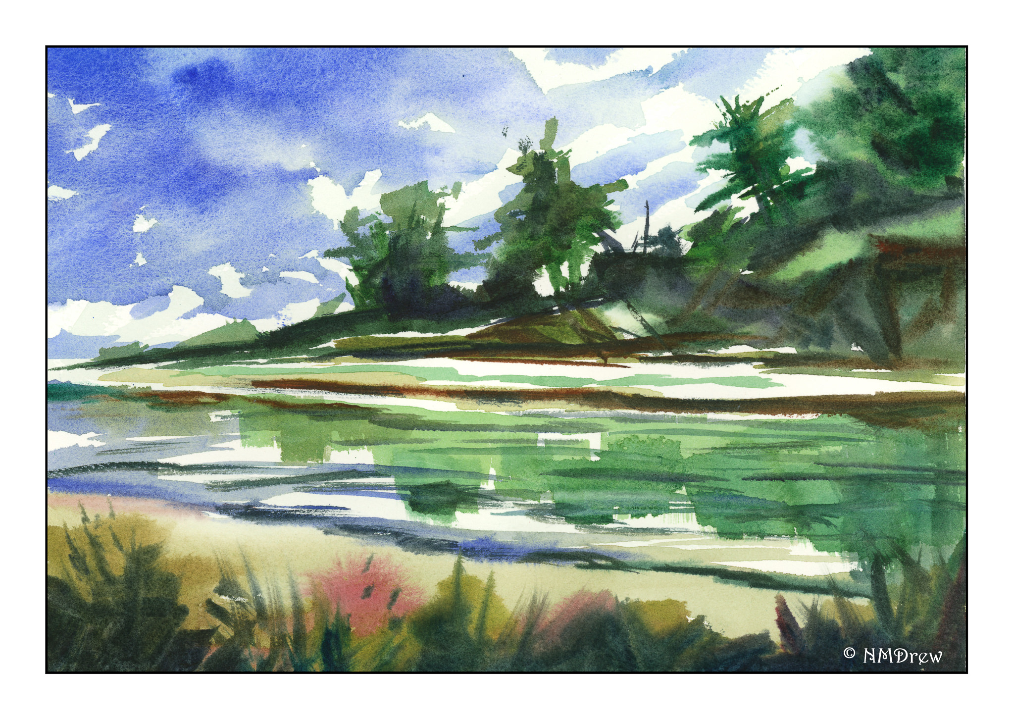
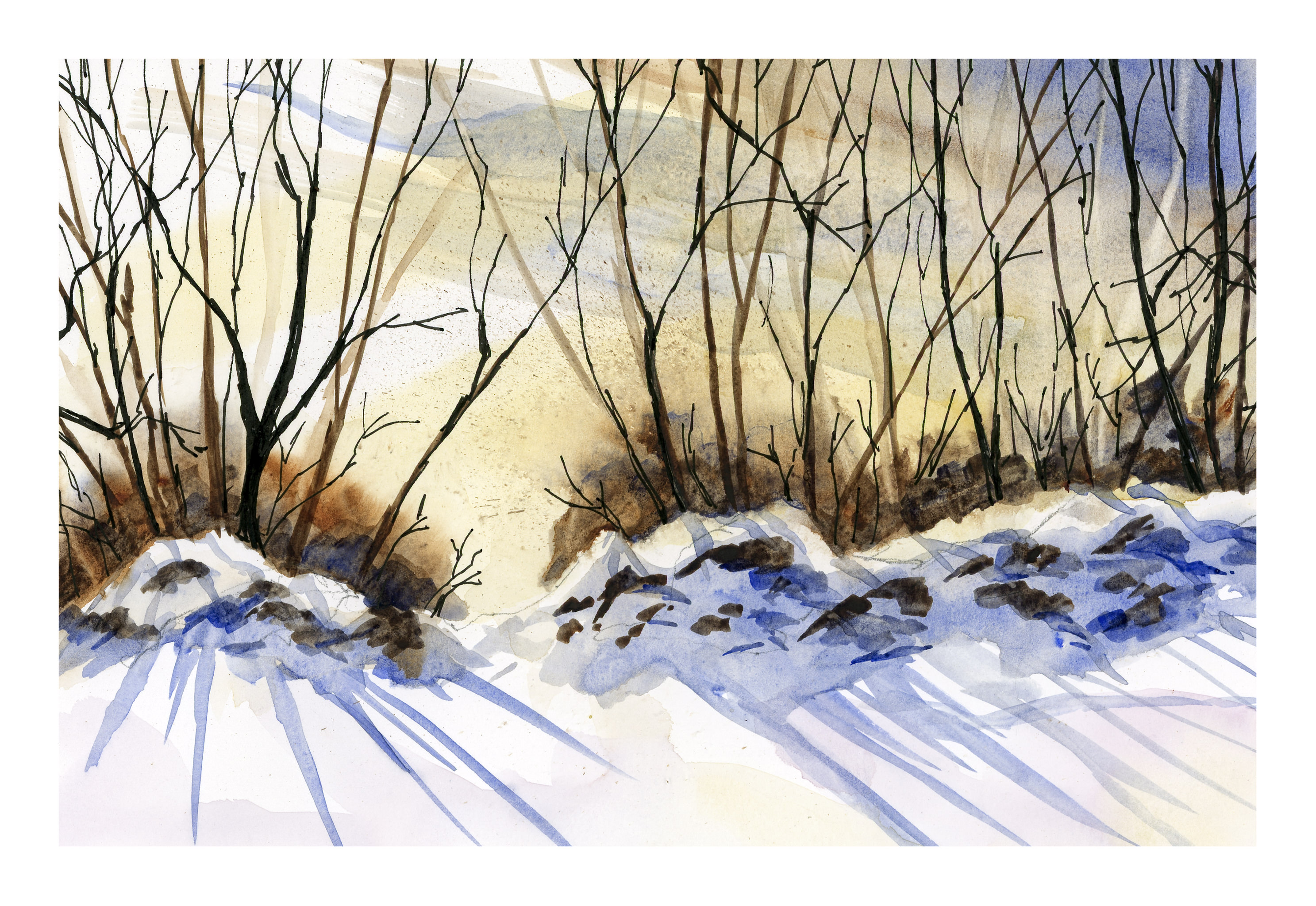
When I first started to paint in watercolor – like when I was a teenager! – the advice was to use a brush bigger than what you think you need. Yeah, right. Over the years, I have resisted this, but lately I have been doing the majority of my painting with a 1.5 inch flat brush. From there, different brushes with different ideas in mind.

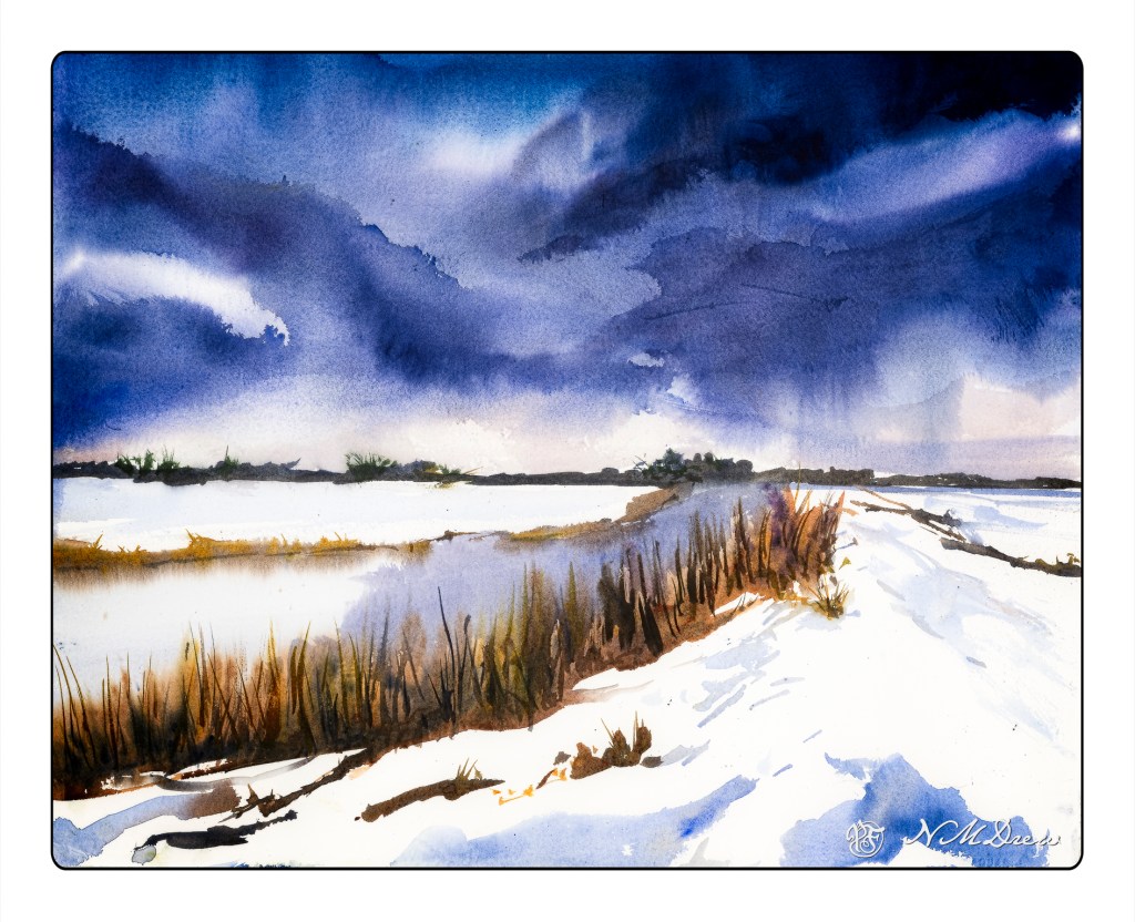
Here, 16×20 CP 140# Arches. I sponged the entire paper with water and then set in the sky. From there, the water and grasses along the shore, working to get blurring of colors into the wet paint. Then, the horizon with the same 1.5 inch brush. I let it dry.

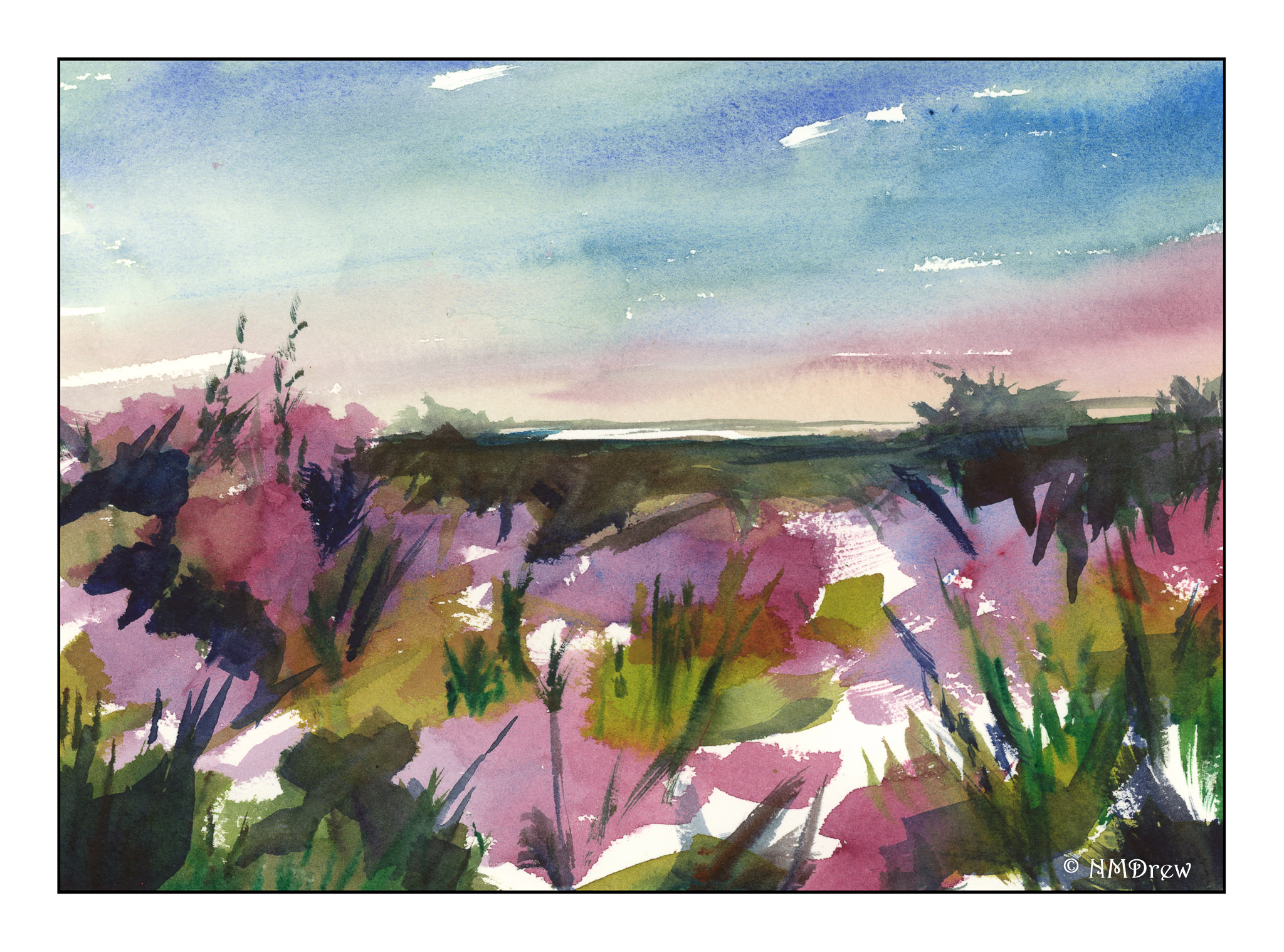
From that point, it was a matter of thought. Initially, the sky dried to a pale color, so I laid in more dark paint for the sky, using a spray bottle to move the paint around, and holding the painting by hand, tilted the paper this way and that to run the paint in various directions.

Looking at it upside down always gives a new perspective, sometimes good, sometimes not. I added some dry brush for the weeds, and used a wet mixture of blues for the snow shadows. I also painted a darker version of the same snow blue into the distant water, moving it into the weeds / reeds. Then, more dry brush once the water had dried to overlap the paint I applied.

This is a stronger painting than some of my more more recent ones, and I will credit the large, flat brush forcing me to work simply. It’s actually much more fun, and easier, in many ways, because I am not getting finicky to the point of crazy.

Progress is being made!

Misty Morning

Summer, fog, early morning rising mist. One color blends into another, overlapping, blurring together. How to express this?

Gouache does not readily lend itself to the color movement as does watercolor. In watercolor, you can discharge one color into another, and the wicking action of water and paper do the work for you. Here, I thought a lot about how to blend and merge colors to create that soft effect of fog. In the end, for this painting, I decided to use a narrow, flat brush with stiff bristles and scumble all the colors together.

Rather a brighter painting than I anticipated, but I think it does express the rising fog and early morning sky fairly well.

7×10 Arches hot press paper.

Abstraction

If you follow my all-purpose art blog, Journey By Paper, you know that I have been slithering around with pastels, gouache, and watercolors as a theme for a painting called “The Slough” – sort of an evolutionary adventure. In doing so, I began to move into a kind of abstraction, painting without lines.

Generally, I tend to paint watercolors without any lines on the paper. I don’t know why, but the lines too often act as a cage, and keep me from just exploring color. I really love the way colors and water react on good paper, and I think the lines make me think I need to produce a “perfect” painting, whatever that is. So, here are some abstractions I did, all in one afternoon, in the order I did them. Comments about each panting are below them. All were painted with a 1/2 inch or 1 inch flat brush.This one I wanted to work on contrast, saving white paper, and creating shapes with the 1/2 inch brush. I was pretty pleased with the results, but the foreground was a bit of a puzzle.The above is an abstraction of heather. The sky doesn’t match the heather. This one I need to re-think.I really like this one – the colors just are so beautiful (to me). I think the abstraction worked to catch trees and snow in the spring, although perhaps I could redo it more simply.Finally, this yellow house has been calling out to me, but a yellow house is not that interesting in and of itself. But, a series of shapes to make a house became the idea after doing all those abstractions before it. Here, a 1 inch brush and a bit of thought. I like this one because it is cheery, has white paper showing through, and is showing me what I can do with pure colors.

Somebody Used to Live Here

Friday was a busy, busy painting day!  Quick sketch in the morning, class in the afternoon.  More last night.  And this morning I did this using only a flat brush, learning about its characteristics and such.  I even got into using it really, really dry, which I had forgotten about.  And the side – the edge of the flat – to make little dabs, such as in the pink flowers.  It was great for wood texture, and fun for the sky.  This was done without a preliminary sketch nor lines drawn on the paper.

White = Snow

If you have been reading along, you know:  I make mud, I need lines, and I cannot get white space at all.  Well, in a moment of mad inspiration, I realized snow is white.  Let’s paint snow!  In my part of the world (California), we are in the midst of a hideous wildfire, which fortunately bypassed our neighborhood, but which could be visited by a fire any time.  Crazy winds and no rain make for dry and dangerous conditions, and certainly the last place where  you will expect to find snow.

Thus, snow.  I went to my favorite place (YouTube) and searched for “watercolor snow” and there we were!  Lot of them.  In particular, I found Peter Sheeler, whose videos are simple to follow, and quite lovely.  He uses a minimal palette, and just paints.  Subtitles let you know the colors and the technique.  Pleasant music moves you along.  Here is my version of his painting.

Peter Sheeler has another video that I used as well.  It was a bit more complex, but not only was it great for shadows on snow, he has very strong light – dark colors, another problem I struggle with.

And here is my version of it.  I was really intimidated by the dark trees and the rocks.  Besides using only Ultramarine, Yellow Ochre, and Burnt Sienna (even though Sap Green is in his video’s palette), Peter uses a 1/2 inch flat brush.  I have some flat brushes, and they scare the hell out of me.  I think people who love flat brushes are nuts.  No more:  I bit the bullet and pulled out my flats and did the entire painting in a flat brush, varying sizes as necessary.  And I used micron pens, too, as did Peter.

I am feeling a lot more confident now about colors, white space, limited palettes, and flat paint brushes.  I think I will continue to follow along with Peter Sheeler’s videos – he is a really good painter, I like his style, and am confident I will get a lot out of his videos.  And Peter, if you should come across this, let me tell you, “Thanks!”