Another day just painting! What a pleasure to be able to do it!
Today we did two different things. Actually, three. For warm-up, we returned to the quick three minute sketches, which eventually morphed into a still life with three objects. Mine were a piece of dried corn, a plastic mushroom, and a plastic artichoke. I was not particularly nimble this morning, but here is one I produced.
From there, we moved on to landscapes, but I will hold off for a moment on those. We did an exercise which I found fascinating: take one object and paint it 6 different ways. I chose a really lovely fake pear – golden and red, reminiscent of autumn. Take a look . . . they are in a gallery format, so click on one image to be able to scroll through them larger than they are here.
This was a lot of fun to do – nothing I ever have considered as an exercise. And then . . . we moved on to landscapes from photographs Brenda took, laminated, and brought to class.
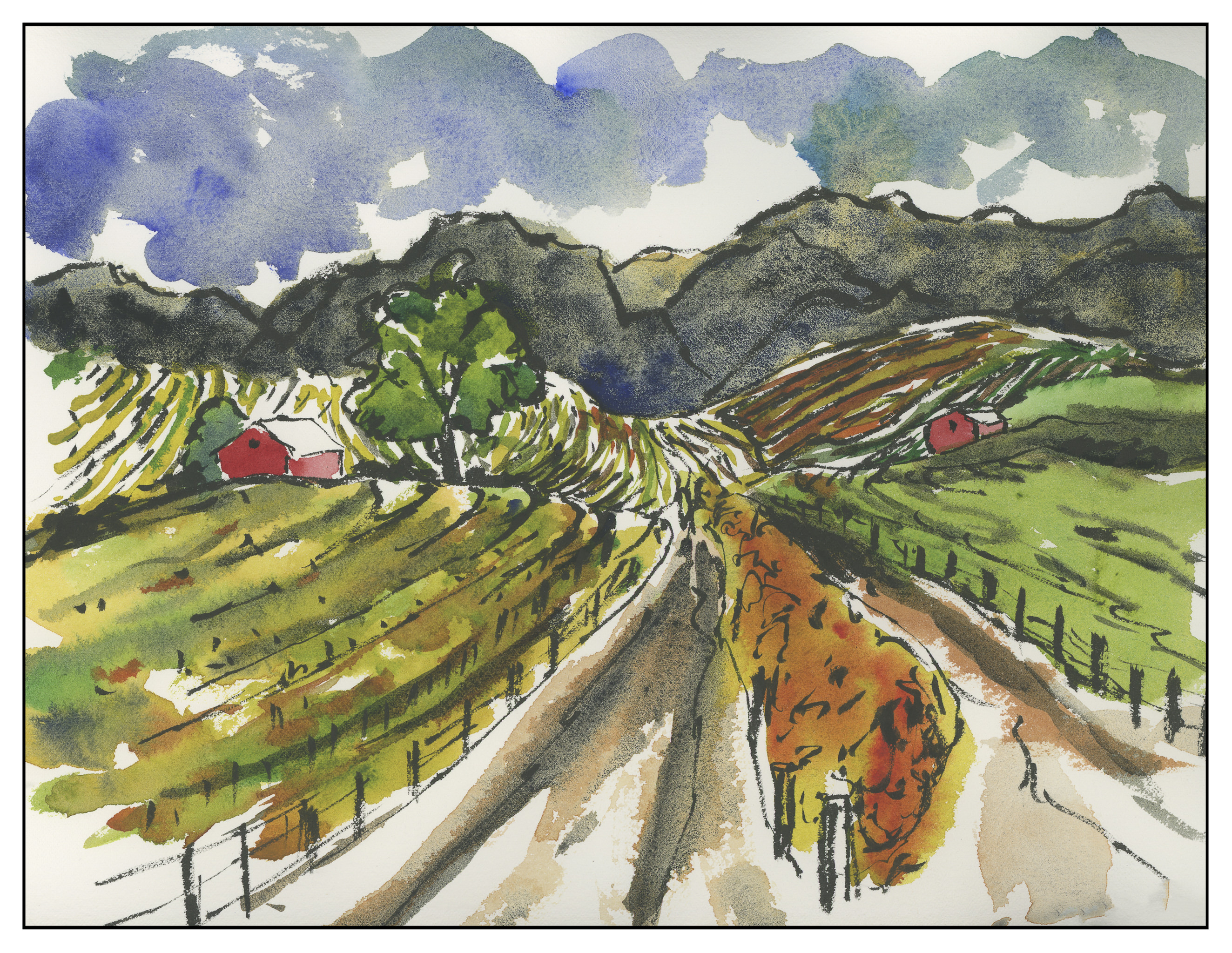
The idea was to take a photo and modify it. This one is in the wine country of Northern California.
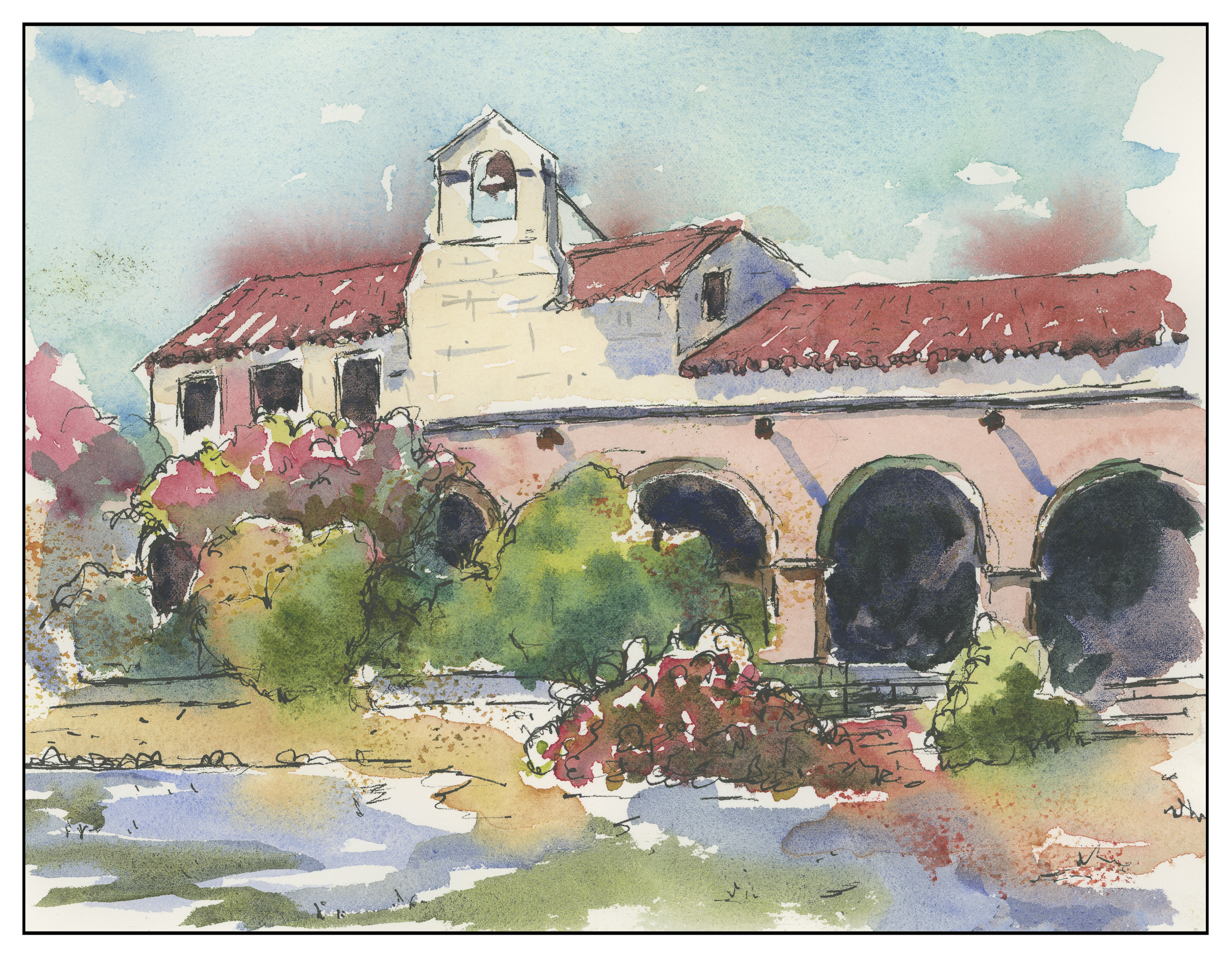
This one is, I think, in Carmel, but I don’t recall. All the speckles are from the fact that it is a ghost image from a wet painting. Truthfully, I was surprised it was a success at all. All day I felt restless and unfocused.
Finally, this one. I think it is the best of everything I did today. The mantra for the day was draw, frame, paint.
Instead of the usual corn tortillas to go along with our homemade chili verde, I thought cornmeal biscuits were a good idea. At first, cornbread floated through my mind, and then I thought of biscuits . . . why not combine the ideas together?
Cornmeal Biscuits
Preheat oven to 425 F.
3/4 c. butter, unsalted, finely diced
1 1/2 c. unbleached flour
3/4 c. yellow cornmeal
1 tsp. baking soda
2 tsp. cream of tartar
1/4 tsp. salt
2 T. white sugar
1/2 c. chopped, fresh sweet pepper (I used pale, green Hungarian)
1/2 c. corn, fresh or frozen
2/3 c. buttermilk (or thin yogurt)
Combine dry ingredients – flour, cornmeal, salt, soda, cream of tartar, and sugar – in a bowl. Blend in, as for pastry, the butter, until combination resembles coarse meal. Stir in the pepper and corn. With a fork, stir in the buttermilk.
Check biscuits for consistency, adding more flour or buttermilk as you think is necessary.
Create a ball out of dough and knead briefly on floured board. Roll out biscuits, about 1/2 to 3/4 inch thick, on floured board, using 2.5 inch biscuit cutter.
Place on baking sheet. If you want, brush tops with extra buttermilk. Bake for 15-20 minutes, depending on your oven quirks, until lightly golden. Cool on wire rack.
The iris – the butterfly flower – is just too much fun to paint! And quite a challenge as well. The videos make it look easy, but I assure you, it is not! The shape of the flower petals is far more difficult to do in a few squishy movements than it appears. Loading the brush, with ink and / or pigment, is also a challenge.
Of all the videos, I looked at Virginia Lloyd-Davies’ the most. The reason for this is that she has multiple irises in different positions. She also uses similar approaches for each iris, but varies the iris enough so that brush variations also occur. By watching her video repeatedly, it became possible to actually learn a great deal by imitating.
For these pictures, I used the same paper. The paper is double xuan, which is an absorbent paper which is heavier than student grade, and much nicer as a result.
Iris Scribbles
Unfortunately, I did not take very good pictures, but at least they are clear. In the picture above, you can see some attempts are better than others. This picture represents my first attempts at painting irises in color. The ones on the left side were done with the paper turned around – what you see are upside down. The reddish-purple ones are my first ones, the blue ones later on. You can see there is some improvement. As always, my sense of value seems very off to me – not enough contrast between the light and the dark and middle tones. The yellow iris was just awful. The yellow paint has a decidedly greenish cast, and I could not find my white paint (I’m using Marie’s Chinese Paints) – or maybe I’m just out of it. Anyway, it held no appeal once the color was on the paper.
Colored Irises, iColored Irises, ii
These two side-by-side paintings were my tries at creating the irises and attaching them to the stem. Not very good. The colors of the irises are not bad, but the shapes leave a lot to be desired. Leaves as well are unpleasant.
Colored Irises, iii
This painting with the reddish irises is better than the blue ones, as far as some of the shapes of the flowers. Those of you familiar with orchids in Asian painting will realize that these are orchid leaves, not iris leaves! Well, I guess I have some sort of hybrid here.
Sumi Iris, i
Once I got frustrated with color, I got out a Chinese ink stick and ground up some ink. I made three shades – light, medium, dark – and went to work. Again, contrast was an issue, but the flowers, stems, and leaves became a lot nicer. This one was the first attempt which pleased me.
Sumi Iris, ii
The second sumi iris also shows a problem with light / dark, but the composition is pleasing to me.
Sumi Iris, iii
And this one, the third one, pleases me the most. Still some problems with light / dark, but not so badly. The entire flower is looking a lot better, from top to bottom. Certainly some of the irises are rather blobby, and the buds don’t quite make it. Parts of the painting are too busy or crowded, but, over all, I think I am seeing some success. Certainly I plan to continue practicing, and I hope that I will be able to produce a creditable flower.
Leftover Ink
This is what I did to use up the rest of my sumi ink – I hate wasting it!
Corn StalkTiger Lily, iTiger Lily, ii
All these paintings were done on Memorial Day. A few others were done as well. As far as the photography, well, let’s just say it sucks and I need to work on it. The paper is a warm cream, and perhaps I should have used a flash. Ah, well, always something new to learn.
These really are a lot of work to make, but they are getting easier. Again, a lot of the hard work is the setting up and the processing. I really do minimal work on them, but would like to make ones that are rather polished. The fact is, making videos is a lot like taking photographs – most of what is done is not at all good, most is trash, only a few are good. Making videos for an afternoon proved that point all too well. Also, the fact is, that being on film really makes me self-conscious, not something I like. Painting a line wrong creates instant trauma!
Initially, when I set up to make videos, the whole idea was to do chrysanthemums, in keeping with their autumnal theme in ink painting. Well, I really don’t like any chrysanthemum I’ve ever painted, so why should I be so foolish as to think I might be able to do one for a video?
I ended up painting corn – a really easy subject, yet one that is uses a lot of different techniques. Dots and medium grey ink, very wet. Twisting the brush in different directions as painting. Dry brush strokes. Contrasting shades and textures.


")
")