Color in Impressionism & Pointillism

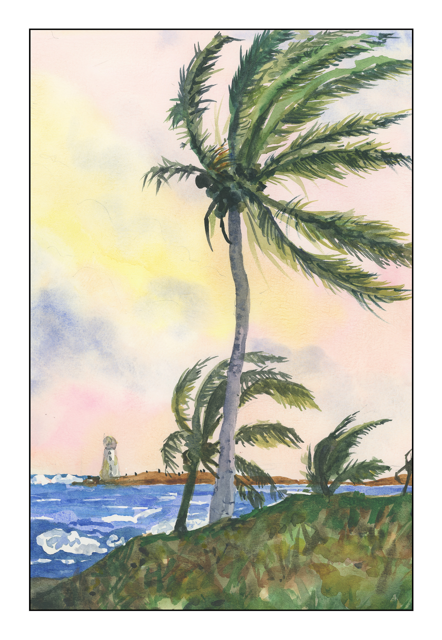
For me, color is an excessively important part of my visual world.  I see colors before I see people or things.  I think in colors.  From there, reality intrudes and I can identify what is around me.  Because colors are my primary draw, when I paint, mud has often been the result.  Learning to separate colors and learn how one color works with another in painting has been, and continues to be, a difficult lesson for me.  My emotions want the color, but reality is that all colors do not create better ones.  Thus, “patience, grasshopper”!

According to Wikipedia:

Impressionism is a 19th-century art movement characterized by relatively small, thin, yet visible brush strokes, open composition, emphasis on accurate depiction of light in its changing qualities (often accentuating the effects of the passage of time), ordinary subject matter, inclusion of movement as a crucial element of human perception and experience, and unusual visual angles. Impressionism originated with a group of Paris-based artists whose independent exhibitions brought them to prominence during the 1870s and 1880s.

If you know your art history, Impressionism was ground-breaking and revolutionary.  Smooth blending and invisible brush strokes gave way to a different sense of light and its workings on the world seen by the artist.  As with all things, evolution occurred, and from this first rebellion against the “acceptable” art of Europe came other schools.  A direct off-shoot is Pointillism.  Color still is extraordinarily important, but instead of “impressions” being important, the usage of pure color became more distilled.  According to Wikipedia:

Pointillism (/ˈpɔɪntɪlɪzəm/) is a technique of painting in which small, distinct dots of color are applied in patterns to form an image.

Below is a short, clear video about Pointillism, its derivation and its influence.

What does this have to do with me? My need to work with color successfully requires a certain amount of intellectualization and rational thought about color – how color works, how colors interact, how Cobalt Teal reacts with Quinacridone Gold, and so on. I find breaking down colors into individuals before combining them helps. So, I decided to turn to the works of Monet and his studies of the ciffs at Etretat. I looked at several Monet studies, but I will use this one in particular:

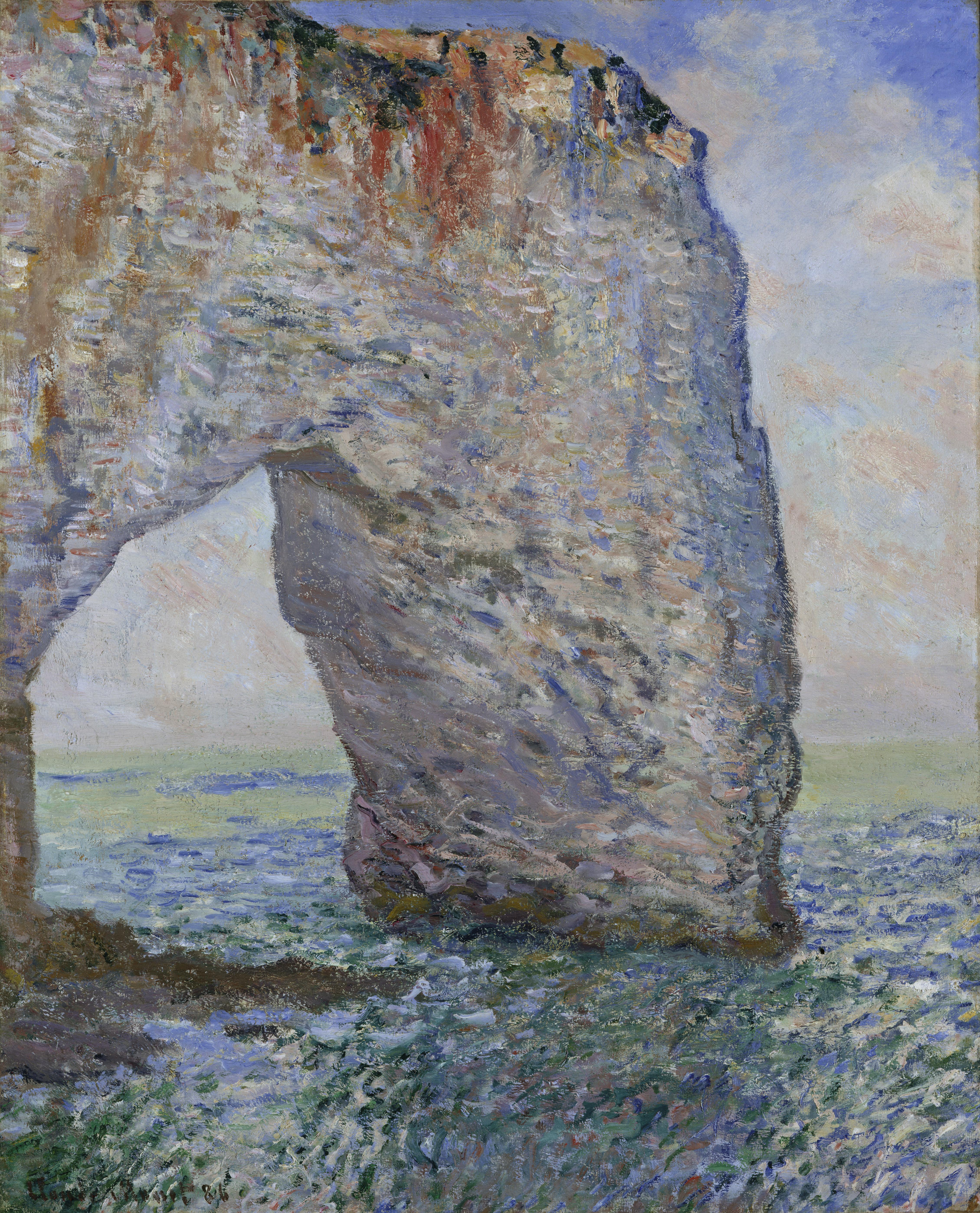
And here is my interpretation of it:

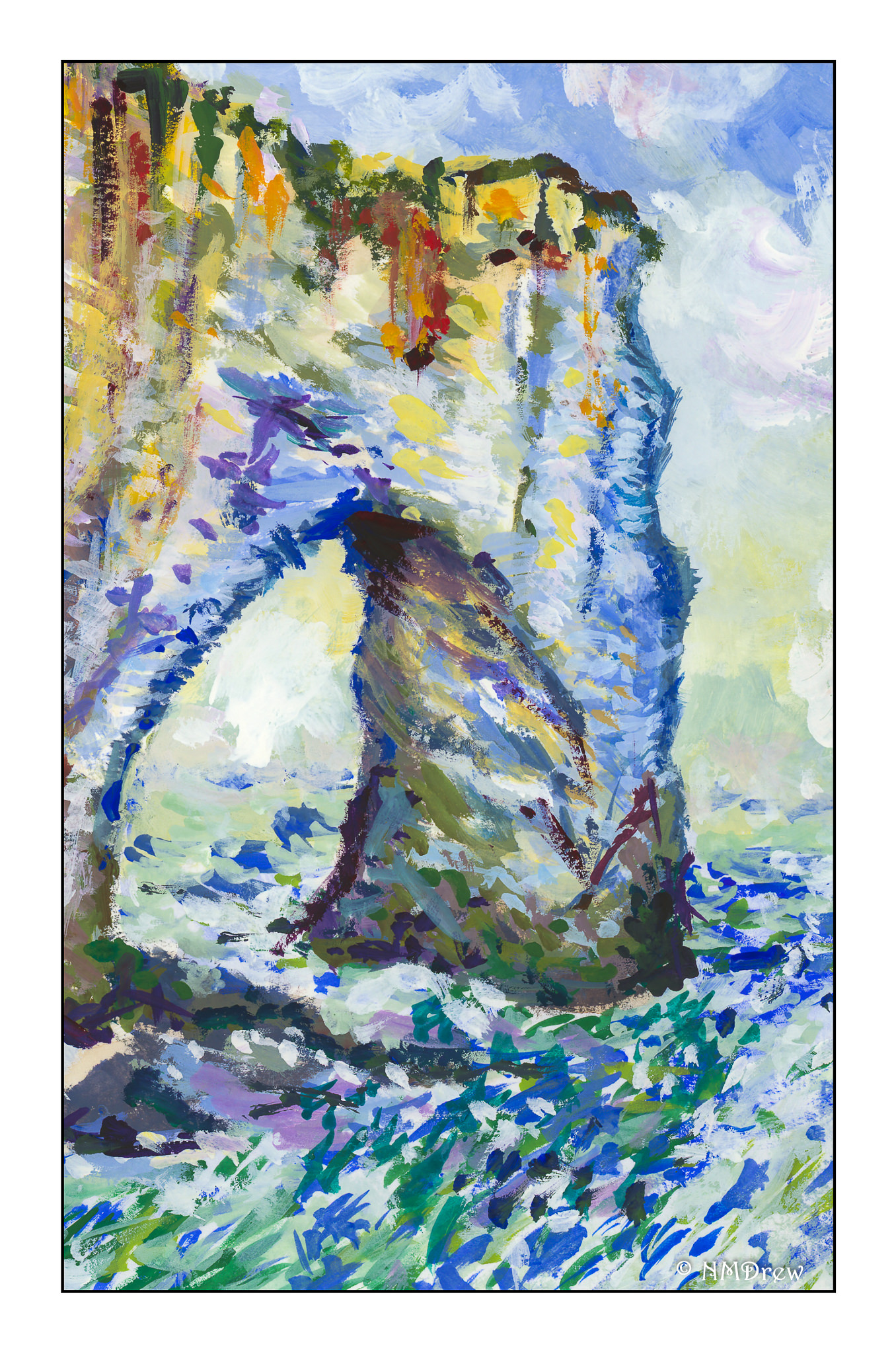
Obviously, my colors are more intense, but the impact of light on surfaces was the focus. After a few “Monet studies” I realized that this was not quite was what I was looking for. I knew of Georges Seurat but do not care much for the start graphic quality of his work. Exploring other Pointillists, I remembered Paul Signac, and it is here that I found my current muse.

Signac’s works vary from graphic and sharp to blurred and “painterly” (for want of a better term). His more purely Pointilistic works have an energy and vitality I prefer to Seurat’s – more modern, more attractive, and more elegant in composition. He also works with the precepts of Pointillism, but still in a more Impressionistic way. I did my first Pointillistic painting by painting a detail of this painting by Signac, Cassis, Cap Lombard:

I took a small section, enlarged it, and painted a detail of it without following the exact structure of Signac’s painting.  If you click on Signac’s painting above a couple of times, you can enlarge it, and find the blues and oranges together in the shadows, which I studied and used in my sample below.  Additionally, I studied both warm and cold blues and oranges to get a sense of the temperature of the painting, but I will admit at this point I am rather befuddled and cannot describe my observations

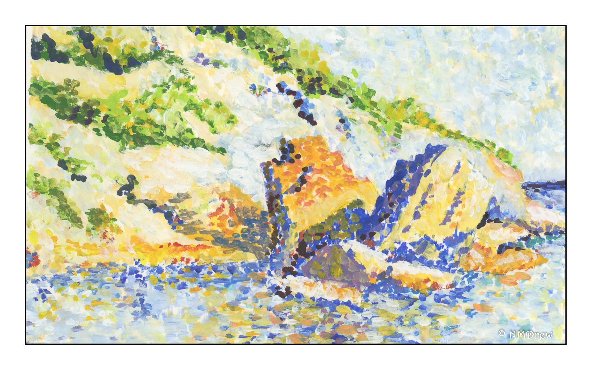
My goal was to look at the usage of color, in particular, the juxtapositioning of colors. In the stones along the shore, and in the reflections in the sea, you find blues and oranges, complements of each other, in play to create light, shadow, reflected light, and reflections seen in the lap of the waves.

Did I succeed? As far as color usage, yes, to a degree. In doing this study I also learned about making a Pointillistic painting. I began with just dots and soon learned it took forever! So, in further studies, I laid in the primary background colors in given areas and then applied the dots. I am working in gouache, and so I can blend colors into each other on the paper to create new ones since artists gouache is never permanently “dry” unless sealed. Gouache is the perfect medium for this, but I can also see the value of acrylics as each layer can dry and then be painted over without dissolving the layer beneath. The other beauty of gouache is that it is an opaque medium and so painting over other colors can be done, unlike watercolors.

More studies will follow using the principles of Pointillism, and I know that I will evolve into my own methods. Copying from the works of a master is a time-honored tradition and an important part of any student’s learning, no matter the field.  Such practice causes one to think, analyze, and apply; it is from this one learns.


Style

Definition search result for STYLE (straight from Google search “definition style”):  1.  a manner of doing something.  2.  a distinctive appearance, typically determined by the principles according to which something is designed. 

I’ve been thinking a lot about style of late, as in style of music, clothing, politics, painting, drawing, writing.  Since we are all individuals, we all have ways of doing things that earmark them as our own.

I don’t particularly care for what I might consider my native way of drawing and painting.  I have a vision in my mind’s eye about how I want things to look as a finished product.  That doesn’t mean no happy accidents, but it does mean I have a certain vision of clarity with watercolor paints in particular.  I think a lot of what I paint seems labored – and maybe that is because I did the laboring?  My paints seem heavy and more opaque rather than utilizing the transparency of the medium.

Copying

Copying a master’s work is a time-honored tradition for art students, whether sitting in the Louvre and copying a Rembrandt (if they still let people do that, like they did in the 1800s), or a sumi-e student in training.

Today there seems to be a shunning of such, with more of an emphasis on “originality” coupled with a fear of lawsuits for copyright infringement.  If you think about it, nothing is really “original” but derivations of other’s works or our own creative minds, but someone before you or me probably had the same idea.  Forgers can make a bit of money by copying masters, and passing them off as the master’s, but with today’s technology, I expect that becomes a bit more difficult.  By the same token, can using a photograph as a springboard to a painting can be considered under some circumstances as copying – even if you have taken the same picture yourself?  It’s my understanding you cannot take pictures of the Eiffel Tower lit up at night because those photographs are copyrighted by the lighting of the tower!  That is how crazy this world can be.

Learning from Copying

What do you learn when you copy someone else’s work?  What do you have to do to “get” there?  You have to look, think, analyze, plan, and then look, think, analyze, and plan again.  After you do that, where do you go?  How can you apply what you have learned to make your newfound knowledge your own?  I struggle with this as there are artists I admire, whose work inspires me – how do I make what I have learned in the process of copying my own?  I am still trying to figure this out.

One thing I do not want to do is pass something off as original if I have copied it as a learning experience.  That is completely unethical.  I find it interesting that certain art instructors make it well known that, if you have taken a workshop with them, any work derived from learning in that workshop cannot be sold as “original.”  Does that mean their “style” is copyrighted?  Does this mean if you develop a style with your own subject matter which is similar to what you have learned that you can be sued for copyright infringement?  If such is the case, none of us can produce anything – this building is copyrighted, that tree is copyrighted, that person is subject to privacy laws, that color is copyrighted, that song sound is copyrighted, that rhythm is copyrighted.  If you do DNA testing, you may be signing away your rights to your own body’s chemical makeup.

So, What Happens Now?

Well, I know what I want to accomplish in my painting.  To list it:

  • clarity of color
  • economy of composition (meaning not overworking something) and simplicity
  • mastery

I prefer landscapes to portraits or animals.  I can do skies fairly well.  Trees, sometimes; mountains, sometimes.  Cityscapes?  Seascapes?  Challenges for sure.  What about painting cars – part of cityscapes!  Waves – part of seascapes.  Water?  Omigod!  It’s overwhelming.

Enough whining and pontificating – time to get out the brushes and color!


The Palm Tree, Nassau – Study from a Painting by Winslow Homer

A couple of things here.  First, I think that Winslow Homer is an amazing painter, especially in watercolor.  Second, I think that copying the work of a master forces one to study what is in front of you – how was this done?  what technique?

As Homer is a master of skies and atmosphere, I spent some time the other morning looking at different paintings he did.  Especially delightful are his paintings done while in the Caribbean, spending time in the Bahamas and other islands.  Homer’s skies are vast and expressive, subtle and strong.  I decided that his painting, The Palm Tree, Nassau, would be a perfect study.  What was most interesting was seeing how differently the same picture looks on different sites – some make it very murky, others make it very colorful.  Below is Homer’s painting:

The Palm Tree, Nassau (by Winslow Homer)

I printed out a copy of this painting on my not-too-high-end color printer.  In the end, I referred to it more for composition rather than colors or detail.  This image shows the sky with blues in it, but other images on the web gave the sky reddish and yellowish undertones.  In the end, I just did what I wanted.

The water could have been more turquoise, as is the water in the Caribbean; the foreground in Homer’s painting is some weird vegetation that I couldn’t figure out, but think it is typical for the scrub of the islands.  If you look at Homer’s painting, there is a reddish blob by the lighthouse – what is it?  Looking closely, you can see it is a flag.  For me, it was a big distraction, so I left it out.  Also, Homer’s rendition of the lighthouse is very simple – I decided to give it a bit more detail.

Copying this painting was a lot of fun.  The sea was rather meh, but Homer’s is not especially spectacular.  His palm trees, though, are divine.  Since I live where there are palms, I really liked the idea of actually attempting to paint a tree – or trees – that are rather intimidating.  Homer’s painting catches them snapping in the trade winds – you can just hear them clacking their fronds against each other.  I hope that my fronds convey the same sense of sound and movement.

Techniques used in this painting were wet-in-wet for the sky, light washes moving into darker ones for the foreground, and layers of colors for the palm fronds and coconuts.  I took some long looks at what was in the painting before me and felt confident enough to figure out what I think Homer did.  For the white of the waves and lighthouse, I cheated and used frisket.  Then, after it was dried, I laid in the sky, and then moved to other areas, working lighter to dark, some detail to final details, depending on what was going on.  Altogether, I spent about 3 hours doing this study.

Copying the Master(s) and Stealing (Their) Secrets

This book remains a favorite of mine, in part because of the history behind art apprenticeships, but also because it serves to remind that in all arts, a period of apprenticeship – with or without a teacher – is needed to gain mastery.  As I struggle with watercolor, I remember how I struggled when I was working with sumi ink.  In sumi-e, the brushes, ink, and paper are enough to make you scream.  Watercolor is perhaps worse!

What makes watercolor difficult?  For me, it is always a matter of less being more.  With colors, I am a magpie – all those colors!  I am hard-pressed to use only a few.  With sumi-e, you have one color:  black.  And shades of grey (50 if you want).  Another struggle is to not create mud.  I seem to be moving away from that.  And finally, lines.  I like lines.  However, I want to paint without lines . . . sort of like giving up training wheels on a bicycle.

At some point, I expect I will be able to master watercolor far more than I am now, but it is a long, hard haul.  And, I admit, one I am not very happy doing.  I wasn’t happy with the struggles with sumi-e, either.

Finding a master is not something easily done in this day and age.  Rather than being apprenticed to learn a skill or craft from a master, many of us go to school.  I am way past spending 4 years or more in college – I am an old workhorse – so I learn by observation.  This means finding an artist I admire and trying to copy his / her work, as well as subscribing to numerous YouTube videos.  I also have to learn by doing, which is the most challenging part.  A part of me expects to be perfect, and my temper flares when I feel frustrated.  That is when it is time for the proverbial deep breath, retreat, regroup, refocus, retry.  Patience is also taught with such apprenticeships!

Thus, in cruising the internet, yes, I do “steal” from the master.  In “stealing,” I learn about color and composition, light and dark, contrast.  I do not ever intend to pass someone’s work off as my own – that is not right.  But, if you go to a museum, you will find people sketching the work of a master.  Why?  To learn.  The best learning is by doing.

Various painters come to mind whose work I enjoy; when I find someone whose work I admire, I like to look at their paintings and try to figure out how they did it, the order it was done, and the colors used.  By copying I learn about color mixing and how to create an image that (might) work.  Every artist is unique, and each has something to offer.  There is a lot to learn from out there, and I am humbled by the talent I see.  And I learn when I copy from the masters.